AX2141
component for Axiom forms
Using the Formatted Grid component, you can display information in a grid format—such as reporting data, lists of information, or grid "worksheets" with various user inputs. The Formatted Grid component takes a designated section of the source spreadsheet and displays the contents of those cells in the Axiom form.
You can define formatting for the grid contents, such as font size and colors, background colors, text alignment, and borders. To apply formatting, you tag each row and column in the grid with style names. The formatting in the spreadsheet is ignored, with the exception of number formats.
Defining a formatted grid is a two-part process that requires the following:
- Creation of a Grid data source in the spreadsheet to define the portion of the spreadsheet to display in the form, and to define the formatting of the grid contents.
- Placement and configuration of a Formatted Grid component on the Axiom form canvas.
The Formatted Grid component can be used for data display only, or to support rich interactivity such as input cells, combo boxes, and more. Formatted grids are very flexible and support many different features. Each formatted grid can look and act very differently depending on the formatting applied and the features used. For more information, see the related topics such as:
- Interactivity options for Formatted Grids
- Using content tags in Formatted Grids
- Setting up drilling for Formatted Grids
- Applying formatting to Formatted Grids
- Editing grid contents in a spreadsheet editor
- Exporting Formatted Grid contents to a spreadsheet
The Formatted Grid component is one of several options that can be used to display reporting data in an Axiom form, along with the Fixed Report component and the Data Grid component. For more information on the differences between these components and when to use each, see Displaying reporting data in an Axiom form.
NOTES:
-
Older formatted grids may use formatting defined in the spreadsheet, instead of using row and column styles. These older grids are known as spreadsheet-formatted grids. The ability to use spreadsheet formatting is deprecated, and is only supported for backward-compatibility. Many newer features of formatted grids are not supported in spreadsheet-formatted grids. If you have existing spreadsheet-formatted grids and you need information on how to edit them, or if you want information on how to migrate them to the new grid style, see Using spreadsheet formatting with Formatted Grids (deprecated).
-
Formatted grids that use the default formatting method are also known as thematic grids, to differentiate them from the legacy spreadsheet-formatted grids.
Data source tags
A Formatted Grid component must have a defined data source within the file to indicate the data for the grid. The tags for the data source are as follows:
Primary tag
Row tags
Column tags
NOTES:
- The primary tag must be placed in the first 500 rows of the sheet.
- Formulas can be used to create the tags, as long as the initial bracket and identifying keyword are whole within the formula.
The following example shows a Grid data source tagged in a sheet. In real implementations this data would most likely be generated by an Axiom query or another data query method; this example uses fixed sample data in order to show the placement of the tags to the data.
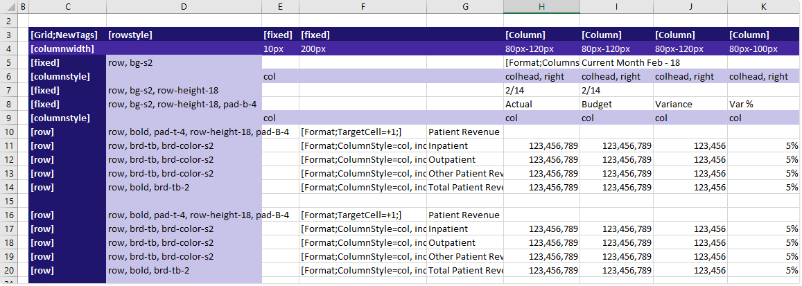
To use the Data Source Wizard to add the tags to a sheet, right-click in a cell and then select Create Axiom Form Data Source > Formatted Grid. You can also highlight a range of data first and then use the wizard to add the tags around that data. The cells in the row above and the column to the left of the selected area must be blank in order for Axiom to place the tags in sheet.
When the form is rendered, this example grid displays as follows:
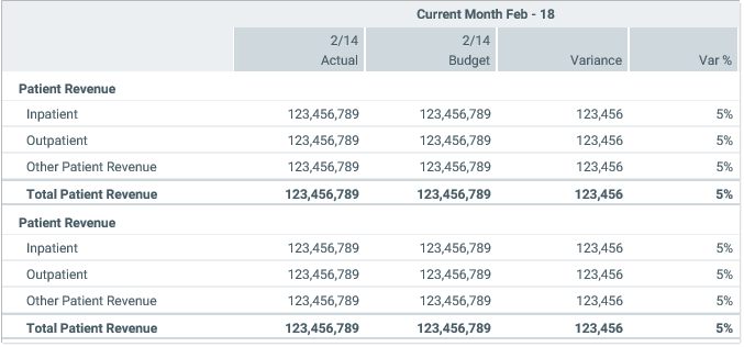
Notice the difference between the formatting in the form versus the formatting (or lack thereof) in the spreadsheet. The formatting in the spreadsheet is ignored. The formatting in the form is determined by the styles applied to the rows and columns in the data source. For example, the subtotal rows use a style such as row,bold,brd-tb,brd-color-s6, to apply bold text and borders to the row.
If desired, you could format the data in the spreadsheet, and that formatting would be ignored when the form is rendered. For example, you might want to bold the header rows and put underlines on the subtotal rows, just so the data is easier to read in the spreadsheet when form designers are working in the file.
You can define the following properties for a Formatted Grid component.
Component properties can be configured using the Form Assistant task pane or the Form Designer unless otherwise noted. All properties can also be defined on the Form Control Sheet directly if desired. For example, if you want a property to be dynamic depending on the result of a formula, you can define that formula in the control sheet. To access the control sheet settings for the component, double-click any property name to go to that property in the Form Control Sheet.
Component behavior properties
The following properties control the display and behavior of this particular component type.
| Item | Description |
|---|---|
|
Data Source |
The data source for the grid. You must have defined the data source within the file using the appropriate tags in order to select it for the grid. NOTE: In the Form Control Sheet, the selected data source is written as SheetName!DataSourceName. The sheet name is the sheet where the selected data source is located. If a data source is already specified and you want to locate it within the file, click the Show location |
|
Data Source Load |
Specifies the loading behavior of the component:
NOTE: Asynchronous loading cannot be used with embedded forms. If the Formatted Grid component will be used inside an embedded form, it must use Inline loading. |
|
Selected Row ID |
The currently selected row in the grid. This setting is optional and should only be used if you want users to be able to select a row in the grid to impact the Axiom form in some way. The data source must have a This setting serves two purposes:
For more information, see Selected row. NOTES:
|
|
Auto Submit |
Specifies whether the Axiom form automatically updates when a user changes the state of the grid. By default this is enabled, which means that the form automatically updates in response to user activity such as:
If this setting is disabled, then edits made to the grid will not trigger an update. The changes will be submitted back to the source file when another component triggers an update, such as a Button component. |
|
Specifies whether a special lightweight auto-submit behavior applies to input cells in the grid. If enabled, the following items are affected: simple unlocked cells and TextArea tags. This option is intended for cases where users are inputting numbers into the grid, and you want to update total formulas and other calculations that reference these inputs, but without submitting all grid values or triggering a full form update. When enabled, the following behavior applies:
No other form values are submitted, and no other form components are updated. The regular form update process does not occur. This option can be enabled by itself or in conjunction with Auto Submit. This option overrides auto-submit behavior for the affected cells, but all other cells can continue to use the regular auto-submit behavior or not as desired. |
|
|
Save On Submit |
Specifies whether a save-to-database occurs when a form update is triggered by this component.
This setting only applies if Auto Submit is enabled for the component. If you are not using the auto-submit behavior but you do want to save data to the database from the Axiom form, then you should instead enable Save on Submit for the Button component that you are using to trigger the update process. |
|
Title Text |
The title text for the component. This text displays in the title bar for the component within the Axiom form, if the title bar is enabled. If the title bar is disabled, then this text does not display at all in the form. It is assumed that if you are not using the title bar, then you have defined title text in the grid itself. NOTE: The font type / size / weight / style of the title text are dependent on the style or skin and cannot be changed. |
|
Show Title Bar |
Specifies whether the title bar is visible. By default this option is enabled, which means that the component will display in a bordered box with a title bar across the top. The defined title text displays within the bar. The formatting of the title bar and its border are determined by the skin specified for the form. If disabled, then the title bar and its border will not display on the component. If the title bar is enabled and the component also has a separately defined border (either via a style or by using the formatting overrides in the advanced component settings), then both borders will display on the component. In some cases this effect may be desired; in other cases one of the borders should be disabled. |
|
Collapse Height |
Specifies whether the component automatically collapses in height if the configured component height is greater than the content to be shown in the component. You should leave this option disabled if you want the component height to always be the same, no matter how much content is available to display. If the content exceeds the component height, the component will have a vertical scroll bar. If the content does not fill the component, then there will be blank space between the final row of content and the bottom edge of the component. If you enable this option, then when the content does not fill the component, the component will auto-shrink to fit the content instead of maintaining its configured height. The behavior if the content exceeds the component height is the same (vertical scroll bar). |
|
Extended Height |
Specifies whether the height of the grid should extend to show all rows of the data source. By default this is disabled. If the rows included in the data source exceed the height of the grid component on the form canvas, then a vertical scroll bar will be present on the grid, allowing users to scroll to view all rows. If this option is enabled, then the height of the grid will automatically extend downward to include all rows. If the rows exceed the size of the form window, then the user can scroll the window to view all rows. For more information on the impact of using extended height, see Setting row sizes for Formatted Grids. This option is primarily intended for use when printing to PDF. If you define any PDF Settings, then it is automatically applied along with those settings. For more information, see Configuring a Formatted Grid component for printing to PDF. |
|
PDF Settings |
Defines settings to apply to the grid when generating a PDF of the form. Click the [...] button to open the PDF Settings dialog and complete the settings. You can define the number of rows to show per page and configure header rows to repeat. For more information on these settings, see Configuring a Formatted Grid component for printing to PDF. |
|
Grid Formatting |
Specifies how the contents of the grid are formatted. By default, this is set to Thematic and should not be changed. Thematic formatting refers to the use of row and column styles to format the grid. Older, existing grids may be set to Spreadsheet, which refers to the deprecated approach of using formatting defined in the spreadsheet. If you have an old spreadsheet-formatted grid, keep in mind that many grid features are not supported in this deprecated format. For more information, see Using spreadsheet formatting with Formatted Grids (deprecated). IMPORTANT: This setting is only present on the Form Control Sheet. Generally speaking, the only reason to edit this property is if you are migrating an old spreadsheet-formatted grid to use thematic formatting. Newly created grids should not use spreadsheet formatting, unless you are working in an older system that has not yet migrated to the new approach, and you need to maintain backward-compatibility. |
 button to the right of the drop-down list. This will move your cursor to the associated data source tag in the file.
The following general properties are available for all components:
| Item | Description |
|---|---|
|
Component Name |
The name of the component. This is for identification in the file; this name does not display on the Axiom form canvas. The name of the component identifies the corresponding settings for the component on the Form Control Sheet. The component names are also useful if you have multiple types of the same component within an Axiom form, so that you can tell which component you are currently editing. Component names must be unique within a file and must start with a letter. Names can only contain letters, numbers, and underscores. Names are validated when the file is saved; an invalid name will prevent the save. NOTE: Spaces are not allowed in component names and will be automatically removed by Axiom Software. For example, if you enter "My Component" as the component name, it will be automatically adjusted to "MyComponent". |
|
Visible |
Specifies whether the component is visible on the Axiom form (On/Off). By default this is set to On. This setting can be used to dynamically show or hide the component using a formula. Keep in mind that if you have multiple components that you need to dynamically show or hide based on the same condition, then it is preferable to place those components on a dedicated layer and then show or hide the entire layer instead of the individual components. NOTE: This setting is only available on the Form Control Sheet; it cannot be set in the Form Assistant or in the Form Designer. |
|
Layer |
The layer that the component belongs to on the Axiom form canvas. In the Form Assistant and the Form Designer, this displays as the layer name (for example: Layer 1). In the Form Control Sheet, this is recorded as the layer ID (for example: 1). If the canvas only has one layer, then the component is automatically assigned to that layer and cannot be changed. If the canvas has multiple layers, you can assign the component to any layer using the drop-down list. By default, the component will be assigned to whichever layer is selected in the Layers box when you initially drag the component onto the canvas. For more information on layers, see Using multiple layers on the canvas. If desired, you can jump to the applicable layer settings on the Form Control Sheet by clicking the binoculars icon |
|
Parent |
The parent component that this component is assigned to. If blank, then the component does not have an assigned parent. Currently, only Panel components can be designated as parents. If a component has an assigned parent, then that component is positioned within the parent instead of within the canvas at large. If the parent is hidden, all "child" components of that parent are also hidden. The parent assignment is automatically completed when a component is dragged into a panel in the Form Designer, and automatically cleared when a component is dragged out of a panel. In most cases, you should not need to manually assign a parent. For more information, see Using panels to group and position components. |
Style and formatting properties
To define the component formatting, you can assign one or more styles to the component. Styles can impact formatting properties such as fonts, borders, and colors.
If you do not want to apply a style to this component, or if you want to override one or more formatting properties in an assigned style, click the Show Advanced Settings link underneath the Style box to display the individual formatting properties. For more information on defining individual formatting properties for a component, see Formatting overrides for Axiom form components.
For Formatted Grid components, the grid-level style only impacts the external grid container; it does not affect the internal grid contents. Row and column styles should be applied to the Grid data source to define the formatting for the grid contents. For more information, see Using row and column styles with Formatted Grids.
| Item | Description |
|---|---|
|
Style |
Optional. The styles used to determine the formatting of the component. You can assign one or more styles. Click the Select component styles button [...] to open the Choose Style dialog. Using this dialog, you can select one or more styles to apply to the component. The available styles depend on the component type and the skin assigned to the form. For more information, see Using component styles. Some components have several styles that are specifically designed for that component type, while other components may only have the "generic" styles that are available to all components. When using a generic style, keep in mind that they may not be useful for all components. You can view a description of each style and view the effective formatting applied by the selected styles within the Choose Style dialog. |
|
Component Theme |
(Deprecated.) The theme to use for the component instead of the form-level theme. If left blank, the component uses the form-level theme. This setting should be left blank unless you need to override the form theme. Generally speaking, themes should be set at the form level and only overridden at the component level when necessary. This setting is available in the advanced component properties (click Show Advanced Settings under the Style box). On the Form Control Sheet, the setting displays using the name Theme Override. NOTE: This setting only applies if your form uses a legacy skin (any skin except the default Axiom2018). The Axiom2018 skin does not use themes. |
You can view the position and size properties for a component by clicking the Show Advanced Settings link under the Style box. If necessary, you can edit these properties directly (instead of automatically modifying them by adjusting the component's position and size on the canvas). For more information on using these settings, see Controlling component position and size.
| Item | Description |
|---|---|
|
Reference Location |
The reference location determines how the x-position and y-position of a component are evaluated. By default the reference location is UpperLeft. NOTE: This setting is not exposed in the advanced component settings. It can be changed on the canvas by double-clicking the corner selection handles of a component, or you can edit the setting on the Form Control Sheet directly. |
|
X Position Y Position |
The x-position determines the component's position along the horizontal axis, and the y-position determines the component's position along the vertical axis. Both are evaluated relative to the reference location. Positions can be set in pixels (default) or percentages. |
|
Width Height |
The width and height determine the size of the component. The width and height can be set in pixels (default) or percentages. Size keywords are also available to support special behavior. |
|
Rendering Order |
The order in which the component is rendered in the layer. A component with a larger order number will display above a component with a smaller order number. For components that support tab navigation (tabbing to the next editable component), the rendering order also determines the tabbing order. NOTE: On the Form Control Sheet, this setting is labeled as Z-Index. |
|
Lock Layout |
If enabled, the component size and position are locked and cannot be changed by dragging and dropping on the canvas. This optional setting is intended to protect against accidentally moving or resizing a component while working on the canvas. |
Using the Data Source Assistant with a Grid data source
You can use the Data Source Assistant to:
- Add column and row tags to the data source.
- Apply styles to rows and columns. For information on using the Data Source Assistant to apply styles, see Using row and column styles with Formatted Grids.
- Edit content tags. For information on using the Data Source assistant to work with content tags, see Creating and editing content tags in Formatted Grids.
The Selection Editor section of the Data Source Assistant is blank if you have your cursor in any of the following areas:
- In the
[ColumnWidth]row or the [RowHeight] column. - In the
[RowID]row. - In a cell that contains a formula, or plain text or numbers.
You must populate these areas manually as needed.
