AX1485
When using a Formatted Grid component, the contents of the grid are formatted by specifying row and column styles within the Grid data source. The formatting defined in the spreadsheet is mostly ignored, with a few exceptions.
The styles that you use depend on whether the form uses the default Axiom2018 skin or a legacy skin:
-
If your form uses the default Axiom2018 skin, there is one set of row and column styles to cover the full range of grid formatting options. These styles combine together to directly specify the formatting to apply to the row or column. For example, the style may directly specify the font color and size, the borders and margins, and other formatting properties. Themes do not apply when using this skin.
-
If your form uses a legacy skin, the styles available and their formatting depend on the theme applied to the grid (either inherited from the form-level theme or set at the component level). These styles were designed to be semantic, such as a "total" row style to apply a predefined set of formatting to a total row. This approach has been deprecated, due to user feedback that requested the ability to apply more granular formatting. The legacy skins, themes, and styles can continue to be used, but they will not be the focus of enhancements going forward.
IMPORTANT: This topic focuses on applying row and column styles when the form uses the default Axiom2018 skin. If you are using a legacy skin, the available styles are not the same and work slightly differently. For more information on the legacy approach, see Using theme-based row and column styles (legacy skins).
Formatting inherited from the spreadsheet
When a formatted grid is rendered in the form, all spreadsheet formatting is ignored except for the following:
-
Number formats are inherited from the spreadsheet. If you want numbers to display using decimals, percentage signs, comma separators, etc., you must format the cells as appropriate in the spreadsheet.
-
If a spreadsheet cell uses General alignment, the grid will honor the spreadsheet alignment behavior unless alignment is explicitly defined in the column style. By default, the General alignment is left-aligned for text and right-aligned for numbers. For example, if a column uses the default col style with no alignment specified, then text and numbers will be auto-aligned as they would in the spreadsheet. But if a column instead uses styles col, right, then all column contents will be right-aligned, because the right style explicitly adds right text alignment.
-
If a cell is unlocked in the spreadsheet, that cell is editable in the grid and will display as an editable text box. If you do not want the cell to be editable, you must lock the cell. All cells start off locked by default.
Formatted grids created in older versions of the software may use a deprecated format, known as spreadsheet-formatted grids. Spreadsheet-formatted grids read the formatting defined in the spreadsheet instead of using row and column styles. If you are working with older grids that use this format, see Using spreadsheet formatting with Formatted Grids (deprecated).
Using row styles
The row style applies formatting to the entire row, except where the formatting is overridden by a column style.
Row styles are placed in the [RowStyle] column, which must be present in the control row of the Grid data source. This tag is included by default when you use Create Axiom Form Data Source > Grid to create the data source. If the tag is not present, you can manually add it to the data source, or you can use the Data Source Assistant to add it. The tag can be placed anywhere to the right of the primary [Grid] tag, but for ease of viewing the data source it is recommended to place it before any content columns.
For each row in the grid that is tagged with either [Fixed] or [Row], you can enter one or more style names in the [RowStyle] column.
-
The style names for a row can include one base style plus any number of add-on styles, separated by commas. For example, you can specify just row to use the default row formatting, or you can include add-on styles such as row,brd-tb,brd-color-s6,bold. In this example the add-on styles add borders and bold text to the row. You can also specify just the add-on styles, and the row base style will be assumed. See Using base styles and add-on styles.
-
The specified styles apply to that row only, for the entire row. If a column style defines a formatting property that conflicts with the row style, the property from the column style will be used in that column only. For example, the row style may specify normal weight font, but a particular column may be styled to use bold font. In that case, the row cell in that particular column will be bold.
-
If no style is defined for a row (or if no
[RowStyle]column is present), the default row formatting is used. This is equivalent to using the row style without any add-on styles. Although you can leave rows blank in order to use the row style, it is recommended to flag all rows with a style so that form designers reviewing the source file can see exactly how the grid is meant to be formatted. -
You can type style names manually, or you can use the Data Source Assistant to see the available style names and populate the current cell. It is strongly recommended to use the Data Source Assistant to apply styles, both to ensure that you are using correct style names and syntax, and because the Data Source Assistant provides an easy way to view all style options. For more information on using the Data Source Assistant, see Using the Data Source Assistant to apply row and column styles.
-
If the grid data is being populated by a rebuild or insert Axiom query, remember that any rows coming from the Axiom query must have a row tag and row styles defined in the calc method, within the relevant columns. When the Axiom query is run and rows are dynamically inserted into the sheet, they will be brought in with the necessary tags for display and formatting within the grid. Any header and total rows that are outside of the Axiom query data range (and therefore static) can be tagged directly on the row.
-
For a full list of available row styles, see Formatted Grid style reference.
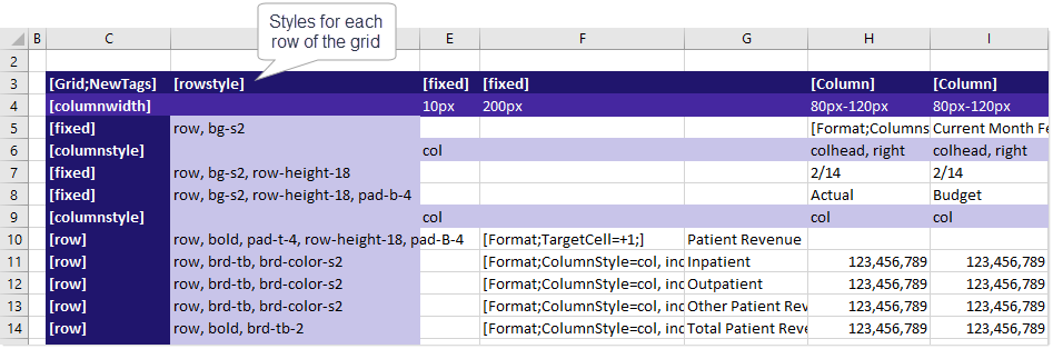
Example [RowStyle] column in a Grid data source
Using column styles
The column style sets the formatting for the column. Unlike row styles, column styles can be changed at any point in the column. You can start the column with one style, and then change it to a different style four rows later, and so on. You can also specify column styles on a per cell basis, to be applied to that cell only.
Column styles are placed in the [ColumnStyle] row. The Grid data source must have at least one [ColumnStyle] row in the control column of the data source, placed at the top of the data source (meaning before any content rows). This initial [ColumnStyle] row defines the starting style for each column. This style will continue to be applied to the column until another [ColumnStyle] row is encountered, at which point that style will be applied until another [ColumnStyle] row is encountered, and so on.
The initial [ColumnStyle] tag is included by default when you use Create Axiom Form Data Source > Grid to create the data source. If the tag is not present, you can manually add it to the data source, or you can use the Data Source Assistant to add it.
For each column in the grid that is tagged with either [Fixed] or [Column], you can enter one or more style names in the [ColumnStyle] row(s).
-
The style names for a column can include one base style plus any number of add-on styles, separated by commas. For example, you can specify just col to use the default column formatting, or you can include add-on styles such as col,bg-p3,bold. In this example the add-on styles add a background color and bold text to the column. You can also specify just the add-on styles, and the col base style will be assumed. See also Using base styles and add-on styles.
-
If no style is defined for a column (or if no
[ColumnStyle]row is present), the default column formatting is used. This is equivalent to using the col style. Although you can leave columns blank in order to use the col style, it is recommended to flag all columns with a style so that form designers reviewing the source file can see exactly how the grid is meant to be formatted. -
When using multiple
[ColumnStyle]rows, if a column is left blank then the previously specified style will continue to apply. Blank will not be interpreted as no style in this case (assuming there is a previously specified style in a prior[ColumnStyle]row). -
The column style can be overridden at the cell level when using content tags such as Format, TextArea, or Symbol. This can be used to format different levels of header text in a label column, or to apply conditional formatting to cells (such as to flag problem values in red). If a column style is specified in a content tag, the current column style from the
[ColumnStyle]row is ignored, and the style specified in the tag is used for that cell only. -
You can type style names manually, or you can use the Data Source Assistant to see the available style names and populate the current cell. It is strongly recommended to use the Data Source Assistant to apply styles, both to ensure that you are using correct style names and syntax, and because the Data Source Assistant provides an easy way to view all style options. For more information on using the Data Source Assistant, see Using the Data Source Assistant to apply row and column styles.
-
For a full list of available column styles, see Formatted Grid style reference.
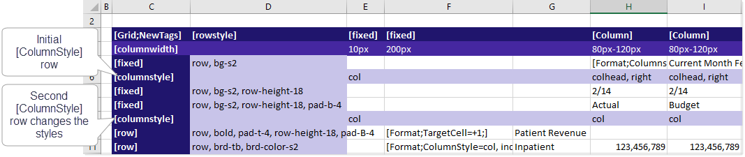
The following example screenshot shows a formatted grid with two [ColumnStyle] rows. In this example, columns H and I start out using the colhead style, but then later change to the col style. This is to display column header shading and bold in the first few rows, but then revert to "normal" column formatting afterward. You can have as many [ColumnStyle] rows in the grid as needed.
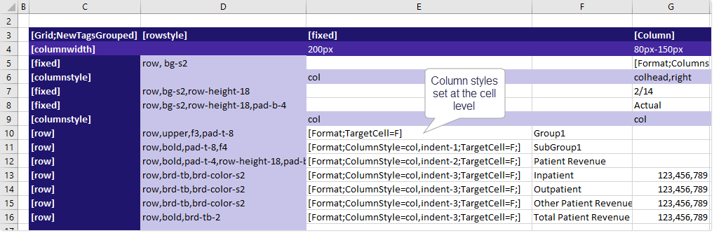
As noted, column styles can also be overridden at the cell level. The following example shows the Format content tag being used to display text using different column styles in each row; in this case to display a set of row labels using different levels of indentation. This approach can be easier than using a bunch of [ColumnStyle] rows, especially if you only need to adjust a single cell in the row.
Using base styles and add-on styles
Row and column styles fall into two categories:
-
Base styles define the default formatting for the row or column.
- Add-on styles apply specific formatting properties, such as bold font or right-side alignment. These styles are intended to layer on top of a base style, in order to modify that one specific property.
For example, a base style for columns is col and an add-on style for columns is bold. If you have a column where you want the text to be bold, then you would specify col, bold for the style. The second style of bold overrides the default font weight for the col style, but leaves all the other default formatting intact. If you want to change other aspects of the default formatting, you must use additional add-on styles.
NOTE: If desired, you can omit the base style, and the default base style of either row or col will be assumed. For example, you can enter col,bold or just bold into the [ColumnStyle] row, and both entries will result in the same formatting because col is assumed as the base style. However, if you want to use a different base style, like colhead, then it must be explicitly listed.
If your list of styles includes a base style, the base style should always be listed first, followed by any number of add-on styles. This is because styles are evaluated in the order they are listed. For example, if you list the styles as bold,col, then the column will not be bold because the font formatting in the default col style will overwrite the bold formatting applied by the bold add-on style. The styles must be listed as bold or col, bold in order to apply the bold formatting.
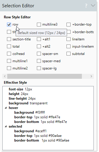
In the Data Source Assistant, base styles and add-on styles are differentiated as follows:
-
Base styles are listed in the Row or Column category respectively. However, there are a few additional base styles that can be used for certain types of rows and columns, such as input-row for rows with user inputs, and colhead for column headers.
-
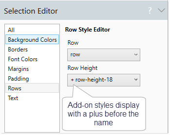
All other styles are add-on styles. These styles display with a plus icon in front of the style name, to indicate that they are applied in addition to a base style.
Using the Data Source Assistant to apply row and column styles
You can use the Data Source Assistant to:
- View the available row and column styles
- View the effective formatting applied by each style or combination of styles
- Insert style names into the Grid data source
To view styles and edit style assignments, place your cursor in the [RowStyles] column or in a [ColumnStyles] row. If you just want to view the styles then the location does not matter; but if you want to edit style assignments then you should place your cursor in the row or column where you want to insert style names or edit existing style assignments.
The Selection Editor section updates to show the available row or column styles. The styles are organized into logical formatting categories, such as Background Colors, Borders, etc. Any style selected from a drop-down list or a check box will be inserted into the cell, using a comma-separated list. If you clear a selection, the style will be removed from the list.
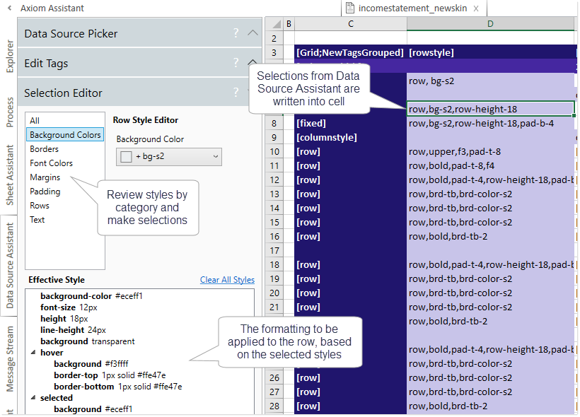
As styles are selected, the effective formatting applied by those styles displays at the bottom of the task pane.
For a full list of available row and column styles, see Formatted Grid style reference.
Using theme-based row and column styles (legacy skins)
If your form uses a legacy skin (any skin that is not Axiom2018), the available row and column styles for a grid are different and work differently. There are three main differences:
-
The available styles depend on the theme specified for the grid. For example, the theme may be Report, Worksheet, or Wizard. This theme can be defined at the form-level and inherited by the grid, or it can be set at the component level. See Setting the theme for a Formatted Grid (deprecated).
Most themes support the same core set of styles, though the same style name may apply different formatting in two different themes. However, some themes support certain styles that are only for use in that particular theme. If the theme is later changed and the style name is not found, the row or column will be treated as if no style is applied (meaning the default row or column style for the theme will be used).
-
The legacy style names are designed to be semantic. For example, using the legacy approach you would specify a row style named total that encompasses all of the formatting for a total row, instead of using the new approach of row,brd-tb,brd-color-s6,bold (where the formatting is defined using formatting-specific add-on styles). The legacy approach still uses base styles and add-on styles, and these combine in the same way as described previously.
IMPORTANT: If your form uses a legacy skin, you cannot simply change the skin to Axiom2018. The old row and column style names for grids are not recognized in the Axiom2018 skin. If you want to migrate to the Axiom2018 skin, you must update the row and column styles to use the new format, as described in the previous sections.
When using themes and legacy styles, the style display in the Data Source Assistant and Tag Editor is slightly different. Styles are not organized into categories. Instead, styles display as a series of checkboxes. Add-on styles are still differentiated from base styles by a plus sign in front of the name.
You can select as many styles as needed to achieve the desired formatting for the row or column. Base styles should still be selected first, followed by any number of add-on styles.
NOTE: The Data Source Assistant always displays the styles for the form-level theme. If you have a grid that is assigned a different theme at the component level, the Data Source Assistant will not show those styles. As a workaround, you must temporarily change the form-level theme to the same theme as the component, assign styles to the grid, and then change the form-level theme back to the desired them.
