AX1489
Axiom Software provides a variety of ways to control the position and size of components on an Axiom form, including options that allow components to dynamically adjust based on the current page size.
The default and most basic way to control position and size is to use the Form Designer to move and resize components on the canvas. When you drag and drop a component to a new location, Axiom Software automatically updates the position coordinates of the component for you. And when you drag a selection handle of a component to a larger or smaller size, Axiom Software automatically updates the width and height of the component to the new size.
However, often you need a more dynamic way to define the size or position of a component. For example, you may want a component to always be placed in the lower right corner or always fill 50% of the page width, regardless of the current page size. To do this, you can use the advanced component settings to adjust position and size.
To access the position and size settings for a component:
-
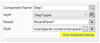
In the Form Designer or Form Assistant, click Show Advanced Settings (located under the Style box). This exposes the position and size settings for the currently selected component.
You can also access the position and size settings for a component on the Form Control Sheet. Generally speaking, it is not recommended to edit the settings this way, because the canvas view will not automatically update for your changes.
The following settings are available to control component position and size. See the detailed discussions on each setting for more information.
| Item | Description |
|---|---|
|
Reference Location |
The reference location determines how the x-position and y-position of a component are evaluated. By default the reference location is UpperLeft. NOTE: This setting is not exposed in the advanced component settings. It can be changed on the canvas by double-clicking the corner selection handles of a component, or you can edit the setting on the Form Control Sheet directly. |
|
X Position Y Position |
The x-position determines the component's position along the horizontal axis, and the y-position determines the component's position along the vertical axis. Both are evaluated relative to the reference location. Positions can be set in pixels (default) or percentages. |
|
Width Height |
The width and height determine the size of the component. The width and height can be set in pixels (default) or percentages. Size keywords are also available to support special behavior. |
|
Rendering Order |
The order in which the component is rendered in the layer. A component with a larger order number will display above a component with a smaller order number. For components that support tab navigation (tabbing to the next editable component), the rendering order also determines the tabbing order. NOTE: On the Form Control Sheet, this setting is labeled as Z-Index. |
|
Lock Layout |
If enabled, the component size and position are locked and cannot be changed by dragging and dropping on the canvas. This optional setting is intended to protect against accidentally moving or resizing a component while working on the canvas. |
NOTE: If a component belongs to a parent Panel component that is configured to use Flow layout behavior, then the position and order of that component is determined differently. For more information, see Auto-flow components in a panel.
The Reference Location setting determines how the horizontal and vertical positions of the component are evaluated. By default, the reference location is set to UpperLeft, which means that the vertical y-position is evaluated from the top of the page and the horizontal x-position is evaluated from the left of the page. A component with y-position 0 and x-position 0 will display with the top left corner of the component in the top left corner of the page.
If desired, you can change this to another location, such as LowerRight. Now the y-position is evaluated from the bottom of the page and the x-position is evaluated from the right of the page. A component with y-position 0 and x-position 0 will display with the bottom right corner of the component in the bottom right corner of the page.
If a component belongs to a parent Panel component, then the reference location is evaluated within the context of that panel rather than the overall page. For example, if the child component has an UpperLeft reference location with x-position 0 and y-position 0, the component will display at the top left corner of the parent panel instead of the page. For more information, see Using panels to group and position components.
The reference location can be any of the following: UpperLeft, UpperRight, LowerLeft, LowerRight.
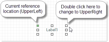
The reference location of a component can be changed by using the Form Designer. Locate the component on the canvas, then double-click the selection handle that corresponds to the desired reference location. For example, double-click the top right corner if you want to change the reference location to UpperRight. The selection handle for the current reference location is colored green.
When you change the reference location using the Form Designer, the x-position and y-position are automatically adjusted so that the component remains at its current location relative to the new reference location. Note that if you change the reference location in the Form Control Sheet directly, then the x-position and y-position remain the same, which means that the position of the component will be different relative to the new reference location.
Fixed and dynamic reference locations
The default reference location, UpperLeft, is a fixed reference location. However, if you select any other reference location, the reference location is now dynamic based on the current page size (or panel size). For example, if the reference location is LowerRight and the component is placed in the lower right corner, then the position of that component will adjust so that it remains in the lower right corner as the page is made taller or wider.
Generally speaking, dynamic reference locations should only be used when you want a component to display close to that location at all times. For example, LowerRight should only be used when you want the component to always display in the lower right corner, or close to it—such as to display a logo in the lower right corner of the page. LowerRight should not be used when you want the component to display in the top left quadrant.
This guideline has to do with how the browser determines when scroll bars are necessary. The browser can handle content that extends past the right side of the page or below the bottom edge of the page, by displaying scroll bars as needed. However, the browser cannot handle content that extends past the left side of the page or above the top edge of the page. These kinds of configurations can occur, if for example, the component's reference location is LowerRight but its y-position is set to something like 900px. If the page height is currently only 800px, the end result is that the component location would resolve off-screen past the top of the page, and therefore not display in the form.
This guideline is less important when components belong to a panel, because in that case the display of the components is constrained to the panel. Generally speaking, the position and size of the child components should not be configured such that they would extend out of the panel (and if they do, the display is then handled by the Overflow setting for the panel).
The X Position setting determines the component's location along the horizontal axis, and the Y Position setting determines the component's location along the vertical axis. The starting point for either position is determined by the reference location. For example, if a component's reference position is UpperLeft, then an x-position of 50px is calculated from the left edge of the page. If a component's reference position is UpperRight, then an x-position of 50px is calculated from the right edge of the page.
If a component belongs to a parent Panel component, then the x-position and y-position are evaluated within the context of that panel rather than the overall page. For example, if a component's reference position is UpperLeft, then an x-position of 50px is calculated from the left edge of the panel instead of the page. For more information, see Using panels to group and position components.
The x-position and y-position can be specified as follows. The default measurement is pixels.
| Position | Description |
|---|---|
|
Pixels |
The component position is evaluated based on a fixed number of pixels relative to the specified Reference Location. If no units are specified on the position, the position will be interpreted as pixels. For example, if an entry is just 50, it will be interpreted as 50px. |
|
Percentages |
The component position is evaluated based on a percentage of the current page size (or panel size), relative to the specified Reference Location. For example, if the x-position is 10% and the reference location is UpperLeft, the component will be placed at 10% of the current page width or panel width, from the left-hand side. Percentage positions are dynamic and will adjust as the page or panel is resized, so that the percentage is calculated against the current width or height. The minimum position is determined by the canvas size defined for the form. For example, if the canvas width is 400px and the x-position is 10%, then the minimum x-position of the component is 40px. (This minimum does not apply directly to child components of a panel, except that it potentially constrains the minimum position of the parent panel.) If you want to use percentages, you must first manually adjust the position setting to indicate the percentage unit. Once the unit has been changed, you can then move the component on the canvas and the new position will continue to be represented using a percentage. The same approach applies if you want to switch back to pixels from percentage. |
|
<Blank> |
The component position is inherited from the component style. If the style does not define a position, blank is treated the same as 0px. Certain component styles, such as the styles used by default for Wizard Panel components, define position properties for the component. In this case, the component-level position settings must be left blank in order for the style-level properties to apply. If you place a component on the canvas and then later decide you want to assign a style that includes position properties, you must manually clear the relevant position settings. |
NOTE: When using dynamic position settings, Scale to Fit must be disabled (default behavior). If Scale to Fit is enabled, the dynamic settings may not resolve as expected.
Width and height
The Width and Height of a component can be specified as follows. The default measurement is pixels.
| Position | Description |
|---|---|
|
Pixels |
The component size is a fixed number of pixels. In this case, the size of the component will always be the same, regardless of the page size (or panel size). The exceptions are if Scale to Fit is enabled for the form, or when viewing the form on a tablet device (which uses its own scaling behavior to fit the tablet). If no units are specified on the size, the size will be interpreted as pixels. For example, if an entry is just 50, it will be interpreted as 50px. |
|
Percentages |
The component size is calculated based on a percentage of the current page size. For example, if the component width is 50% and the page width is currently 1000px, then the component will render as 500px wide. If the component belongs to a parent Panel component, then the size is calculated based on a percentage of the current panel size. Percentage sizes are dynamic and will adjust as the page or panel is resized, so that the percentage is always calculated against the current width or height. The minimum size is determined by the canvas size defined for the form. For example, if the canvas width is 400px and the component width is 10%, then the minimum width of the component is 40px. (This minimum does not apply directly to child components of a panel, except that it potentially constrains the minimum size of the parent panel.) If you want to use percentages, you must first manually adjust the size setting to indicate the percentage unit. Once the unit been changed, you can then resize the component on the canvas and the new size will continue to be represented using a percentage. The same approach applies if you want to switch back to pixels from percentage. When using percentages for width or height, make sure that your percentage logically combines with the defined position of the component. The two settings together should not exceed 100% of the width or height of the page (or panel). For example, if your x-position is 30% and your width is 80%, then your component width is always going to extend past the edge of the page or panel. |
| Dock |
The keyword Docked sizes are dynamic and will adjust as the page or panel is resized, so that the component always fills the remaining width or height. Once a size has been specified as docked, the component cannot be resized away from its docked edge. If you want the component to no longer be docked, you must manually edit the size settings to specify a size in pixels or percentage instead. |
|
Auto |
The keyword Generally speaking, this option should only be used on components where it is automatically assigned (or where you have accidentally changed the component's setting and you want to change it back to Auto). If you manually assign Auto to a component that does not support it by default, the results may not be as you expect. The exception to this rule is the Label component. You can set either the width or the height to Auto, and the label will automatically adjust to fit the current text. This may be useful if the text shown in the label is dynamic. (Label components are set to Auto by default for height.) |
NOTE: When using dynamic size settings, Scale to Fit must be disabled (default behavior). If Scale to Fit is enabled, the dynamic settings may not resolve as expected.
The Rendering Order setting (also known as Z-Index) determines the order in which the component is rendered within the layer, relative to other components in the layer. If the component is a child of a parent Panel component, then the order is relative to the other components in the panel within the same layer.
By default, the rendering order determines whether a component is rendered above or below another component. A component with a larger order number will display above a component with a smaller number (for example, 10 displays above 2). The rendering order is set automatically when using the Form Designer to add a new component, and when using Send to Back and Send to Front. There is not much purpose in editing the setting manually, as you would have to also know the rendering number of all other components in the layer to set the order appropriately.
However, there is one case where it is required to edit the rendering order manually, when using a Panel component that is set to Flow layout behavior. In this context, the rendering order determines the flow order of the child components. The flow order will be set automatically as you add new components to the panel, but if you want to edit the order after the fact then you must do it manually. For more information, see Auto-flow components in a panel.
Locking component position and size
Once you have a component positioned and sized the way you want it, you can optionally lock the component so that it cannot be accidentally moved or resized on the canvas while you are working with other components. To do this, enable the Lock Layout property.
When Lock Layout is enabled, the component cannot be moved or resized on the canvas. However, you can still adjust the position and size manually using the advanced component settings.
When using the Wizard Panel and Titled Panel components, these components are locked by default because they are intended to be used in a certain configuration.
Setting component position and size using styles
Component position and size can also be set using styles. For example, the docked-to-container style sets the x-position and y-position to 0px, and sets the width and height to dock. Axiom Software uses styles like this to apply preconfigured positions and sizes when you place certain components on the form canvas, such as the Wizard Panel or the Titled Panel.
When position or size is set by a style, the corresponding position or size property for the component must be blank. If the position or size property is not blank, then the component property will take priority over the style. This means:
-
If you want to manually apply a style with position or size settings to a component, you should first apply the style, then clear out the relevant position or size settings for the component. You must do this even if you have just added the component to the canvas and not adjusted it at all, because Axiom Software writes the position and size settings to the component properties as soon as you drop the component on the canvas. (The exception is when you drop a preconfigured component on the canvas, such as the Wizard Panel.)
-
If a component already uses a style with position or size settings, and you want to remove the style, you should first define a value for any blank position or size properties. Once all position and size properties have a value, you can remove the style. If you remove the style when blank properties exist, the component may not be positioned or sized as expected, which may cause issues when attempting to work with the component in the Form Designer.
