AX1499
Using Panel components, you can design a form where child components are not absolutely positioned. Instead, the child components will automatically flow across and down the panel as needed, based on a defined order and depending on the current page size. This feature is primarily intended for home pages and dashboards where you may have several "blocks" of content that you want to present in a certain order, but you want these blocks to flow to fit the page dynamically.
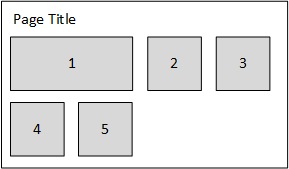
For example, imagine that you have five main content blocks. These "blocks" could be components such as the Announcements component, the Process Summary component, one or more Formatted Grid components, and one or more chart components of various types. You want these content blocks to automatically flow to fit the page, so that on a wide screen the components might look like this:
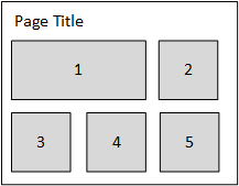
But on a smaller screen or a resized window, the components might look like this:
To do this, you place a Panel component on the form canvas that defines the area where you want child components to flow. All child components assigned to the panel will automatically flow to fill the panel in a designated order. Components start by flowing from left to right, from the top left corner of the panel. The first component that would extend past the current panel width is then dropped down to start the next row of components, and components flow left to right again.
To configure a Panel component for flow layout behavior:
-
Place a Panel component on the form, and position and size it as desired. For more information on design considerations for the parent panel, see the following section.
-
Set the Child Layout property of the panel to Flow. This means that the child components of the panel will now auto-flow across and down the panel, instead of using the component properties for x-position and y-position to determine absolute positioning.
-
Set the Flow Layout Direction to the desired flow direction. By default, child components flow from left to right. However, you can optionally change this so that child components flow from right to left.
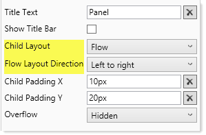
Panel properties configured for flow layout
Positioning and sizing the parent Panel component
The Panel component defines the area where you want components to flow. For example, you might want the panel to take up the whole page (so that the flow behavior applies to the whole page), or you may want to dedicate the top area of the page to fixed titles and other content, and use the panel to fill the remaining area of the page.
Note the following when positioning and sizing the panel component:
-
In most cases, you will want a page title at the top of the page that is not part of the panel flow. Therefore you should set the Y Position of the panel to something like 100px, so that you can place a fixed position label at the top of the page (and other components as needed, such as an image). The panel and its flow behavior can start underneath this fixed area.
-
Set the X Position of the panel to the amount of padding you want between the left side of the page and the start of the panel contents. For example, you might set this to 10px.
-
If you want the panel to fill the remaining width and/or height of the page, then set the Width and/or Height to
dock. The child padding settings will ensure that panel contents do not bump directly against the right edge and bottom edge of the page. For more information, see Setting the padding between child components. If you want the panel to fill a designated area of the page, set the Width and/or Height to a specific size (pixels or percentage). -
Make sure to configure the Overflow property as appropriate for the desired behavior. In the majority of cases you should set this to Visible or Scroll so that the user can see all child components regardless of the current panel size. Visible will cause the page to scroll as needed, and Scroll will scroll the panel as needed. Using Hidden with any panel configuration may result in child components flowing off the panel and therefore not visible to users.
To edit the size and position properties for the Panel component, click Show Advanced Settings in the Form Designer or Form Assistant.
Once you have the panel positioned and sized the way you want it, it is a good idea to enable Lock Layout so that you do not accidentally move or resize it when working in the Form Designer. You can still edit the position and size settings manually while the layout is locked.
Placing child components on the panel
Once the Panel component is configured for flow layout behavior, you can now drag and drop child components into the panel, in the order you want them to flow. The first component added to the panel becomes the first component in the flow order, and so on. You can change the order later, but if you already know the desired order it is easiest to set it when you are initially adding components to the panel.
Note the following behavior when adding child components to a flow panel:
-
The X Position and Y Position properties are blank by default for child components of a flow panel. These settings are irrelevant due to the flow behavior.
-
By default, Lock Layout is enabled for child components, so that you cannot move or resize them on the canvas. This is done to emphasize that the component position is controlled by the flow order—moving a component on the canvas has no effect as long as it belongs to a flow panel.
-
If you want to resize a component, you can click Show Advanced Settings and manually enter the desired width and height, or you can disable Lock Layout and then resize the component on the canvas. When you are done resizing the component, it is recommended to re-enable Lock Layout.
NOTE: The act of resizing a component on the canvas may cause the x-position and y-position to become populated with values. These values will be ignored as long as the component belongs to the parent panel. You may want to manually clear these values so that they do not cause any confusion.
-
The Rendering Order of the component is automatically set to the next highest number of all components within the layer. In this context, the rendering order is the flow order. The child component with the smallest number renders first in the flow, and the component with the largest number renders last in the flow.
As you drag and drop components into the panel, they will display in flow order within the Form Designer. This is the same flow that will be used in the browser when the form is rendered.
If you need to change the flow order after placing components on the canvas, you can do this by manually editing the Rendering Order in the advanced component settings. The flow order cannot be changed by moving components on the canvas—for example, if you clear Lock Layout and then drag child component 6 to a spot before child component 4, this will not change their order (and component 6 will automatically snap back to its flow position when you are done). You must manually edit the rendering order for all affected components if you want to change the flow order. After making these edits, you must refresh the Form Designer to see the effects of the changes.
The specific numbers in the rendering order do not matter; the only thing that matters is how each number relates to the other child components in the panel (smaller or larger). Additionally, you should not expect the number for the first child component to be 1, because the numbers are auto-generated based on all components in the layer (including the parent panel itself). When reordering components, you can skip numbers to create more leeway for future reordering.
All child components in a flow panel should have unique rendering order numbers. If two child components have the same rendering order number, then Axiom Software will determine their order. The numbers only need to be unique within the context of the child components of that panel. Other components that do not belong to the panel or that belong to different panels can duplicate rendering order numbers.
NOTES:
-
When dragging and dropping components into the panel, make sure that the top left-hand corner of each component is within the panel, so that the panel is automatically assigned as the Parent of the component. Also, remember that you do not need to precisely position the child components while you are dragging and dropping them in the panel, because the child components will be automatically positioned due to the flow. For example, if you are dragging and dropping the third child component into the panel, there is no need to try and position the component "after" the second component.
-
Although it is possible to place components on a Fixed Position panel and then later change the panel to Flow, the components will probably not end up in the order you want and you will need to manually reorder them. It is best to set the panel to use the flow layout behavior before adding child components.
-
If you added a component to the panel by mistake and you want to move it out of the panel, you can clear Lock Layout in the advanced component settings and then drag it outside of the panel. This will clear the Parent setting so that the component no longer belongs to the panel, and you can now position the component as normal.
-
If you duplicate a component in a flow panel, the rendering order number of the new component will be the same as the original component. You should manually edit this number as appropriate, depending on where you want the new component to be placed in the flow order.
Setting the padding between child components
When a Panel component is set to flow layout behavior, two new settings are exposed for the panel, to control the padding between child components:
- Child Padding X defines the horizontal spacing between components. It is applied to the right side of each component when using the default left-to-right flow, and to the left side of each component when using right-to-left flow.
- Child Padding Y defines the vertical spacing between components. It is applied to the bottom of each component.
For example, you might want to set the x-padding to 10px so that there is 10px of space between each component within a row, and set the y-padding to 20px so that there is 20px of space between each row of components. The padding can be set in pixels (default) or percentages.
The padding is incorporated into the child component's overall size. For example, if a component is set to 400px width and the x-padding is 10px, this means that the component contents take up 390px so that there is 10px left over for the padding.
The padding applies to all child components in the panel, including the last component in a row and the bottom row of components, so that the panel contents do not bump up directly against the right edge or bottom edge of the panel.
No padding is applied to the top of child components, or to the starting side of child components (for example, the left side when flowing left-to-right). This means that the parent Panel component should not be placed directly against the left side of the page or the top of the page, or else child components will bump directly against the left and top of the page. Instead, you should set the x-position and y-position of the Panel component so that it provides the necessary space between the left and top of the page. For example, you might set the x-position of the Panel component to the same amount as the x-padding for the child components, so that there is a consistent horizontal padding for all components in the row. (If you have changed the flow direction so that it flows from right-to-left, the same principle applies but now it applies to the right side.)
Using panels within a flow panel
You may have multiple components that you want to keep together as a "block" within the flow layout. To do this, you can add a Panel component as a child of the parent flow panel, and then add the components to the child panel. The child panel will have a flow order like all of the other child components of the flow panel, and will adjust position as the flow panel is sized larger or smaller. But the components within the child panel can be absolutely positioned within that panel, so that they maintain their positions as the child panel adjusts within the flow.
For example, you may have a label and three bullet charts that you want to display as a block within the flow layout. You can:
-
Add a Panel component to the flow panel, and make sure its rendering order is set appropriately for where you want this content positioned within the flow. The Child Layout for this panel should be left at the default of Positioned. Adjust the size of the panel as needed to hold the contents that you want to display within this "block."
-
Add the label and the bullet charts to this child panel, and size and position them as required. For example, the label may go at the top of the panel, followed by three stacked bullet charts. When you drag and drop components into this child panel, make sure they are fully within the child panel. If a component extends outside of the child panel, then it will not be assigned to that panel and will instead be assigned to the parent flow panel.
As this child panel flows within its parent panel, the individual components belonging to the child panel will stay together and maintain their positions within the child panel.
Component flow and canvas size
The canvas size of the form—specifically, the canvas width—determines the minimum number of child components that will display on a row. For example, if the canvas width is 800px, and the first three components are 400px, 300px, and 300px wide respectively, then the first two components will always display on the first row of the panel because 800px is the minimum width. If the page is sized narrower than that, then a horizontal scroll bar will result instead of pushing the second component to the next row.
You should consider the display of the form and adjust the canvas size as appropriate when setting up a flow panel. By default, the canvas width is 400px. Unless you have several narrow components at the start of the flow order, this likely means the form will allow resizing to the point of showing only one component per row. In many cases this may be an undesirable result. If so, you should set the canvas width to a size that accommodates the minimum number of components that you want to display on a row.
To change the canvas width, click Edit Form Properties in the Form Assistant or Form Designer, and then edit the first number under Canvas Size. For more information, see Defining the canvas size of an Axiom form.
NOTE: Scale to Fit cannot be used with flow panels. Generally speaking, scale-to-fit behavior is not compatible with any dynamic size and position option.
