AX1483
Styles are available at the component level to define certain formatting aspects of the component, such as fonts, borders, and positioning.
To use styles, you assign a named style to a component, such as normal or page-title. The component then uses the formatting settings defined for that style. For example, the page-title style could define formatting such as bold font, size 24, and blue color.
Each component can optionally be assigned one or more styles to define the formatting of that component. The available styles depend on the component type. If you are using a legacy skin instead of the default Axiom2018 skin, the available styles also depend on component's assigned theme (either inherited from the form-level theme or specified at the component level).
Additionally, many component types allow you to explicitly define certain formatting properties, such as font size or border width. You can define these properties in addition to using styles or instead of using styles. If the style and the component property are in conflict, the component property takes precedence.
IMPORTANT: This topic discusses how to apply component-level styles. If you want to apply row and column styles to a Grid data source for a Formatted Grid component, see Using row and column styles with Formatted Grids.
Order of precedence for component formatting
For any particular formatting property, the settings used for a component are determined in the following order. If the top item in the list is not defined for a component, the next item in the list is used, and so on.
- Specific formatting settings defined in the component properties.
- Formatting defined by the style(s) assigned to the component. If multiple styles are assigned in a comma-separated list, the last-listed style takes precedence.
-
Formatting defined by the skin assigned to the form.
NOTE: If your form uses a legacy skin (any skin other than Axiom2018), the component formatting may also be affected by the theme specified at the form-level or the component level.
As an example, consider a Label component and the font size. If the font size is specified using the Font Size property in the advanced component settings, then that size is used. If not, then the font size specified by the assigned style for the component is used. If the component is not assigned a style, or if the assigned style does not specify a font size, then the font size specified by the skin is used.
Assigning styles to a component
To assign styles to a component, use the Style property in the component settings. If styles have already been assigned, they will display here.
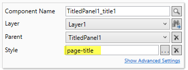
Click the Select component styles button [...] to open the Choose Style dialog. From here, you can view the available styles for the component, assign styles, and view the effective formatting resulting from the selected styles.
-
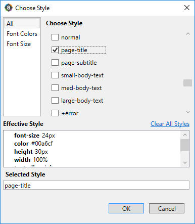
The Choose Style section lists the available styles for the component. Styles may be organized by categories, which you can select from the box to the left. For example, click All to view all styles, or click Font Colors to view only styles relating to font color. Additionally, some styles have descriptions that display in a tooltip when you hover your cursor over the style name.
-
Select a base style (style without a plus sign) before selecting any add-on styles (styles with a plus sign). See the following section for more information about base styles and add-on styles.
-
Once a style has been selected, the style name displays in the Selected Style box. If additional styles are selected, those styles will be added in a comma-separated list, with the last-selected style listed last. If the styles are in the wrong order for the desired order of precedence (see the previous section), you can clear the selections and then re-apply them in the desired order. When you click OK, the styles listed in the Selected Style box are written to the component properties.
Once one or more styles have been selected, the effective style for the component displays in the Effective Style box. This allows you to see precisely which formatting properties will be applied to the component based on your style selections. If a particular formatting property is not listed, then the selected styles do not affect that property. The formatting for any unlisted property will be determined by the skin, or by the individual component properties (if applicable and if defined for that component).
When styles are assigned to a component, you will see the effect of these styles in the Form Designer (and in the rendered form). If the component does not display as you expect (even after clicking Refresh), then check the following:
-
If the component is assigned multiple styles, check the effective style properties to make sure the styles are applied in the correct order. You may need to change the order of styles to get the desired effect. Base styles should always be listed before add-on styles.
-
Remember that any formatting specified in the component properties takes precedence over styles. If a component already has a defined formatting property such as font size, then any font size in the style will be ignored. In this case, you must clear the component-level property in order to use the formatting defined in the style.
NOTE: If you apply a style to an existing component on the canvas, and the style contains size or position properties, then you must always use Show Advanced Settings to clear out the component's existing size and position properties before the style properties will take effect.
-
Some components do not support certain formatting properties. If you apply a style that contains these unsupported properties to a component, then the style properties will either be ignored or not display as expected. For example, Combo Box components do not support borders (other than the built-in box border), so if you apply a border style to the component it will not display as expected. As a guideline, check the advanced properties of the component to see if the formatting property is available as a component-level property. If it is not available, then that property probably cannot be set by a style.
When a form is rendered, if a specified component style is not found then it is simply ignored. For example, this may occur if a style name was manually typed into the Form Control Sheet incorrectly.
Using base styles and add-on styles
Styles fall into two categories:
-
Base styles define all of the necessary formatting to properly display the component, according to the purpose of the style.
- Add-on styles apply one specific formatting property (or a small group of related properties), such as to apply a font color. These styles are intended to layer on top of a base style, in order to modify that one specific property.
For example, a base style for Label components is page-title and an add-on style is right. If you have a label where you want to use the title formatting but you also want it to be right-aligned, then you would select page-title,right for the style. The second style of right only layers on the text alignment; it does not overwrite any of the other properties of the page-title style.
The base style should be listed first, followed by the add-on styles. In the Choose Style dialog, add-on styles are differentiated from base styles by a plus icon next to the style name.
Styles and Formatted Grid components
Formatted Grid components have a special application of styles:
-
The Style property at the component level only affects the outer formatting of the component, such as the title bar and component border. It does not affect the grid contents.
-
Additional styles can be applied at the row and column level, within the Grid data source. These styles affect the formatting of the grid contents. For more information on how to use row and column styles, see Using row and column styles with Formatted Grids.
Style FAQ
My selected style contains position / size properties, but my component isn't honoring them.
If position and size are set at the component level, these properties will override the style. When you drag a component on the canvas, position and size gets set automatically. So if you apply a style afterward, you must manually clear out the size and/or position properties on the component (use Show Advanced Settings to access them) in order to use the style properties.
I selected a style but it doesn't seem to do anything, or doesn't look right.
Some generic styles are available to all components, but these styles may contain settings that do not apply to some components or do not work well with some components. Also, some component-specific styles are intended for specific use cases. For example, the titledpanel-body style for panels works well in the Titled Panel use case, but otherwise may not be very useful when using panels in other form types.
Additionally, remember that style names are case-sensitive. If you have manually typed a style name instead of using the helper tools to choose styles, then you may have mistyped the name or used the wrong case. Use the style helper tools to verify the style name and case.
Why isn't there a style to do <something>?
Styles are continually evolving. Additional styles may be added in future releases. Remember that you can use the advanced component settings to set component-level formatting if a style is not available to do what you want to do.
