AX1740
component for Axiom forms
Using the Fixed Report component, you can query data from the Axiom Software database and display that data in a fixed-row report structure, within an Axiom form. The Fixed Report component can be used to display an income statement or any other report that uses a fixed format, including headers, subheaders, subtotals, and totals.
The Fixed Report component queries the data directly from the database, using the primary table defined in the component properties, and the column and row information defined in the associated data sources. The resulting data is not returned into the spreadsheet source file; it is only returned into the form. This provides a more efficient and performant method of displaying data in an Axiom form, as compared to querying data into the spreadsheet source file and then tagging it for display in a Formatted Grid component.
The Fixed Report component also supports the following reporting features:
-
Drilling: You can optionally enable drilling for the report. Users can drill down any data row in the report, to see the data at a different level of detail.
-
Icons and commands: You can optionally display icons in the report. The icons can be used simply as informational signals, or they can be used to trigger a command or open a designated URL. The icons can be persistent in the report, or they can display on hover only. Conditions can be defined for the icons, so that the icons only display when certain conditions are met.
-
Excel export: You can optionally enable the ability to export the report contents to an Excel spreadsheet.
Fixed Report components display read-only data. They do not support editing values or displaying other interactive elements such as check boxes or drop-down lists. If data edits are necessary, use a Formatted Grid component instead.
Generally speaking, the Fixed Report component does not support user-definable formatting options. The various components of the report are automatically formatted (such as shading and borders on subtotal and total rows). This default formatting cannot be customized.
Defining a fixed report is a multiple-step process that requires the following:
-
Creation of a FixedReportConfig data source in the spreadsheet that defines the row structure of the report, including headers, subheaders, data row sections, subtotals, and totals. This process may include creation of one or more optional FixedReportSectionConfig data sources, to individually define the rows in a section, as opposed to dynamically generating the rows based on the values in a specified table column.
-
Creation of a FixedReportColumns data source in the spreadsheet that defines the columns to display in the report, as well as various display properties for those columns.
-
Placement and configuration of a Fixed Report component on the Axiom form canvas. The primary table for the query and the overall data filter are defined in the component properties.
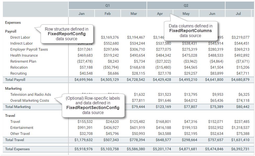
How the sections in a Fixed Report component correspond to its various data sources
The Fixed Report component is one of several options that can be used to display reporting data in an Axiom form, along with the Data Grid component and the Formatted Grid component. For more information on the differences between these components and when to use each, see Displaying reporting data in an Axiom form.
NOTE: The Fixed Report component has special update behavior that does not follow the same rules as other form components. If you want the data in the report to change based on changes made to other components, you must be aware of this behavior and design accordingly. For more information, see Update behavior.
Data source tags: FixedReportConfig
A Fixed Report component must have a defined FixedReportConfig data source within the file, to define the row structure of the report. The tags for the data source are as follows:
Primary tag
Row tags
Column tags
NOTES:
- The primary tag must be placed in the first 500 rows of the sheet.
- Formulas can be used to create the tags, as long as the initial bracket and identifying keyword are whole within the formula.
To use the Data Source Wizard to add the tags to a sheet, right-click in a cell and then select Create Axiom Form Data Source > Fixed Report. You can also highlight a range of data first and then use the wizard to add the tags around that data. The cells in the row above and the column to the left of the selected area must be blank in order for Axiom to place the tags in sheet.
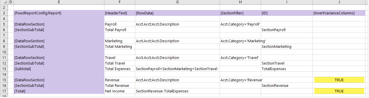
The following example shows a sample FixedReportConfig data source tagged in a sheet:
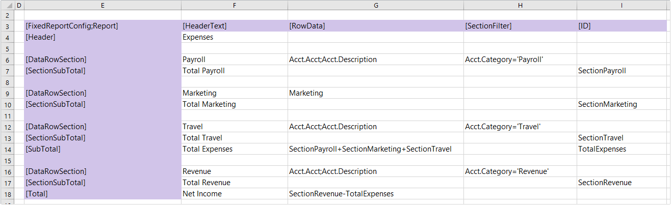
Example FixedReportConfig data source
Note the following about this example:
-
Most of the data row sections in this example are configured to automatically generate the rows based on a specified Table.Column and section filter. For example, the data row section for Payroll has defined row data of
Acct.Acct;Acct.Description, and a section filter ofAcct.Category='Payroll'. This means that the section will be automatically populated with account-level rows that belong to the category Payroll. Additionally, instead of showing the account code on each row, the report will use the account description as the row label. -
The data row section for Marketing uses a data source name instead of a Table.Column. This means that the rows in this section are defined in the referenced FixedReportSectionConfig data source.
-
The section subtotal rows in this example immediately follow their corresponding data row sections, so they will automatically subtotal the rows in that section. In this case, it is not necessary to specify anything in the
[RowData]field for the section subtotal rows. If instead you wanted the subtotal rows to display above their corresponding sections, then you would need to specify the data row section name as the row data for the section subtotal. -
On the subtotal and total rows, ID names are referenced to indicate what should be included in the subtotal and total.
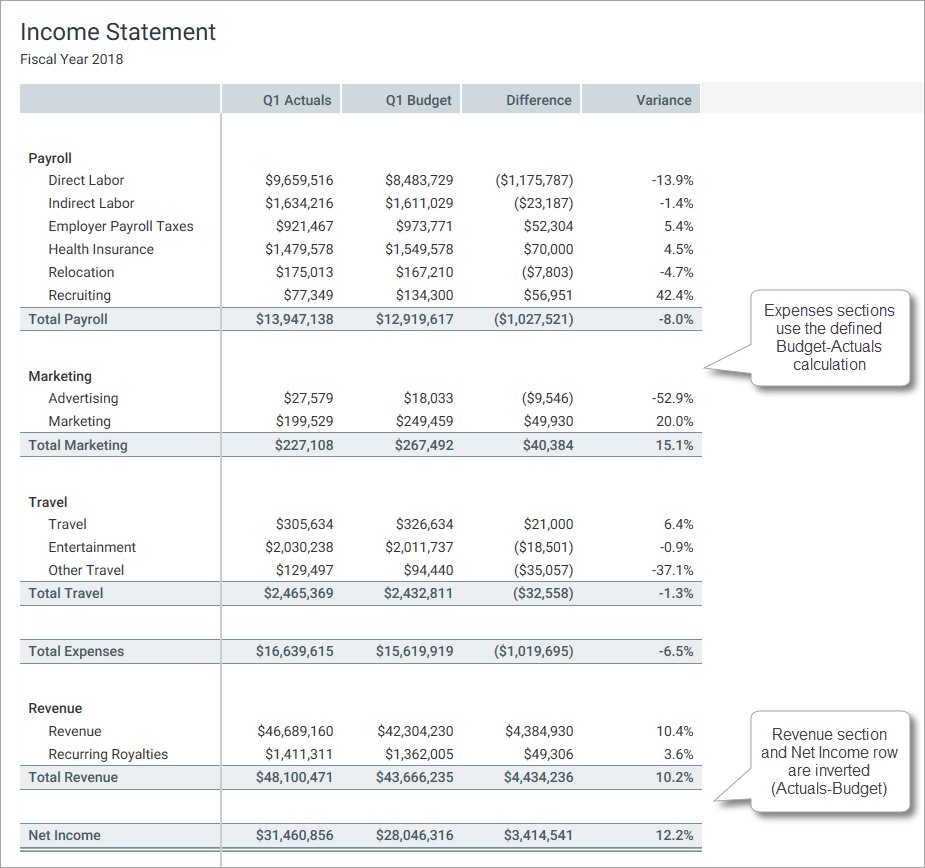
The resulting report for the example data source shown above looks as follows. In this example, you can see the various headers, sections, subtotals, and totals that were mapped out in the data source.
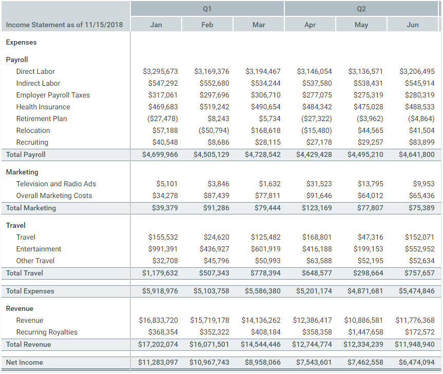
Example row structure generated from the FixedReportConfig data source
Data source tags: FixedReportSectionConfig
A Fixed Report component can optionally use one or more defined FixedReportSectionConfig data sources within the file, to define the individual rows within a data row section. You can specify the name of a FixedReportSectionConfig data source in the [RowData] field of a [DataRowSection], in the FixedReportConfig data source.
The tags for the FixedReportSectionConfig data source are as follows:
Primary tag
Row tags
Column tags
NOTES:
- The primary tag must be placed in the first 500 rows of the sheet.
- Formulas can be used to create the tags, as long as the initial bracket and identifying keyword are whole within the formula.
To use the Data Source Wizard to add the tags to a sheet, right-click in a cell and then select Create Axiom Form Data Source > Fixed Report Row Section. You can also highlight a range of data first and then use the wizard to add the tags around that data. The cells in the row above and the column to the left of the selected area must be blank in order for Axiom to place the tags in sheet.
The following example shows a sample FixedReportSectionConfig data source tagged in a sheet:
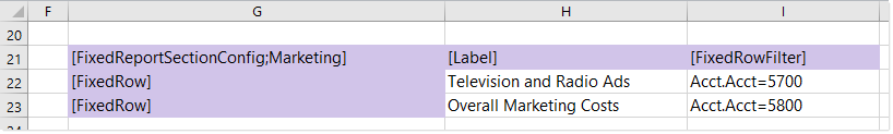
Example FixedReportSectionConfig data source
This section will contain two rows with the labels specified in the data source. The first row contains data for account 5700 and the second row contains data for account 5800. The intent of this data source is to allow you to precisely define both the label text and data for each row. It is most useful when you want to display row data that does not directly correspond with a particular grouping—for example, if you want to display row data at different grouping levels within the same section.
The following example shows the rows generated from the FixedReportSectionConfig data source (within the context of the FixedReportConfig data source shown in the previous section):
Example rows generated from FixedReportSectionConfig data source
Data source tags: FixedReportColumns
A Fixed Report component must have a defined FixedReportColumns data source within the file, to indicate the columns of data to display in the report. The tags for the data source are as follows:
Primary tag
Row tags
Column tags
NOTES:
- The primary tag must be placed in the first 500 rows of the sheet.
- Formulas can be used to create the tags, as long as the initial bracket and identifying keyword are whole within the formula.
To use the Data Source Wizard to add the tags to a sheet, right-click in a cell and then select Create Axiom Form Data Source > Fixed Report Columns. You can also highlight a range of data first and then use the wizard to add the tags around that data. The cells in the row above and the column to the left of the selected area must be blank in order for Axiom to place the tags in sheet.
The following example shows a sample FixedReportColumns data source tagged in a sheet:
Example FixedReportColumns data source
The resulting report for the example data source shown above looks as follows:
Example columns generated from the FixedReportColumns data source
You can define the following properties for a Fixed Report component.
Component properties can be configured using the Form Assistant task pane or the Form Designer unless otherwise noted. All properties can also be defined on the Form Control Sheet directly if desired. For example, if you want a property to be dynamic depending on the result of a formula, you can define that formula in the control sheet. To access the control sheet settings for the component, double-click any property name to go to that property in the Form Control Sheet.
Component behavior properties
The following properties control the display and behavior of this particular component type.
| Item | Description |
|---|---|
|
Title Text |
The title text for the component. This text displays in the title bar for the component within the Axiom form, if the title bar is enabled. |
|
Show Title Bar |
Specifies whether the title bar is visible. By default this option is enabled, which means that the component will display in a bordered box with a title bar across the top. The defined title text displays within the bar. The formatting of the title bar and its border are determined by the skin specified for the form. If disabled, then the title bar and its border will not display on the component. If the title bar is enabled and the component also has a separately defined border (either via a style or by using the formatting overrides in the advanced component settings), then both borders will display on the component. In some cases this effect may be desired; in other cases one of the borders should be disabled. |
|
Primary Table |
The primary table for the data query that is used to populate the report. Enter any valid table name from the Table Library. The primary table determines which table columns are valid to include in the report. System tables (such as Axiom.Columns) cannot be used as the primary table. For example, if you specify GL2019 as the primary table, then the query can retrieve data from that table, plus any reference tables that the primary table looks up to. If you want to include data from multiple data tables, you can include any table that shares keys with the primary table, as well as any shared lookup reference tables. |
|
Data Filter |
Optional. A filter to limit the data returned by the query and displayed in the report. Enter a filter criteria statement that is valid in the context of the primary table. If no filter is defined, all data that matches the query is displayed in the report. |
|
Suppress Zeros in Data Rows |
Optional. If enabled, then data rows that contain all zeroes are suppressed from showing in the fixed report. Non-key columns that meet both of the following criteria are evaluated to determine whether a row should be hidden:
If the primary table is a data table, Integer and Numeric columns on lookup reference tables are ignored—meaning these columns may have values, but the row is still suppressed if all applicable data table columns have zero values. There is one exception: reference table columns are considered if the column classification is Values and the numeric type is Currency. Calculated columns defined in the fixed report are not evaluated for this purpose and do not prevent a row from being hidden. If all rows in a particular section are zero-data rows, the associated section header and subtotal row (if present) are not automatically hidden. You can enable the separate option Hide Empty Sections to hide these items. |
|
Columns Data Source |
The FixedReportColumns data source for the report. You must have defined the data source within the file using the appropriate tags in order to select it. NOTE: In the Form Control Sheet, the selected data source is written as SheetName!DataSourceName. The sheet name is the sheet where the selected data source is located. If a data source is already specified and you want to locate it within the file, click the Show location |
|
Fixed Report Data Source |
The FixedReportConfig data source for the report. You must have defined the data source within the file using the appropriate tags in order to select it. NOTE: In the Form Control Sheet, the selected data source is written as SheetName!DataSourceName. The sheet name is the sheet where the selected data source is located. If a data source is already specified and you want to locate it within the file, click the Show location |
|
Component Dependencies |
Optional. Specifies one or more components that the Fixed Report component is dependent on. If you want the report to dynamically update based on changes made to other components, list one or more component names in this field. Separate multiple component names with commas. If a component name is listed here, then the report is refreshed when a form update submits a change to the listed component. If no component names are listed here, or if the listed components are unchanged, then the report is not refreshed when a form update occurs (unless the update includes a save-to-database). Components listed as component dependencies must be interactive components, such as Combo Box components, Check Box components, and so on. The purpose of this option is that you want to enable refreshing the report based on a change a user made to an interactive component. Non-interactive components, such as Label components, cannot submit values back to the source file and cannot trigger form updates. Therefore, non-interactive components cannot cause the report to refresh. NOTES:
For more information, see Update behavior. |
|
Hide Empty Sections |
Optional. Specifies whether data row sections with no rows are hidden in the fixed report. By default, this option is disabled, which means that all data row sections defined in the FixedReportConfig data source are shown in the report, regardless of whether any data rows were returned for the section. If this option is enabled, then data row sections with no data rows are hidden, including any associated section header text and section subtotal row. Additionally, if all of the data row sections referenced by a Whether a data row section is considered to be empty depends on how the row data is defined:
|
|
Enable Row Selection |
Specifies whether users can select a row in the report. By default this is disabled, which means rows are not selectable in the report. If enabled, then rows are selectable in the report. When a user selects a row, the values for that row are written back to the Total |
|
Auto Submit |
Specifies whether the Axiom form automatically updates when a user selects a row in the report. This option only applies if Enable Row Selection is enabled. By default, auto submit is disabled. You should leave this option disabled if you have not enabled row selection. However, if you have enabled row selection, then in most cases you will want to enable auto submit as well. If both auto submit and row selection are enabled, then the form automatically updates when the user selects a row in the report (by clicking on it). If auto submit is disabled but row selection is enabled, then the user must use a separate Button component (or a different auto-submit component) in order to update the form for the selected row. |
|
Enable Excel Export |
Specifies whether users can export the report contents to an Excel spreadsheet (XLSX).
When a user clicks the Export to Excel button, the contents of the report are exported to an Excel spreadsheet. Configured number formats are not preserved, but default number formatting is applied based on the column data type. The name of the exported file is the Title Text for the component, if defined. Otherwise, a system generated name is used. It is recommended to define title text for this purpose when using the export feature, even if the title bar is not enabled. The following features are not supported with the export feature:
For more information, see Exporting Fixed Report contents to a spreadsheet. |
|
Enable Drilling |
Optional. Select this check box to enable drilling for the report. If enabled, users can "drill down" a row in the report to see the data in that row at a different level of detail. The remaining properties in this section, such as Drill Button Tooltip and Drilling Hierarchies, only apply if drilling is enabled. For more information about setting up and using drilling for a Fixed Report component, see Setting up drilling for Fixed Report components in Axiom forms. |
|
Selected Row Filter |
A filter statement representing the currently selected row, based on the row data definition. This system-controlled field is automatically populated when a user selects a row in the report. This field is only located on the Form Control Sheet, and only applies when Enable Row Selection is enabled. You can optionally reference this value when setting up form interactivity based on the selected row. NOTE: This property is only available on the Form Control Sheet; it does not display in the Form Assistant or in the Form Designer. |
|
Action Row Filter |
A filter statement representing the icon action row, based on the row data definition. This system-controlled field is automatically populated when a user clicks on an action icon in the report. This field is only located on the Form Control Sheet. You can optionally reference this value when setting up form interactivity based on the action row. NOTE: This property is only available on the Form Control Sheet; it does not display in the Form Assistant or in the Form Designer. |
 button to the right of the drop-down list. This will move your cursor to the associated data source tag in the file.
The following general properties are available for all components:
| Item | Description |
|---|---|
|
Component Name |
The name of the component. This is for identification in the file; this name does not display on the Axiom form canvas. The name of the component identifies the corresponding settings for the component on the Form Control Sheet. The component names are also useful if you have multiple types of the same component within an Axiom form, so that you can tell which component you are currently editing. Component names must be unique within a file and must start with a letter. Names can only contain letters, numbers, and underscores. Names are validated when the file is saved; an invalid name will prevent the save. NOTE: Spaces are not allowed in component names and will be automatically removed by Axiom Software. For example, if you enter "My Component" as the component name, it will be automatically adjusted to "MyComponent". |
|
Visible |
Specifies whether the component is visible on the Axiom form (On/Off). By default this is set to On. This setting can be used to dynamically show or hide the component using a formula. Keep in mind that if you have multiple components that you need to dynamically show or hide based on the same condition, then it is preferable to place those components on a dedicated layer and then show or hide the entire layer instead of the individual components. NOTE: This setting is only available on the Form Control Sheet; it cannot be set in the Form Assistant or in the Form Designer. |
|
Layer |
The layer that the component belongs to on the Axiom form canvas. In the Form Assistant and the Form Designer, this displays as the layer name (for example: Layer 1). In the Form Control Sheet, this is recorded as the layer ID (for example: 1). If the canvas only has one layer, then the component is automatically assigned to that layer and cannot be changed. If the canvas has multiple layers, you can assign the component to any layer using the drop-down list. By default, the component will be assigned to whichever layer is selected in the Layers box when you initially drag the component onto the canvas. For more information on layers, see Using multiple layers on the canvas. If desired, you can jump to the applicable layer settings on the Form Control Sheet by clicking the binoculars icon |
|
Parent |
The parent component that this component is assigned to. If blank, then the component does not have an assigned parent. Currently, only Panel components can be designated as parents. If a component has an assigned parent, then that component is positioned within the parent instead of within the canvas at large. If the parent is hidden, all "child" components of that parent are also hidden. The parent assignment is automatically completed when a component is dragged into a panel in the Form Designer, and automatically cleared when a component is dragged out of a panel. In most cases, you should not need to manually assign a parent. For more information, see Using panels to group and position components. |
Style and formatting properties
To define the component formatting, you can assign one or more styles to the component. Styles can impact formatting properties such as fonts, borders, and colors.
If you do not want to apply a style to this component, or if you want to override one or more formatting properties in an assigned style, click the Show Advanced Settings link underneath the Style box to display the individual formatting properties. For more information on defining individual formatting properties for a component, see Formatting overrides for Axiom form components.
For Fixed Report components, the component-level style only impacts the external report container; it does not affect the internal report contents.
| Item | Description |
|---|---|
|
Style |
Optional. The styles used to determine the formatting of the component. You can assign one or more styles. Click the Select component styles button [...] to open the Choose Style dialog. Using this dialog, you can select one or more styles to apply to the component. The available styles depend on the component type and the skin assigned to the form. For more information, see Using component styles. Some components have several styles that are specifically designed for that component type, while other components may only have the "generic" styles that are available to all components. When using a generic style, keep in mind that they may not be useful for all components. You can view a description of each style and view the effective formatting applied by the selected styles within the Choose Style dialog. |
|
Component Theme |
(Deprecated.) The theme to use for the component instead of the form-level theme. If left blank, the component uses the form-level theme. This setting should be left blank unless you need to override the form theme. Generally speaking, themes should be set at the form level and only overridden at the component level when necessary. This setting is available in the advanced component properties (click Show Advanced Settings under the Style box). On the Form Control Sheet, the setting displays using the name Theme Override. NOTE: This setting only applies if your form uses a legacy skin (any skin except the default Axiom2018). The Axiom2018 skin does not use themes. |
You can view the position and size properties for a component by clicking the Show Advanced Settings link under the Style box. If necessary, you can edit these properties directly (instead of automatically modifying them by adjusting the component's position and size on the canvas). For more information on using these settings, see Controlling component position and size.
| Item | Description |
|---|---|
|
Reference Location |
The reference location determines how the x-position and y-position of a component are evaluated. By default the reference location is UpperLeft. NOTE: This setting is not exposed in the advanced component settings. It can be changed on the canvas by double-clicking the corner selection handles of a component, or you can edit the setting on the Form Control Sheet directly. |
|
X Position Y Position |
The x-position determines the component's position along the horizontal axis, and the y-position determines the component's position along the vertical axis. Both are evaluated relative to the reference location. Positions can be set in pixels (default) or percentages. |
|
Width Height |
The width and height determine the size of the component. The width and height can be set in pixels (default) or percentages. Size keywords are also available to support special behavior. |
|
Rendering Order |
The order in which the component is rendered in the layer. A component with a larger order number will display above a component with a smaller order number. For components that support tab navigation (tabbing to the next editable component), the rendering order also determines the tabbing order. NOTE: On the Form Control Sheet, this setting is labeled as Z-Index. |
|
Lock Layout |
If enabled, the component size and position are locked and cannot be changed by dragging and dropping on the canvas. This optional setting is intended to protect against accidentally moving or resizing a component while working on the canvas. |
When the Axiom form is initially rendered, the Fixed Report component queries data from the Axiom Software database based on its component settings and its data source settings. This data and the overall report state (such as visible columns) will remain the same until one of the following occurs:
-
If the form uses refresh variables, applying changed refresh variables via the Filters panel will refresh the report. This means that the report can be set up to change its data based on the selected value of a refresh variable.
-
If one or more components are listed in the Component Dependencies property for the Fixed Report component, the report is refreshed when a changed value is submitted for one of those components. Otherwise, if no components are listed, or if no changes are submitted for listed components, then form updates triggered by interactive components do not cause the report to refresh.
-
If a save-to-database is executed for the form, the report is automatically refreshed. This refresh occurs regardless of whether the Save on Submit component is listed as a component dependency.
By default, when an update is triggered in the form, the report is preserved as is.
For example, imagine that the form contains a Combo Box component that is set to auto-submit. When a user selects a value from the combo box, this value is submitted to the source file and a form update is triggered. Under normal circumstances, if another component is configured to dynamically change based on the currently selected value for the combo box, this change would be reflected in the form once the form update is complete. However, the Fixed Report component does not update in this circumstance. Even if the selected value for the combo box impacts a report property—such as the primary table, or the data filter, or the visible columns—the report will not change during this form update.
If you want the Fixed Report component to update based on the selected value of the Combo Box component, then you must list the name of the Combo Box component in the Component Dependencies property for the Fixed Report component. For example, if the Combo Box component is named ComboRegion because it is used to select a region, you would list ComboRegion as a component dependency.
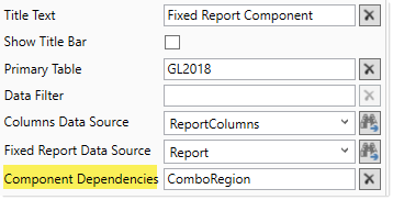
Now when a change is submitted for the Combo Box component named ComboRegion, the Fixed Report component is refreshed. The data query is run based on the current component properties and data source properties, and the state of the report is reset. This occurs at the end of the form update process, when the form display is updated in the browser.
When a form update is triggered, Axiom Software checks to see if any component names are listed in the Component Dependencies property of the Fixed Report component. You can list multiple component names, separated by commas. If any components are listed, Axiom Software then checks to see if any of those components are included in the current form submission. If none of the listed components are included, the Fixed Report component is not refreshed during the form update. If one or more of the listed components are included, then the Fixed Report component is refreshed.
NOTES:
-
The components in Component Dependencies do not have be set to auto-submit in order to refresh the Fixed Report component. If an interactive component is changed but it is not configured to auto-submit, then its change will be submitted when the next form update is triggered (either by a Button component, or by a different component that is configured to auto-submit). The Fixed Report component will still recognize the component change, even though the change was submitted by a different component.
-
The report cannot be dependent on a component used in a Dialog Panel component.
-
If the Fixed Report component is used in a child embedded form, enabling force refresh in the Menu data source will cause the report to update in response to changes that would affect the report state.
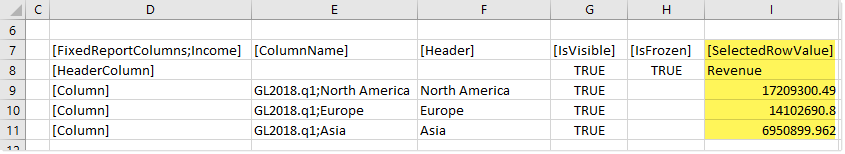
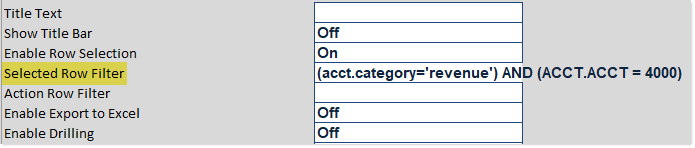
If Enable Row Selection is enabled for the Fixed Report component, users can select a data row in the report. The values in the selected row are submitted back to the source file, and written to the SelectedRowValue column of the FixedReportColumns data source. A filter representing the current row is also written back to the Selected Row Filter field in the Form Control Sheet.
If you want the Axiom form to respond to the currently selected row, then you must set up the file so that another component references one or more of the selected values (or the filter), and changes based on those values. For example, you could have a chart that updates to show information about the department for the currently selected row. For general information on setting up interactive components for an Axiom form, see Using interactive components in an Axiom form.
The row selection feature is the primary means of impacting the form based on user interaction in the report. However, you can also set up interactive behavior for icons displayed in the report, to execute a command when a user clicks on an icon. For more information on using actions with icons, see Using the IconConfig data source with Fixed Report components.
Example
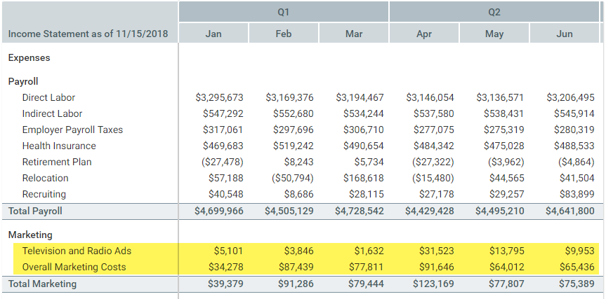
A fixed report could display a summary income statement:
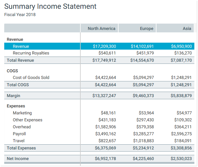
If a user selects the Revenue row, then the values in that row are submitted back to the source file and written to the SelectedRowValue column in the FixedReportColumns data source:
The filter for the current row is also written to the Selected Row Filter in the Form Control Sheet:
There are a number of ways that the form could respond to the selected value in the report. For example, you might want to display detailed information about the selected row in a chart. The chart would need to be set up with formulas that look to the appropriate cells of the SelectedRowValue column (or to the Selected Row Filter field), so that the data in the chart changes based on the currently selected value.
Creating column groups for the report header
You can create column groups in the
-
The row tag
[ColumnGroup]indicates that you want to start a group. All columns that follow this tag belong to the group, until the group is ended.The data source properties of
[Header]and[HeaderAlignment]can be used with[ColumnGroup]rows, to indicate the header text for the column group, and to indicate the alignment of that text across the grouped columns. If no alignment is specified, the default is centered. No other data source properties apply, and will be ignored if set. -
The row tag
[EndGroup]indicates that you want to end a column group. This tag can be omitted if the group extends to the end of the column list. Data source properties do not apply to[EndGroup]rows. If an[EndGroup]tag cannot be matched to a corresponding[ColumnGroup]tag, an error occurs when rendering the component.
For example, you may want to define grouped header text such as "Q1" for the columns representing the months of the first quarter. You can place those columns in a column group and define header text for the group using the [Header] property. After the last column in the first quarter, you can end the group and then start a new group for Q2.
Groups can be nested for multiple levels of column headers. The [EndGroup] tag ends the closest column group to the tag, leaving any other column groups open. If you want to end multiple groups, you must have multiple end tags.
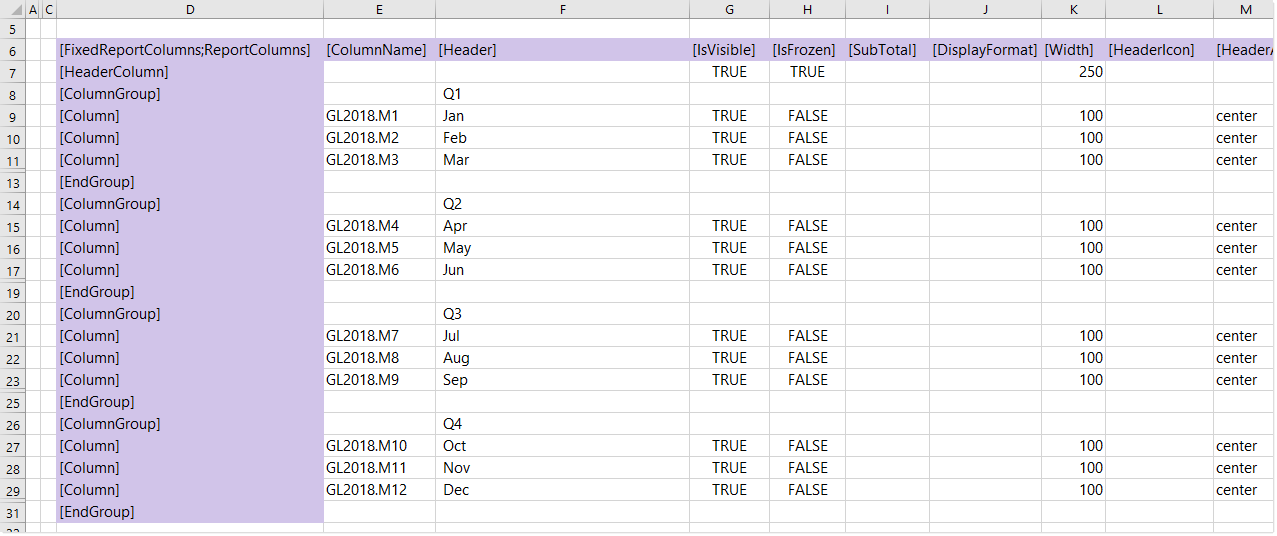
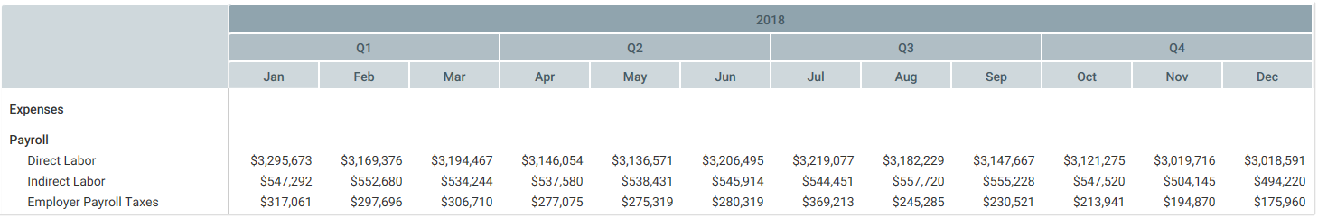
The following example data source shows two levels of column groups. The first, top-level column group indicates the year for the columns (2018). Then multiple, second-level column groups indicate the relevant quarter (Q1, Q2, etc.).
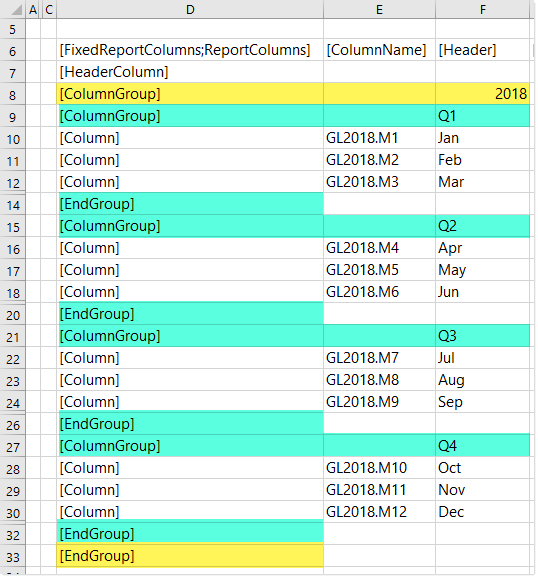
Example data source with nested groups
The first end tag in row 14 ends the closest column group, which is the Q1 group. The next tag in the data source starts the Q2 column group. The 2018 column group is left open to continue to span over all of the quarter groups. When the end of the Q4 group is reached, there are two end tags to end both the Q4 group and the 2018 group (rows 32 and 33).
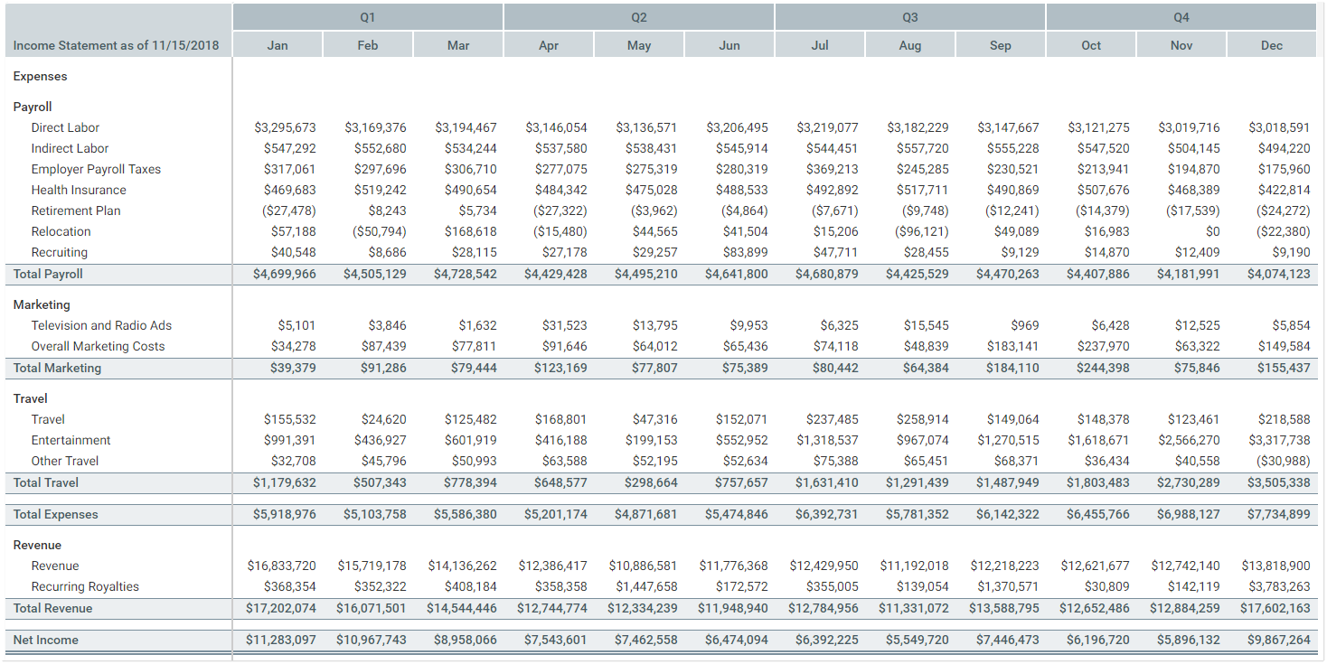
When the component is rendered, the headers look as follows:
NOTES:
-
Header text for a column group is optional. You may want to use column groups with no header text as "spacer" rows, to accommodate headers with varying levels of groupings.
-
Column groups cannot be used within frozen columns. If a column belongs to a column group but is also flagged as a frozen column, the frozen status is ignored. It is not possible to define column groups within the frozen columns area.
Sign reversal for variance columns
You can perform sign reversal on certain calculated columns in a Fixed Report component, on a section by section basis. This is intended for cases where the column contains a variance calculation, and the variance needs to be shown differently for different sections in the report. For example, when comparing budget to actuals in a report, you may want revenue sections to show positive variance (Actuals-Budget) while expense sections show negative variance (Budget-Actuals).
Sign reversal can be enabled using the following columns in the FixedReportColumns data source and the FixedReportConfig data source:
-
For calculated columns where you want to enable sign reversal, enter
Trueinto the[IsVarianceColumn]field of the FixedReportColumns data source.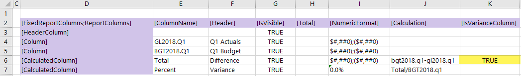
-
Then for each section where you want the sign to be reversed, enter
Trueinto the[InvertVarianceColumns]field of the FixedReportConfig data source. You can enable this option on[DataRowSection]rows to reverse the sign on all data rows in the section, including the associated section subtotal row (if present). If you want to reverse the sign on separate[Subtotal]or[Total]rows, you must separately enable the option on those rows.In this example, the variance calculation is defined as Budget-Actuals, so the sign reversal should be performed on the Revenue section and on the Net Income total row. If instead the variance calculation was defined as Actuals-Budget, then the sign reversal should be performed on the Expenses sections and their separate subtotal.
The Fixed Report component in this example looks as follows:
PDF design considerations
The following design considerations apply when generating a PDF of an Axiom form with a Fixed Report component:
-
The report is automatically extended to show all rows in the PDF. It does not matter which rows are currently visible in the form.
-
Report columns are resized to fit the component width in the PDF, regardless of their configured column size. If the columns exceed the page width, the remaining columns are omitted from the PDF. You should set the PDF page size and orientation as needed to fit the columns. For example, a wide report with many columns should be set to Landscape.
-
Header groups are all shown in the same shade of gray in the PDF, instead of the varying shades shown in the report.
Design alternatives
The Fixed Report component is designed to handle a very specific purpose, to display reporting data using a fixed-row format. If the fixed-row format is a requirement, but you need more flexibility in the report design, you can use a Formatted Grid component. For example, you might use a Formatted Grid component in the following cases:
-
When you need to use more advanced data query configurations or features. You can use Axiom queries to bring data into the source file, and then use the Formatted Grid component to display that data in the form.
-
When you need users to be able to edit data in the report and save the changed data to the database. Formatted Grid components support many options for editing data.
-
When you need the ability to format the report contents at a more granular level. Formatted Grid components support a variety of formatting options to format grid contents, including fonts, colors, and borders.
If the fixed-row format is not a requirement, and you want users to be able to have more features to explore data, then you can use a Data Grid component. The Data Grid component provides built-in sorting, filtering, and grouping tools.
Video: How to create a fixed report in an Axiom form
