AX1670
for Axiom forms
Using the KPI Panel component, you can display key performance indicators (KPIs) in a series of easily readable, eye-catching panels. The design of the component is flexible to accommodate various numbers and display configurations.
The KPI Panel component displays each KPI using a primary value or status, and several optional supporting values. Each KPI can be shown with an optional bullet chart or sparkline chart. KPIs can be flagged as trending up or down, which is indicated using an arrow and a color (green for up, red for down). KPIs can also be configured to execute one or more actions using a button in the top-right corner or a fly-out menu.
Defining a KPI panel is a two-part process that requires the following:
-
Creation of KPI data using a predefined data structure. This data can be sourced from a KPI table or from a data source defined within the spreadsheet. Each KPI from the table or data source displays as its own box within the overall KPI panel.
-
Placement and configuration of a KPI Panel component on the Axiom form canvas.
KPI Panel components can also support interactivity, to change the contents of the Axiom form based on the currently selected KPI box in the panel.
NOTE: Your Axiom Software license determines whether you have access to this component. For more information, see Licensing requirements for Axiom forms.
KPI Panel components must point to a defined set of KPI data. This data can be provided using either of the following options:
-
Use a KPISource data source in the spreadsheet. In this case, the component reads the KPI data from the spreadsheet. You can use any Axiom data query features to bring data into the spreadsheet and then perform calculations on that data as needed to arrive at the KPI data for the data source.
OR
-
Use a KPI table in the Reports Library. In this case, the component reads the KPI data directly from the table. The KPI data is never brought into the spreadsheet. This approach requires a KPI table to be present in the Reports Library, and that table must be populated with the desired KPI data using some other means. For example, you may have a separate report utility that runs periodically to calculate the KPI data and save it to the KPI table. For more information on KPI tables, see About KPI tables.
The KPI Panel component depends on a predefined data structure so that it can automatically format and position the KPI data into a series of KPI boxes. KPI tables and the KPISource data source both use the same basic predefined structure to provide the KPI data.
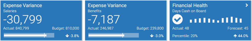
The KPI boxes in the panel can display in a variety of ways, depending on the following:
-
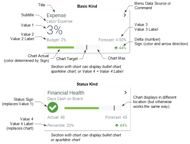
KPI Kind: The kind specified for each KPI determines the information that displays in each KPI box. Basic KPIs emphasize numeric detail, whereas Status KPIs are intended to show whether a KPI is "good" or "bad" at a glance. Basic and Status KPIs can be mixed within the same panel.
-
Other KPI Properties: The various properties that are populated for each KPI affect the display of that KPI. For example, a Basic KPI can display either Value 4 or a chart, but not both.
-
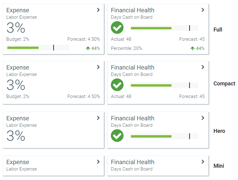
KPI Size:
The following diagram shows how the major KPI properties are displayed in Basic and Status KPIs, so that you can see how the data structure maps to the presentation of KPI boxes.
The following screenshot shows some common variations on this structure:
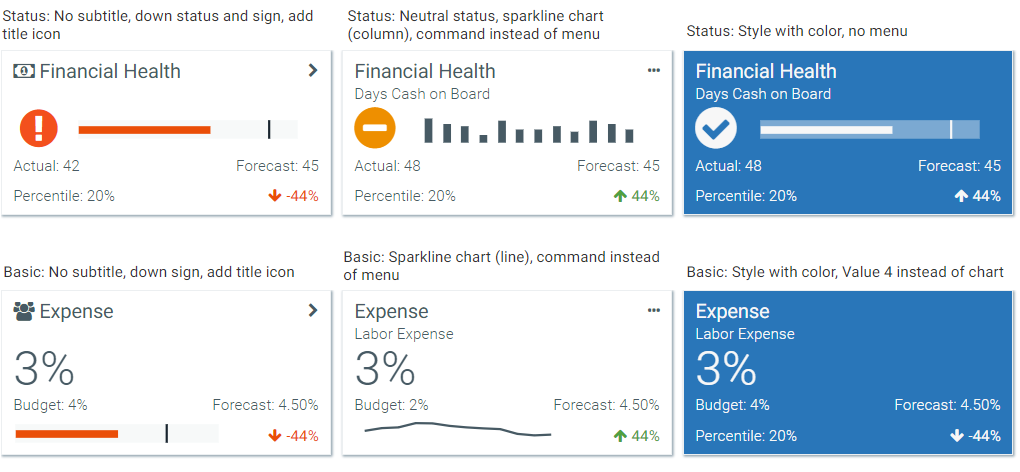
NOTE: If the value of any property is too long to display in its allotted space, the value is truncated and displays with an ellipsis. The full value is shown in a tooltip.
The following screenshot shows how the specified size affects the presentation of Basic and Status KPIs.
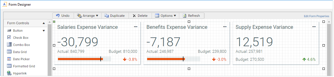
Sizing the KPI Panel on the canvas
The KPI Panel is a specialized panel component that is designed to show one or more KPI "boxes". The number of KPIs to display within the component depends on the KPI rows defined in the KPISource data source or in the KPI table.
The KPI Panel uses panel flow behavior to automatically position the KPI boxes within the component. You should size the KPI Panel component depending on how many KPIs are defined in the data source and how you want those KPIs to be arranged in the form.
For example, imagine that you have 3 KPIs and you want those KPIs to display in a horizontal bar. In that case, you should size your KPI Panel to be long and short, so that the KPIs flow horizontally:
On the other hand, if you want the KPIs to display as a vertical bar down the side of the form, you should size your KPI Panel to be tall and thin, so that each KPI flows down to a new "row":
The number of KPI boxes that can fit on each row of the panel depends on the following properties:
- The Child Padding X and Child Padding Y properties, which set the padding between each KPI box.
- The Size property, which determines the height of each KPI box.
- The KPI Layout property, which determines whether KPI boxes use a fixed width or whether they stretch dynamically. By default, KPI boxes use a fixed width. Depending on the overall size of the panel and the number of KPIs available to fit on the row, this means that there can be a significant amount of white space at the right edge of the KPI panel. As an alternative, you can choose a layout option that stretches the width of the boxes to dynamically fill the width of the panel (limited by either a maximum box width or a fixed number of boxes to show per row).
NOTE: The overflow behavior for the KPI Panel is set to Auto and cannot be changed. This means that if the number of KPI boxes exceeds the space allotted to the KPI Panel component, the component displays with a scroll bar to view the excess KPIs. The KPIs will not overflow the panel or be cut off as hidden.
Within the KPI Panel, the KPI boxes are ordered as follows:
- When using a data source, the boxes are displayed in the order they are found in the data source.
- When using a KPI table, you can specify a sort order for the boxes based on one or more columns in the table.
KPI Panel components can use a KPISource data source to define the KPIs to display in the component. The tags for the data source are as follows:
Primary tag
Row tags
Column tags
- [ID]
-
Optional. The ID for the KPI. This column can contain any value that uniquely identifies each KPI row. This column is only necessary if you want to implement interactivity for the form based on the currently selected KPI, or based on the KPI where a command was triggered using its menu. If you do not need this column, it can be omitted or left blank. For more information, see Interactive behavior and Executing commands from KPI Panels in Axiom forms.
- [Kind]
-
The kind of KPI, either
BasicorStatus. The kind determines whether the primary KPI value is numeric or a status icon.If this column is blank, or if it contains any value other than Basic or Status, the KPI kind is interpreted as
Legacy. The Legacy kind is for backward-compatibility only, and it displays KPIs using the format and properties supported by KPIs created in 2018.1. - [Title]
-
The title of the KPI, displayed at the top of the KPI box.
- [SubTitle]
-
Optional. The subtitle of the KPI, displayed directly beneath the title.
- [TitleIcon]
-
Optional. The name of an icon to display in the KPI title. Enter any valid icon name, such as
fa-dollar. The icon names are the same as the symbol names available for use in Axiom form components such as Formatted Grids. If specified, the symbol displays in the far left of the title, before the title text.To look up valid icon names, you can use the symbol choosers available for Formatted Grid, Label, and Button components. Currently, no helpers are available to populate the TitleIcon column with icon names directly.
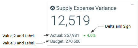
- [Value1]
-
The primary value to highlight for the KPI, when using the Basic kind. This value displays in large, bold font directly underneath the title. This is the value that you want to draw the most attention to.
If you are using the Status kind, this value is ignored and instead the primary value is the StatusSign.
- [Value2]
-
Optional. A supporting value to show for the KPI. A label can be defined for this value, using the Value2Label column.
The supporting values can be used to provide additional information about the primary value. For example, if the primary value is a variance, then Value 2 and Value 3 might display the actual and budget numbers used to calculate that variance. Or if the primary value is the actual number, then Value 2 and Value 3 might display the variance and the budget number to provide more context for the actual number. The values displayed are entirely user-definable.
- [Value2Label]
-
Optional. The label for Value 2. The label precedes the value and displays with a colon, such as "Actuals: Value 2". The label should explain what Value 2 represents.
- [Value3]
-
Optional. A supporting value to show for the KPI. A label can be defined for this value, using the Value3Label column.
- [Value3Label]
-
Optional. The label for Value 3. The label precedes the value and displays with a colon, such as "Budget: Value 3". The label should explain what Value 3 represents.
- [Value4]
-
Optional. A supporting value to show for the KPI. A label can be defined for this value, using the Value4Label column.
When using the Basic kind, Value 4 and the chart are interchangeable. You can display either Value 4 or a chart, but not both. If both are defined, the chart takes precedence. When using the Status kind, the chart displays in a different place so you can display both if desired.
- [Value4Label]
-
Optional. The label for Value 4. The label precedes the value and displays with a colon, such as "Forecast: Value 4". The label should explain what Value 4 represents.
- [ChartTarget]
-
Optional. A value that defines the target line for the bullet chart. This value can be omitted if it is not needed.
- [ChartActual]
-
Optional. A value that defines the actual line for the bullet chart. This value can be omitted if the KPI does not use a bullet chart.
- [ChartMax]
-
Optional. The maximum value of the bullet chart. The chart target and actual values are represented in relation to this maximum value.
For example, if the actual value is 100 and the maximum value is 1000, then the actual bar will only take up 1/10th of the bullet chart. But if the maximum value is 150, then the actual bar will take up 2/3rds of the bullet chart.
This value is required if you want to display a bullet chart on the KPI. This value should be omitted if you don't want to display a chart at all, or if you want to display a sparkline chart instead by using the SparklineData
- [Delta]
-
Optional. A value that illustrates the positive or negative measure of the KPI. This value can be omitted if not needed.
The Delta value displays in either red or green (as determined by the Sign value)
- [Sign]
-
Optional. Specifies whether the primary KPI value is trending up (positive) or down (negative). Enter either
UporDown. If omitted, Down is assumed.- If Up, then an up-arrow displays in front of the Delta value. The value, arrow, and the actual bar of the bullet chart display in green.
- If Down, then a down-arrow displays in front of the Delta value. The value, arrow, and the actual bar of the bullet chart display in red.
If the style of the KPI is anything other than
white,S1, or blank (transparent), then these items display in white instead of green or red.If the KPI does not have a defined Delta value, the Sign still determines the color of the bullet chart (if applicable).
- [StatusSign]
-
Specifies the status of the KPI, when using the Status kind. Enter one of the following:
Up,Down,Neutral. The status displays as a colored circle with a positive, neutral, or negative indicator:Up Neutral Down 


The green, orange, and red colors are only used when the style of the KPI is
white,S1, or blank (transparent). If the box has a background color, then the status circle is white and the indicator uses the same color as the background. - [Command]
-
Optional. Specifies a command to execute when the user clicks the icon in the top right corner of the KPI box.
If you want users to be able to execute a command from the KPI box, you can use the Command column or you can use the MenuData
- When using Command, you can define a single command to be triggered by a three-dots icon that displays in the top right corner of the box. This option is intended for cases where you only need to provide access to one command, and you don't need a custom icon.
- When using MenuData
The valid entries for the Command column are the same that can be defined for the Command column in the KPIMenu data source. See Executing commands from KPI Panels in Axiom forms.
NOTE: The command string cannot change dynamically using a formula. If a formula is used to create the string, the formula will not be recalculated before the command is executed. This means that the only way the command can change dynamically is by using bracketed cell references within the command's shortcut parameters. When the command is executed, the current value of the referenced cell is always used. Bracketed cell references are only supported for certain commands and in certain parameters. The reference topic for each command details whether bracketed cell references are supported.
- [Style]
-
Optional. Specifies a color style to set the background color of the KPI box. By default, the box is transparent.
The following Axiom color styles are supported (specify one per KPI): S1, S6, A11, A51, P5, P6, P7, P9, P10. You can also specify
white. When using darker background colors, the text in the KPI automatically adjusts to white. - [Tooltip]
-
Optional. Defines a tooltip to display when a user hovers over the button in the top right corner of the KPI box. This applies as follows:
- If you are using the Command column, the tooltip displays for the default three-dots icon.
- If you are using the MenuData
- If you are using the MenuData
- [MenuDataSource]
-
Optional. Specifies a KPIMenu data source that defines one or more commands that can be executed from the KPI box. If multiple commands are available, these commands display in a fly-out menu. For more information, see Executing commands from KPI Panels in Axiom forms.
If both the Command column and the MenuDataSource column are populated, the menu takes precedence.
- [SparklineDataSource]
-
Optional. Specifies a chart data source in order to display a sparkline chart in the KPI box. The data source must be an XYChart data source. For more information, see Displaying charts in KPI Panels in Axiom forms.
The KPI box can display a bullet chart or a sparkline chart, but not both. If ChartMax and SparklineDataSource are both defined, an error occurs when attempting to render the component.
- [SparklineSeriesName]
-
Optional. Specifies a series name within the data source specified as the SparklineDataSource. The series must be Line or Column kind within the XYChart data source. Unsupported kinds are rendered as Line.
Only one series can be displayed within the sparkline chart. If the series name is omitted or invalid, the sparkline chart does not display. For more information, see Displaying charts in KPI Panels in Axiom forms.
- [Hidden]
-
Specifies whether the KPI row is hidden from the KPI Panel (True/False). If omitted, False is assumed. You can use a formula in this property to dynamically show or hide the KPI based on some condition.
NOTES:
- The primary tag must be placed in the first 500 rows of the sheet.
- Formulas can be used to create the tags, as long as the initial bracket and identifying keyword are whole within the formula.
To use the Data Source Wizard to add the tags to a sheet, right-click in a cell and then select Create Axiom Form Data Source > KPI Panel. You can also highlight a range of data first and then use the wizard to add the tags around that data. The cells in the row above and the column to the left of the selected area must be blank in order for Axiom to place the tags in sheet.
The following example shows a sample KPISource data source tagged in a sheet:

Example KPISource data source
The resulting KPI Panel for the example data source shown above looks as follows:
As discussed in the previous section, the arrangement of multiple KPI boxes depends on the size of the KPI Panel component on the canvas. In this example, the KPI Panel has been sized long and short to display the three KPIs horizontally.
Once the KPISource data source has been added to the sheet, you can optionally use the Data Source Assistant to:
-
Add column and row tags to the data source.
-
Review and complete column properties for each row in the data source. When your cursor is in a
[KPI]row, all available column properties display in the Selection Editor. You can edit any property and that edit will be made in the corresponding cell of the data source.
You can define the following properties for a KPI Panel component.
Component properties can be configured using the Form Assistant task pane or the Form Designer unless otherwise noted. All properties can also be defined on the Form Control Sheet directly if desired. For example, if you want a property to be dynamic depending on the result of a formula, you can define that formula in the control sheet. To access the control sheet settings for the component, double-click any property name to go to that property in the Form Control Sheet.
Component behavior properties
The following properties control the display and behavior of this particular component type.
| Item | Description |
|---|---|
|
Data Source |
The data source to provide the KPI data for the component. You must have defined the KPISource data source within the file using the appropriate tags in order to select it for the grid. NOTE: In the Form Control Sheet, the selected data source is written as SheetName!DataSourceName. The sheet name is the sheet where the selected data source is located. If a data source is already specified and you want to locate it within the file, click the Show location NOTE: KPI Panel components can use either a data source or a KPI Table. If you specify a data source, the table-related properties are hidden in the Form Assistant and Form Designer. If you later decide you want to switch from using a data source to a table, you must clear the data source name in order to show the table-related properties. |
|
Enable KPI Selection |
Optional. Specifies whether users can select a KPI box in the panel. Only applies when using a data source. By default this is disabled, which means KPIs are not selectable in the panel. If enabled, and if the ID column is populated in the KPISource data source, then KPIs are selectable in the panel. When a user selects a KPI, the ID for that KPI is written back to Selected ID field. The form can be configured to change in some way based on the currently selected KPI. For more information, see Interactive behavior. |
|
Selected ID |
Optional. The currently selected KPI in the panel, identified by the corresponding ID in the KPISource data source. Only applies when using a data source, and only if Enable KPI Selection is enabled. This setting serves two purposes:
For more information, see Interactive behavior. NOTES:
|
|
Triggering ID |
When a user executes a command from a KPI box, the ID for that KPI is written back to this field (as defined in the KPISource data source). You can reference this value to impact the command being executed, or to impact something else in the form. For more information, see Using the Triggering ID to impact the form. NOTE: This setting is only available on the Form Control Sheet; it does not show in the Form Assistant or in the Form Designer. |
|
KPI Table |
The KPI table to provide the KPI data for the component. Enter any KPI table name. Only KPI tables can be used in this context, because KPI tables contain the necessary columns that map to the properties used by the KPI Panel component. For more information on KPI tables, see About KPI tables. NOTE: KPI Panel components can use either a data source or a KPI Table. If you specify a KPI table, the data source-related properties are hidden in the Form Assistant and Form Designer. If you later decide you want to switch from using a table to a data source, you must clear the table name in order to show the data source-related properties. |
|
Data Filter |
Optional. A filter to limit the KPIs shown in the component. Enter any valid filter criteria statement based on the specified KPI table. Only applies when using a KPI table. If no filter is defined, then all KPIs in the table will display in the component (except for rows with the Hidden column set to True). |
|
Sort Order |
Optional. One or more table columns to determine the sort order of the KPIs shown in the component. Specify any columns on the KPI table or a lookup table. Only applies when using a KPI table. Use fully qualified Table.Column syntax to specify each column. Separate multiple columns with semicolons. If multiple columns are specified, the first column is the top-level sort. You can optionally indicate ascending (asc) or descending (desc) sort after the column name. Ascending order is used by default. For example: |
|
KPI Size |
Specifies the size of the KPI boxes in the panel. KPIs support the following sizes:
For examples of each size, see the screenshot of sizes in the Component overview. |
|
KPI Layout |
Specifies how the width of the individual KPI boxes is determined:
|
|
Fixed Width |
Specifies the width of each KPI box in pixels. If left blank, the default is 300. Only applies when the KPI Layout is set to Fixed Size. |
|
Max Width |
Specifies the maximum width of each KPI box in pixels. If left blank, the default is 500. Only applies when the KPI Layout is set to Stretch to Fill up to Max Width. |
|
KPIs Per Row |
Specifies the maximum number of KPI boxes to show in each row. If left blank, the default is 3. Only applies when the KPI Layout is set to Stretch to Fill with Fixed Number. |
|
Child Padding X Child Padding Y |
Defines the x-padding and y-padding between KPI boxes.
The padding can be set in pixels (default) or in percentages. |
|
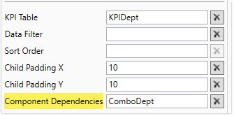
Component Dependencies |
Optional. Specifies one or more components that the KPI Panel component is dependent on. Only applies when using a KPI table. If you want the KPI panel to dynamically update based on changes made to other components, list one or more component names in this field. Separate multiple component names with commas. If a component name is listed here, then the KPI panel is refreshed when a form update submits a change to the listed component. If no component names are listed here, or if the listed components are unchanged, then the KPI panel is not refreshed when a form update occurs (unless the update includes a save-to-database). Components listed as component dependencies must be interactive components, such as Combo Box components, Check Box components, and so on. The purpose of this option is that you want to enable refreshing the KPI panel based on a change a user made to an interactive component. Non-interactive components, such as Label components, cannot submit values back to the source file and cannot trigger form updates. Therefore, non-interactive components cannot cause the KPI panel to refresh. NOTES:
For more information, see Update behavior. |
 button to the right of the drop-down list. This will move your cursor to the associated data source tag in the file.
The following general properties are available for all components:
| Item | Description |
|---|---|
|
Component Name |
The name of the component. This is for identification in the file; this name does not display on the Axiom form canvas. The name of the component identifies the corresponding settings for the component on the Form Control Sheet. The component names are also useful if you have multiple types of the same component within an Axiom form, so that you can tell which component you are currently editing. Component names must be unique within a file and must start with a letter. Names can only contain letters, numbers, and underscores. Names are validated when the file is saved; an invalid name will prevent the save. NOTE: Spaces are not allowed in component names and will be automatically removed by Axiom Software. For example, if you enter "My Component" as the component name, it will be automatically adjusted to "MyComponent". |
|
Visible |
Specifies whether the component is visible on the Axiom form (On/Off). By default this is set to On. This setting can be used to dynamically show or hide the component using a formula. Keep in mind that if you have multiple components that you need to dynamically show or hide based on the same condition, then it is preferable to place those components on a dedicated layer and then show or hide the entire layer instead of the individual components. NOTE: This setting is only available on the Form Control Sheet; it cannot be set in the Form Assistant or in the Form Designer. |
|
Layer |
The layer that the component belongs to on the Axiom form canvas. In the Form Assistant and the Form Designer, this displays as the layer name (for example: Layer 1). In the Form Control Sheet, this is recorded as the layer ID (for example: 1). If the canvas only has one layer, then the component is automatically assigned to that layer and cannot be changed. If the canvas has multiple layers, you can assign the component to any layer using the drop-down list. By default, the component will be assigned to whichever layer is selected in the Layers box when you initially drag the component onto the canvas. For more information on layers, see Using multiple layers on the canvas. If desired, you can jump to the applicable layer settings on the Form Control Sheet by clicking the binoculars icon |
|
Parent |
The parent component that this component is assigned to. If blank, then the component does not have an assigned parent. Currently, only Panel components can be designated as parents. If a component has an assigned parent, then that component is positioned within the parent instead of within the canvas at large. If the parent is hidden, all "child" components of that parent are also hidden. The parent assignment is automatically completed when a component is dragged into a panel in the Form Designer, and automatically cleared when a component is dragged out of a panel. In most cases, you should not need to manually assign a parent. For more information, see Using panels to group and position components. |
Style and formatting properties
To define the component formatting, you can assign one or more styles to the component. Styles can impact formatting properties such as fonts, borders, and colors.
If you do not want to apply a style to this component, or if you want to override one or more formatting properties in an assigned style, click the Show Advanced Settings link underneath the Style box to display the individual formatting properties. For more information on defining individual formatting properties for a component, see Formatting overrides for Axiom form components.
By default, the KPI boxes in the panel display with a border and with a shadow. You can apply styles to the component in order to remove either of these items:
- no-kpi-box-shadow: Removes the shadow on individual KPI boxes.
- no-kpi-border: Removes the border on individual KPI boxes.
| Item | Description |
|---|---|
|
Style |
Optional. The styles used to determine the formatting of the component. You can assign one or more styles. Click the Select component styles button [...] to open the Choose Style dialog. Using this dialog, you can select one or more styles to apply to the component. The available styles depend on the component type and the skin assigned to the form. For more information, see Using component styles. Some components have several styles that are specifically designed for that component type, while other components may only have the "generic" styles that are available to all components. When using a generic style, keep in mind that they may not be useful for all components. You can view a description of each style and view the effective formatting applied by the selected styles within the Choose Style dialog. |
|
Component Theme |
(Deprecated.) The theme to use for the component instead of the form-level theme. If left blank, the component uses the form-level theme. This setting should be left blank unless you need to override the form theme. Generally speaking, themes should be set at the form level and only overridden at the component level when necessary. This setting is available in the advanced component properties (click Show Advanced Settings under the Style box). On the Form Control Sheet, the setting displays using the name Theme Override. NOTE: This setting only applies if your form uses a legacy skin (any skin except the default Axiom2018). The Axiom2018 skin does not use themes. |
You can view the position and size properties for a component by clicking the Show Advanced Settings link under the Style box. If necessary, you can edit these properties directly (instead of automatically modifying them by adjusting the component's position and size on the canvas). For more information on using these settings, see Controlling component position and size.
| Item | Description |
|---|---|
|
Reference Location |
The reference location determines how the x-position and y-position of a component are evaluated. By default the reference location is UpperLeft. NOTE: This setting is not exposed in the advanced component settings. It can be changed on the canvas by double-clicking the corner selection handles of a component, or you can edit the setting on the Form Control Sheet directly. |
|
X Position Y Position |
The x-position determines the component's position along the horizontal axis, and the y-position determines the component's position along the vertical axis. Both are evaluated relative to the reference location. Positions can be set in pixels (default) or percentages. |
|
Width Height |
The width and height determine the size of the component. The width and height can be set in pixels (default) or percentages. Size keywords are also available to support special behavior. |
|
Rendering Order |
The order in which the component is rendered in the layer. A component with a larger order number will display above a component with a smaller order number. For components that support tab navigation (tabbing to the next editable component), the rendering order also determines the tabbing order. NOTE: On the Form Control Sheet, this setting is labeled as Z-Index. |
|
Lock Layout |
If enabled, the component size and position are locked and cannot be changed by dragging and dropping on the canvas. This optional setting is intended to protect against accidentally moving or resizing a component while working on the canvas. |
The KPI Panel component uses two different types of update behavior, depending on the source of data for the KPIs:
-
Data source: When using a data source, the update behavior is the standard form update behavior. Each time a form update is triggered, the KPI Panel component is refreshed to reflect the current component settings and show the latest data in the data source.
-
KPI table: When using a KPI table, the KPI Panel component queries data from the Axiom Software database when the Axiom form is initially rendered. This data remains the same until one of the following occurs:
-
If the form uses refresh variables, applying changed refresh variables via the Filters panel will refresh the KPI panel. This means that the KPI panel can be set up to change its data based on the selected value of a refresh variable.
-
If one or more components are listed in the Component Dependencies property for the KPI panel, the KPI panel is refreshed when a changed value is submitted for one of those components. Otherwise, if no components are listed, or if no changes are submitted for listed components, then form updates triggered by interactive components do not cause the KPI panel to refresh.
-
By default, when an update is triggered in the form, the KPI panel is preserved as is. The component settings are not re-read and the data query is not run again. This behavior is intended to improve performance by not executing the data query and not redrawing the panel every time a form update occurs.
For example, imagine that the form contains a Combo Box component that is set to auto-submit. When a user selects a value from the combo box, this value is submitted to the source file and a form update is triggered. Under normal circumstances, if another component is configured to dynamically change based on the currently selected value for the combo box, this change would be reflected in the form once the form update is complete. However, the KPI Panel component does not update in this circumstance. Even if the selected value for the combo box impacts a KPI Panel property—such as the KPI table or the data filter—by default the KPI panel will not change during this form update.
If you want the KPI panel to update based on the selected value of the combo box, then you must list the name of the Combo Box component in the Component Dependencies property for the KPI Panel component. For example, if the Combo Box component is named ComboDept because it is used to select a department, you would list ComboDept as a component dependency.
Now when a change is submitted for the Combo Box component named ComboDept, the KPI Panel component is refreshed. The data query is run based on the current component properties. This occurs at the end of the form update process, when the form display is updated in the browser.
When a form update is triggered, Axiom Software checks to see if any component names are listed in the Component Dependencies property of the KPI Panel component. You can list multiple component names, separated by commas. If any components are listed, Axiom Software then checks to see if any changes to those components are included in the current form submission. If the listed components are unchanged, the KPI Panel component is not refreshed during the form update. If one or more of the listed components are changed, then the KPI Panel component is refreshed.
NOTES:
-
The components in Component Dependencies do not have be set to auto-submit in order to refresh the KPI Panel component. If an interactive component is changed but it is not configured to auto-submit, then its change will be submitted when the next form update is triggered (either by a Button component, or by a different component that is configured to auto-submit). The KPI Panel component will still recognize the component change, even though the change was submitted by a different component.
-
The KPI panel cannot be dependent on a component used in a Dialog Panel component.
-
If the KPI Panel component is used in a child embedded form, enabling force refresh in the Menu data source will cause the KPI panel to update in response to changes that would affect the KPI panel state. Note that the KPI panel will not update if force refresh is enabled in the Embedded Form component properties instead of the Menu data source.
The KPI Panel component can be set up to allow the user to select a specific KPI box within the panel, and then submit the selected KPI back to the source file. The selected KPI is written to the Selected ID setting on the Form Control Sheet, using the ID value defined in the KPISource data source. Once a box is selected, the user can either click on a different box to change the selection, or click on the same box to clear the selection.
To enable selecting KPI boxes:
- Enable KPI Selection must be enabled for the KPI Panel component.
- The KPISource data source must contain a populated ID column. If the ID column is omitted or blank, then row selection is not available. Row selection is also not supported when using a KPI table.
If you want the Axiom form to respond to the currently selected KPI, then you must set up the file so that another component references the selected KPI and changes based on it. For more information on setting up interactive components for an Axiom form, see Using interactive components in an Axiom form.
KPI interactivity is intended to support KPI "drilling" based on the currently selected item. For example the user may want to see more detail about the data that makes up the KPI, or see "child" KPIs related to the selected KPI.
When a user selects a KPI in the panel, the selected KPI box updates to display with a black background color. This is how the user knows which KPI is selected. Black is not otherwise supported as a background color for KPI boxes, so it does not conflict with any other background color that may be used in the panel.
Example
The Axiom form could contain an initial KPI Panel component that shows top-level key performance indicators. If you want users to be able to see lower-level KPIs within the same category, you could set up a secondary KPI panel that shows these "child" KPIs based on the currently selected KPI in the top panel. The secondary panel could remain hidden until a KPI is selected, or the form could start out with a default selection.
For example, the initial KPI Panel could have top-level KPIs for Revenue and Expense. When the user clicks the KPI box for Expense, the secondary panel could show additional detailed KPIs relating to expenses. The secondary panel could be set up in a variety of ways in order to change what it shows:
- The form could contain multiple data sources to be used by the secondary panel, and the selected KPI could drive which data source the secondary panel uses.
- The form could contain a single data source for the secondary panel, and the selected KPI could drive which KPIs in the data source are currently visible (using the
[Hidden]column). - The secondary panel could reference a KPI table, and the selected KPI could drive which table is referenced, or drive a filter on the table.
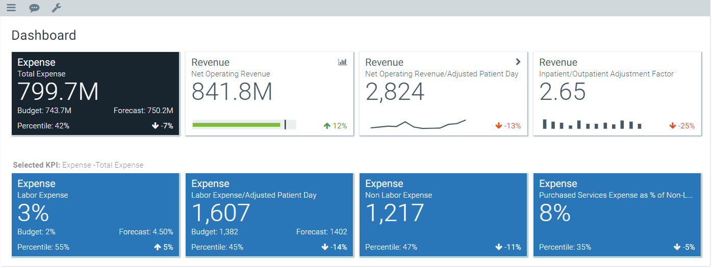
Example form with selected KPI
Legacy KPIs refer to the KPI structure in version 2018.1, before additional kinds and sizes were introduced. If you have KPI Panels created in version 2018.1, these KPIs are displayed as legacy KPIs until you assign them a kind (and complete any additional properties used by the kind).
Legacy KPIs are intended for backward-compatibility only. Going forward, all new KPIs should be assigned a kind.
Legacy KPIs are most similar to the Basic kind, but have the following differences:
- The formatting applied to legacy KPIs has minor, subtle differences. For example, the spacing between the top of the box, the title, and Value 1 is slightly different. If a legacy KPI is displayed next to a Basic KPI, they will not look exactly the same, though they use the same basic elements.
- Legacy KPIs do not support subtitles, Value 4, status signs, or sparkline charts. The only chart option is the bullet chart.
- Legacy KPIs do not support sizes. Legacy KPIs always display at full size, regardless of the size set in the KPI Panel component properties.
- If no bullet chart is defined for a legacy KPI, the display of the values rearranges as follows: