AX1726
in Axiom forms
Each KPI in a KPI Panel component can include an optional chart. There are two options to display a chart:
- Bullet Chart: To display a bullet chart in the KPI box, complete the ChartTarget, ChartActual, and ChartMax columns in the KPI table
- SparklineChart: To display a sparkline chart in the KPI box, first create an XYChart data source to define the data for the sparkline. Then, complete
Each KPI can use either a bullet chart or a sparkline chart, but not both.
Both kinds of KPIs (Basic and Status) can display charts. In Basic KPIs, the chart displays at the bottom left of the KPI box. In Status KPIs, the chart displays in the middle of the KPI box, next to the status indicator.
In Basic KPIs, the chart and Value 4 display in the same location, so only one or the other can be used per KPI. If both are defined, the chart takes precedence. This is not an issue for Status KPIs because the chart displays in a different location.
Displaying bullet charts in KPIs
To display a bullet chart in a KPI, complete the following columns in the KPI table
-
ChartTarget: A value that defines the target line for the bullet chart.
-
ChartActual: A value that defines the actual line for the bullet chart.
-
ChartMax: The maximum value of the bullet chart. The chart target and actual values are represented in relation to this maximum value.
For example, if the actual value is 100 and the maximum value is 1000, then the actual bar will only take up 1/10 of the bullet chart. But if the maximum value is 150, then the actual bar will take up 2/3 of the bullet chart.
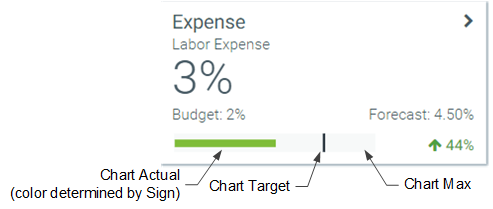
If the Style of the KPI is set to white, blank (transparent), or S1, then the actual bar of the chart displays in red or green, depending on the value of the Sign column. Otherwise, it displays in white.
NOTE: Tooltips display on bullet chart values within the KPI. However, these values display as unformatted numbers.
Displaying sparkline charts in KPIs
To display a sparkline chart in a KPI, create an XYChart data source to define the sparkline data (see Creating an XYChart data source for a Sparkline chart). Then, do one of the following:
-
If using a KPISource data source, enter the name of the XYChart data source in the SparklineDataSource column, and enter the name of a series in that data source in the SparklineSeriesName column. For example, the data source name might be
Sparklineand the series name might beRevenue. The Revenue series is then displayed in the KPI box as a sparkline chart. -
If using a KPI table, you must use special syntax to save the contents of the XYChart data source and series to the SparklineData column of the table during a save-to-database. When setting up Save Type 1 in the file, the contents of the SparklineData column must contain the following special syntax:
[Datasource=DataSourceName;Series=SeriesName]. The specified XYChart data source and series must be present in the same file where you are performing the save-to-database.
For example, you can create an XYChart data source named Sparkline, with two series. One is a line series named LineSeries and the other is a column series named ColumnSeries.
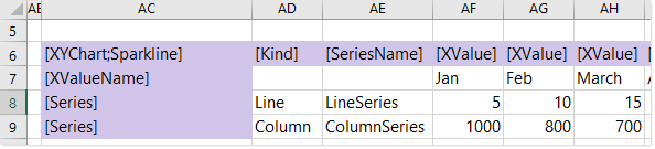
Example XYChart data source
When using a KPISource data source, you can list the series name and the XYChart data source name in the KPISource data source directly. When the KPIs are rendered in the form, Axiom Software finds the specified series in the specified XYChart data source, and displays the data as a sparkline chart.
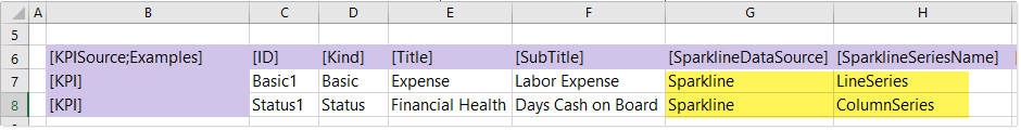
Example KPISource data source referencing sparkline series
To save series data to a KPI table, you must place the special syntax in the SparklineData column for the save-to-database, as shown in the following screenshot:
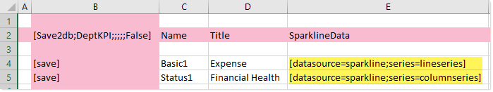
Example save-to-database using special syntax to save sparkline data
When the save-to-database is executed, Axiom Software finds the designated XYChart data source, and converts the contents of the specified series into an XML string. That XML string is then saved to the SparklineData column in the KPI table. When the KPI table is used with a KPI Panel component, the XML string is used to render the sparkline chart on the KPI box.
The SparklineData column in KPI tables can only accept the special data source syntax when saving to the database using Save Type 1. If any other contents are present in the SparklineData column within the sheet (even the resulting XML syntax), an error occurs when saving. If you want to modify and save the other columns in the table without modifying the SparklineData column, then the SparklineData column must be omitted from the save.
The following example KPIs show how a line and column sparkline chart appear in the KPI box:
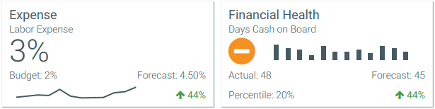
Example KPIs with sparkline charts
NOTES:
- Sparkline charts in KPIs do not display using colors. They are black when the KPI box uses a light color and white when the KPI box uses a dark color.
- Tooltips display on sparkline chart values within the KPI.
Creating an XYChart data source for a Sparkline chart
The tags for the XYChart data source are as follows when using it to define a sparkline chart for a KPI. When using the data source with a KPI table, the data source must be created in the save-to-database file that is being used to populate the table
Primary tag
Row tags
Column tags
NOTES:
-
The primary tag must be placed in the first 500 rows of the sheet.
-
Formulas can be used to create the tags, as long as the initial bracket and identifying keyword are whole within the formula.
-
Negative numbers in a data source must use the minus symbol or parentheses to indicate the negative value. Alternative negative formats such as red number text are not recognized and will display as positive values in the chart.
When using Create Axiom Form Data Source on the right-click menu, there is no separate option for Sparkline. Instead, you should select Line Chart or Column Chart to create an XYChart data source. You can modify the Kind column as needed to specify Line or Column for each series.
