AX1081
for Axiom forms
The Sparkline component for Axiom forms can be used to show trends at-a-glance, in a simple format. Unlike full-sized charts which are intended to stand alone and convey detailed data, sparklines are intended to be presented along with text and data, to illustrate what is being conveyed.
The only content of a sparkline chart is the data plotting element (for example, the chart line, or the chart columns)—no axis values or labels of any kind display on the chart. The goal of the sparkline chart is to convey the essence of the data, not the specific details—for example, is the data generally trending up, down, or fluctuating? However, users can hover their cursor over distinct points of the sparkline chart to see the specific value for that point in a tooltip.
Defining a sparkline chart is a two-part process that requires the following:
- Creation of an XYChart data source in the spreadsheet to define the data to display in the chart.
- Placement and configuration of a Sparkline component on the Axiom form canvas.
NOTE: Your Axiom Software license determines whether you have access to this component. For more information, see Licensing requirements for Axiom forms.
Data source tags
Sparkline components use the same data source tags as Bar Chart, Column Chart, Line Chart, and Area Chart components—meaning the XYChart data source. Any XYChart series kind can be displayed in the sparkline chart.
Note the following exceptions when using an XYChart data source for a sparkline chart:
-
Sparkline charts do not display axis labels or legends, so the
[XValueName]row and the[VisibleinLegend]column are not applicable. The[SeriesName]column must still be used to identify series in the data source, but the series names do not display in the chart. -
Sparkline charts only support one Y-axis scale, so the
[Axis]column is not applicable. If[Axis]is present in the data source and any series are assigned to the Secondary axis, those series will not display in the sparkline chart.
Primary tag
Row tags
Column tags
The data source wizard only adds the [SeriesName], [XValue], and [Kind] columns. If you want to use any of the other columns, you must manually add them to the data source.
NOTES:
-
The primary tag must be placed in the first 500 rows of the sheet.
-
Formulas can be used to create the tags, as long as the initial bracket and identifying keyword are whole within the formula.
-
Negative numbers in a data source must use the minus symbol or parentheses to indicate the negative value. Alternative negative formats such as red number text are not recognized and will display as positive values in the chart.
The following example shows simple data flagged in a sheet. In real implementations this data would most likely be generated by an Axiom query or Axiom functions; here the data is simply typed in order to show the placement of the tags to the data.

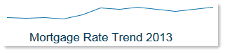
The resulting chart would appear as follows (where the chart title is a separate Label component):
When using Create Axiom Form Data Source on the right-click menu, there is no separate option for Sparkline; instead you should select Line Chart, Column Chart, etc., based on what type of chart you want to display in the sparkline chart. Traditionally sparklines are line charts, but you can use any of the chart kinds supported by the XYChart data source. To see an example data source, see the topic for the type of chart that you want to display as a sparkline. For example, if you want to display a Line Chart as a sparkline, see the topic for Line Chart component.
When configuring the settings for the Sparkline component, you can select not only which data source to use, but also which series from that data source to use. Therefore you may have multiple Sparkline components that use the same data source, but each sparkline chart displays a different series in the data source. In this example the data source has only one series, but it could have multiple series with multiple components referencing the same data source.
You can define the following properties for a Sparkline component.
Component properties can be configured using the Form Assistant task pane or the Form Designer unless otherwise noted. All properties can also be defined on the Form Control Sheet directly if desired. For example, if you want a property to be dynamic depending on the result of a formula, you can define that formula in the control sheet. To access the control sheet settings for the component, double-click any property name to go to that property in the Form Control Sheet.
Component behavior properties
The following properties control the display and behavior of this particular component type.
| Item | Description |
|---|---|
|
Data Source |
The data source for the sparkline chart. You must have defined the data source within the file using the appropriate tags in order to select it for the chart. NOTE: In the Form Control Sheet, the selected data source is written as SheetName!DataSourceName. The sheet name is the sheet where the selected data source is located. If a data source is already specified and you want to locate it within the file, click the Show location |
|
Data Source Access |
Specifies the loading behavior of the component:
|
|
Selected Series |
Optional. The specific series of the data source to show in the chart. The drop-down list shows all currently visible series names in the data source. You can select one of these names or type in a name (in case you haven't defined the series name yet, or if it is currently "hidden" via a formula). This setting allows you to define multiple series within a single data source, and then display each series within a separate sparkline chart. If you do not specify a series, then all series in the data source will display in the chart. Keep in mind that if the data source contains more than a small handful of series, the sparkline chart will likely be unreadable. |
|
Default Series Kind |
Specifies the default kind for series in the sparkline chart, to be used if the Kind column is omitted from the data source, or if an entry in the column is blank. Select either Bar, Column, Line, or Area. The default kind for sparklines is Line, since that is the traditional chart type of sparklines. |
|
Display Tooltip |
Specifies whether tooltips display on the chart when a user hovers the cursor over it. By default this is enabled. A tooltip is available for each individual value in the series, displaying the series name and value. |
|
Tooltip Format |
Optional. Specifies the format for values displayed in the sparkline tooltip: Number (default), Currency, or Percent. NOTES:
|
|
Tooltip Decimals |
Optional. Specifies how many decimal places to show in the sparkline tooltip. By default, no decimal places are shown (0). |
|
URL |
Optional. The URL to launch when a user clicks on the component. The URL must use full HTTP syntax—meaning, use For example, you might use the URL to open another Axiom form with more detailed information about the data in the sparkline chart. For more information about using a URL to open another Axiom form, see Generating a URL to an Axiom file or an Axiom form. |
|
Use New Window |
If a URL is defined, specifies whether the link is opened in a new window. By default this is enabled, which means the link is opened in a new window. Disable this option if you want the link to open within the same window (replacing the current Axiom form). |
 button to the right of the drop-down list. This will move your cursor to the associated data source tag in the file.
The following general properties are available for all components:
| Item | Description |
|---|---|
|
Component Name |
The name of the component. This is for identification in the file; this name does not display on the Axiom form canvas. The name of the component identifies the corresponding settings for the component on the Form Control Sheet. The component names are also useful if you have multiple types of the same component within an Axiom form, so that you can tell which component you are currently editing. Component names must be unique within a file and must start with a letter. Names can only contain letters, numbers, and underscores. Names are validated when the file is saved; an invalid name will prevent the save. NOTE: Spaces are not allowed in component names and will be automatically removed by Axiom Software. For example, if you enter "My Component" as the component name, it will be automatically adjusted to "MyComponent". |
|
Visible |
Specifies whether the component is visible on the Axiom form (On/Off). By default this is set to On. This setting can be used to dynamically show or hide the component using a formula. Keep in mind that if you have multiple components that you need to dynamically show or hide based on the same condition, then it is preferable to place those components on a dedicated layer and then show or hide the entire layer instead of the individual components. NOTE: This setting is only available on the Form Control Sheet; it cannot be set in the Form Assistant or in the Form Designer. |
|
Layer |
The layer that the component belongs to on the Axiom form canvas. In the Form Assistant and the Form Designer, this displays as the layer name (for example: Layer 1). In the Form Control Sheet, this is recorded as the layer ID (for example: 1). If the canvas only has one layer, then the component is automatically assigned to that layer and cannot be changed. If the canvas has multiple layers, you can assign the component to any layer using the drop-down list. By default, the component will be assigned to whichever layer is selected in the Layers box when you initially drag the component onto the canvas. For more information on layers, see Using multiple layers on the canvas. If desired, you can jump to the applicable layer settings on the Form Control Sheet by clicking the binoculars icon |
|
Parent |
The parent component that this component is assigned to. If blank, then the component does not have an assigned parent. Currently, only Panel components can be designated as parents. If a component has an assigned parent, then that component is positioned within the parent instead of within the canvas at large. If the parent is hidden, all "child" components of that parent are also hidden. The parent assignment is automatically completed when a component is dragged into a panel in the Form Designer, and automatically cleared when a component is dragged out of a panel. In most cases, you should not need to manually assign a parent. For more information, see Using panels to group and position components. |
Style and formatting properties
To define the component formatting, you can assign one or more styles to the component. Styles can impact formatting properties such as fonts, borders, and colors.
If you do not want to apply a style to this component, or if you want to override one or more formatting properties in an assigned style, click the Show Advanced Settings link underneath the Style box to display the individual formatting properties. For more information on defining individual formatting properties for a component, see Formatting overrides for Axiom form components.
Currently, the Axiom Software platform does not provide any styles specifically designed for Sparkline components. Only the generic styles are available.
NOTE: The colors used in the chart are determined by the data source. If colors are not specified in the data source, then they are determined by the style, theme, or skin (in that order).
| Item | Description |
|---|---|
|
Style |
Optional. The styles used to determine the formatting of the component. You can assign one or more styles. Click the Select component styles button [...] to open the Choose Style dialog. Using this dialog, you can select one or more styles to apply to the component. The available styles depend on the component type and the skin assigned to the form. For more information, see Using component styles. Some components have several styles that are specifically designed for that component type, while other components may only have the "generic" styles that are available to all components. When using a generic style, keep in mind that they may not be useful for all components. You can view a description of each style and view the effective formatting applied by the selected styles within the Choose Style dialog. |
|
Component Theme |
(Deprecated.) The theme to use for the component instead of the form-level theme. If left blank, the component uses the form-level theme. This setting should be left blank unless you need to override the form theme. Generally speaking, themes should be set at the form level and only overridden at the component level when necessary. This setting is available in the advanced component properties (click Show Advanced Settings under the Style box). On the Form Control Sheet, the setting displays using the name Theme Override. NOTE: This setting only applies if your form uses a legacy skin (any skin except the default Axiom2018). The Axiom2018 skin does not use themes. |
You can view the position and size properties for a component by clicking the Show Advanced Settings link under the Style box. If necessary, you can edit these properties directly (instead of automatically modifying them by adjusting the component's position and size on the canvas). For more information on using these settings, see Controlling component position and size.
| Item | Description |
|---|---|
|
Reference Location |
The reference location determines how the x-position and y-position of a component are evaluated. By default the reference location is UpperLeft. NOTE: This setting is not exposed in the advanced component settings. It can be changed on the canvas by double-clicking the corner selection handles of a component, or you can edit the setting on the Form Control Sheet directly. |
|
X Position Y Position |
The x-position determines the component's position along the horizontal axis, and the y-position determines the component's position along the vertical axis. Both are evaluated relative to the reference location. Positions can be set in pixels (default) or percentages. |
|
Width Height |
The width and height determine the size of the component. The width and height can be set in pixels (default) or percentages. Size keywords are also available to support special behavior. |
|
Rendering Order |
The order in which the component is rendered in the layer. A component with a larger order number will display above a component with a smaller order number. For components that support tab navigation (tabbing to the next editable component), the rendering order also determines the tabbing order. NOTE: On the Form Control Sheet, this setting is labeled as Z-Index. |
|
Lock Layout |
If enabled, the component size and position are locked and cannot be changed by dragging and dropping on the canvas. This optional setting is intended to protect against accidentally moving or resizing a component while working on the canvas. |
Sparkline alternatives
Axiom forms often support several different ways of performing the same task, to provide a broad range of display options and user interface behavior. Depending on your form design, you may want to consider the following alternatives:
- The Sparkline content tag can be used in Formatted Grid components to present sparklines within a grid. In many cases this approach may be preferred to place the sparkline in context with its associated data. For more information, see Displaying sparkline charts in Formatted Grids.
