AX1505
for Axiom forms
The Process Summary component can be used to display information about users' current process tasks. The component is automatically filtered to show the tasks for the current user, for a specified plan file process. The goal is to direct the user's attention to their active tasks, and allow the user to easily take action on those tasks.
This component is primarily intended to be used in form-enabled Home files for the Web Client, to provide users with a way to easily see and manage their process tasks in the Web Client. The component could also be used in a form-enabled Home file for the Desktop ClientGeneral term for using either the Excel Client or the Windows Client, both of which are installed to the user's desktop.. However, in this case you may want to disable the Process task pane (or only show it to certain users), so that end users are not confused by having two user interfaces for viewing and completing process tasks.
Component overview
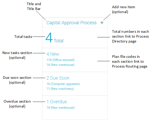
The component displays the following information for the current user, for a specified plan file process:
- The total number of tasks for the user
- The number of new tasks for the user (optional)
- The number of tasks due soon for the user (optional)
- The number of overdue tasks for the user (optional)
For each of the optional sections, the component displays the plan codes and descriptions for the plan file tasks in that category (up to a maximum number of items). You can also optionally allow users to create new plan files for on-demand file groups from this component.
The following screenshot shows an example component with the major sections and features annotated:
NOTE: The built-in hyperlinks to the process web pages always open in the Web Client (the user's browser), even if the form is open as an embedded web tab in the Desktop Client.
You can define the following properties for a Process Summary component.
Component properties can be configured using the Form Assistant task pane or the Form Designer unless otherwise noted. All properties can also be defined on the Form Control Sheet directly if desired. For example, if you want a property to be dynamic depending on the result of a formula, you can define that formula in the control sheet. To access the control sheet settings for the component, double-click any property name to go to that property in the Form Control Sheet.
Component behavior properties
The following properties control the display and behavior of this particular component type.
| Item | Description |
|---|---|
|
Selected Process |
Specifies the process to display in this component, based on a selected file group. Click the Choose a plan file process button [...] to select a file group or a file group alias. The selected file group must have a designated Plan File Process in its file group properties. The Process Summary component will use that process. If the designated process for the file group changes, the component will automatically update to use the new process. If the selected file group is a file group alias, then the component will use the process for the file group that the alias currently points to. If the alias is changed to point to a different file group, the component will automatically update to use the new file group and its designated process. In the Form Designer and Form Assistant, the Selected Process field displays the name of the plan file process that it is using, not the name of the selected file group or alias. However, if you look at the corresponding Form Control Sheet entry, the file group is indicated using shortcut syntax such as |
|
Title Text |
The title text for the component. This text displays in the title bar for the component within the Axiom form, if the title bar is enabled. If the title bar is disabled, then this text does not display at all in the form. |
|
Show Title Bar |
Specifies whether the title bar is visible. By default this option is enabled, which means that the component will display in a bordered box with a title bar across the top. The defined title text displays within the bar. The formatting of the title bar and its border are determined by the skin specified for the form. If disabled, then the title bar and its border will not display on the component. If the title bar is enabled and the component also has a separately defined border (either via a style or by using the formatting overrides in the advanced component settings), then both borders will display on the component. In some cases this effect may be desired; in other cases one of the borders should be disabled. |
|
Collapse Height |
Specifies whether the component automatically collapses in height if the configured component height is greater than the content to be shown in the component. You should leave this option disabled if you want the component height to always be the same, no matter how much content is available to display. If the content does not fill the component, then there will be blank space between the content and the bottom edge of the component. If you enable this option, then when the content does not fill the component, the component will auto-shrink to fit the content instead of maintaining its configured height. The component behavior when the content exceeds the available height is always the same: excess content will be excluded. In practice, this means that the number of plan file tasks in each section will be limited to whatever amount will fit in each section, rather than honoring the maximum tasks per section. |
|
Orientation |
Specifies how the sections in the component are presented within the form:
If you do not include any of the optional sections, then the component is essentially a square and the orientation does not matter. |
|
Show new item button |
Specifies whether users can create new on-demand plan files from the title bar of the component. By default, this is disabled. If enabled, then a plus icon displays in the title bar. Users can click the plus icon to create a new on-demand plan file in the file group. The file group is determined based on the specified process for the component. The plus icon only displays if:
When a user clicks the plus button, the designated Add File Form opens. The user can use this form as normal to create a new plan file. |
|
Task count text |
Defines text for the total tasks section. This section always displays the total number of current tasks for the current user, for the specified process. This section is always included. By default, this is set to |
|
Max tasks per section |
Specifies the maximum number of plan file tasks to show per section. By default, this is set to 2. If a section has active tasks, then the plan file names for those tasks display in the section, up to the maximum number of tasks per section. The plan file tasks display as hyperlinks that can be used to open the Process Routing page for that plan file. For more information, see Using the Process Routing page. The number of tasks that can be displayed per section depends on the overall height of the component (for either orientation), and on the number of optional sections that are configured to display (when using vertical orientation). The space available for each section is divided equally among the optional sections. If you are using all three sections, each section gets one third of the available height. If the maximum tasks do not fit within the available height, then a lesser number of tasks will display. |
|
Show new tasks |
Specifies whether to include a section for new tasks. This option is selected by default, which means that details about new tasks display in the component. If you disable this option, then the new tasks section does not display in the component. The number of days that a task is considered new is configured within the process definition. By default, tasks are considered new for 2 days after they are created for the task owner. |
|
New tasks header |
Defines header text for the new tasks section. This setting only applies if Show new tasks is enabled. By default, this is set to You can edit this text as desired, but if you want the number of new tasks to display, you must use the variable |
|
Show tasks due soon |
Specifies whether to include a section for tasks that are due soon. This option is selected by default, which means that details about tasks that are almost due display in the component. If you disable this option, then the due soon section does not display in the component. The number of days that a task is considered due soon is configured within the process definition. By default, tasks are considered due soon for 2 days until their due date. |
|
Due soon header |
Defines header text for the due soon section. This setting only applies if Show tasks due soon is enabled. By default, this is set to You can edit this text as desired, but if you want the number of new tasks to display, you must use the variable |
|
Show overdue tasks |
Specifies whether to include a section for overdue tasks. This option is selected by default, which means that details about overdue tasks display in the component. If you disable this option, then the overdue tasks section does not display in the component. |
|
Overdue tasks header |
Defines header text for the overdue tasks section. This setting only applies if Show overdue tasks is enabled. By default, this is set to |
The following general properties are available for all components:
| Item | Description |
|---|---|
|
Component Name |
The name of the component. This is for identification in the file; this name does not display on the Axiom form canvas. The name of the component identifies the corresponding settings for the component on the Form Control Sheet. The component names are also useful if you have multiple types of the same component within an Axiom form, so that you can tell which component you are currently editing. Component names must be unique within a file and must start with a letter. Names can only contain letters, numbers, and underscores. Names are validated when the file is saved; an invalid name will prevent the save. NOTE: Spaces are not allowed in component names and will be automatically removed by Axiom Software. For example, if you enter "My Component" as the component name, it will be automatically adjusted to "MyComponent". |
|
Visible |
Specifies whether the component is visible on the Axiom form (On/Off). By default this is set to On. This setting can be used to dynamically show or hide the component using a formula. Keep in mind that if you have multiple components that you need to dynamically show or hide based on the same condition, then it is preferable to place those components on a dedicated layer and then show or hide the entire layer instead of the individual components. NOTE: This setting is only available on the Form Control Sheet; it cannot be set in the Form Assistant or in the Form Designer. |
|
Layer |
The layer that the component belongs to on the Axiom form canvas. In the Form Assistant and the Form Designer, this displays as the layer name (for example: Layer 1). In the Form Control Sheet, this is recorded as the layer ID (for example: 1). If the canvas only has one layer, then the component is automatically assigned to that layer and cannot be changed. If the canvas has multiple layers, you can assign the component to any layer using the drop-down list. By default, the component will be assigned to whichever layer is selected in the Layers box when you initially drag the component onto the canvas. For more information on layers, see Using multiple layers on the canvas. If desired, you can jump to the applicable layer settings on the Form Control Sheet by clicking the binoculars icon |
|
Parent |
The parent component that this component is assigned to. If blank, then the component does not have an assigned parent. Currently, only Panel components can be designated as parents. If a component has an assigned parent, then that component is positioned within the parent instead of within the canvas at large. If the parent is hidden, all "child" components of that parent are also hidden. The parent assignment is automatically completed when a component is dragged into a panel in the Form Designer, and automatically cleared when a component is dragged out of a panel. In most cases, you should not need to manually assign a parent. For more information, see Using panels to group and position components. |
 next to the drop-down list.
Style and formatting properties
To define the component formatting, you can assign one or more styles to the component. Styles can impact formatting properties such as fonts, borders, and colors.
If you do not want to apply a style to this component, or if you want to override one or more formatting properties in an assigned style, click the Show Advanced Settings link underneath the Style box to display the individual formatting properties. For more information on defining individual formatting properties for a component, see Formatting overrides for Axiom form components.
Currently, the Axiom Software platform does not provide any styles specifically designed for Process Summary components. Only the generic styles are available. Most styling for the component is controlled by the form-level skin.
| Item | Description |
|---|---|
|
Style |
Optional. The styles used to determine the formatting of the component. You can assign one or more styles. Click the Select component styles button [...] to open the Choose Style dialog. Using this dialog, you can select one or more styles to apply to the component. The available styles depend on the component type and the skin assigned to the form. For more information, see Using component styles. Some components have several styles that are specifically designed for that component type, while other components may only have the "generic" styles that are available to all components. When using a generic style, keep in mind that they may not be useful for all components. You can view a description of each style and view the effective formatting applied by the selected styles within the Choose Style dialog. |
|
Component Theme |
(Deprecated.) The theme to use for the component instead of the form-level theme. If left blank, the component uses the form-level theme. This setting should be left blank unless you need to override the form theme. Generally speaking, themes should be set at the form level and only overridden at the component level when necessary. This setting is available in the advanced component properties (click Show Advanced Settings under the Style box). On the Form Control Sheet, the setting displays using the name Theme Override. NOTE: This setting only applies if your form uses a legacy skin (any skin except the default Axiom2018). The Axiom2018 skin does not use themes. |
You can view the position and size properties for a component by clicking the Show Advanced Settings link under the Style box. If necessary, you can edit these properties directly (instead of automatically modifying them by adjusting the component's position and size on the canvas). For more information on using these settings, see Controlling component position and size.
| Item | Description |
|---|---|
|
Reference Location |
The reference location determines how the x-position and y-position of a component are evaluated. By default the reference location is UpperLeft. NOTE: This setting is not exposed in the advanced component settings. It can be changed on the canvas by double-clicking the corner selection handles of a component, or you can edit the setting on the Form Control Sheet directly. |
|
X Position Y Position |
The x-position determines the component's position along the horizontal axis, and the y-position determines the component's position along the vertical axis. Both are evaluated relative to the reference location. Positions can be set in pixels (default) or percentages. |
|
Width Height |
The width and height determine the size of the component. The width and height can be set in pixels (default) or percentages. Size keywords are also available to support special behavior. |
|
Rendering Order |
The order in which the component is rendered in the layer. A component with a larger order number will display above a component with a smaller order number. For components that support tab navigation (tabbing to the next editable component), the rendering order also determines the tabbing order. NOTE: On the Form Control Sheet, this setting is labeled as Z-Index. |
|
Lock Layout |
If enabled, the component size and position are locked and cannot be changed by dragging and dropping on the canvas. This optional setting is intended to protect against accidentally moving or resizing a component while working on the canvas. |
