AX2146
for Axiom forms
The Pie Chart component displays data in a segmented circle, where the size of each "slice" is proportional to the size of the data point in relation to the overall total.
Defining a pie chart is a two-part process that requires the following:
- Creation of a PieChart data source in the spreadsheet to define the data to display in the chart.
- Placement and configuration of a Pie Chart component on the Axiom form canvas.
Pie charts can also support form interactivity, to change the contents of the Axiom form based on the currently selected slice in the chart.
NOTE: Your Axiom Software license determines whether you have access to this component. For more information, see Licensing requirements for Axiom forms.
A Pie Chart component must have a defined data source within the report to indicate the data for the slices. The tags for the data source are as follows:
Primary tag
Row tags
Column tags
NOTES:
- The primary tag must be placed in the first 500 rows of the sheet.
- Formulas can be used to create the tags, as long as the initial bracket and identifying keyword are whole within the formula.
The following example shows simple data flagged in a report. In real implementations this data would most likely be generated by an Axiom query or Axiom functions; here the data is simply typed in order to show the placement of the tags to the data.
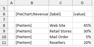
To use the Data Source Wizard to add the tags to a sheet, right-click in the cell where you want to start the data source and then select Create Axiom Form Data Source > Pie Chart. If the data already exists in the sheet, you can first highlight the labels and the values (in the example above, you would highlight C3:D6) and then use the wizard. Axiom Software will add the tags as displayed in the example above. The cells in the row above and the column to the left of the highlighted area must be blank in order for Axiom to place the tags in sheet.
The resulting chart would appear as follows:
You can define the following properties for a Pie Chart component.
Component properties can be configured using the Form Assistant task pane or the Form Designer unless otherwise noted. All properties can also be defined on the Form Control Sheet directly if desired. For example, if you want a property to be dynamic depending on the result of a formula, you can define that formula in the control sheet. To access the control sheet settings for the component, double-click any property name to go to that property in the Form Control Sheet.
Component behavior properties
The following properties control the display and behavior of this particular component type.
| Item | Description |
|---|---|
|
Data Source |
The data source for the chart. You must have defined the data source within the report using the appropriate tags in order to select it for the chart. NOTE: In the Form Control Sheet, the selected data source is written as SheetName!DataSourceName. The sheet name is the sheet where the selected data source is located. If a data source is already specified and you want to locate it within the file, click the Show location |
|
Data Source Load |
Specifies the loading behavior of the component:
|
|
Title Text |
The title text for the chart. This text displays in the title bar of the chart panel within the Axiom form, if the title bar is enabled. If the title bar is not enabled, then the text displays centered over the top of the chart. NOTE: The font type / size / weight / style of the title text are dependent on the style or skin and cannot be changed. |
|
Show Title Bar |
Specifies whether the title bar is visible. By default this option is enabled, which means that the component will display in a bordered box with a title bar across the top. The defined title text displays within the bar. The formatting of the title bar and its border are determined by the skin specified for the form. If disabled, then the title bar and its border will not display on the component. If the title bar is enabled and the component also has a separately defined border (either via a style or by using the formatting overrides in the advanced component settings), then both borders will display on the component. In some cases this effect may be desired; in other cases one of the borders should be disabled. |
|
Pie Kind |
The display type of the pie chart. You can specify Pie (default) or Donut. |
|
Legend |
The location of the chart legend. You can specify None for no legend, or specify a location such as Top, Bottom, Right, or Left. If no legend is used, then the value for each slice will be noted on the pie chart, either using callouts or on the slices themselves (depending on whether Place Labels on Slices is enabled). If a legend is used, then labels are not placed on the chart and the user must mouse over each slice to see the value. |
|
Selected Label |
The currently selected pie slice in the chart. This setting serves two purposes:
NOTES:
|
|
Explode Selected |
Specifies whether selected slices in the chart become "exploded" from the rest of the chart. These slices will be slightly separated from the rest of the chart with white space, and extended slightly outward. It is recommended to enable this item if the chart is set up to support interactivity, so that the user can clearly see which slice in the pie is selected. NOTE: If you want to explode certain slices of the chart for emphasis only, and have those items remain fixed (meaning, the user cannot change which slices are exploded by clicking on items), then you should not enable this option. Instead, you should use the |
|
Place Labels on Slices |
Specifies where labels should display on the pie chart, if a legend is not being used.
This setting only applies if Legend is set to None. If any particular slice is too small to legibly display the label, then you should disable this option. There is no way to configure a hybrid display (where labels display on large slices but callouts are used for small slices). |
|
Auto Submit |
Specifies whether the Axiom form automatically updates when a user selects a slice in the chart. By default, this is disabled. You should leave this option disabled if you have not set up your chart to support interactivity; otherwise the Axiom form will update unnecessarily if the user clicks on items in the chart. If enabled, then the form automatically updates when the user selects a slice in the chart. It is recommended to enable this option if the chart is set up to support interactivity, so that the user gets immediate feedback on their selection. |
 button to the right of the drop-down list. This will move your cursor to the associated data source tag in the file.
The following general properties are available for all components:
| Item | Description |
|---|---|
|
Component Name |
The name of the component. This is for identification in the file; this name does not display on the Axiom form canvas. The name of the component identifies the corresponding settings for the component on the Form Control Sheet. The component names are also useful if you have multiple types of the same component within an Axiom form, so that you can tell which component you are currently editing. Component names must be unique within a file and must start with a letter. Names can only contain letters, numbers, and underscores. Names are validated when the file is saved; an invalid name will prevent the save. NOTE: Spaces are not allowed in component names and will be automatically removed by Axiom Software. For example, if you enter "My Component" as the component name, it will be automatically adjusted to "MyComponent". |
|
Visible |
Specifies whether the component is visible on the Axiom form (On/Off). By default this is set to On. This setting can be used to dynamically show or hide the component using a formula. Keep in mind that if you have multiple components that you need to dynamically show or hide based on the same condition, then it is preferable to place those components on a dedicated layer and then show or hide the entire layer instead of the individual components. NOTE: This setting is only available on the Form Control Sheet; it cannot be set in the Form Assistant or in the Form Designer. |
|
Layer |
The layer that the component belongs to on the Axiom form canvas. In the Form Assistant and the Form Designer, this displays as the layer name (for example: Layer 1). In the Form Control Sheet, this is recorded as the layer ID (for example: 1). If the canvas only has one layer, then the component is automatically assigned to that layer and cannot be changed. If the canvas has multiple layers, you can assign the component to any layer using the drop-down list. By default, the component will be assigned to whichever layer is selected in the Layers box when you initially drag the component onto the canvas. For more information on layers, see Using multiple layers on the canvas. If desired, you can jump to the applicable layer settings on the Form Control Sheet by clicking the binoculars icon |
|
Parent |
The parent component that this component is assigned to. If blank, then the component does not have an assigned parent. Currently, only Panel components can be designated as parents. If a component has an assigned parent, then that component is positioned within the parent instead of within the canvas at large. If the parent is hidden, all "child" components of that parent are also hidden. The parent assignment is automatically completed when a component is dragged into a panel in the Form Designer, and automatically cleared when a component is dragged out of a panel. In most cases, you should not need to manually assign a parent. For more information, see Using panels to group and position components. |
Style and formatting properties
To define the component formatting, you can assign one or more styles to the component. Styles can impact formatting properties such as fonts, borders, and colors.
If you do not want to apply a style to this component, or if you want to override one or more formatting properties in an assigned style, click the Show Advanced Settings link underneath the Style box to display the individual formatting properties. For more information on defining individual formatting properties for a component, see Formatting overrides for Axiom form components.
Currently, the Axiom Software platform does not provide any styles specifically designed for pie charts. Only the generic styles are available.
NOTE: The colors used in the chart are determined by the data source. If colors are not specified in the data source, then they are determined by the style, theme, or skin (in that order).
| Item | Description |
|---|---|
|
Style |
Optional. The styles used to determine the formatting of the component. You can assign one or more styles. Click the Select component styles button [...] to open the Choose Style dialog. Using this dialog, you can select one or more styles to apply to the component. The available styles depend on the component type and the skin assigned to the form. For more information, see Using component styles. Some components have several styles that are specifically designed for that component type, while other components may only have the "generic" styles that are available to all components. When using a generic style, keep in mind that they may not be useful for all components. You can view a description of each style and view the effective formatting applied by the selected styles within the Choose Style dialog. |
|
Component Theme |
(Deprecated.) The theme to use for the component instead of the form-level theme. If left blank, the component uses the form-level theme. This setting should be left blank unless you need to override the form theme. Generally speaking, themes should be set at the form level and only overridden at the component level when necessary. This setting is available in the advanced component properties (click Show Advanced Settings under the Style box). On the Form Control Sheet, the setting displays using the name Theme Override. NOTE: This setting only applies if your form uses a legacy skin (any skin except the default Axiom2018). The Axiom2018 skin does not use themes. |
You can view the position and size properties for a component by clicking the Show Advanced Settings link under the Style box. If necessary, you can edit these properties directly (instead of automatically modifying them by adjusting the component's position and size on the canvas). For more information on using these settings, see Controlling component position and size.
| Item | Description |
|---|---|
|
Reference Location |
The reference location determines how the x-position and y-position of a component are evaluated. By default the reference location is UpperLeft. NOTE: This setting is not exposed in the advanced component settings. It can be changed on the canvas by double-clicking the corner selection handles of a component, or you can edit the setting on the Form Control Sheet directly. |
|
X Position Y Position |
The x-position determines the component's position along the horizontal axis, and the y-position determines the component's position along the vertical axis. Both are evaluated relative to the reference location. Positions can be set in pixels (default) or percentages. |
|
Width Height |
The width and height determine the size of the component. The width and height can be set in pixels (default) or percentages. Size keywords are also available to support special behavior. |
|
Rendering Order |
The order in which the component is rendered in the layer. A component with a larger order number will display above a component with a smaller order number. For components that support tab navigation (tabbing to the next editable component), the rendering order also determines the tabbing order. NOTE: On the Form Control Sheet, this setting is labeled as Z-Index. |
|
Lock Layout |
If enabled, the component size and position are locked and cannot be changed by dragging and dropping on the canvas. This optional setting is intended to protect against accidentally moving or resizing a component while working on the canvas. |
Interactive behavior
The Pie Chart component can be set up to allow the user to select a slice in the chart. The selected slice is submitted back to the source file, and written to the Selected Label setting on the Form Control Sheet, using the name from the [Label] column of the data source. Once a slice is selected, the user can either click on a different slice to change the selection, or click on the same slice to clear the selection.
If you want the Axiom form to respond to the currently selected item, then you must set up the file so that another component references the selected item and changes based on it. For more information on setting up interactive components for an Axiom form, see Using interactive components in an Axiom form.
Chart interactivity is intended to support chart drilling based on the currently selected item. For example the user may want to see more detail about the data that makes up a particular slice in the pie chart.
Example
The Axiom form could contain a pie chart that shows a breakdown of revenue sources. If you want users to be able to see more details about the data in any particular slice, you could set up a second chart that references the selected label of the first chart. For example, if the user selects the Retail Stores slice in the first chart, the second chart will be updated to show revenue by individual store.
Pie Chart formatting notes
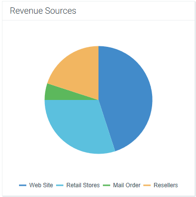
If a legend is enabled for the pie chart, then the values do not display directly on the chart. Users can hover their cursor over the pie slices to see the values, as shown in the following screenshot.
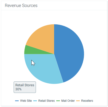
If no legend is present, then the pie labels and values are noted using callouts, as shown in the following screenshot. Alternatively, you can use the Place Labels on Slices option to display the labels and values on each individual slice instead of using callouts (however, this option is only recommended for pie charts with a small number of slices and short labels).
In some cases, if the callout text does not fit within the area allotted for the component, the callout may extend past the edge of the component and partially disappear. If this occurs, you can try the following options to correct the situation:
-
Resize the component slightly larger or smaller. The size adjustment may cause the text to fit or allow the text to automatically wrap. (However, remember that if Scale to Fit is enabled for your form, then the issue may arise again as the form is dynamically sized larger or smaller.)
-
If appropriate, you can manually place line breaks within the label text by adding the characters
\nto the label text. For example, if the label text is defined as "Greater Metropolitan Area \n of Cleveland," then a line break will be placed after "Area." If line breaks are used, then automatic text wrapping is not applied to the label and only the marked breaks are honored. -
If the callouts still will not fit, then you may need to manually shorten the text by abbreviating the labels or changing the value format, or switch to using a chart legend instead.
In all cases, the format for the value is taken from the format used in the Values column of the data source, in the spreadsheet. For example, if the value is formatted as a percent in the spreadsheet, then it will display as a percent in the pie chart. If the value is formatted as a plain integer in the spreadsheet, or as a decimal, then it will display in that format in the pie chart.
