AX1590
for Axiom forms
The Menu component displays a menu control in an Axiom form. Users can select items from the menu to change the current contents shown in the form, or to open content in a new window. For example, menu components can be used to:
-
Display different Panel components in an Axiom form, where each item in the menu corresponds to a different panel. As a user selects different items on the menu, the currently visible panel changes as appropriate. (Layers could also be used instead of panels.)
-
Display different "child" forms embedded within a "parent" form, where each item in the menu corresponds to a different child form. In this example, the parent form serves as a "frame" that contains the Menu component and an Embedded Form component. As a user selects different items on the menu, the Embedded Form component displays the corresponding child form. For more information, see Using embedded forms.
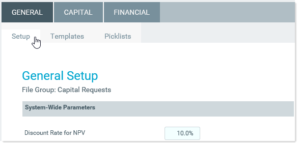
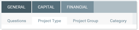
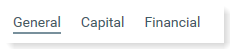
Menus can be displayed using various styles, such as tabular menus and drop-down menus. The following screenshot shows an example tabular menu with two levels:
Defining a menu is a two-step process that requires the following:
- Creation of a Menu data source in the spreadsheet to define the items to display in the menu.
- Placement and configuration of a Menu component on the Axiom form canvas.
NOTE: This component requires Use Web Client Container to be enabled for the form. By default, the Web Client container is enabled for new forms. For more information, see Using the Web Client Container with Axiom forms.
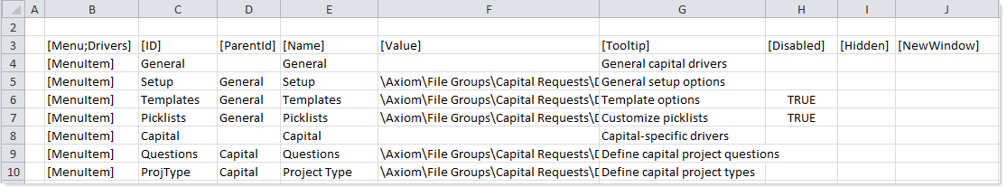
A Menu component must have a defined data source within the file to define the items to display in the menu. The tags for the Menu data source are as follows:
Primary tag
Row tags
Column tags
NOTES:
- The primary tag must be placed in the first 500 rows of the sheet.
- Formulas can be used to create the tags, as long as the initial bracket and identifying keyword are whole within the formula.
The following example data source defines a menu with two levels.
To use the Data Source Wizard to add the tags, right-click a cell and select Create Axiom Form Data Source > Menu. You can right-click a single empty cell to place the initial tags and then fill out the data, or you can have the data already in the spreadsheet and highlight the applicable data to add the tags. The cells in the row above the data and the column to the left of the data must be blank in order for Axiom to place the tags in sheet.
The resulting menu would display in the form as follows, depending on the configured type of the Menu component (Tabular or Drop-Down):
Tabular format
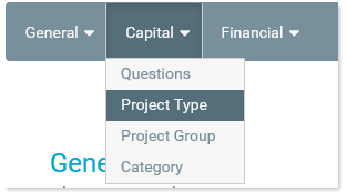
Drop-down format
The Link format does not support multiple-level menus, so the example data source shown above could not be used. However, if the data source only had top-level items with values, the menu would display as follows when using Link format:
Link format
You can define the following properties for a Menu component.
Component properties can be configured using the Form Assistant task pane or the Form Designer unless otherwise noted. All properties can also be defined on the Form Control Sheet directly if desired. For example, if you want a property to be dynamic depending on the result of a formula, you can define that formula in the control sheet. To access the control sheet settings for the component, double-click any property name to go to that property in the Form Control Sheet.
Component behavior properties
The following properties control the display and behavior of this particular component type.
| Item | Description |
|---|---|
|
Data Source |
The data source for the component. You can select any defined Menu data source in the file. NOTE: In the Form Control Sheet, the selected data source is written as SheetName!DataSourceName. The sheet name is the sheet where the selected data source is located. If a data source is already specified and you want to locate it within the file, click the Show location |
|
Menu Type |
The display format of the menu. Select one of the following:
|
|
Selected ID |
The currently selected item in the menu. This setting serves two purposes:
In certain cases the ID and value are not written back to the source file, such as when a menu item is used to open a URL in a new window. For more information, see Specifying the value for a menu item. |
|
Selected Value |
When a user selects an item from the menu, the defined value from the NOTE: This setting is only available on the Form Control Sheet. The Selected Value cannot be used to set a default value for the menu; the Selected ID should be used instead. |
|
Parent Menu Buttons |
Optional. The name of one or more Button components to display on the parent (top-level) menu bar. Only applies if the Menu Type is Tabular. Separate multiple names with semicolons. Buttons display in the order listed. This feature can be used to display a button "toolbar" on the right-hand side of the menu. For more information on how to set up this feature, see Displaying buttons on the menu. |
|
Child Menu Buttons |
Optional. The name of one or more Button components to display on the child (bottom-level) menu bar. Only applies if the Menu Type is Tabular. Separate multiple names with semicolons. Buttons display in the order listed. This feature can be used to display a button "toolbar" on the right-hand side of the menu. For more information on how to set up this feature, see Displaying buttons on the menu. |
 button to the right of the drop-down list. This will move your cursor to the associated data source tag in the file.
The following general properties are available for all components:
| Item | Description |
|---|---|
|
Component Name |
The name of the component. This is for identification in the file; this name does not display on the Axiom form canvas. The name of the component identifies the corresponding settings for the component on the Form Control Sheet. The component names are also useful if you have multiple types of the same component within an Axiom form, so that you can tell which component you are currently editing. Component names must be unique within a file and must start with a letter. Names can only contain letters, numbers, and underscores. Names are validated when the file is saved; an invalid name will prevent the save. NOTE: Spaces are not allowed in component names and will be automatically removed by Axiom Software. For example, if you enter "My Component" as the component name, it will be automatically adjusted to "MyComponent". |
|
Visible |
Specifies whether the component is visible on the Axiom form (On/Off). By default this is set to On. This setting can be used to dynamically show or hide the component using a formula. Keep in mind that if you have multiple components that you need to dynamically show or hide based on the same condition, then it is preferable to place those components on a dedicated layer and then show or hide the entire layer instead of the individual components. NOTE: This setting is only available on the Form Control Sheet; it cannot be set in the Form Assistant or in the Form Designer. |
|
Layer |
The layer that the component belongs to on the Axiom form canvas. In the Form Assistant and the Form Designer, this displays as the layer name (for example: Layer 1). In the Form Control Sheet, this is recorded as the layer ID (for example: 1). If the canvas only has one layer, then the component is automatically assigned to that layer and cannot be changed. If the canvas has multiple layers, you can assign the component to any layer using the drop-down list. By default, the component will be assigned to whichever layer is selected in the Layers box when you initially drag the component onto the canvas. For more information on layers, see Using multiple layers on the canvas. If desired, you can jump to the applicable layer settings on the Form Control Sheet by clicking the binoculars icon |
|
Parent |
The parent component that this component is assigned to. If blank, then the component does not have an assigned parent. Currently, only Panel components can be designated as parents. If a component has an assigned parent, then that component is positioned within the parent instead of within the canvas at large. If the parent is hidden, all "child" components of that parent are also hidden. The parent assignment is automatically completed when a component is dragged into a panel in the Form Designer, and automatically cleared when a component is dragged out of a panel. In most cases, you should not need to manually assign a parent. For more information, see Using panels to group and position components. |
Style and formatting properties
To define the component formatting, you can assign one or more styles to the component. Styles can impact formatting properties such as fonts, borders, and colors.
Currently, the Axiom Software platform does not provide any styles specifically designed for Menu components. Only the generic styles are available. Additionally, menu components do not have component-specific formatting properties.
| Item | Description |
|---|---|
|
Style |
Optional. The styles used to determine the formatting of the component. You can assign one or more styles. Click the Select component styles button [...] to open the Choose Style dialog. Using this dialog, you can select one or more styles to apply to the component. The available styles depend on the component type and the skin assigned to the form. For more information, see Using component styles. Some components have several styles that are specifically designed for that component type, while other components may only have the "generic" styles that are available to all components. When using a generic style, keep in mind that they may not be useful for all components. You can view a description of each style and view the effective formatting applied by the selected styles within the Choose Style dialog. |
|
Component Theme |
(Deprecated.) The theme to use for the component instead of the form-level theme. If left blank, the component uses the form-level theme. This setting should be left blank unless you need to override the form theme. Generally speaking, themes should be set at the form level and only overridden at the component level when necessary. This setting is available in the advanced component properties (click Show Advanced Settings under the Style box). On the Form Control Sheet, the setting displays using the name Theme Override. NOTE: This setting only applies if your form uses a legacy skin (any skin except the default Axiom2018). The Axiom2018 skin does not use themes. |
You can view the position and size properties for a component by clicking the Show Advanced Settings link under the Style box. If necessary, you can edit these properties directly (instead of automatically modifying them by adjusting the component's position and size on the canvas). For more information on using these settings, see Controlling component position and size.
| Item | Description |
|---|---|
|
Reference Location |
The reference location determines how the x-position and y-position of a component are evaluated. By default the reference location is UpperLeft. NOTE: This setting is not exposed in the advanced component settings. It can be changed on the canvas by double-clicking the corner selection handles of a component, or you can edit the setting on the Form Control Sheet directly. |
|
X Position Y Position |
The x-position determines the component's position along the horizontal axis, and the y-position determines the component's position along the vertical axis. Both are evaluated relative to the reference location. Positions can be set in pixels (default) or percentages. |
|
Width Height |
The width and height determine the size of the component. The width and height can be set in pixels (default) or percentages. Size keywords are also available to support special behavior. |
|
Rendering Order |
The order in which the component is rendered in the layer. A component with a larger order number will display above a component with a smaller order number. For components that support tab navigation (tabbing to the next editable component), the rendering order also determines the tabbing order. NOTE: On the Form Control Sheet, this setting is labeled as Z-Index. |
|
Lock Layout |
If enabled, the component size and position are locked and cannot be changed by dragging and dropping on the canvas. This optional setting is intended to protect against accidentally moving or resizing a component while working on the canvas. |
NOTE: The height of the component is fixed when using the tabular menu type. Changing the height property is not recommended and will not affect the display of the component (though it could potentially affect the menu hover behavior, if Axiom Software thinks that the component is taller than it actually renders). When using the drop-down menu type, the component will honor the height setting, though only the background color will expand to fill the space—the menu names will remain the same size.
Interactive behavior
The Menu component is intended to be used as in-form navigation, to change the contents shown in the form based on the currently selected item in the menu.
When a user clicks on an item in the menu, the ID for the item is submitted back to the source file, and written to the Selected ID cell on the Form Control Sheet. Additionally, the corresponding value for the item is written to the Selected Value cell on the Form Control Sheet. Both the ID and the value are obtained from the Menu data source.
NOTE: Menu components always auto-submit in response to clicking menu items, when the item is not being opened in a new window. If the item is opened in a new window, then no values are submitted and no form update occurs.
If you want the Axiom form to respond to the currently selected item, then you must set up the file so that something else in the file references the selected value and changes based on it. For more information on setting up interactive components for an Axiom form, see Using interactive components in an Axiom form.
Example
The Axiom form can contain an Embedded Form component to display a child form within the current parent form, and the values in the Menu data source can be file paths to Axiom forms. The Embedded Form component can be linked to the Menu component by using the Source Menu Component property of the Embedded Form component. This causes the Embedded Form component to automatically use the current selected value of the menu as its target form.
You could also use the selected ID or selected value of the Menu component in other ways, such as to define the text of a Label component. The Text field of the Label component could use a formula that references the Selected ID cell of the Menu component. As the user selects items in the menu, the text of the Label component would update to show the currently selected item.
Specifying the value for a menu item
When specifying the value for a menu item, use the following entries:
| Value | Description |
|---|---|
|
<Blank> |
You can leave the value blank if the menu item is a parent item with child menu items. For more information on using parent and child menu items, see Creating multi-level menus. If the value is blank, clicking on the item expands the menu to show the child items. No other action occurs. The selected ID and value are left as is. If the menu type is drop-down, then it is required to leave the value blank for parent items. |
|
Path to Axiom form |
You can enter a file path to a form-enabled file, in order to open that form within an Embedded Form component, or to open it in a new window. The file path can be specified with or without the \Axiom\Reports Library\Forms\MyFile.xlsx document://\Axiom\Reports Library\Forms\MyFile.xlsx The menu item behaves as follows:
NOTES:
|
|
Component or layer name |
You can enter the name of a component or a layer in the form, in order to dynamically show that component or layer when it is the selected value. Panel components and layers are most likely to be used here, since they can define entire "screens" worth of content. However, you could also use the menu to switch between showing certain charts, maps, or other components. When the menu item is selected, the selected ID and value are written back to the source file. The file must be configured to change in some way based on this value. For example, imagine that you have 3 Panel components that correspond to 3 menu items. When the selected value is Panel1, then Panel1 should be visible and the other panels should be hidden. It is up to the form designer to set up the necessary formulas to show and hide the panels. The |
|
URL |
You can enter a URL, in order to open that URL in the current window or a new window. The URL can be to a web site, or to an Axiom file (such as a URL created using GetFormDocumentURL). When the value is a URL, clicking on the menu item opens the target URL. No other action occurs. The selected ID and value are left as is. NOTE: This is the only way to open an Axiom spreadsheet file using the Menu component. If you generate a URL to the file using the GetDocumentHyperlink function, the link will launch the Desktop Client and open the spreadsheet file. |
You can use other values as needed, as long as you set up the form to respond to the selected ID or value. For example, you might set the value to the menu ID or name, and then use formulas to show or hide rows in a grid based on the selected ID or value.
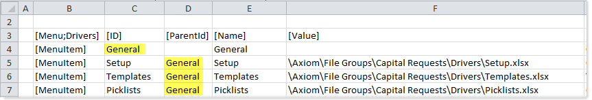
You can create multi-level menus by assigning a parent ID to a menu item. This causes the child item to display underneath the parent item on the menu. To do this, enter the ID of the parent item into the [ParentID] cell of the child item.
The following example shows a Menu data source using parent IDs to create multi-level menus. In row 4, the General menu item is a top-level parent item because it does not have an assigned parent ID. In row 5, the Setup menu item is assigned General as a parent ID, so it will display underneath the General menu item (as will the items in rows 6 and 7).
See the following sections for multi-level design considerations by menu type.
Tabular
Tabular menus can only have two levels of menu items (parent and child). When a user clicks on a parent item, the child items display in a 2nd level of tabs, underneath the top-level items.
Parent items in tabular menus can optionally have an assigned value, or the value can be left blank. When a user clicks on the parent item in a tabular menu, the selected ID and value are handled as follows:
- If the parent item has an assigned value, that value is used.
- If the parent item does not have an assigned value, then the first child item is selected by default. If the user selects a child item in the sub-menu, that item will be remembered the next time the user clicks on the parent item in the current session.
Using the example data source shown previously, the first time the user clicks on General, the Setup child item is selected by default (because General does not have an assigned value). Now imagine the user clicks on Templates, and then later clicks on a different parent item. If the user goes back to General, now the Templates menu item is selected, because the user's previous selection in that sub-menu is remembered.
Drop-Down
Drop-down menus can have any number of levels. The behavior of the child items depends on the level of the parent:
- If the parent is a top-level menu item, the child items are shown in a drop-down menu that expands underneath the parent.
- If the parent is not a top-level menu item, the child items are shown in a side menu that expands to the right of the parent.
When using the drop-down menu, the user must first click on the parent item in order to view the child items. However, once a menu has been expanded, the user can hover their cursor over other menu items to view the child items.
Parent items in drop-down menus cannot have assigned values. If a parent item has an assigned value, then clicking on the parent item will activate the parent value instead of opening the drop-down menu.
Link
Link menus do not support multiple levels. Any items with parent IDs will not be accessible using the link menu.
Passing document variables using a menu
Using the [DocumentVariables] column in the data source, you can pass values to the target form. This feature only applies when the value for the menu item is a path to an Axiom form. The form can be opened as a child form within an Embedded Form component, or the form can be opened in a new window.
For example, you might want to use a menu to open the same child form repeatedly, applying different values each time the form is opened using a different menu item. Using the [DocumentVariables] column in the data source, you can set values for each menu item, and automatically apply those values when the user selects the menu item and opens the target form.
The following data source shows an example of passing variable values using a menu:
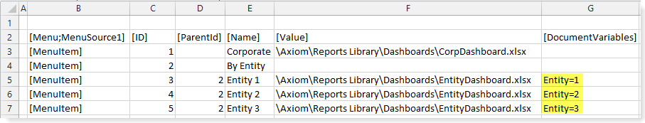
In this example, IDs 3-5 all reference the same target form in the [Value] column. When a user clicks on ID 3 in the menu, the Entity value of 1 is passed to the target form. Then when a user clicks on ID 4 in the menu, the Entity value of 2 is now passed to the target form. Assuming that the target form is set up to filter data queries based on the value of Entity, the form will show different data depending on the currently selected ID in the menu.
The variable values can be returned in the target form by using the GetDocumentInfo function. For example:
=GetDocumentInfo("Variable","Entity")
This returns the passed value of Entity when the target form is opened.
Displaying buttons on the menu
You can display one or more Button components on the right-hand side of a tabular menu, on either the top-level parent menu or the bottom-level child menu. This feature can be used to display a button "toolbar" on the menu.
To display buttons on the menu, do the following:
-
Create a dedicated layer to hold the buttons, and configure that layer to not be visible on the form. On the Form Control Sheet, set Visible to Off.
-
Create the Button components, and place them on the layer. Although the layer is configured as not visible, the buttons on the layer must have Visible set to On in order to show on the menu.
You can use any type of button, but link-style buttons often look best in this environment. You can use text, symbols, and images, but remember that the buttons must fit in the space allotted to the menu bar.
The position of the button on the layer does not matter, because the button will be automatically positioned on the right-hand side of the menu bar. However, the size of the button matters. The button height should be no greater than 40px (the height of the menu bar). The button width should be no wider than necessary to hold the button text and/or symbol, because extra blank space may throw off the spacing of the buttons.
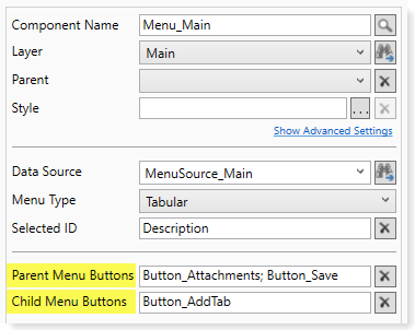
- Enter the Button component names into either the Parent Menu Buttons property or the Child Menu Buttons property of the Menu component, depending on where you want the buttons to display. Separate multiple button names with semicolons.
The following example shows a Menu component that is configured to display buttons on the menu. Two buttons will be shown on the top parent menu bar, and one button will be shown on the bottom child menu bar.
When the menu is rendered, the buttons are displayed on the far right-hand side, as shown in the following screenshot. Because the buttons are integrated with the Menu component, the buttons are automatically positioned on the menu.
In this example, the buttons are all link-style buttons using symbols instead of text. Alternatively the buttons could have used text such as "Attachments" and "Save", with or without the symbols. Remember that the Tooltip property on the Button components can be used to display helper text when a user hovers over a button.
If the [HelpCode] property is populated in the Menu data source, this causes a question mark icon (help button) to display in the far right of the menu bar. In this case, the parent and child menu buttons are moved slightly to the left, with extra space between the "toolbar" buttons and the help button.
Although you can instead simply place a Button component on top of the Menu component on the form canvas, this approach is not ideal. It can be difficult to manually position the button properly, and since the button is not actually part of the menu, the button will not automatically adjust to the menu (such as when the menu tabs overflow). It is recommended to use the official method of placing buttons on the menu, so that the menu and buttons adjust together.
Menu display behavior notes
-
When using the tabular or link menu, if the number of menu items on a level exceeds the available horizontal space for the menu, the remaining items are displayed in a drop-down list. This list is accessible by clicking the ... (ellipses) that display at the far right end of the menu.
-
When using the drop-down menu, the menu overflows to additional rows if all items cannot be displayed on the first row.
-
When using the tabular or link menu, the currently active item is indicated on the menu. For tabular menus, the active top-level item uses a dark background, and the active child item uses a light background. For link menus, the active item is displayed with an underline.
-
The link menu is shown in dark gray font with gray underline. Currently, there is no way to style the link menu to display as blue hyperlinks.
