AX1257
for Axiom forms
The Map View component displays geospatial data on a map. The component can be used to plot comparative data on a map (for example, using bigger circles to indicate greater revenue at a location), or the component can serve as an geographical selection tool to interactively display additional data based on the user's selected point on the map.
Defining a map view is a multiple-step process that requires the following:
-
Creation of a MapView data source in the spreadsheet to define the data to display in the chart.
-
Placement and configuration of a Map View component on the Axiom form canvas.
-
Optional. Import of a GEO Feature file into the Reports Library to provide mapping shapes and feature data. For more information, see Using GEO Feature Files and Map Tiles with Map View components.
NOTE: Your Axiom Software license determines whether you have access to this component. For more information, see Licensing requirements for Axiom forms.
A Map View component must have a defined data source within the report to indicate the data for the map. Each row in the data source is used for one of the following purposes:
-
To define a specific location on the map, indicated by the latitude and longitude of the location. This location can be marked on the map using a pin or a circle. Circles can display in relative size based on some aspect of the location.
-
To define properties for a feature (shape) displayed on the map, as defined in the GEO Feature File used by the Map View component. For example, if the GEO Feature File defines U.S. states, then each state can optionally be defined in the data source to set certain properties about the state on the map.
Depending on the purpose of your map view (and whether or not you are using a GEO Feature File), your data source may have a mixture of both types of rows, or just "location" rows, or just "feature" rows. For example, you might display various locations on a map view using either pins or relative circles and not use a GEO Feature File at all. Or at the other extreme you might only display "features" on a map so that users can select the features to view associated data (like state data), and not plot any specific locations at all. For more information, see Using GEO Feature Files and Map Tiles with Map View components.
The tags for the data source are as follows:
Primary tag
Row tags
Column tags
Column tags (optional)
The following optional tags are not added by the data source wizard; you must manually add them to the data source as needed.
- [PopupText]
-
Text to display in a popup text box when a user clicks on the pin, circle, or feature. For example, instead of using
[LabelText], you may want to display the label as a popup.IMPORTANT: If popup text is defined, then auto-submit is disabled for the item and no refresh will occur when the item is selected. You will not be able to reference the selected item to trigger changes in the form. The only thing users can do with the item is click on it to read the popup text.
- [Href]
-
A URL to open in a new window when the pin, circle, or feature is selected in the map. You can use functions such as GetFormDocumentURL or GetDocumentHyperlink to generate hyperlinks to open Axiom forms or other Axiom files.
- [SeriesName]
-
The name of the series. This can be used to group multiple rows in the data source by assigning them the same series name. Currently the Map View component does not do anything with this information, but you can use it in the data source to set other properties to the same value for all rows belonging to the group—for example, to set the
[FillColor]the same for all series that use the same series name. - [LineColor]
-
For Feature rows, this value defines the color of the line used to draw the feature shape. For Circle rows, this value defines the border color for the circle. You can use basic color names (for example, Blue) or you can enter valid hexadecimal color codes (for example #00FFFF for Aqua).
If omitted, the Text Color specified in the component settings is used. This value does not apply to Pin rows.
- [LineSize]
-
For Feature rows, this value defines thickness of the line (in pixels) used to draw the feature shape. If omitted, the Feature Line Width specified in the Map Component settings is used.
For Circle rows, this value defines the thickness of the border (in pixels) for the circle. If omitted, the circle does not have a border.
This value does not apply to Pin rows.
- [DashSize]
-
Determines whether a dashed line should be used for Feature rows and Circle rows. To display dashed lines, specify the gap between dashes in pixels. If omitted, lines are solid. This value does not apply to Pin rows.
- [LabelColor]
-
The color of the label text. You can use basic color names (for example, Blue) or you can enter valid hexadecimal color codes (for example #00FFFF for Aqua). If omitted, the color will be determined by the Text Color in the Map View component settings.
- [LabelPosition]
-
The position of the label text. This is based on a 9-point grid similar to a touch-phone keypad, with 1 as the top left position, 5 as the middle position, and 9 as the bottom right position. If omitted, the default is 5 (center). See example...
For Pin and Circle rows, the position is relative to the marker (treating the marker as the middle of the 9-point grid). For Feature rows, the feature shape is treated as if the 9-point grid is overlaid on the shape. If a
[Lat]and[Lon]have been defined for a Feature row, then that location will be used as the center point of the grid. Some trial and error with[LabelPosition]and[LabelBoxSize]may be necessary to find a good position within certain feature shapes (or specify a[Lat]and[Lon]to place the label at a specific location within the feature shape). - [LabelBoxSize]
-
Defines an alternate size for the label position points, in pixels. Larger box sizes mean that the position points will be farther away from each other and from the relative center.
- [FontStyle]
-
The style of the font used for the label text, either
Default(the style determined by the form-level skin),Normal, orItalic. If omitted the default style is used. - [FontSize]
-
The size of the font used for the label text, in pixels. If omitted the size is determined by the form-level skin.
- [FontFamily]
-
The font family used for the label text. If omitted, the system default for sans serif font will be used. If you specify a font family, it is strongly recommended to use a very common, basic font such as Arial, which all client machines and devices are likely to support.
- [FontWeight]
-
The weight of the font used for the label text, either
Default(the weight for the form-level skin),Normal, orBold. If omitted the default weight is used.
NOTES:
- The primary tag must be placed in the first 500 rows of the sheet.
- Formulas can be used to create the tags, as long as the initial bracket and identifying keyword are whole within the formula.
The following example shows simple mapping data flagged in a report. In this example the data source contains both pin locations and features from the GEO Feature File.
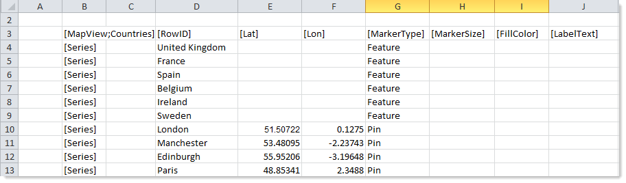
To use the Data Source Wizard to add the tags, right-click a cell and select Create Axiom Form Data Source > Map View. You can right-click a single empty cell to place the initial tags and then fill out the data, or you can have the data already in the spreadsheet and highlight the applicable data to add the tags. The cells in the row above the data and the column to the left of the data must be blank in order for Axiom to place the tags in sheet.
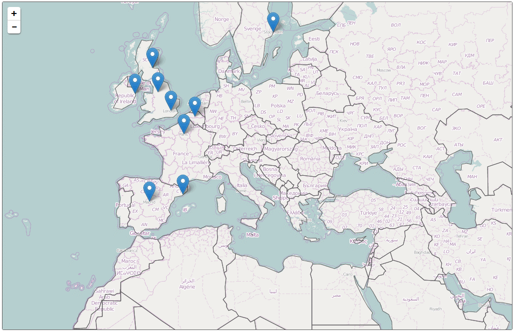
The resulting chart would appear as follows. This example assumes use of a Map Tile Provider in addition to the GEO Feature File that defines the country shapes (drawn with a dark gray outline here).
You can define the following properties for a Map View component.
Component properties can be configured using the Form Assistant task pane or the Form Designer unless otherwise noted. All properties can also be defined on the Form Control Sheet directly if desired. For example, if you want a property to be dynamic depending on the result of a formula, you can define that formula in the control sheet. To access the control sheet settings for the component, double-click any property name to go to that property in the Form Control Sheet.
Component behavior properties
The following properties control the display and behavior of this particular component type.
| Item | Description |
|---|---|
|
Data Source |
The data source for the component. You must have defined the data source within the report using the appropriate tags in order to select it for the component. NOTE: In the Form Control Sheet, the selected data source is written as SheetName!DataSourceName. The sheet name is the sheet where the selected data source is located. If a data source is already specified and you want to locate it within the file, click the Show location |
|
Data Source Load |
Specifies the loading behavior of the component:
|
|
Selected Value |
The currently selected item in the map (a pin, circle, or feature). This setting serves two purposes:
NOTES:
|
|
Lat, Lon, Zoom |
The starting latitude, longitude, and zoom level for the map. The specified location will be centered in the middle of the component area, displayed at the specified zoom level. Each value must be entered in the stated order, separated by commas. The latitude and longitude must be expressed in decimal degrees. The zoom level is an integer from 1-18, where 1 is fully zoomed in and 18 is fully zoomed out. By default, the latitude and longitude are set to the middle of the United States. One good approach to finding the best starting value for your map is to enable Show Map Params and Allow Map Navigation and then preview your form. Center and zoom the map as desired, and then highlight and copy the values displayed in the bottom left corner of the component. You can then copy these values into the Lat,Lon,Zoom field. These values are only applied when the form is first opened. When the form is refreshed using a Button component or auto-submit behavior on an interactive component, the map does not return to these starting coordinates; instead the user's current location is retained. |
|
Show Map Params |
Specifies whether the current map parameters—latitude, longitude, and zoom level—will display in the bottom left corner of the form. By default this is disabled, which means the parameters will not display. |
|
Allow Map Navigation |
Specifies whether users can move and zoom the map. By default this is enabled, which means:
If this option is disabled, then the map display is fixed at its starting Lat,Lon,Zoom setting. |
|
Map Tiles Provider |
The provider of map tiles to display in the component. By default this is set to None, which means no map tiles will display. You must specify either a Map Tiles Provider or a GEO Feature File URI (or both) to define the map graphic for the Map View component. For more information, see Using GEO Feature Files and Map Tiles with Map View components. |
|
GEO Feature File URI |
The file that contains the set of GeoJSON "features" (geographical shapes) to display in the component. The file contents must use the GeoJSON specification and the file type must be JSON. Click the [...] button to select the file. The file must be located in the Reports Library. If the file is not already saved in the Reports Library, you can right-click a folder and select Import to import the file (if you have the appropriate rights to do so). You must specify either a Map Tiles Provider or a GEO Feature File URI (or both) to define the map graphic for the Map View component. For more information, see Using GEO Feature Files and Map Tiles with Map View components. If you specify a GEO Feature File, then several optional feature properties become available, as detailed in the following table. |
|
Title Text |
The title text for the component. This text displays in the title bar of the component panel within the Axiom form, if the title bar is enabled. If the title bar is not enabled, then the text does not display. In the latter case you can alternatively use a separate Label component to create a chart title. NOTE: The font type / size / weight / style of the title text are dependent on the form-level skin and cannot be changed. |
|
Show Title Bar |
Specifies whether the title bar is visible. By default this option is enabled, which means that the component will display in a bordered box with a title bar across the top. The defined title text displays within the bar. The formatting of the title bar and its border are determined by the skin specified for the form. If disabled, then the title bar and its border will not display on the component. If the title bar is enabled and the component also has a separately defined border (either via a style or by using the formatting overrides in the advanced component settings), then both borders will display on the component. In some cases this effect may be desired; in other cases one of the borders should be disabled. |
 button to the right of the drop-down list. This will move your cursor to the associated data source tag in the file.
Feature properties
The following optional feature properties are only available if a GEO Feature File has been specified.
| Item | Description |
|---|---|
|
Feature Line Width |
The width of the feature lines defined by the specified GEO Feature File, in pixels. This setting is only used if no size is defined for a feature in the If left blank, and if |
|
Feature Fill Color |
The fill color of the features defined by the specified GEO Feature File. This setting is only used if no fill color is defined for a feature in the If left blank, and if Click the [...] button to open the Choose Color dialog. You can select from the colors displayed at the top of the dialog, or you can enter a valid RGB or hexadecimal color code (such as #00FFFF for Aqua). Click OK to use the specified color. If you are modifying the Form Control Sheet directly, then you must use a hexadecimal code. For an example list of colors and hexadecimal codes, see: http://www.w3.org/TR/css3-color/#svg-color (external link). |
|
Feature ID Property |
The property in the specified GEO Feature File that identifies each individual feature. Enter the name of a property defined in the file. Only applies if a GEO Feature File URI is specified. NOTE: This setting is case-sensitive and must match the property in the GEO Feature File exactly. For example, if the property is defined as "code" in the file then you must enter "code" into the Feature ID Property; "Code" will not be recognized. This property is used to enable interactivity for the map features. When a feature is selected in the map, the property value for the selected feature will be written to the Selected Value field for the Map View component. The form can then be configured to change in some way based on the selected feature. The property can also be used in the If this setting is left blank, then the features in the form will not be selectable, and you will not be able to define formatting for the features in the data source. |
|
Feature Description Property |
The property in the specified GEO Feature File that contains descriptive text that you want to display as popup text when the user clicks on the feature. Enter the name of a property defined in the file. This setting only applies if a GEO Feature File URI is specified, and the description is only displayed for features that are not defined in the data source. Additionally, Filter Unmatched Features must be disabled. NOTE: This setting is case-sensitive and must match the property in the GEO Feature File exactly. For example, if the property is defined as "name" in the file then you must enter "name" into the Feature Description Property; "node" will not be recognized. IMPORTANT: If a property name is specified here, then auto-submit is disabled for affected items and no refresh will occur when these features are selected. You will not be able to reference these items to trigger changes in the form. The only thing users can do with affected items is click on them to read the popup text. |
|
Filter Unmatched Features |
Specifies whether only matched features from the GEO Feature File will be shown in the map view. By default this is not selected, which means that all features listed in the GEO Feature File will display in the map view. If selected, then the map view will only display features that are also listed in the MapView data source, based on matching the |
The following general properties are available for all components:
| Item | Description |
|---|---|
|
Component Name |
The name of the component. This is for identification in the file; this name does not display on the Axiom form canvas. The name of the component identifies the corresponding settings for the component on the Form Control Sheet. The component names are also useful if you have multiple types of the same component within an Axiom form, so that you can tell which component you are currently editing. Component names must be unique within a file and must start with a letter. Names can only contain letters, numbers, and underscores. Names are validated when the file is saved; an invalid name will prevent the save. NOTE: Spaces are not allowed in component names and will be automatically removed by Axiom Software. For example, if you enter "My Component" as the component name, it will be automatically adjusted to "MyComponent". |
|
Visible |
Specifies whether the component is visible on the Axiom form (On/Off). By default this is set to On. This setting can be used to dynamically show or hide the component using a formula. Keep in mind that if you have multiple components that you need to dynamically show or hide based on the same condition, then it is preferable to place those components on a dedicated layer and then show or hide the entire layer instead of the individual components. NOTE: This setting is only available on the Form Control Sheet; it cannot be set in the Form Assistant or in the Form Designer. |
|
Layer |
The layer that the component belongs to on the Axiom form canvas. In the Form Assistant and the Form Designer, this displays as the layer name (for example: Layer 1). In the Form Control Sheet, this is recorded as the layer ID (for example: 1). If the canvas only has one layer, then the component is automatically assigned to that layer and cannot be changed. If the canvas has multiple layers, you can assign the component to any layer using the drop-down list. By default, the component will be assigned to whichever layer is selected in the Layers box when you initially drag the component onto the canvas. For more information on layers, see Using multiple layers on the canvas. If desired, you can jump to the applicable layer settings on the Form Control Sheet by clicking the binoculars icon |
|
Parent |
The parent component that this component is assigned to. If blank, then the component does not have an assigned parent. Currently, only Panel components can be designated as parents. If a component has an assigned parent, then that component is positioned within the parent instead of within the canvas at large. If the parent is hidden, all "child" components of that parent are also hidden. The parent assignment is automatically completed when a component is dragged into a panel in the Form Designer, and automatically cleared when a component is dragged out of a panel. In most cases, you should not need to manually assign a parent. For more information, see Using panels to group and position components. |
Style and formatting properties
To define the component formatting, you can assign one or more styles to the component. Styles can impact formatting properties such as fonts, borders, and colors.
If you do not want to apply a style to this component, or if you want to override one or more formatting properties in an assigned style, click the Show Advanced Settings link underneath the Style box to display the individual formatting properties. For more information on defining individual formatting properties for a component, see Formatting overrides for Axiom form components.
Even though Feature Line Width and Feature Line Color can be affected by styles, this property is exposed as a component behavior property because it is unique to this component type. Also, Axiom Software does not currently provide any styles specifically for maps.
| Item | Description |
|---|---|
|
Style |
Optional. The styles used to determine the formatting of the component. You can assign one or more styles. Click the Select component styles button [...] to open the Choose Style dialog. Using this dialog, you can select one or more styles to apply to the component. The available styles depend on the component type and the skin assigned to the form. For more information, see Using component styles. Some components have several styles that are specifically designed for that component type, while other components may only have the "generic" styles that are available to all components. When using a generic style, keep in mind that they may not be useful for all components. You can view a description of each style and view the effective formatting applied by the selected styles within the Choose Style dialog. |
|
Component Theme |
(Deprecated.) The theme to use for the component instead of the form-level theme. If left blank, the component uses the form-level theme. This setting should be left blank unless you need to override the form theme. Generally speaking, themes should be set at the form level and only overridden at the component level when necessary. This setting is available in the advanced component properties (click Show Advanced Settings under the Style box). On the Form Control Sheet, the setting displays using the name Theme Override. NOTE: This setting only applies if your form uses a legacy skin (any skin except the default Axiom2018). The Axiom2018 skin does not use themes. |
You can view the position and size properties for a component by clicking the Show Advanced Settings link under the Style box. If necessary, you can edit these properties directly (instead of automatically modifying them by adjusting the component's position and size on the canvas). For more information on using these settings, see Controlling component position and size.
| Item | Description |
|---|---|
|
Reference Location |
The reference location determines how the x-position and y-position of a component are evaluated. By default the reference location is UpperLeft. NOTE: This setting is not exposed in the advanced component settings. It can be changed on the canvas by double-clicking the corner selection handles of a component, or you can edit the setting on the Form Control Sheet directly. |
|
X Position Y Position |
The x-position determines the component's position along the horizontal axis, and the y-position determines the component's position along the vertical axis. Both are evaluated relative to the reference location. Positions can be set in pixels (default) or percentages. |
|
Width Height |
The width and height determine the size of the component. The width and height can be set in pixels (default) or percentages. Size keywords are also available to support special behavior. |
|
Rendering Order |
The order in which the component is rendered in the layer. A component with a larger order number will display above a component with a smaller order number. For components that support tab navigation (tabbing to the next editable component), the rendering order also determines the tabbing order. NOTE: On the Form Control Sheet, this setting is labeled as Z-Index. |
|
Lock Layout |
If enabled, the component size and position are locked and cannot be changed by dragging and dropping on the canvas. This optional setting is intended to protect against accidentally moving or resizing a component while working on the canvas. |
Interactive behavior
The Map View component can be set up to allow the user to select an item in the map, such as a pin, circle, or feature. The selected item is submitted back to the source file, and written to the Selected Value setting on the Form Control Sheet, using the value defined in the [RowID] column of the data source. Once an item is selected, the user can either click on a different item to change the selection, or click on the same item to clear the selection.
NOTES:
- Feature items are not required to be set up in the data source in order to enable interactivity. The ID for all feature items is determined by the Feature ID Property. This setting identifies a property in the GEO Feature File that defines the ID for the feature items.
- Map View components always auto-submit in response to changing selections in the map; it is not possible to disable the auto-submit behavior.
If you want the Axiom form to respond to the currently selected item, then you must do either or both of the following:
-
Set up the file so that something else in the file references the selected value and changes based on it. For more information on setting up interactive components for an Axiom form, see Using interactive components in an Axiom form.
-
Define a URL in the
[Href]column of the data source. If a URL is defined here, it will be opened in a new window when the corresponding item is selected in the map.
Example
The Axiom form could contain a map with pins for store locations. If you want users to be able to see more details about a particular store, the form could also contain a formatted grid that displays data about the currently selected store. A filter can reference the Selected Value field, so that the Axiom query or GetData functions shown in the formatted grid only show the appropriate data.
