AX1038
for Axiom forms
The Hierarchy Chart component can be used to present information in a hierarchical or tree view, where "parent" nodes link to one or more "child" nodes.
Defining a hierarchy chart is a three-part process that requires the following:
- Creation of a HierarchyChart data source in the spreadsheet to define the data to display in the chart.
- Placement and configuration of a Hierarchy Chart component on the Axiom form canvas.
- Creation of one or more Label templates to define the display of hierarchy nodes.
Hierarchy charts can also support form interactivity, to change the contents of the Axiom form based on the currently selected node in the hierarchy.
NOTE: Your Axiom Software license determines whether you have access to this component. For more information, see Licensing requirements for Axiom forms.
Hierarchy Chart components must have a defined data source within the source file to indicate the data for the chart. The tags for the data source are as follows:
Primary tag
Row tags
Column tags
NOTES:
- The primary tag must be placed in the first 500 rows of the sheet.
- Formulas can be used to create the tags, as long as the initial bracket and identifying keyword are whole within the formula.
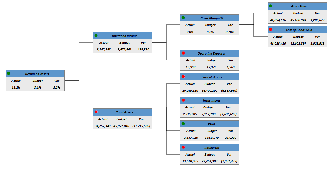
The following example shows a simple hierarchy flagged in a sheet. In real implementations this data might be generated by an Axiom query or Axiom functions; here the data is simply typed in order to show the placement of the tags to the data.
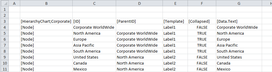
In this example we are using the node name as the ID and then simply referencing that name in the [Data.Text] column, but this is not required—you can use any unique value for the ID.
To use the Data Source Wizard to add the tags, right-click a cell and select Create Axiom Form Data Source > Hierarchy Chart. You can right-click a single empty cell to place the initial tags and then fill out the data, or you can have the data already in the spreadsheet and highlight the applicable data to add the tags. The cells in the row above the data and the column to the left of the data must be blank in order for Axiom to place the tags in sheet.
The resulting chart would appear as follows:
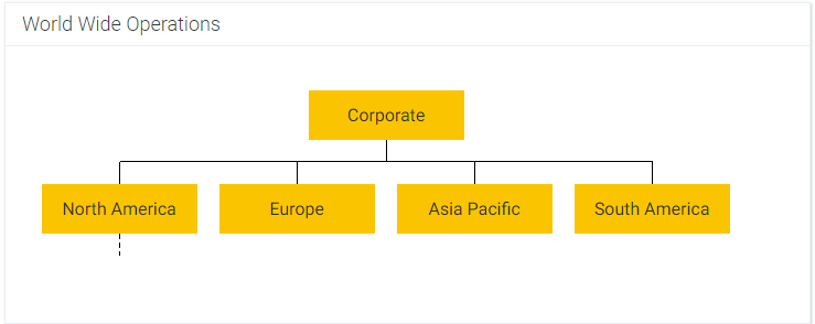
NOTE: The dashed line under North America indicates the node is collapsed. The nodes underneath North America will not display until the node is expanded. See Collapse and expand behavior.
You can define the following properties for an Hierarchy Chart component.
Component properties can be configured using the Form Assistant task pane or the Form Designer unless otherwise noted. All properties can also be defined on the Form Control Sheet directly if desired. For example, if you want a property to be dynamic depending on the result of a formula, you can define that formula in the control sheet. To access the control sheet settings for the component, double-click any property name to go to that property in the Form Control Sheet.
Component behavior properties
The following properties control the display and behavior of this particular component type.
| Item | Description |
|---|---|
|
Data Source |
The data source for the chart. You must have defined the data source within the file using the appropriate tags in order to select it for the chart. NOTE: In the Form Control Sheet, the selected data source is written as SheetName!DataSourceName. The sheet name is the sheet where the selected data source is located. If a data source is already specified and you want to locate it within the file, click the Show location |
|
Data Source Load |
Specifies the loading behavior of the component:
|
|
Title Text |
The title text for the chart. This text displays in the title bar of the chart panel within the Axiom form, if the title bar is enabled. If the title bar is not enabled, then the text displays centered over the top of the chart. |
|
Show Title Bar |
Specifies whether the title bar is visible. By default this option is enabled, which means that the component will display in a bordered box with a title bar across the top. The defined title text displays within the bar. The formatting of the title bar and its border are determined by the skin specified for the form. If disabled, then the title bar and its border will not display on the component. If the title bar is enabled and the component also has a separately defined border (either via a style or by using the formatting overrides in the advanced component settings), then both borders will display on the component. In some cases this effect may be desired; in other cases one of the borders should be disabled. |
|
Default Template |
Optional. Specifies the default Label template to be used for any node that does not have an assigned template in the [Template] column of the data source. If the [Template] column is omitted, then a default template is required and will apply to all nodes. You can select from any Label component name that is defined in the Axiom form. |
|
Orientation |
The orientation of the hierarchy chart, either:
|
|
Connector Style |
The style of the connector lines between each parent and child node, either Straight or Elbow. |
|
Connector Color |
The color of the connector lines. If left at Default, the default color for the style or skin is used. Click the [...] button to open the Choose Color dialog. You can select from the colors displayed at the top of the dialog, or you can enter a valid RGB or hexadecimal color code (such as #00FFFF for Aqua). Click OK to use the specified color. If you are modifying the Form Control Sheet directly, then you must use a hexadecimal code. For an example list of colors and hexadecimal codes, see: http://www.w3.org/TR/css3-color/#svg-color (external link). |
|
Selected Value |
The selected value in the hierarchy chart. This setting serves two purposes:
NOTES:
|
|
Auto Submit |
Specifies whether the Axiom form is automatically updated when a user changes the state of the component. By default, this is enabled, which means that the form automatically updates when the user selects a different node in the hierarchy. If this setting is disabled, then the user must use a Button component in order to update the form for the changed state. |
 button to the right of the drop-down list. This will move your cursor to the associated data source tag in the file.
The following general properties are available for all components:
| Item | Description |
|---|---|
|
Component Name |
The name of the component. This is for identification in the file; this name does not display on the Axiom form canvas. The name of the component identifies the corresponding settings for the component on the Form Control Sheet. The component names are also useful if you have multiple types of the same component within an Axiom form, so that you can tell which component you are currently editing. Component names must be unique within a file and must start with a letter. Names can only contain letters, numbers, and underscores. Names are validated when the file is saved; an invalid name will prevent the save. NOTE: Spaces are not allowed in component names and will be automatically removed by Axiom Software. For example, if you enter "My Component" as the component name, it will be automatically adjusted to "MyComponent". |
|
Visible |
Specifies whether the component is visible on the Axiom form (On/Off). By default this is set to On. This setting can be used to dynamically show or hide the component using a formula. Keep in mind that if you have multiple components that you need to dynamically show or hide based on the same condition, then it is preferable to place those components on a dedicated layer and then show or hide the entire layer instead of the individual components. NOTE: This setting is only available on the Form Control Sheet; it cannot be set in the Form Assistant or in the Form Designer. |
|
Layer |
The layer that the component belongs to on the Axiom form canvas. In the Form Assistant and the Form Designer, this displays as the layer name (for example: Layer 1). In the Form Control Sheet, this is recorded as the layer ID (for example: 1). If the canvas only has one layer, then the component is automatically assigned to that layer and cannot be changed. If the canvas has multiple layers, you can assign the component to any layer using the drop-down list. By default, the component will be assigned to whichever layer is selected in the Layers box when you initially drag the component onto the canvas. For more information on layers, see Using multiple layers on the canvas. If desired, you can jump to the applicable layer settings on the Form Control Sheet by clicking the binoculars icon |
|
Parent |
The parent component that this component is assigned to. If blank, then the component does not have an assigned parent. Currently, only Panel components can be designated as parents. If a component has an assigned parent, then that component is positioned within the parent instead of within the canvas at large. If the parent is hidden, all "child" components of that parent are also hidden. The parent assignment is automatically completed when a component is dragged into a panel in the Form Designer, and automatically cleared when a component is dragged out of a panel. In most cases, you should not need to manually assign a parent. For more information, see Using panels to group and position components. |
Style and formatting properties
To define the component formatting, you can assign one or more styles to the component. Styles can impact formatting properties such as fonts, borders, and colors.
If you do not want to apply a style to this component, or if you want to override one or more formatting properties in an assigned style, click the Show Advanced Settings link underneath the Style box to display the individual formatting properties. For more information on defining individual formatting properties for a component, see Formatting overrides for Axiom form components.
Even though Connector Color can be affected by styles, this property is exposed as a component behavior property because it is unique to this component type. Also, Axiom Software does not currently provide any styles specifically for hierarchy charts.
| Item | Description |
|---|---|
|
Style |
Optional. The styles used to determine the formatting of the component. You can assign one or more styles. Click the Select component styles button [...] to open the Choose Style dialog. Using this dialog, you can select one or more styles to apply to the component. The available styles depend on the component type and the skin assigned to the form. For more information, see Using component styles. Some components have several styles that are specifically designed for that component type, while other components may only have the "generic" styles that are available to all components. When using a generic style, keep in mind that they may not be useful for all components. You can view a description of each style and view the effective formatting applied by the selected styles within the Choose Style dialog. |
|
Component Theme |
(Deprecated.) The theme to use for the component instead of the form-level theme. If left blank, the component uses the form-level theme. This setting should be left blank unless you need to override the form theme. Generally speaking, themes should be set at the form level and only overridden at the component level when necessary. This setting is available in the advanced component properties (click Show Advanced Settings under the Style box). On the Form Control Sheet, the setting displays using the name Theme Override. NOTE: This setting only applies if your form uses a legacy skin (any skin except the default Axiom2018). The Axiom2018 skin does not use themes. |
You can view the position and size properties for a component by clicking the Show Advanced Settings link under the Style box. If necessary, you can edit these properties directly (instead of automatically modifying them by adjusting the component's position and size on the canvas). For more information on using these settings, see Controlling component position and size.
| Item | Description |
|---|---|
|
Reference Location |
The reference location determines how the x-position and y-position of a component are evaluated. By default the reference location is UpperLeft. NOTE: This setting is not exposed in the advanced component settings. It can be changed on the canvas by double-clicking the corner selection handles of a component, or you can edit the setting on the Form Control Sheet directly. |
|
X Position Y Position |
The x-position determines the component's position along the horizontal axis, and the y-position determines the component's position along the vertical axis. Both are evaluated relative to the reference location. Positions can be set in pixels (default) or percentages. |
|
Width Height |
The width and height determine the size of the component. The width and height can be set in pixels (default) or percentages. Size keywords are also available to support special behavior. |
|
Rendering Order |
The order in which the component is rendered in the layer. A component with a larger order number will display above a component with a smaller order number. For components that support tab navigation (tabbing to the next editable component), the rendering order also determines the tabbing order. NOTE: On the Form Control Sheet, this setting is labeled as Z-Index. |
|
Lock Layout |
If enabled, the component size and position are locked and cannot be changed by dragging and dropping on the canvas. This optional setting is intended to protect against accidentally moving or resizing a component while working on the canvas. |
Interactive behavior
The Hierarchy Chart component allows the user to select a node in the hierarchy. This selected node is submitted back to the source file, and written to the Selected Value setting on the Form Control Sheet, using the value from the [ID] column for that node. Once a node is selected, the user can either click on a different node to change the selection, or click on the same node to clear the selection.
If you want the Axiom form to respond to the currently selected node, then you must set up the file so that another form component references the selected node and changes based on it. For more information on setting up interactive components for an Axiom form, see Using interactive components in an Axiom form.
For example, you could have a hierarchy chart like the example in this topic, where each node represents a world region. Users could select different nodes in the hierarchy to impact the data displayed in the entire Axiom form, or just to change the data in a single component such as a column chart.
NOTE: Axiom Software does not apply any formatting to the selected node in the Axiom form to indicate to the user that the node is selected. If desired, you can set up the [Template] column for the data source to use a dynamic formula, so that a different Label template is used if the node is the currently selected item.
Defining Label templates
Hierarchy Chart components require one or more associated Label components to define how each node will be displayed in the chart. These Label templates should be hidden on the Axiom form, either by setting the Visible property for each individual label, or by placing all the labels on a layer and then setting the Visible property for that layer.
You can set a default Label template for the chart, which will be used for any node that does not have an assigned template within the [Template] column of the data source. If all nodes use the same template, then you can just use the default template and omit the [Template] column.
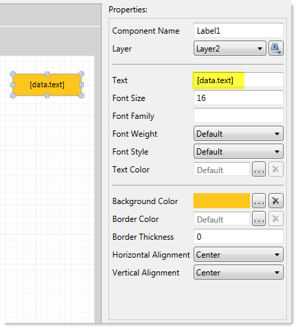
You can configure the Label templates as desired. There is no special setting on the Label component to indicate that it is a template for a Hierarchy Chart component; to use a Label component as a template, you specify the Label component name.
NOTE: By default, the height of a Label component is set to Auto. You must change this to specify an actual height. To do this, click Show Advanced Settings under the Style box, then adjust the Height property. For example, you can enter 30px to start, then further adjust the template on the canvas as needed.
Each node to use a Label template will inherit the configuration settings for the specified Label component, such as background color, border color, etc. You can use the [Data.Variable] columns to pass values into the template to use for that node. For example, at minimum you will want to define a column such as [Data.Text], and then use that variable within the Text property of the Label component, so that the label displays the name of that node.
Example Label template
It is possible to use more sophisticated formatting for the label, such as presenting the text information on multiple rows and/or incorporating multiple colors and graphics. To do this you can enter any valid HTML into the Text property field (using the Form Control Sheet). The HTML entered into this field can reference any [Data.Variable] column, and can be used to control the display of the label.
IMPORTANT: The HTML option is only intended for advanced users who are familiar with HTML tagging. Axiom Software is not responsible for any HTML code entered into this field.
The following example shows a hierarchy chart created using this HTML tagging:
In this example, several columns of information are being passed to the label template, as well as special format tags to obtain the table formatting within the label.
The specific sizing properties of the template—such as the Height and Width of the label, and the font size—are used to determine the desired proportions of the template, not the actual size. When rendered in the chart, the template will adjust as needed based on the number of items being shown and the space allotted for the hierarchy chart.
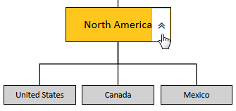
Hierarchy nodes with child items can be collapsed and expanded within the Axiom form. To collapse or expand a node, you can hover your cursor over the left-hand side of the node. An arrow will display, indicating the item can be collapsed or expanded if the arrow is clicked.
If a node has a dashed line extending from it, this means the node has children and can be expanded by clicking the arrow.
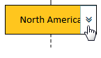
Once the node has been expanded, it can be collapsed by clicking the arrow.