AX2139
for Axiom forms
The Combo Box component is an interactive component that displays a drop-down list of items in the Axiom form. Users can select an item from the list to impact the form in some way.
Defining a combo box is a two-part process that requires the following:
- Creation of a ComboBox data source in the spreadsheet to define the list of items.
- Placement and configuration of a Combo Box component on the Axiom form canvas.
A Combo Box component must have a defined data source in the file to define the list of items. There are two different ways to define this data source:
- You can use the default approach of defining the list of items within the sheet using column and row tags. This approach is described below.
- Alternatively, you can use "extended syntax" for the ComboBox tag to define the list of items by referencing a table column or an Axiom query. This works in a similar manner as the Select tag for Formatted Grid components. For more information on this approach, see the following sections:
The tags for the default Combo Box data source are as follows:
Primary tag
Row tags
Column tags
NOTES:
- The primary tag must be placed in the first 500 rows of the sheet.
- Formulas can be used to create the tags, as long as the initial bracket and identifying keyword are whole within the formula.
The following example shows sample data flagged in a report. In real implementations this data might be generated by an Axiom query or Axiom functions; here the data is simply typed in order to show the placement of the tags to the data.
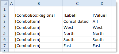
To use the Data Source Wizard to add the tags to a sheet, right-click in a cell and then select Create Axiom Form Data Source > Combo Box. You can also highlight a range of cells first and then use the wizard (in the example above, you would highlight C3:D7). Axiom Software will add the tags as displayed in the example above. The cells in the row above and the column to the left of the selected area must be blank in order for Axiom to place the tags in sheet.
The resulting combo box for this example data source would appear as follows:
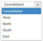
If a user selects the label Consolidated from the combo box, the corresponding value of All is written to the Selected Value property of the data source.
You can define the following properties for a Combo Box component.
Component properties can be configured using the Form Assistant task pane or the Form Designer unless otherwise noted. All properties can also be defined on the Form Control Sheet directly if desired. For example, if you want a property to be dynamic depending on the result of a formula, you can define that formula in the control sheet. To access the control sheet settings for the component, double-click any property name to go to that property in the Form Control Sheet.
Component behavior properties
The following properties control the display and behavior of this particular component type.
| Item | Description |
|---|---|
|
Data Source |
The data source for the combo box, to determine the list of items in the box. A data source must be tagged within the file as specified above, and then selected for the combo box.
NOTE: In the Form Control Sheet, the selected data source is written as SheetName!DataSourceName. The sheet name is the sheet where the selected data source is located. If a data source is already specified and you want to locate it within the file, click the Show location |
|
Initial Text |
The text to display on the button if the Selected Value is blank. By default, this text is "Select..." to prompt the user to select a value from the drop-down list. If you want to use different text, enter that text into this field. Blank initial text is not supported. If this setting and the Selected Value setting are both blank, then the combo box will display "Select..." The appearance of the initial text depends on the skin assigned to the form, and on the browser used to view the form. In most environments the initial text displays in a lighter color than selected values, but not always. |
|
Tooltip |
Optional. The tooltip text for the component. When a user hovers the cursor over the component, the text displays in a tooltip. |
|
Selected Value |
The currently selected value for the combo box. This setting serves two purposes:
NOTES:
|
|
Searchable |
Specifies whether the combo box includes the ability to type in values to search the list. By default this is disabled, which means that the user can only select values from the list. The user cannot type in a value to find a matching value. If enabled, then the user can click into the box to start typing text. This filters the list for matching values, which the user can then select. Typically this setting is only enabled for longer lists where it would be inconvenient for the user to have to scroll to the value, or where the total list exceeds the number of items that can be shown (in this case the user can still search to select the value). |
|
Auto Submit |
Specifies whether the Axiom form is automatically updated when a user changes the state of the component. By default, this is enabled, which means that the form automatically updates when the user selects an item from the combo box. If this setting is disabled, then the user must use a Button component in order to update the form for the changed state. For example, you might disable the auto-submit behavior if the combo box is one of several user selections that are intended to be submitted together at one time, instead of piecemeal as each one changes. In that situation the user can make all necessary changes for all related components, and then click a Button component to submit the changes at once and trigger an update. |
|
Save on Submit |
Specifies whether a save-to-database occurs when a form update is triggered by this component.
This setting only applies if Auto Submit is enabled for the component. If you are not using the auto-submit behavior but you do want to save data to the database from the Axiom form, then you should instead enable Save on Submit for the Button component that you are using to trigger the update process. |
|
Enabled |
Specifies whether the component is enabled. By default this is set to On, which means that the component displays normally and users can interact with it (if applicable). This setting can be used to dynamically enable or disable the component using a formula. If set to Off, then the component displays as grayed out. If the component is normally interactive, users cannot interact with the component while it is disabled. Disabled components cannot trigger update events for the form. NOTE: This setting is only available on the Form Control Sheet; it cannot be set in the Form Assistant or in the Form Designer. |
 button to the right of the drop-down list. This will move your cursor to the associated data source tag in the file.
The following general properties are available for all components:
| Item | Description |
|---|---|
|
Component Name |
The name of the component. This is for identification in the file; this name does not display on the Axiom form canvas. The name of the component identifies the corresponding settings for the component on the Form Control Sheet. The component names are also useful if you have multiple types of the same component within an Axiom form, so that you can tell which component you are currently editing. Component names must be unique within a file and must start with a letter. Names can only contain letters, numbers, and underscores. Names are validated when the file is saved; an invalid name will prevent the save. NOTE: Spaces are not allowed in component names and will be automatically removed by Axiom Software. For example, if you enter "My Component" as the component name, it will be automatically adjusted to "MyComponent". |
|
Visible |
Specifies whether the component is visible on the Axiom form (On/Off). By default this is set to On. This setting can be used to dynamically show or hide the component using a formula. Keep in mind that if you have multiple components that you need to dynamically show or hide based on the same condition, then it is preferable to place those components on a dedicated layer and then show or hide the entire layer instead of the individual components. NOTE: This setting is only available on the Form Control Sheet; it cannot be set in the Form Assistant or in the Form Designer. |
|
Layer |
The layer that the component belongs to on the Axiom form canvas. In the Form Assistant and the Form Designer, this displays as the layer name (for example: Layer 1). In the Form Control Sheet, this is recorded as the layer ID (for example: 1). If the canvas only has one layer, then the component is automatically assigned to that layer and cannot be changed. If the canvas has multiple layers, you can assign the component to any layer using the drop-down list. By default, the component will be assigned to whichever layer is selected in the Layers box when you initially drag the component onto the canvas. For more information on layers, see Using multiple layers on the canvas. If desired, you can jump to the applicable layer settings on the Form Control Sheet by clicking the binoculars icon |
|
Parent |
The parent component that this component is assigned to. If blank, then the component does not have an assigned parent. Currently, only Panel components can be designated as parents. If a component has an assigned parent, then that component is positioned within the parent instead of within the canvas at large. If the parent is hidden, all "child" components of that parent are also hidden. The parent assignment is automatically completed when a component is dragged into a panel in the Form Designer, and automatically cleared when a component is dragged out of a panel. In most cases, you should not need to manually assign a parent. For more information, see Using panels to group and position components. |
Style and formatting properties
To define the component formatting, you can assign one or more styles to the component. Styles can impact formatting properties such as fonts, borders, and colors.
If you do not want to apply a style to this component, or if you want to override one or more formatting properties in an assigned style, click the Show Advanced Settings link underneath the Style box to display the individual formatting properties. For more information on defining individual formatting properties for a component, see Formatting overrides for Axiom form components.
Currently, the Axiom Software platform does not provide any styles specifically designed for Combo Box components. Only the generic styles are available. Most combo box styling is controlled by the form-level skin.
| Item | Description |
|---|---|
|
Style |
Optional. The styles used to determine the formatting of the component. You can assign one or more styles. Click the Select component styles button [...] to open the Choose Style dialog. Using this dialog, you can select one or more styles to apply to the component. The available styles depend on the component type and the skin assigned to the form. For more information, see Using component styles. Some components have several styles that are specifically designed for that component type, while other components may only have the "generic" styles that are available to all components. When using a generic style, keep in mind that they may not be useful for all components. You can view a description of each style and view the effective formatting applied by the selected styles within the Choose Style dialog. |
|
Component Theme |
(Deprecated.) The theme to use for the component instead of the form-level theme. If left blank, the component uses the form-level theme. This setting should be left blank unless you need to override the form theme. Generally speaking, themes should be set at the form level and only overridden at the component level when necessary. This setting is available in the advanced component properties (click Show Advanced Settings under the Style box). On the Form Control Sheet, the setting displays using the name Theme Override. NOTE: This setting only applies if your form uses a legacy skin (any skin except the default Axiom2018). The Axiom2018 skin does not use themes. |
You can view the position and size properties for a component by clicking the Show Advanced Settings link under the Style box. If necessary, you can edit these properties directly (instead of automatically modifying them by adjusting the component's position and size on the canvas). For more information on using these settings, see Controlling component position and size.
| Item | Description |
|---|---|
|
Reference Location |
The reference location determines how the x-position and y-position of a component are evaluated. By default the reference location is UpperLeft. NOTE: This setting is not exposed in the advanced component settings. It can be changed on the canvas by double-clicking the corner selection handles of a component, or you can edit the setting on the Form Control Sheet directly. |
|
X Position Y Position |
The x-position determines the component's position along the horizontal axis, and the y-position determines the component's position along the vertical axis. Both are evaluated relative to the reference location. Positions can be set in pixels (default) or percentages. |
|
Width Height |
The width and height determine the size of the component. The width and height can be set in pixels (default) or percentages. Size keywords are also available to support special behavior. |
|
Rendering Order |
The order in which the component is rendered in the layer. A component with a larger order number will display above a component with a smaller order number. For components that support tab navigation (tabbing to the next editable component), the rendering order also determines the tabbing order. NOTE: On the Form Control Sheet, this setting is labeled as Z-Index. |
|
Lock Layout |
If enabled, the component size and position are locked and cannot be changed by dragging and dropping on the canvas. This optional setting is intended to protect against accidentally moving or resizing a component while working on the canvas. |
Interactive behavior
The Combo Box component allows the user to select an item from a list. The selected item is submitted back to the source file, and written to the Selected Value setting on the Form Control Sheet, using the value in the [Value] column of the data source (not the display name in the [Label] column).
If you want the Axiom form to respond to the currently selected item, then you must set up the file so that another component references the selected item and changes based on it. For more information on setting up interactive components for an Axiom form, see Using interactive components in an Axiom form.
An Axiom form could contain a column chart that dynamically changes its series or its data based on a combo box. For example, the combo box could allow the user to select a region, or a company, or an account type, and then the chart would update to show the selected item.
Example
A combo box could display values such as the following:
In this case the default value for the combo box (the value saved in the Selected Value setting for the file) is Consolidated. The user can change this value by selecting a region, such as West. This causes the value West to overwrite the existing value in the Selected Value setting. A column chart could look to this setting to determine what to display in the chart.
There are a variety of ways that the chart could update based on this setting. For example, the data filter for the Axiom query could change based on the setting, so that the data coming into the sheet is different depending on what the user selects. Or, all of the data could already exist in the sheet, and the chart could simply show or hide particular data series based on the user's selection (by setting up the series tags using a dynamic formula).
Using a table column as the source for a combo box
The Combo Box component can use the key column of a reference table as the source for the list. For example, you might want to display a list of accounts in a combo box.
To do this, use the following "extended syntax" for the ComboBox tag. In this case, the ComboBox data source only consists of this tag; there are no column and row tags.
[ComboBox; DataSourceName; ValueColumn=ColumnName; DescriptionColumn=ColumnName; SortColumn=ColumnName; DisplayCell=CellAddress; DisplayFormat=Text; Filter=FilterStatement]
| Parameter | Description |
|---|---|
|
ValueColumn |
The column to provide the list of values for the combo box. Enter a fully-qualified Table.Column name such as You can specify any column from any client-defined table in your system. System tables such as Axiom.Aliases are not supported for use with refresh variables and cannot be used. When using columns with lookups (including multi-level lookups), the final lookup table is considered the primary table. For example, if you specify When using columns with lookups, the starting table impacts the list of items to be returned from the value column. For example, |
|
DescriptionColumn |
Optional. The column that contains descriptions for the value column, specified using a fully qualified Table.Column name or an alias name. For example: Acct.Description. This property only applies if the value column is a key column or a validated column. By default, the primary table's first description column will be displayed in the list if no alternate description column is specified in the tag. You only need to complete the DescriptionColumn parameter if the table has more than one description column and you want to specify a different description column. However, if you are using the DisplayFormat parameter to define a custom display format, then the DescriptionColumn parameter does not apply. Instead, you should include the description column in the custom display format as desired. |
|
SortColumn |
Optional. The column by which to sort the list of values. By default, the list is sorted by the display format if defined, and by the value column if no display format is defined. You can use this property to override the default sort and instead specify a different column to sort by. If the value column uses a lookup, then the column must be resolvable from the primary table, or must use a fully qualified path from the starting table. |
|
DisplayCell |
Optional. The cell that contains content that you want to display in the combo box other than the selected value. Specify either a cell reference (A22) or a column letter (A). If only a column letter is specified, the current row is assumed. For example, if the purpose of the combo box is to select an account, and the account list displays items as Account - Description, then you may want the selected value to also display as Account - Description instead of just Account. You could have a formula in the designated display cell that creates this alternate display based on the selected value. |
|
DisplayFormat |
Optional. Defines a display format for the items in the list, and specifies additional columns to display. By default, items in the list are displayed as: KeyColumn - DescriptionColumn If you want to specify a different format and/or use additional columns, then you can indicate the display format here. Use fully qualified Table.Column syntax and place column references in curly brackets. For example, you could indicate something like: {Acct.Acct} - {Acct.Description} ({Acct.Category}) This would display account items in the following format: 8000 - Facilities (Overhead) Any columns listed should use fully qualified Table.Column syntax. If the value column uses a lookup, then any additional columns must be resolvable from the primary table, or must use a fully qualified path from the starting table. Additional columns included in the display format are searchable within the list. |
|
Filter |
Optional. A filter criteria statement to limit the values available for selection. The filter impacts both what displays in the drop-down list, and what is available when searching using the filter box. If the value column uses a lookup, then the column in the filter criteria statement must be resolvable from the primary table, or must use a fully qualified path from the starting table. |
Parameters can be listed in any order after the ComboBox tag and the data source name. You do not need to indicate omitted parameters with an "empty" semi-colon.
To create the extended ComboBox tag, you can manually type it within a cell, or you can use the Combo Box Tag Helper to assist you in creating a tag. To open the helper dialog, place the basic ComboBox tag within a cell—meaning [ComboBox;ComboBoxName]—then double-click the cell.
Note the following when using the extended ComboBox tag:
-
The selected value is still placed in the Selected Value cell of the component properties. Indirect cell references and form state / shared variable tags can be used as normal.
-
In most cases, Searchable should be enabled in the component properties so that users can search the list. All columns displayed in the list are included in the search. However, if the list only has a small number of items then this may not be necessary.
NOTE: Only the first 100 values from the data source are displayed in the drop-down list. If the list contains more than 100 values, then Searchable must be enabled so that users can search for the other values. This limit does not apply when using the regular
[ComboItem]syntax; the limit only applies to extended tags. -
In the form, the Initial Text will show in the combo box until a value is selected. Once a value is selected, the contents of the Selected Value field will show unless a DisplayCell has been specified, in which case the contents of the DisplayCell will show.
Using an Axiom query as the source for a combo box
The Combo Box component can use an Axiom query as the source for the list.
To do this, use the following "extended syntax" for the ComboBox tag. In this case, the ComboBox data source only consists of this tag; there are no column and row tags.
[ComboBox; DataSourceName; AQ=Sheet!AQName; ValueColumn=ColumnName; DescriptionColumn=ColumnName; DisplayCell=CellAddress; DisplayFormat=Text; Filter=FilterStatement]
| Parameter | Description |
|---|---|
| AQ |
The name of the Axiom query to use as the source of the list. This parameter uses the following syntax: SheetName!AQName. For example: Sheet2!AQList. The setup requirements for the Axiom query are the same requirements used by the Select tag for Formatted Grid components. For more information, see Axiom query setup for use in a Select tag. |
|
ValueColumn |
Optional. The column that contains the list of values, specified using a fully qualified Table.Column name or an alias name. For example: Acct.Acct. By default, the first column in the Axiom query field definition is assumed as the value column. You only need to specify the value column in the tag if it is not the first entry in the field definition. |
|
DescriptionColumn |
Optional. The column that contains descriptions for the value column, specified using a fully qualified Table.Column name or an alias name. For example: Acct.Description. By default, the second column in the Axiom query field definition is assumed as the description column. You only need to specify the description column in the tag if it is not the second entry in the field definition and if you are not using the DisplayFormat parameter to define a custom display format. However, if you are using the DisplayFormat parameter to define a custom display format, then the DescriptionColumn parameter does not apply. Instead, you should include the description column in the custom display format as desired. |
|
DisplayCell |
Optional. The cell that contains content that you want to display in the combo box other than the selected value. Specify either a cell reference (A22) or a column letter (A). If only a column letter is specified, the current row is assumed. For example, if the purpose of the combo box is to select an account, and the account list displays items as Account - Description, then you may want the selected value to also display as Account - Description instead of just Account. You could have a formula in the designated display cell that creates this alternate display based on the selected value. |
|
DisplayFormat |
Optional. Defines a display format for the items in the list, and specifies additional columns to display. By default, items in the list are displayed as: KeyColumn - DescriptionColumn If you want to specify a different format and/or use additional columns, then you can indicate the display format here. Use fully qualified Table.Column syntax and place column references in curly brackets. For example, you could indicate something like: {Acct.Acct} - {Acct.Description} ({Acct.Category}) This would display account items in the following format: 8000 - Facilities (Overhead) Any column used in the display format must also be included in the field definition of the Axiom query. |
|
Filter |
Optional. A filter criteria statement to limit the values available for selection. The filter impacts both what displays in the drop-down list, and what is available when searching using the filter box. When using an Axiom query as a source, you can use the filter parameter, or you can define a filter in the Axiom query settings (or both). |
Parameters can be listed in any order after the ComboBox tag and the data source name. You do not need to indicate omitted parameters with an "empty" semi-colon.
To create the extended ComboBox tag, you can manually type it within a cell, or you can use the Combo Box Tag Helper to assist you in creating a tag. To open the helper dialog, place the basic ComboBox tag within a cell—meaning [ComboBox;ComboBoxName]—then double-click the cell.
Note the following when using the extended ComboBox tag:
-
The selected value is still placed in the Selected Value cell of the component properties. Indirect cell references and form state / shared variable tags can be used as normal.
-
In most cases, Searchable should be enabled in the component properties so that users can search the list. All columns displayed in the list are included in the search. However, if the list only has a small number of items then this may not be necessary.
NOTE: Only the first 100 values from the data source are displayed in the drop-down list. If the list contains more than 100 values, then Searchable must be enabled so that users can search for the other values. This limit does not apply when using the regular
[ComboItem]syntax; the limit only applies to extended tags. -
In the form, the Initial Text will show in the combo box until a value is selected. Once a value is selected, the contents of the Selected Value field will show unless a DisplayCell has been specified, in which case the contents of the DisplayCell will show.
Design alternatives
Axiom forms often support several different ways of performing the same task, to provide a broad range of display options and user interface behavior. Depending on your form design, you may want to consider the following alternatives:
-
The Select content tag can be used in Formatted Grid components to present drop-down lists within a grid. You may want to do this if your form is primarily grid-based, or if the combo boxes need to be integrated with the other contents of the grid. For more information, see Using drop-down lists in Formatted Grids.
-
The ComboBox refresh variable can be used to present drop-down lists in the Web Client filter panel. You may want to do this if the combo box only impacts the data refresh and does not need to be displayed on the form itself with the other form contents.
