AX1058
for Axiom forms
The Bullet Chart component for Axiom forms displays a value along a defined standard of measurement, comparing it against a target value. The chart is shaded to indicate where the current value falls within one of three ranges of performance, such as poor, satisfactory, and good.
Bullet charts and gauges are visually similar, but are typically used for different purposes. Although both components display a value along a defined measurement scale, the bullet chart adds the concept of a target value and therefore explicitly communicates performance against a defined goal. The overall appearance of bullet charts is also more streamlined than gauges, which are often styled to resemble real-life measurement tools such as thermometers or speedometers.
NOTES:
- Your Axiom Software license determines whether you have access to this component. For more information, see Licensing requirements for Axiom forms.
- The Bullet Chart component does not use the BulletChart data source; you must define all data for the chart within the component properties. Currently, the BulletChart data source is only for use with the Sparkline content tag in formatted grids. For more information see Displaying sparkline charts in Formatted Grids.
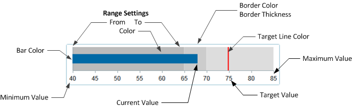
You can define the following properties for a Bullet Chart component. The following screenshot shows an example chart with the major properties that impact the display:
Component properties can be configured using the Form Assistant task pane or the Form Designer unless otherwise noted. All properties can also be defined on the Form Control Sheet directly if desired. For example, if you want a property to be dynamic depending on the result of a formula, you can define that formula in the control sheet. To access the control sheet settings for the component, double-click any property name to go to that property in the Form Control Sheet.
Component behavior properties
The following properties control the display and behavior of this particular component type.
| Item | Description |
|---|---|
|
Current Value |
The current value for the bullet chart. The current value is indicated by the chart bar. In most cases you will want to read the value from some location in the spreadsheet rather than typing a value into the component properties. You can use the Form Control Sheet to enter a formula for this property. |
|
Target Value |
The target value for the bullet chart. This value should represent the goal of whatever is being measured by the bullet chart. The target value is indicated by a colored line in the chart. |
|
Minimum Value |
The minimum value for the chart scale of measurement. By default this is 0. |
|
Maximum Value |
The maximum value for the chart scale of measurement. By default this is 100. |
|
Tooltip Format |
Specifies the number format for chart values: Number (default), Currency, or Percent. NOTES:
|
|
Decimal Places |
Optional. Specifies how many decimal places to show on chart values in the tooltip and the axis labels (if visible). By default, no decimal places are shown (0). |
|
Bar Color |
Optional. The color of the bar that indicates the current value. If left blank, the color is determined by the style or skin (in that order). Click the [...] button to open the Choose Color dialog. You can select from the colors displayed at the top of the dialog, or you can enter a valid RGB or hexadecimal color code (such as #00FFFF for Aqua). Click OK to use the specified color. If you are modifying the Form Control Sheet directly, then you must use a hexadecimal code. For an example list of colors and hexadecimal codes, see: http://www.w3.org/TR/css3-color/#svg-color (external link). |
|
Target Line Color |
Optional. The color of the line that indicates the target value. If left blank, the color is determined by the style or skin (in that order). Color can be specified in the same way as described above for bar color. |
|
Orientation |
Specifies the orientation of the chart: Vertical or Horizontal (default). |
|
Show Axis |
Specifies whether axis labels display on the chart. By default this is enabled. If disabled, users can still view the chart values in the tooltip. |
NOTE: Bullet charts do not have a Title property. If you want to display a title for the chart you must use a separate Label component.
Range properties
You can define up to three ranges for the bullet chart. Ranges are defined by a starting and ending value, and a color to shade that range. If you do not want to use a particular range, leave the settings for that range blank.
If at least one range is defined, then any measurement values on the chart that do not fall within a defined range are not colored. If you want the ranges to be continuous, then the To value of one range and the From value of the next range should be the same number. For example, if range one is from 0 to 20, then the from value for range two should be 20.
Range colors may be inherited from the style, theme, or skin, or may be manually specified. Colors can be manually specified in the same way as described above for bar color.
| Item | Description |
|---|---|
|
Range 1 From |
The starting value of the range. |
|
Range 1 To |
The ending value of the range. |
|
Range 1 Color |
The color for the range. |
|
Range 2 From |
The starting value of the range. |
|
Range 2 To |
The ending value of the range. |
|
Range 2 Color |
The color for the range. |
|
Range 3 From |
The starting value of the range. |
|
Range 3 To |
The ending value of the range. |
|
Range 3 Color |
The color for the range. |
The following general properties are available for all components:
| Item | Description |
|---|---|
|
Component Name |
The name of the component. This is for identification in the file; this name does not display on the Axiom form canvas. The name of the component identifies the corresponding settings for the component on the Form Control Sheet. The component names are also useful if you have multiple types of the same component within an Axiom form, so that you can tell which component you are currently editing. Component names must be unique within a file and must start with a letter. Names can only contain letters, numbers, and underscores. Names are validated when the file is saved; an invalid name will prevent the save. NOTE: Spaces are not allowed in component names and will be automatically removed by Axiom Software. For example, if you enter "My Component" as the component name, it will be automatically adjusted to "MyComponent". |
|
Visible |
Specifies whether the component is visible on the Axiom form (On/Off). By default this is set to On. This setting can be used to dynamically show or hide the component using a formula. Keep in mind that if you have multiple components that you need to dynamically show or hide based on the same condition, then it is preferable to place those components on a dedicated layer and then show or hide the entire layer instead of the individual components. NOTE: This setting is only available on the Form Control Sheet; it cannot be set in the Form Assistant or in the Form Designer. |
|
Layer |
The layer that the component belongs to on the Axiom form canvas. In the Form Assistant and the Form Designer, this displays as the layer name (for example: Layer 1). In the Form Control Sheet, this is recorded as the layer ID (for example: 1). If the canvas only has one layer, then the component is automatically assigned to that layer and cannot be changed. If the canvas has multiple layers, you can assign the component to any layer using the drop-down list. By default, the component will be assigned to whichever layer is selected in the Layers box when you initially drag the component onto the canvas. For more information on layers, see Using multiple layers on the canvas. If desired, you can jump to the applicable layer settings on the Form Control Sheet by clicking the binoculars icon |
|
Parent |
The parent component that this component is assigned to. If blank, then the component does not have an assigned parent. Currently, only Panel components can be designated as parents. If a component has an assigned parent, then that component is positioned within the parent instead of within the canvas at large. If the parent is hidden, all "child" components of that parent are also hidden. The parent assignment is automatically completed when a component is dragged into a panel in the Form Designer, and automatically cleared when a component is dragged out of a panel. In most cases, you should not need to manually assign a parent. For more information, see Using panels to group and position components. |
 next to the drop-down list.
Style and formatting properties
To define the component formatting, you can assign one or more styles to the component. Styles can impact formatting properties such as fonts, borders, and colors.
If you do not want to apply a style to this component, or if you want to override one or more formatting properties in an assigned style, click the Show Advanced Settings link underneath the Style box to display the individual formatting properties. For more information on defining individual formatting properties for a component, see Formatting overrides for Axiom form components.
Even though Bar Color, Target Line Color, and range colors can be affected by styles, these properties are exposed as component behavior properties because they are unique to this component type. Also, Axiom Software does not currently provide any styles specifically for bullet charts.
| Item | Description |
|---|---|
|
Style |
Optional. The styles used to determine the formatting of the component. You can assign one or more styles. Click the Select component styles button [...] to open the Choose Style dialog. Using this dialog, you can select one or more styles to apply to the component. The available styles depend on the component type and the skin assigned to the form. For more information, see Using component styles. Some components have several styles that are specifically designed for that component type, while other components may only have the "generic" styles that are available to all components. When using a generic style, keep in mind that they may not be useful for all components. You can view a description of each style and view the effective formatting applied by the selected styles within the Choose Style dialog. |
|
Component Theme |
(Deprecated.) The theme to use for the component instead of the form-level theme. If left blank, the component uses the form-level theme. This setting should be left blank unless you need to override the form theme. Generally speaking, themes should be set at the form level and only overridden at the component level when necessary. This setting is available in the advanced component properties (click Show Advanced Settings under the Style box). On the Form Control Sheet, the setting displays using the name Theme Override. NOTE: This setting only applies if your form uses a legacy skin (any skin except the default Axiom2018). The Axiom2018 skin does not use themes. |
You can view the position and size properties for a component by clicking the Show Advanced Settings link under the Style box. If necessary, you can edit these properties directly (instead of automatically modifying them by adjusting the component's position and size on the canvas). For more information on using these settings, see Controlling component position and size.
| Item | Description |
|---|---|
|
Reference Location |
The reference location determines how the x-position and y-position of a component are evaluated. By default the reference location is UpperLeft. NOTE: This setting is not exposed in the advanced component settings. It can be changed on the canvas by double-clicking the corner selection handles of a component, or you can edit the setting on the Form Control Sheet directly. |
|
X Position Y Position |
The x-position determines the component's position along the horizontal axis, and the y-position determines the component's position along the vertical axis. Both are evaluated relative to the reference location. Positions can be set in pixels (default) or percentages. |
|
Width Height |
The width and height determine the size of the component. The width and height can be set in pixels (default) or percentages. Size keywords are also available to support special behavior. |
|
Rendering Order |
The order in which the component is rendered in the layer. A component with a larger order number will display above a component with a smaller order number. For components that support tab navigation (tabbing to the next editable component), the rendering order also determines the tabbing order. NOTE: On the Form Control Sheet, this setting is labeled as Z-Index. |
|
Lock Layout |
If enabled, the component size and position are locked and cannot be changed by dragging and dropping on the canvas. This optional setting is intended to protect against accidentally moving or resizing a component while working on the canvas. |
