AX1224
for Axiom forms
Area Chart components display information as a series of data points that are connected and shaded to form an area. An area chart is a variation of a line chart, where the area below the line is shaded to form a distinct shape. The areas can be stacked or overlapping. Area charts are part of the XYChart family, which includes bar, line, and column charts. All of these charts use the same data source type (XYChart) and have the same basic component properties.
Defining an area chart is a two-part process that requires the following:
- Creation of an XYChart data source in the spreadsheet to define the data to display in the chart.
- Placement and configuration of an Area Chart component on the Axiom form canvas.
Area charts can also support interactivity, to change the contents of the Axiom form based on the currently selected data point in the chart.
NOTE: Your Axiom Software license determines whether you have access to this component. For more information, see Licensing requirements for Axiom forms.
Area Chart components must have a defined data source within the source file to indicate the data for the chart. The tags for the data source are as follows:
Primary tag
Row tags
Column tags
The data source wizard only adds the [SeriesName], [XValue], and [Kind] columns. If you want to use any of the other columns, you must manually add them to the data source.
NOTES:
-
The primary tag must be placed in the first 500 rows of the sheet.
-
Formulas can be used to create the tags, as long as the initial bracket and identifying keyword are whole within the formula.
-
Negative numbers in a data source must use the minus symbol or parentheses to indicate the negative value. Alternative negative formats such as red number text are not recognized and will display as positive values in the chart.
The following example shows simple actual-to-budget data flagged in a sheet. In real implementations this data would most likely be generated by an Axiom query or Axiom functions; here the data is simply typed in order to show the placement of the tags to the data.
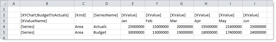
To use the Data Source Wizard to add the tags to a sheet, right-click in the cell where you want to start the data source and then select Create Axiom Form Data Source > Area Chart. If the data already exists in the sheet, you can first highlight the labels and the values (in the example above, you would highlight D3:J5) and then use the wizard. Axiom Software will add the tags as displayed in the example above, including adding the [Kind] column. The cells in the row above and the column to the left of the highlighted area must be blank in order for Axiom to place the tags in sheet.
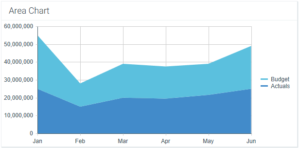
The resulting chart would appear as follows (using the default behavior of stacked series for area charts):
You can define the following properties for an Area Chart component.
Component properties can be configured using the Form Assistant task pane or the Form Designer unless otherwise noted. All properties can also be defined on the Form Control Sheet directly if desired. For example, if you want a property to be dynamic depending on the result of a formula, you can define that formula in the control sheet. To access the control sheet settings for the component, double-click any property name to go to that property in the Form Control Sheet.
Component behavior properties
The following properties control the display and behavior of this particular component type.
| Item | Description | |||
|---|---|---|---|---|
|
Data Source |
The data source for the chart. You must have defined the data source within the file using the appropriate tags in order to select it for the chart. NOTE: In the Form Control Sheet, the selected data source is written as SheetName!DataSourceName. The sheet name is the sheet where the selected data source is located. If a data source is already specified and you want to locate it within the file, click the Show location |
|||
|
Data Source Load |
Specifies the loading behavior of the component:
|
|||
|
Selected Label Selected Series |
The currently selected data point in the chart. This is identified by the corresponding label for the data point (the XValueName) and the Series that the data point belongs to. These settings are only used if the chart is configured to support interactivity. These settings serve two purposes:
|
|||
|
Auto Submit |
Specifies whether the Axiom form is automatically refreshed when a user selects a data point in the chart. By default, this is disabled. You should leave this option disabled if you have not set up your chart to support interactivity; otherwise the Axiom form will refresh unnecessarily if the user clicks on data points in the chart. If enabled, then the form automatically refreshes when the user selects a data point in the chart. It is recommended to enable this option if the chart is set up to support interactivity, so that the user gets immediate feedback on their selection. |
|||
|
Title Text |
The title text for the chart. This text displays in the title bar of the chart panel within the Axiom form, if the title bar is enabled. If the title bar is not enabled, then the text displays centered over the top of the chart. NOTE: The font type / size / weight / style of the title text are dependent on the style or skin and cannot be changed. |
|||
|
Show Title Bar |
Specifies whether the title bar is visible. By default this option is enabled, which means that the component will display in a bordered box with a title bar across the top. The defined title text displays within the bar. The formatting of the title bar and its border are determined by the skin specified for the form. If disabled, then the title bar and its border will not display on the component. If the title bar is enabled and the component also has a separately defined border (either via a style or by using the formatting overrides in the advanced component settings), then both borders will display on the component. In some cases this effect may be desired; in other cases one of the borders should be disabled. |
|||
|
Legend |
The location of the chart legend. You can specify None for no legend, or specify a location such as Top, Bottom, Right, or Left. If you are using a legend, and you want to omit a series from displaying in the legend, you can use the optional column Legends not only identify each series in the chart, they can also be used to dynamically show and hide series in the chart. Users can click on a series name in the legend to toggle that series hidden and visible. |
|||
|
Default Series Kind |
Specifies the default kind for series in the chart, to be used if the Kind column is omitted from the data source, or if an entry in the column is blank. When you place a chart component on the canvas, the Default Series Kind is automatically set based on the type of chart you used. For example, if you drag and drop a Column Chart on the canvas, then the default is automatically set to Column. You can change the default chart type by changing this value. |
|||
|
Composition Kind |
Specifies the composition of items in the chart when multiple series are present:
The selected composition kind applies to all series in the chart. |
|||
|
Area Series Opacity |
Specifies the opacity of area series within the chart:
This setting is ignored for all other series kinds. |
|||
|
Show Grid Lines |
Specifies whether gridlines display on the chart. By default, this is enabled. |
|||
|
Show Axes |
Specifies whether the axis labels display on the chart. By default, this is enabled. Disabling this option hides the XValueNames defined in the data source, and the scale values for both axes. NOTE: If an optional Y-axis label is defined, it will display regardless of this setting. |
|||
|
Name Rotation |
The degree of rotation for the chart names (the XValueNames from the data source). By default this is blank, which means that the names are not rotated. To rotate the names, enter a value from -360 to 360. The purpose of this setting is to allow displaying longer names as vertical or slanted. For example, a value of -45 displays the name as slanted upward, whereas a value of 45 displays the name as slanted downward.
|
|||
|
Primary Y-Axis Label |
Optional. The label for the primary Y-axis. This will display next to the Y-axis scale. For example, if the scale is dollars in millions, you can define a label of "Dollars" or "Dollars in Millions". |
|||
|
Primary Y-Axis Format |
Specifies the format for the primary Y-axis values: Number (default), Currency, or Percent. NOTES:
|
|||
|
Primary Y-Axis Decimals |
Optional. Specifies how many decimal places to show on the primary Y-axis labels. By default, no decimal places are shown (0). NOTE: This setting only impacts the Y-axis numbers. The actual chart values (shown in tooltips) will continue to display as they are formatted in the spreadsheet. |
|||
|
Primary Y-Axis Min Primary Y-Axis Max |
Optional. Specifies the maximum value and the minimum value for the primary Y-axis labels. If omitted, the maximum and minimum values will be determined by the values in the series. For example, you might use this option if you want to show a full percent scale from 0% to 100%, even though the minimum and maximum values in the series are 25% and 83%. NOTE: If the series format is percent, the minimum and maximum values should be entered in the decimal equivalent. For example, enter 1 if you want the maximum to be 100%. |
|||
|
Primary Y-Axis Scale |
Optional. Specifies a scaling property for the numbers displayed along the Y-axis. By default, no scale is applied. Enter a number to scale all Y-axis numbers by that value. The Y-axis numbers will be divided by the specified value. For example, if a Y-axis value is 25,000,000 and the scale is 1000, the value will be displayed as 25,000. If the scale is 1000000, then the value will be displayed as 25. NOTES:
|
|||
|
Use Secondary Y-Axis |
Select this option if you want to create a chart with two different Y-axis scales. If this check box is selected, then another series of Y-Axis settings will display for the Secondary Y-Axis. These settings work the same way as the settings for the Primary Y-Axis. Typically, multiple Y-axis scales are only used with combination charts, meaning charts with two types of series. For more information, see Creating combination charts. |
 button to the right of the drop-down list. This will move your cursor to the associated data source tag in the file.

The following general properties are available for all components:
| Item | Description |
|---|---|
|
Component Name |
The name of the component. This is for identification in the file; this name does not display on the Axiom form canvas. The name of the component identifies the corresponding settings for the component on the Form Control Sheet. The component names are also useful if you have multiple types of the same component within an Axiom form, so that you can tell which component you are currently editing. Component names must be unique within a file and must start with a letter. Names can only contain letters, numbers, and underscores. Names are validated when the file is saved; an invalid name will prevent the save. NOTE: Spaces are not allowed in component names and will be automatically removed by Axiom Software. For example, if you enter "My Component" as the component name, it will be automatically adjusted to "MyComponent". |
|
Visible |
Specifies whether the component is visible on the Axiom form (On/Off). By default this is set to On. This setting can be used to dynamically show or hide the component using a formula. Keep in mind that if you have multiple components that you need to dynamically show or hide based on the same condition, then it is preferable to place those components on a dedicated layer and then show or hide the entire layer instead of the individual components. NOTE: This setting is only available on the Form Control Sheet; it cannot be set in the Form Assistant or in the Form Designer. |
|
Layer |
The layer that the component belongs to on the Axiom form canvas. In the Form Assistant and the Form Designer, this displays as the layer name (for example: Layer 1). In the Form Control Sheet, this is recorded as the layer ID (for example: 1). If the canvas only has one layer, then the component is automatically assigned to that layer and cannot be changed. If the canvas has multiple layers, you can assign the component to any layer using the drop-down list. By default, the component will be assigned to whichever layer is selected in the Layers box when you initially drag the component onto the canvas. For more information on layers, see Using multiple layers on the canvas. If desired, you can jump to the applicable layer settings on the Form Control Sheet by clicking the binoculars icon |
|
Parent |
The parent component that this component is assigned to. If blank, then the component does not have an assigned parent. Currently, only Panel components can be designated as parents. If a component has an assigned parent, then that component is positioned within the parent instead of within the canvas at large. If the parent is hidden, all "child" components of that parent are also hidden. The parent assignment is automatically completed when a component is dragged into a panel in the Form Designer, and automatically cleared when a component is dragged out of a panel. In most cases, you should not need to manually assign a parent. For more information, see Using panels to group and position components. |
Style and formatting properties
To define the component formatting, you can assign one or more styles to the component. Styles can impact formatting properties such as fonts, borders, and colors.
If you do not want to apply a style to this component, or if you want to override one or more formatting properties in an assigned style, click the Show Advanced Settings link underneath the Style box to display the individual formatting properties. For more information on defining individual formatting properties for a component, see Formatting overrides for Axiom form components.
Currently, the Axiom Software platform does not provide any styles specifically designed for charts in the XYChart family. Only the generic styles are available.
NOTE: The colors used in the chart are determined by the data source. If colors are not specified in the data source, then they are determined by the style, theme, or skin (in that order).
| Item | Description |
|---|---|
|
Style |
Optional. The styles used to determine the formatting of the component. You can assign one or more styles. Click the Select component styles button [...] to open the Choose Style dialog. Using this dialog, you can select one or more styles to apply to the component. The available styles depend on the component type and the skin assigned to the form. For more information, see Using component styles. Some components have several styles that are specifically designed for that component type, while other components may only have the "generic" styles that are available to all components. When using a generic style, keep in mind that they may not be useful for all components. You can view a description of each style and view the effective formatting applied by the selected styles within the Choose Style dialog. |
|
Component Theme |
(Deprecated.) The theme to use for the component instead of the form-level theme. If left blank, the component uses the form-level theme. This setting should be left blank unless you need to override the form theme. Generally speaking, themes should be set at the form level and only overridden at the component level when necessary. This setting is available in the advanced component properties (click Show Advanced Settings under the Style box). On the Form Control Sheet, the setting displays using the name Theme Override. NOTE: This setting only applies if your form uses a legacy skin (any skin except the default Axiom2018). The Axiom2018 skin does not use themes. |
You can view the position and size properties for a component by clicking the Show Advanced Settings link under the Style box. If necessary, you can edit these properties directly (instead of automatically modifying them by adjusting the component's position and size on the canvas). For more information on using these settings, see Controlling component position and size.
| Item | Description |
|---|---|
|
Reference Location |
The reference location determines how the x-position and y-position of a component are evaluated. By default the reference location is UpperLeft. NOTE: This setting is not exposed in the advanced component settings. It can be changed on the canvas by double-clicking the corner selection handles of a component, or you can edit the setting on the Form Control Sheet directly. |
|
X Position Y Position |
The x-position determines the component's position along the horizontal axis, and the y-position determines the component's position along the vertical axis. Both are evaluated relative to the reference location. Positions can be set in pixels (default) or percentages. |
|
Width Height |
The width and height determine the size of the component. The width and height can be set in pixels (default) or percentages. Size keywords are also available to support special behavior. |
|
Rendering Order |
The order in which the component is rendered in the layer. A component with a larger order number will display above a component with a smaller order number. For components that support tab navigation (tabbing to the next editable component), the rendering order also determines the tabbing order. NOTE: On the Form Control Sheet, this setting is labeled as Z-Index. |
|
Lock Layout |
If enabled, the component size and position are locked and cannot be changed by dragging and dropping on the canvas. This optional setting is intended to protect against accidentally moving or resizing a component while working on the canvas. |
Interactive behavior
The Area Chart component can be set up to allow the user to select an area in the chart, and then submit the selected point on the area back to the source file. The selected point is written to the Selected Label and Selected Series settings on the Form Control Sheet, using the XValueName and the corresponding Series name of the selected area. Once an area is selected, the user can either click on a different area to change the selection, or click on the same area to clear the selection.
NOTES:
-
If the chart areas are overlapping instead of stacking, then it may be difficult for users to select particular Series at points where the areas overlap.
-
Selecting particular XValues in an area chart is difficult, because there is no distinct beginning and end to the XValue (unlike in a column chart, where the user can select a distinct column shape). For example, if the user wants to select the XValue for February for a particular Series, they could unintentionally select the value for January or March depending on where they click on the area.
If you want the Axiom form to respond to the currently selected area, then you must set up the file so that another component references the selected label and/or series and changes based on it. For more information on setting up interactive components for an Axiom form, see Using interactive components in an Axiom form.
Chart interactivity is intended to support chart drilling based on the currently selected item. For example the user may want to see more detail about the data that makes up a particular area in the chart.
Example
The Axiom form could contain an area chart that shows budget and actuals data by month. If you want users to be able to see the details about the data in any particular month, you could set up a second chart that references the selected label and series of the first chart. For example, if the user selects the Budget area for February in the first chart, the second chart will be updated to show detailed budget data for February. The second chart could support additional interactivity so that the Axiom form user can decide how they want to view this detailed budget data (for example, broken out by account category or by department regions).
