AX1478
for Axiom forms
The Wizard Panel component is an interactive component that displays a series of ordered screens to the form user. Each screen is a step in the wizard. The steps are intended to be used to gather various user inputs and then apply those inputs toward a particular action, such as creating a new plan file, or saving data to the database, or triggering a Scheduler job for execution.
The Wizard Panel is intended to streamline the process of creating guided forms. It provides a standardized look and feel so that you do not have to design the wizard "container." It also provides a built-in methodology for moving through steps and showing the appropriate content, so that you do not have to manually set up the step contents to dynamically show and hide.
Defining a wizard panel requires several steps. The basic setup requires the following:
- Creation of a WizardPanel data source in the spreadsheet to define the list of steps to show in the wizard and their basic properties.
- Placement and configuration of a Wizard Panel component on the Axiom form canvas.
Additionally, you must define the contents to display for each step. There are two different approaches to define step contents. For more information, see Defining the wizard contents for each step.
By default, the Wizard Panel component is intended to use the entire page. When you drag and drop the component onto the canvas, it is automatically configured to fill the canvas. It is recommended to start with a new form file when using this component, as it will cover up any existing components on the canvas. In many cases you will not need to add any more components to the canvas, assuming that you plan to use the thematic Formatted Grid that is also placed on the canvas by default. But if you do want to use other components, it is best to add them after the Wizard Panel is already in place, so that the components are automatically assigned to the panel as you place them on the canvas.
NOTES:
-
If your form uses a legacy skin (any skin other than Axiom2018), then the theme for the form must be set to Wizard in order for the Wizard Panel to display property. This theme assignment occurs automatically when the Wizard Panel is first added to the form, and should not be changed. This does not apply to the Axiom2018 skin, where the necessary Wizard Panel formatting is automatically applied to forms that contain a Wizard Panel.
-
The Wizard Panel component is a Panel component with special default settings and support for wizard-related features. The panel aspect of the component behaves just like a normal panel, as far as placing other components on the panel and becoming the parent for those child components. For more information on this behavior, see Using panels to group and position components.
Wizard Panel overview
The Wizard Panel component uses pre-set formatting and supports various built-in features. These features leverage the settings defined in the WizardPanel data source and the component properties to present a full-featured and polished "wizard" to the user.
The following screenshot illustrates the Wizard Panel's formatting and features:
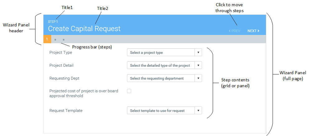
The steps that drive the wizard are defined in the WizardPanel data source. Within the data source, you define step properties such as:
- The value to use for each step (to show the step contents)
- The step titles (Title1 and Title2)
- The step tooltip text for the progress bar
- Whether the step is required to be completed before the user can move to the next step (and if so, whether the step is currently complete)
- Whether the step is hidden (for wizards with variable steps)
As users move through the steps using the Prev and Next buttons in the header (or by clicking the step icons in the progress bar), the titles for the current step display at the top of the page, and the progress bar updates to show the current step. Additionally, the value for the step is written to the Selected Value of the Wizard Panel component.
To display the wizard contents, this example uses the thematic Formatted Grid component that is present in the Wizard Panel by default. When using this approach, the step values are all names of Grid data sources. The Formatted Grid component is configured to read its data source from the Selected Value of the Wizard Panel. Therefore as the Selected Value changes, so does the content of the grid, by pointing to a different data source.
Alternatively the step values can be Panel component names. When using this approach, only the panel that corresponds to the current Selected Value is shown in the wizard. For more information, see Defining the wizard contents for each step.
A Wizard Panel component must have a defined data source in the file to define the list of wizard screens and their basic properties. The tags for the data source are as follows:
Primary tag
Row tags
Column tags
NOTES:
- The primary tag must be placed in the first 500 rows of the sheet.
- Formulas can be used to create the tags, as long as the initial bracket and identifying keyword are whole within the formula.
The following example shows sample wizard steps flagged in a report.
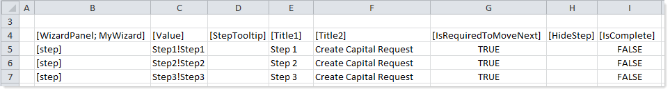
To use the Data Source Wizard to add the tags to a sheet, right-click in a cell and then select Create Axiom Form Data Source > Wizard Panel. You can also highlight a range of cells first and then use the wizard. Axiom Software will add the tags as displayed in the example above. The cells in the row above and the column to the left of the selected area must be blank in order for Axiom to place the tags in sheet.
The resulting wizard for this example data source would appear as shown in the previous section.
You can define the following properties for a Wizard Panel component.
Component properties can be configured using the Form Assistant task pane or the Form Designer unless otherwise noted. All properties can also be defined on the Form Control Sheet directly if desired. For example, if you want a property to be dynamic depending on the result of a formula, you can define that formula in the control sheet. To access the control sheet settings for the component, double-click any property name to go to that property in the Form Control Sheet.
Component behavior properties
The following properties control the display and behavior of this particular component type.
| Item | Description |
|---|---|
|
Data Source |
The data source for the component, to define the steps in the wizard and their properties. A data source must be tagged within the file as detailed in the previous section, and then selected for the component. You can select any WizardPanel data source defined in the file.
NOTE: In the Form Control Sheet, the selected data source is written as SheetName!DataSourceName. The sheet name is the sheet where the selected data source is located. If a data source is already specified and you want to locate it within the file, click the Show location |
|
Selected Value |
The currently selected value for the Wizard Panel component. This setting is used to associate each step in the wizard with the content to display in the panel. As the user clicks through the wizard steps, the corresponding value from the If the Selected Value is left blank, the value for the first step in the WizardPanel data source is assumed as the selected value when a user opens the form. If you want the wizard to start at a step other than the first step, you must enter the value for the desired step. The values should be either Grid data source names (if using the default Formatted Grid component) or Panel component names. As the user moves through the steps of the wizard, the contents will update to show the current Grid data source or panel. For more information, see Defining the wizard contents for each step. |
|
Update Selected Values |
Specifies when the selected value for the Wizard Panel component is updated after a user navigates to a different step. Select one of the following:
These options correspond to the processing steps used by command adapters to determine when the command is run during the form update process. Behind the scenes, the Wizard Panel uses an internal command adapter to set its current step. |
|
Allow Step-Specific Navigation |
Specifies whether users can use the progress bar at the top of the wizard to navigate to specific steps. By default, this option is enabled, which means that users can click on the dots in the progress bar to navigate directly to the corresponding step in the wizard. If this option is disabled, then the progress bar is for display only. It shows users where they are in the current step progression, but they cannot use the progress bar to navigate to specific steps. Users must use the Back and Next buttons to navigate. You should disable this option if you are using the |
|
Title Text |
The title text for the component. This text displays in the header bar for the component within the Axiom form, if the title bar is enabled. By default the title bar is disabled for Wizard Panel components, so this text does not display at all in the form. |
|
Show Title Bar |
Specifies whether the title bar is visible. By default this is disabled, which means that the title bar and the title text do not display on the wizard. If enabled, then the title bar and title text will display on the wizard. When using the default configuration of the Wizard Panel component, it is recommended to leave this option disabled. By default the wizard fills the entire form window, so the title bar is typically unnecessary and the title border is not visible. |
|
Overflow |
Specifies the behavior if child components extend beyond the visible area of the panel. Select one of the following:
|
 button to the right of the drop-down list. This will move your cursor to the associated data source tag in the file.
NOTE: The Child Layout property for Panel components does not apply to the Wizard Panel.
The following general properties are available for all components:
| Item | Description |
|---|---|
|
Component Name |
The name of the component. This is for identification in the file; this name does not display on the Axiom form canvas. The name of the component identifies the corresponding settings for the component on the Form Control Sheet. The component names are also useful if you have multiple types of the same component within an Axiom form, so that you can tell which component you are currently editing. Component names must be unique within a file and must start with a letter. Names can only contain letters, numbers, and underscores. Names are validated when the file is saved; an invalid name will prevent the save. NOTE: Spaces are not allowed in component names and will be automatically removed by Axiom Software. For example, if you enter "My Component" as the component name, it will be automatically adjusted to "MyComponent". |
|
Visible |
Specifies whether the component is visible on the Axiom form (On/Off). By default this is set to On. This setting can be used to dynamically show or hide the component using a formula. Keep in mind that if you have multiple components that you need to dynamically show or hide based on the same condition, then it is preferable to place those components on a dedicated layer and then show or hide the entire layer instead of the individual components. NOTE: This setting is only available on the Form Control Sheet; it cannot be set in the Form Assistant or in the Form Designer. |
|
Layer |
The layer that the component belongs to on the Axiom form canvas. In the Form Assistant and the Form Designer, this displays as the layer name (for example: Layer 1). In the Form Control Sheet, this is recorded as the layer ID (for example: 1). If the canvas only has one layer, then the component is automatically assigned to that layer and cannot be changed. If the canvas has multiple layers, you can assign the component to any layer using the drop-down list. By default, the component will be assigned to whichever layer is selected in the Layers box when you initially drag the component onto the canvas. For more information on layers, see Using multiple layers on the canvas. If desired, you can jump to the applicable layer settings on the Form Control Sheet by clicking the binoculars icon |
|
Parent |
The parent component that this component is assigned to. If blank, then the component does not have an assigned parent. Currently, only Panel components can be designated as parents. If a component has an assigned parent, then that component is positioned within the parent instead of within the canvas at large. If the parent is hidden, all "child" components of that parent are also hidden. The parent assignment is automatically completed when a component is dragged into a panel in the Form Designer, and automatically cleared when a component is dragged out of a panel. In most cases, you should not need to manually assign a parent. For more information, see Using panels to group and position components. |
Style and formatting properties
To define the component formatting, you can assign one or more styles to the component. Styles can impact formatting properties such as fonts, borders, and colors.
If you do not want to apply a style to this component, or if you want to override one or more formatting properties in an assigned style, click the Show Advanced Settings link underneath the Style box to display the individual formatting properties. For more information on defining individual formatting properties for a component, see Formatting overrides for Axiom form components.
| Item | Description |
|---|---|
|
Style |
By default, Wizard Panel components are automatically assigned the docked-to-container style. This style is used to set the size and position of the panel, as well as several formatting properties. In the majority of cases, you should leave the assigned style as is. Although you can remove or change the style, it is not recommended to do so. The Wizard Panel component is designed to be used with this assigned style. The colors used by the Wizard Panel cannot be changed by use of styles. |
|
Theme Override |
(Deprecated.) The theme to use for the component instead of the form-level theme. If left blank, the component uses the form-level theme. This setting should be left blank unless you need to override the form theme. Generally speaking, themes should be set at the form level and only overridden at the component level when necessary. This setting is available in the advanced component properties (click Show Advanced Settings under the Style box). On the Form Control Sheet, the setting displays using the name Theme Override. NOTE: This setting only applies if your form uses a legacy skin (any skin except the default Axiom2018). The Axiom2018 skin does not use themes. |
Position and size properties
You can view the position and size properties for a component by clicking the Show Advanced Settings link under the Style box. If necessary, you can edit these properties directly (instead of automatically modifying them by adjusting the component's position and size on the canvas). For more information on using these settings, see Controlling component position and size.
When you drag and drop a Wizard Panel component onto the canvas, the position and size properties are automatically left blank so that the panel can inherit these properties from the docked-to-container style. This style sets the x- and y-position of the component to 0px so that it is placed in the top left corner, and sets the width and height to dock so that the panel fills the full page. The panel is also locked by default (Lock Layout enabled) so that you cannot accidentally move it when working on the form canvas.
In the majority of cases, you should leave the position and size properties as is. Although you can override these settings—for example, to move the entire panel to the right so that you can have space for a left-hand sidebar—it is not recommended to do so. The Wizard Panel component is designed to be used as a full-page screen.
For more information on the available settings, see Controlling component position and size.
Interactive behavior
The Wizard Panel includes interactive elements that can be used to change the current contents shown in the wizard.
- The Prev and Next buttons can be used to move to the previous or next steps in the step progression.
- The progress bar can be used to navigate to specific steps, by clicking the step dots.
When a user clicks one of these buttons, the Wizard Panel always triggers a full form update (in other words, the wizard always uses auto-submit behavior). The Selected Value field for the Wizard Panel becomes populated with the value that corresponds to the currently selected step, as defined in the WizardPanel data source. For example:
- If the user is currently on the second step and clicks Next, the Selected Value field is populated with the value for the third step.
- If the user clicks the third button in the progress bar, the Selected Value field is populated with the value for the third step.
When the form update is complete, the wizard will show the contents for the third step.
The "third step" is determined dynamically each time the form update is triggered, based on the currently visible steps in the data source. This is determined by the [HideStep] column. If no steps are hidden, then the third step is the third row of the data source. But if some steps in the data source are hidden, then the third step might be the fourth row of the data source (for example if the third row is currently hidden).
NOTE: By default, the selected value for the Wizard Panel is not set until after Axiom queries are run. This means that you can use the returned data to determine whether a step should be shown or hidden via the [HideStep] column. However, this also means that you cannot dynamically enable or disable an Axiom query based on the current step, because the queries are already run by the time the current step is determined. If desired, you can change the timing of when the selected value is set, using the Update Selected Values property on the component.
In most cases the contents of each wizard step are also interactive, but that interactivity is governed by the specific components used to define the contents. For example, if you are using a Formatted Grid component to define the step contents, you must decide if you want auto-submit to be enabled for the grid or not. If auto-submit is not enabled for the step contents, then you must decide whether the contents can be submitted when the user clicks a Wizard Panel button, or if you need a separate button in the step contents to trigger the submit. If the step contents are required (using the [IsRequiredToMoveNext] column), then you must submit the step contents separately so that the step can resolve to completed in the data source (using the [IsComplete] column) and therefore enable the Next button in the wizard header.
Defining the wizard contents for each step
There are two different approaches you can use to define the contents for each step of the wizard:
-
Thematic grid: You can use a single thematic Formatted Grid component for the contents, and then dynamically change the data source used to populate the grid for each step. Thematic grids support a variety of input controls such as combo boxes, check boxes, text boxes, and buttons, so it is possible to create robust screens with just this single component type. The default Wizard Panel component includes a preconfigured thematic grid that can be used for this purpose. For more information, see Using a formatted grid for Wizard Panel content.
-
Panels: You can use a series of regular Panel components with child components to create the contents, and then dynamically show the appropriate panel for each step. The main advantage of this approach is that you can use any component in your wizard screens (including thematic grids). For more information, see Using panels for Wizard Panel content.
Your choice determines how the [Value] column should be populated in the WizardPanel data source. If using a grid, the values should be Grid data source names, in the format: SheetName!DataSourceName. If using panels, the values should be Panel component names.
Completing the wizard
After the user has completed all necessary inputs, you may need an action to "complete" the wizard. How the wizard is completed is up to the form designer. There is no built-in completion step or action. The wizard header does not display a Finish button.
In most cases, you should design the last step of the wizard with a button that performs the desired action. The button may simply trigger a save-to-database, and/or the button may use a command such as Add Plan File or RunEvent.
This last step may also include some explanatory text with a summary of what the user is about to do. For example, the last step could contain text such as "Click the Create Request button to create a new capital request with the following properties", followed by a summary of the key properties. Once the button has been clicked, you may want to update the page to display confirmation text and information on what to do next. For example: "Your request has been created. You can access this request from your Axiom Software home page."
Design alternatives
The Wizard Panel component is intended to streamline the process of creating guided input forms. However, it is possible to manually create all of the functionality that a Wizard Panel provides.
For example, you can manually create several layers and use buttons to dynamically show and hide those layers as appropriate. The buttons can simulate the "Previous" and "Next" progression provided by the wizard, or they can be used as "tabs" to toggle among the available layers. Once all required inputs have been gathered, you can dynamically show a "Finish" or "OK" button that triggers a particular action, and then display a final confirmation screen. In this case, you must set up all of the dynamic relationships yourself, so that the appropriate content displays for each screen.
