AX1195
for Axiom forms
The Date Picker component is an interactive component that displays an input box for date selection in the Axiom form. Users can click the calendar icon to select a date from a calendar control. This date selection can be used to impact the Axiom form in some way.
The Date Picker component can be used to select any of the following:
- A full date (1/1/2019)
- A month/year combination (January 2019)
- A year (2019)
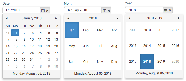
Example date pickers in a form (the date shown at the bottom is the current date)
You can define the following properties for a Date Picker component.
Component properties can be configured using the Form Assistant task pane or the Form Designer unless otherwise noted. All properties can also be defined on the Form Control Sheet directly if desired. For example, if you want a property to be dynamic depending on the result of a formula, you can define that formula in the control sheet. To access the control sheet settings for the component, double-click any property name to go to that property in the Form Control Sheet.
Component behavior properties
The following properties control the display and behavior of this particular component type.
| Item | Description |
|---|---|
|
Selected Date |
The currently selected date of the date picker. This setting serves two purposes:
The selected date is stored in the source spreadsheet as an Excel date/time serial number. Keep in mind that the date picker allows users to clear the date and return a blank value. If the selected date value is being used in calculations and/or to drive other components in the form, make sure to construct the relationship to accommodate a possible blank value. NOTES:
|
|
Earliest Date |
Optional. Specify the earliest date that is valid for a user to select in the date picker. If specified, the calendar control will not allow the user to select a date that is earlier than this date. You can use the Choose a date button [...] to open a calendar control and select a date. You can also modify the Form Control Sheet directly to use a formula or an indirect cell reference, but in this case you must make sure that value returned by the formula or in the referenced cell is an actual date value. See Handling date formats for more information. |
|
Latest Date |
Optional. Specify the latest date that is valid for a user to enter into the date picker. If specified, the calendar control will not allow the user to select a date that is later than this date. You can use the Choose a date button [...] to open a calendar control and select a date. You can also modify the Form Control Sheet directly to use a formula or an indirect cell reference, but in this case you must make sure that value returned by the formula or in the referenced cell is an actual date value. See Handling date formats for more information. |
|
Selection Type |
Specifies the type of date value for selection:
The type determines the values for selection and the display of the selected value in the control. However, the return value is always a full date. See Handling date formats for more information. |
|
Tooltip |
Optional. The tooltip text for the component. When a user hovers the cursor over the component, the text displays in a tooltip. |
|
Read-Only |
Specifies whether the date picker is read-only.
This is intended for situations where you want to dynamically change the date picker from read/write to read-only depending on a certain criteria. |
|
Auto Submit |
Specifies whether the Axiom form automatically updates when a user changes the state of the component. By default, this is enabled, which means that the form automatically updates when the user selects a date. If this setting is disabled, then the user must use the Button component in order to update the form for the changed state. |
|
Save on Submit |
Specifies whether a save-to-database occurs when a form update is triggered by this component.
This setting only applies if Auto Submit is enabled for the component. If you are not using the auto-submit behavior but you do want to save data to the database from the Axiom form, then you should instead enable Save on Submit for the Button component that you are using to trigger the update process. |
The following general properties are available for all components:
| Item | Description |
|---|---|
|
Component Name |
The name of the component. This is for identification in the file; this name does not display on the Axiom form canvas. The name of the component identifies the corresponding settings for the component on the Form Control Sheet. The component names are also useful if you have multiple types of the same component within an Axiom form, so that you can tell which component you are currently editing. Component names must be unique within a file and must start with a letter. Names can only contain letters, numbers, and underscores. Names are validated when the file is saved; an invalid name will prevent the save. NOTE: Spaces are not allowed in component names and will be automatically removed by Axiom Software. For example, if you enter "My Component" as the component name, it will be automatically adjusted to "MyComponent". |
|
Visible |
Specifies whether the component is visible on the Axiom form (On/Off). By default this is set to On. This setting can be used to dynamically show or hide the component using a formula. Keep in mind that if you have multiple components that you need to dynamically show or hide based on the same condition, then it is preferable to place those components on a dedicated layer and then show or hide the entire layer instead of the individual components. NOTE: This setting is only available on the Form Control Sheet; it cannot be set in the Form Assistant or in the Form Designer. |
|
Layer |
The layer that the component belongs to on the Axiom form canvas. In the Form Assistant and the Form Designer, this displays as the layer name (for example: Layer 1). In the Form Control Sheet, this is recorded as the layer ID (for example: 1). If the canvas only has one layer, then the component is automatically assigned to that layer and cannot be changed. If the canvas has multiple layers, you can assign the component to any layer using the drop-down list. By default, the component will be assigned to whichever layer is selected in the Layers box when you initially drag the component onto the canvas. For more information on layers, see Using multiple layers on the canvas. If desired, you can jump to the applicable layer settings on the Form Control Sheet by clicking the binoculars icon |
|
Parent |
The parent component that this component is assigned to. If blank, then the component does not have an assigned parent. Currently, only Panel components can be designated as parents. If a component has an assigned parent, then that component is positioned within the parent instead of within the canvas at large. If the parent is hidden, all "child" components of that parent are also hidden. The parent assignment is automatically completed when a component is dragged into a panel in the Form Designer, and automatically cleared when a component is dragged out of a panel. In most cases, you should not need to manually assign a parent. For more information, see Using panels to group and position components. |
 next to the drop-down list.
Style and formatting properties
To define the component formatting, you can assign one or more styles to the component. Styles can impact formatting properties such as fonts, borders, and colors.
If you do not want to apply a style to this component, or if you want to override one or more formatting properties in an assigned style, click the Show Advanced Settings link underneath the Style box to display the individual formatting properties. For more information on defining individual formatting properties for a component, see Formatting overrides for Axiom form components.
Currently, the Axiom Software platform does not provide any styles specifically designed for Date Picker components. Only the generic styles are available. Most date picker styling is controlled by the form-level skin.
| Item | Description |
|---|---|
|
Style |
Optional. The styles used to determine the formatting of the component. You can assign one or more styles. Click the Select component styles button [...] to open the Choose Style dialog. Using this dialog, you can select one or more styles to apply to the component. The available styles depend on the component type and the skin assigned to the form. For more information, see Using component styles. Some components have several styles that are specifically designed for that component type, while other components may only have the "generic" styles that are available to all components. When using a generic style, keep in mind that they may not be useful for all components. You can view a description of each style and view the effective formatting applied by the selected styles within the Choose Style dialog. |
|
Component Theme |
(Deprecated.) The theme to use for the component instead of the form-level theme. If left blank, the component uses the form-level theme. This setting should be left blank unless you need to override the form theme. Generally speaking, themes should be set at the form level and only overridden at the component level when necessary. This setting is available in the advanced component properties (click Show Advanced Settings under the Style box). On the Form Control Sheet, the setting displays using the name Theme Override. NOTE: This setting only applies if your form uses a legacy skin (any skin except the default Axiom2018). The Axiom2018 skin does not use themes. |
You can view the position and size properties for a component by clicking the Show Advanced Settings link under the Style box. If necessary, you can edit these properties directly (instead of automatically modifying them by adjusting the component's position and size on the canvas). For more information on using these settings, see Controlling component position and size.
| Item | Description |
|---|---|
|
Reference Location |
The reference location determines how the x-position and y-position of a component are evaluated. By default the reference location is UpperLeft. NOTE: This setting is not exposed in the advanced component settings. It can be changed on the canvas by double-clicking the corner selection handles of a component, or you can edit the setting on the Form Control Sheet directly. |
|
X Position Y Position |
The x-position determines the component's position along the horizontal axis, and the y-position determines the component's position along the vertical axis. Both are evaluated relative to the reference location. Positions can be set in pixels (default) or percentages. |
|
Width Height |
The width and height determine the size of the component. The width and height can be set in pixels (default) or percentages. Size keywords are also available to support special behavior. |
|
Rendering Order |
The order in which the component is rendered in the layer. A component with a larger order number will display above a component with a smaller order number. For components that support tab navigation (tabbing to the next editable component), the rendering order also determines the tabbing order. NOTE: On the Form Control Sheet, this setting is labeled as Z-Index. |
|
Lock Layout |
If enabled, the component size and position are locked and cannot be changed by dragging and dropping on the canvas. This optional setting is intended to protect against accidentally moving or resizing a component while working on the canvas. |
Interactive behavior
The Date Picker component allows the user to select a date. This date is submitted back to the source file, and written to the Selected Date setting on the Form Control Sheet. You might be collecting the date to save to the database, or to impact the state of another component.
If you want the Axiom form to respond to the selected date, then you must set up the file so that another component references the date and changes based on it. For more information on setting up interactive components for an Axiom form, see Using interactive components in an Axiom form.
Example
An Axiom form could contain a chart with data that starts as of a certain date. The date range for the chart could look to the Selected Date field for the Date Picker component to determine the starting date. When the user selects a new date and submits it back to the source file, the date range of the chart changes and then the data changes in response.
Within the date picker control, the selected values are displayed as follows, depending on the selection type. The exact format depends on your system locale.
- Date: Dates are displayed in an Excel "short date" format, such as 1/1/2019.
- Month: Months are displayed in month/year format, such as January 2019.
- Year: Years are displayed as the year number, such as 2019.
However, in all cases, the selected value is returned to the source spreadsheet as an Excel date/time serial number. If you want to use just the selected month or the year in your calculations, you may need to use functions such as MONTH or YEAR to extract the information from the full date.
If you want to set a default value for the date picker (or set minimum and maximum dates to restrict the valid selections), then your value must be resolvable as an Excel date/time value. For example, if you want to set a default value when using the Year selection type, you cannot simply enter the number 2019. Instead, you must enter a date such as 1/1/2019. The date picker control will resolve this date value as the year 2019. If you enter just the number, then the date picker will not interpret that value as a date.
Design alternatives
Axiom forms often support several different ways of performing the same task, to provide a broad range of display options and user interface behavior. Depending on your form design, you may want to consider the following alternatives:
-
The DatePicker content tag can be used in Formatted Grid components to present a calendar control within a grid. You may want to do this if your form is primarily grid-based, or if the calendar needs to be integrated with the other contents of the grid. For more information, see Using date pickers in Formatted Grids.
-
The Calendar refresh variable can be used to present a calendar control in the Web Client filter panel. You may want to do this if the date selection only impacts the data refresh and does not need to be displayed on the form itself with the other form contents.
