AX1676
Using the Report Builder, you can configure all aspects of a web report, including:
- Defining general report settings like the display title and optional associated file group
- Defining one or more data sources to determine the data available to the report
- Adding and removing components such as data grids and labels
- Resizing and moving components to determine the size and position of each component
- Configuring component properties to determine the data and/or text shown in each component, and other display properties
- Defining refresh variables to allow users to change the data in the report based on their selected values
The Report Builder is available as follows:
-
When you create a new web report, the new report is automatically opened in the Report Builder.
-
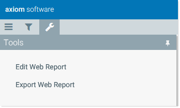
You can edit existing reports in the Report Builder. Open the web report that you want to edit, then select Tools > Edit Web Report to open the report in the Report Builder.
Report Builder overview
The Report Builder consists of the following:
- Configuration panels docked along the left-hand side of the screen, to configure various aspects of the report.
- A report canvas area showing the placement of the components in the report.
- A secondary toolbar in the right-hand side of the task bar to save and preview the report.
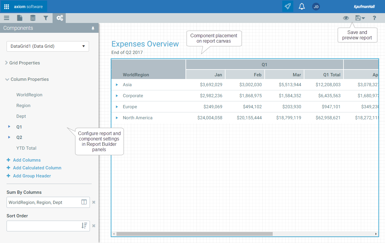
Example Report Builder
The Report Builder configuration is organized into the following panels. Select the icons in the left-hand side of the task bar to switch between different panels.
| Report Builder Panels | Icon | Description |
|---|---|---|
|
Report Settings |
|
Optional. Define general settings for the report, such as a title and an associated file group. For more information, see Defining general report settings. |
|
Data Source |
|
Define one or more data sources for the report. Data sources determine the data available to Data Grid components. For more information, see Defining data sources for Data Grid components. |
|
Refresh Variables |
|
Optional. Define one or more refresh variables for the web report, to allow users to filter the report data on demand. For more information, see Configuring refresh variables for web reports. |
|
Components |
|
Configure the components in the report, such as a Label component for the report title, and a Data Grid component to display data. Component properties determine the display and content of each component. For more information, see Configuring component properties. |
To get help on any of these areas, click the help icon in the right-hand side of the task bar. For example, if you are currently on the Refresh Variables panel, clicking the help icon takes you to information about refresh variables.
Defining general report settings
You can define general report settings for each web report. These settings are defined on the Report Settings panel 
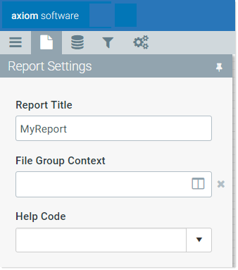
Example Report Settings panel
Report settings
| Item | Description |
|---|---|
|
Report Title |
Optional. Defines alternate title text to display in the browser tab instead of the full file name. By default, the file name is set as the report title. |
|
File Group Context |
Optional. Associates the web report with a file group. You can do this if you want to limit the available tables in the report to tables used by the file group, and you want the report to be dynamic based on file group table variables. For more information, see Associating a web report with a file group. |
|
Help Code |
Optional. Associates the web report with a custom help code, to provide report-specific help. Select any help code as defined in the Custom Help Admin area. For more information, see Associating a web report with a help code. |
|
Help Source |
Optional. The help source in which to find the help code. By default, this is set to Database, which means that the help code was defined using the Custom Help Admin feature and is stored in your Axiom Budgeting & Performance Reporting database. Other entries of Product, Web, and Desktop are supported, but these are primarily used by product developers or implementation consultants. |
|
Product Name |
Optional. The product help in which to find the help code, when the Help Source is set to Product. This must match an installed product name. |
|
Product Area |
Optional. The product area that the file belongs to, for display purposes in the Web Client. This option is only present in systems with installed products. |
|
Show Grid Line |
Specifies whether grid lines show on the web report canvas. By default, this is enabled, which means grid lines show on the canvas. If disabled, grid lines do not display. This option only applies when the report is open for editing in the Report Builder. It has no effect when viewing the web report. |
|
Snap to Grid |
Specifies whether components automatically align with the nearest gridlines when you move them on the canvas by dragging and dropping. By default, this is enabled, which means components snap to grid lines. If disabled, components do not snap to grid lines and can be positioned in between the lines. NOTE: Show Grid Line does not have to be enabled in order to enable Snap to Grid. |
Adding and deleting components
Depending on the template you used to create the web report, it may already have components, or it may be a blank report. You can add components as needed, and you can delete components. For more information on the available components, see Web report components.
To add a component:
-
Click the plus icon at the top of the panel to display the component toolbox.
TBD
- Drag and drop a component from the menu to the desired location on the web report.
Once the component is in the report, you can move and resize it, and configure its properties. See the other sections in this topic for more information.
To delete a component:
- Select the component on the web report. When a component is selected, it displays with a blue box around it.
- Press the Delete button on your keyboard.
The component is deleted, as well as its configuration settings.
Moving and resizing components
Once a component has been added to the web report, you can move it to different locations, and you can resize it.
-
To move a component, select the component on the report and then drag and drop the component to the desired location. You can also use the arrow keys to move the component in the arrow direction (up, down, left, right).
-
To resize a component, select the component on the canvas and then hover your cursor over one of the selection handles on the corners and sides of the component, so that the cursor becomes a two-sided arrow. You can then resize the component to a larger or smaller size by dragging the selection handle.
To maintain the current proportions when you resize, hold down the SHIFT key and drag any of the non-corner selection handles. For example, if you want to resize an image but maintain the current aspect ratio.
When you are using the Report Builder panel, gridlines display on the web report to help you size and position components in the report. Each minor line in the grid represents 10px and each major line in the grid represents 100px. The gridlines only display when the report is open for editing; they do not display when viewing the web report.
Alignment lines also display on the report when you drag a component close to alignment with the edge of another component. If you drop the component while an alignment line is displayed, the component will align with that edge of the other component.
Configuring component properties
When you create a new web report, the report has one or more components as determined by the template used to create the report. Currently, it is not possible to add or remove components, or to move or resize components. However, you can otherwise configure the component properties.
Each component on a web report has properties that determine the display and content of that component. For each component in the report, you must review these properties and configure them as needed. For example, Label components have display text, and Data Grid components have selected columns to display in the grid.
Components are configured on the Components panel 
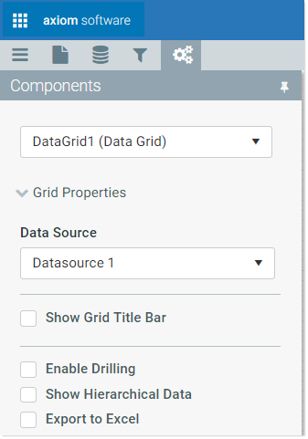
Example Components panel
To configure a component in a web report:
-
Select the component that you want to configure. You can do either of the following to select the component:
-
Click on a component in the web report canvas to select it.
OR
-
Use the drop-down list at the top of the Components tab to select a component. Components are listed by component name and type.
The properties for the selected component display in the panel.
-
-
Edit the component properties as needed. The specific properties depend on the component type.
For more information on configuring the component properties for a particular component type, see Web report components and view the topic for the relevant component type.
Previewing and saving the web report
At any time, you can save the current web report configuration by clicking the Save icon in the right-hand side of the task bar.
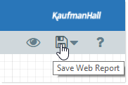
If you want to save a copy of the web report, click the down arrow next to the Save icon to open the Save menu, then click Save As.
Although the display of the web report in the Report Builder is close to the actual display, components are not fully interactive within the editor. If you want to see how end users can interact with the web report, you can use the preview feature.
-
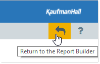
To preview the web report, click Preview (the eye icon) in the right-hand side of the task bar. This automatically saves the report and opens it in the normal web report view. You can then test interactivity as needed.
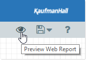
-
To return to the Report Builder and make further changes, click Return (the back arrow icon) in the right-hand side of the task bar.