AX1529
Button components can be used to present a selection dialog to users. Users can select one or more items in the dialog, and then those selections will be submitted back to the source file.
To use a button for selection of multiple items, you must:
- Specify the button behavior as Multi-Select Items.
- Create a MultiSelect data source in the file to define the list of items, and then configure the button to use that data source.
The multi-select button behavior is best suited for small lists of items. The dialog does not support "type to search" behavior to help users find items in the list. Users must scroll through the list in order to select items.
Configuring a button for multi-select behavior
To configure a Button component as a multi-select button, select Multi-Select Items as the Button Behavior. Once this behavior is selected, the following additional properties become available for the component:
| Item | Description |
|---|---|
|
Data Source |
The data source to define the list of items for the selection dialog. You can select from any MultiSelect data source defined in the source file.
NOTE: In the Form Control Sheet, the selected data source is written as SheetName!DataSourceName. The sheet name is the sheet where the selected data source is located. If a data source is already specified and you want to locate it within the file, click the Show location |
|
Confirmation Message |
Optional. Defines explanatory text to display at the top of the selection dialog. If omitted, the dialog will display the text "Select one or more items from the list." |
 button to the right of the drop-down list. This will move your cursor to the associated data source tag in the file.
Notice that there is no component property to store the selected items. Instead, items are flagged as selected or not within the MultiSelect data source itself. To configure the form to change based on the selected values, you must reference the [Selected] column in the data source.
MultiSelect data source
A MultiSelect data source must be created in the source file to define the list of items. The tags for the data source are as follows:
Primary tag
Row tags
Column tags
NOTES:
- The primary tag must be placed in the first 500 rows of the sheet.
- Formulas can be used to create the tags, as long as the initial bracket and identifying keyword are whole within the formula.
The following example shows sample data flagged in a report. In real implementations this data might be generated by an Axiom query or other query methods; here the data is simply typed in order to show the placement of the tags to the data.
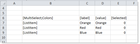
To use the Data Source Wizard to add the tags to a sheet, right-click in a cell and then select Create Axiom Form Data Source > MultiSelect. If the data already exists in the sheet, you can first highlight the labels and the values (in the example above, you would highlight C7:E9) and then use the wizard. Axiom Software will add the tags as displayed in the example above. The cells in the row above and the column to the left of the highlighted area must be blank in order for Axiom to place the tags in sheet.
The resulting selection dialog appears as follows:
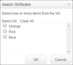
If a user selected both Orange and Red and then clicked OK, the [Selected] column in the data source would be updated to 1 for those two items.
Multi-select alternatives
Axiom forms often support several different ways of performing the same task, to provide a broad range of display options and user interface behavior. Depending on your form design, you may want to consider the following alternatives:
-
Select tags in Formatted Grid components can be configured to allow multi-select. In this case, the selected items are written to the target cell using a comma-separated list. For more information, see Using drop-down lists in Formatted Grids.
- The Grid refresh variable can be used to allow multi-select in the Web Client filter panel. You may want to do this if the user's selections only impact the data refresh, and do not need to be displayed on the form itself with the other form contents.
It is also possible to use a Formatted Grid component with CheckBox tags to allow users to select multiple items displayed in the grid. The logic employed to determine which items are currently selected would be the same as when using the multi-select button—instead of checking the [Selected] column of the MultiSelect data source, you would check the target column of the CheckBox tags. The grid with the check boxes could be displayed directly in the form, or launched using a Dialog Panel as needed. For more information, see Using check boxes in Formatted Grids.
