AX1054
You can use the CheckBox content tag within a Grid data source to present an interactive check box to users.
The CheckBox tag has no effect within the source file itself, but when the file is viewed as an Axiom form, the cell containing the Checkbox tag will be resolved as an interactive check box. The user can check and uncheck the box, and this state change will be submitted back to the source file.
The CheckBox tag can also be used to present an interactive toggle switch within a grid. One of the parameters of the CheckBox tag determines whether it displays as a check box (the default behavior) or as a toggle switch (optional behavior).
NOTE: If you want to display a static check box symbol in a grid (meaning you do not need the user to be able to check and uncheck the box), then you can use the Symbol tag instead.
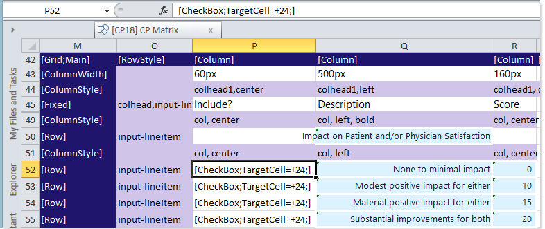
Example CheckBox tags in a Grid data source
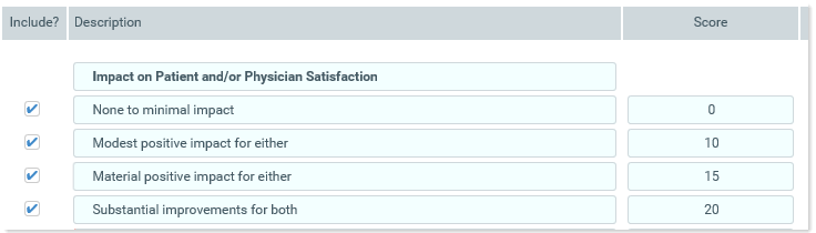
Rendering of example tags in an Axiom form
Content tag syntax for check boxes
The syntax for the CheckBox content tag is as follows:
[Checkbox; TargetCell=CellAddress; FormState=KeyName; SharedVariable=VariableName; Text=LabelText; Tooltip=Text; Symbol-checked=SymbolName; Symbol-unchecked=SymbolName; ReadOnly=True/False; ToggleSwitch=True/False; OnText=Text; OffText=Text; AutoSubmit=Enabled/Disabled/Grid; ColumnStyle=StyleName; Columns=Number;]
Parameters can be listed in any order after the CheckBox tag. Optional parameters can be omitted.
To create the tag, you can manually type it within a cell, or you can use the Data Source Assistant / Tag Editor. For more information, see Creating and editing content tags in Formatted Grids.
| Parameter | Description |
|---|---|
|
TargetCell |
The cell to place the current state of the check box—checked (1) or unchecked (0). You can specify the cell using one of the following options:
For more information, see Referencing cells in content tag parameters. The target cell cannot be the same cell that contains the CheckBox tag. The target cell can be anywhere in the spreadsheet and does not need to be visible within the formatted grid. NOTES:
|
|
FormState |
The key name for the value to be stored in the form state. For example, IncludeItem. The name must be unique. It is best to define a name that relates to the specific purpose of this check box. When a form state key name is defined, the current state of the check box is not stored anywhere in the source file. Instead, it is stored in form state memory for the current file. If you need to reference the value within the form, you can use the GetFormState function to return the value into a cell. The FormState parameter should only be used if the form is intended to be used as a dialog in the Excel Client or the Windows Client, and you need to be able to pass values from the form to the currently active spreadsheet. For more information, see Passing values between an Axiom form and the active client spreadsheet (form state). |
| SharedVariable |
The shared variable name to save the selected value as. For example, IncludeItem. When a variable name is defined, the current state of the check box is not stored anywhere in the source file. Instead, it is saved to the variable list that is stored in memory for the shared form instance. If you need to reference the value within the form, you can use the GetSharedVariable function to return the value into a cell. The SharedVariable parameter should only be used if the form is intended to be used in an embedded form context (as either the parent form or a child form), and you need to share this value with other forms in the shared form instance. For more information, see Sharing variables between parent and child forms. |
|
AutoSubmit |
Optional. Specifies how interactive controls submit values back to the source file:
If omitted, the default behavior is Grid. |
|
Text |
Optional. If defined, the label text displays to the right of the check box. Otherwise, only the check box displays in the cell. You can define the text within the tag directly, or you can use a bracketed cell reference to read the text from another cell. For more information, see Referencing cells in content tag parameters. This parameter does not apply and is ignored if the ToggleSwitch parameter is set to True. |
| Tooltip |
Optional. Specifies tooltip text to display when a user hovers the cursor over the cell contents. Alternatively, you can use a bracketed cell reference to read the tooltip text from the referenced cell. This approach is useful if you want to dynamically determine the text, because then the formula can be in the referenced cell instead needing to construct the tag using a formula. For more information, see Referencing cells in content tag parameters. |
|
Symbol-checked |
Optional. The symbol to use to represent the checked state of the check box. By default this is icon-check. You can use any symbol allowed by the Symbol content tag. When using the Data Source Assistant / Tag Editor, you must first select the Use Custom Symbol check box in order to expose this option. You can then click the ... button to select a symbol from the Choose Symbol dialog. Alternatively, you can use a bracketed cell reference to read the symbol name from another cell. For more information, see Referencing cells in content tag parameters. This parameter does not apply and is ignored if the ToggleSwitch parameter is set to True. |
|
Symbol-unchecked |
Optional. The symbol to use to represent the unchecked state of the check box. By default this is icon-check-empty. You can use any symbol allowed by the Symbol content tag. When using the Data Source Assistant / Tag Editor, you must first select the Use Custom Symbol check box in order to expose this option. You can then click the ... button to select a symbol from the Choose Symbol dialog. Alternatively, you can use a bracketed cell reference to read the symbol name from another cell. For more information, see Referencing cells in content tag parameters. This parameter does not apply and is ignored if the ToggleSwitch parameter is set to True. |
|
ReadOnly |
Optional. Specifies whether the control is "active" (True/False). The default value, False, means that the control is active and that the user can check or uncheck the box as needed. If True, then the control becomes "frozen" and no further edits can be made. The control will display the current value of the target cell. This parameter can be used to control whether a user can edit the cell. Generally speaking, this parameter would only be used within a formula to dynamically enable / disable the check box. |
|
Columns |
Optional. Specifies how many columns the cell contents will span in the grid. If this parameter is omitted or set to 1, then content generated by the tag will only span the current column. If you want the content to span multiple columns, enter a number such as 2 to span 2 columns. The column span extends to the right. NOTE: The row and column styles used in the grid impact how the column span displays. For example, if the content in the starting column is left-aligned and does not naturally exceed the width of the starting column, then the spanned columns will simply be blank because no content is extending to those columns. However, if the content is long enough to extend out of the starting column, or if the content has external borders (such as a text box), or if the content is center-aligned or right-aligned, then content will display in the spanned columns. |
|
ColumnStyle |
Optional. Specifies one or more column styles to apply to the current cell. The specified styles override the current column styles set by the Enter one or more valid column style names, separated by commas. If you are using the Data Source Assistant / Tag Editor, you can click the [...] button to open the Choose Styles dialog and select from available styles. The available styles depend on the skin specified for the form. For more information, see Using row and column styles with Formatted Grids. Alternatively, you can use a bracketed cell reference to read the style from the referenced cell. This approach is useful if you want to dynamically determine the style, because then the formula can be in the referenced cell instead needing to construct the tag using a formula. For more information, see Referencing cells in content tag parameters. |
Toggle switch parameters
If you want to display a toggle switch instead of a check box within the grid, you can use the following parameters.
| Parameter | Description |
|---|---|
|
ToggleSwitch |
Specifies whether the interactive control displays as a check box or as a toggle switch. By default this is False, which means the control displays as a check box. If True, then the control displays as a toggle switch. When toggle switch behavior is enabled, the following parameters do not apply and are ignored:
When using the Data Source Assistant / Tag Editor, this option is labeled Use Toggle Switch. When you select the check box to use the toggle switch, the On Text and Off Text options are exposed. |
|
OnText |
Optional. Defines text to display when the switch is toggled to On. By default, the text On is used if no alternate text is defined. |
|
OffText |
Optional. Defines text to display when the switch is toggled to Off. By default, the text Off is used if no alternate text is defined. |
Behavior notes
-
To set the initial state of the check box, you can enter 1 (checked) or 0 (unchecked) into the target cell. If you are using form state or a shared variable instead of a target cell, then the default value can be set by entering 1 (checked) or 0 (unchecked) into the default value parameter of the GetFormState function or the GetSharedVariable function. These functions can be located anywhere in the sheet.
-
It is assumed that the target cell is off to one side (not visible in the formatted grid), within a work column. If you are saving the user's input to the database, the column to save is the column containing the target cell (not the column containing the input cell).
Examples
[Checkbox;TargetCell=K]
This example displays a check box using the minimum required parameters. The user can check or uncheck the box, and either 1 or 0 will be written to column K within the current row (for example if the tag is in row 22, the target cell is K22).
[Checkbox;TargetCell=K23;Text=Delete;AutoSubmit=Disabled]
In this example, text has been defined to display to the right of the check box. Also, when the user changes the state of the check box, the form will not be updated automatically (meaning a submit will not occur, regardless of whether the formatted grid is set to auto-submit).
[Checkbox;FormState=CheckBoxState]
In this example, the state of the check box is stored in form state memory under the key name CheckBoxState, instead of placing the state in a target cell. When the Axiom form is used as a dialog, this value can be passed to the currently active spreadsheet file (as True or False).
[Checkbox;SharedVariable=CheckBoxState]
In this example, the state of the check box is stored in memory in the list of variables for the shared form instance, as the value for the variable CheckBoxState. For example, you might do this so that the user can enable or disable something in a child form (displayed using the Embedded Form component), and then that state can be referenced in the parent form as well as other child forms within the shared form instance.
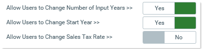
[CheckBox;TargetCell=H;ToggleSwitch=True;OnText=Yes;OffText=No;]
In this example, the ToggleSwitch parameter is used so that the interactive control displays as a toggle switch instead of a check box. Additionally, the OnText and OffText parameters are used to change the On/Off text shown on the toggle switch.
Checkbox tag displayed as toggle switches
