AX1601
for Axiom forms
The Form Help component displays custom help text in an Axiom form. You can use this component to provide information and instructions about the current form to end users.
For example, you may have a form that is used to gather user inputs and save them to the database, and you want to provide users with guidance on how certain fields in the form should be filled out, or give users information on how the inputs will be used after saving. Or the form may contain reporting data and charts, and you want to provide users with more information on the data, or explain certain terms and abbreviations used in the charts.
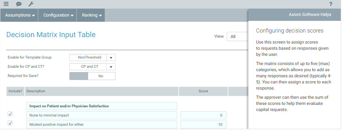
The Form Help component displays as a question mark icon in the form. When a user clicks on the icon, a panel slides out from the right-hand side of the form to display the help text associated with the component.
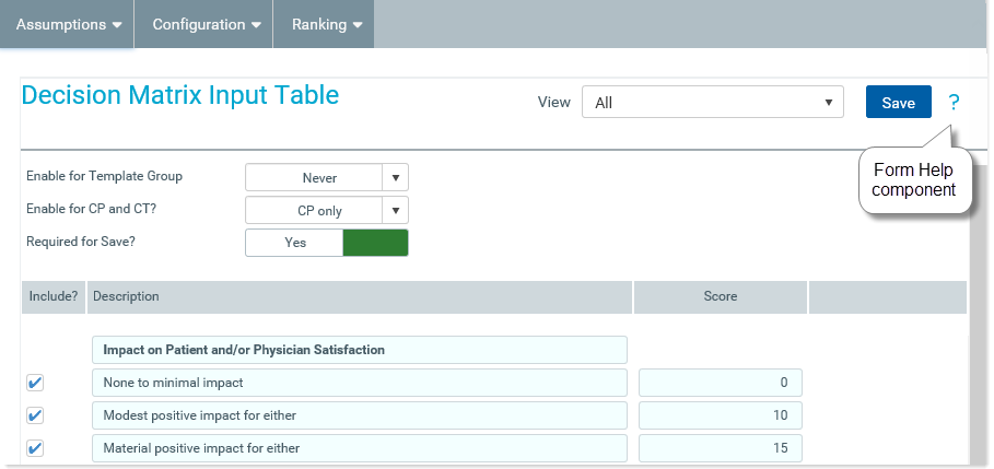
Example Form Help component
Displaying custom help for an Axiom form is a two-part process that requires the following:
-
Defining a help code and the associated help text that you want to display in the form. This is done separately, using the Form Help Admin page in the Web Client. For more information, see Managing custom help codes. (If a help code already exists for your desired text, you can use that code in as many forms as needed.)
-
Placement and configuration of a Form Help component on the Axiom form canvas. When configuring the component, you specify which help code it should use.
The Form Help component can be used by itself, or in conjunction with the form-level Help Code property. For example, you might use the form-level help code to provide overall help for the form, and then use the Form Help component to provide context-sensitive help for particular sections, fields, or other items in a form.
NOTE: If you want to use a Form Help component in conjunction with a Menu component, to provide help on the various tabs in the menu, then you can specify the help codes directly in the Menu data source. For more information, see Menu component for Axiom forms.
You can define the following properties for a Form Help component.
Component properties can be configured using the Form Assistant task pane or the Form Designer unless otherwise noted. All properties can also be defined on the Form Control Sheet directly if desired. For example, if you want a property to be dynamic depending on the result of a formula, you can define that formula in the control sheet. To access the control sheet settings for the component, double-click any property name to go to that property in the Form Control Sheet.
Component behavior properties
The following properties control the display and behavior of this particular component type.
| Item | Description |
|---|---|
|
Help Code |
The code that identifies the help text to display in the help panel. For example, you might have a defined code such as Help_Comment_Input that defines help text for a form named Comment_Input. Help codes and their associated text are defined separately, using the Form Help Admin page in the Web Client. For more information, see Managing custom help codes. Currently, it is not possible to look up a help code from within the component properties. You must already know the appropriate code and manually enter it. Or, if you are an administrator, you can go to the Form Help Admin page, search for the appropriate code, and then copy / paste it into the component properties. If the specified code does not match a defined Form Help code in your system, then clicking the help icon will do nothing in the rendered form. No error will occur. |
The following general properties are available for all components:
| Item | Description |
|---|---|
|
Component Name |
The name of the component. This is for identification in the file; this name does not display on the Axiom form canvas. The name of the component identifies the corresponding settings for the component on the Form Control Sheet. The component names are also useful if you have multiple types of the same component within an Axiom form, so that you can tell which component you are currently editing. Component names must be unique within a file and must start with a letter. Names can only contain letters, numbers, and underscores. Names are validated when the file is saved; an invalid name will prevent the save. NOTE: Spaces are not allowed in component names and will be automatically removed by Axiom Software. For example, if you enter "My Component" as the component name, it will be automatically adjusted to "MyComponent". |
|
Visible |
Specifies whether the component is visible on the Axiom form (On/Off). By default this is set to On. This setting can be used to dynamically show or hide the component using a formula. Keep in mind that if you have multiple components that you need to dynamically show or hide based on the same condition, then it is preferable to place those components on a dedicated layer and then show or hide the entire layer instead of the individual components. NOTE: This setting is only available on the Form Control Sheet; it cannot be set in the Form Assistant or in the Form Designer. |
|
Layer |
The layer that the component belongs to on the Axiom form canvas. In the Form Assistant and the Form Designer, this displays as the layer name (for example: Layer 1). In the Form Control Sheet, this is recorded as the layer ID (for example: 1). If the canvas only has one layer, then the component is automatically assigned to that layer and cannot be changed. If the canvas has multiple layers, you can assign the component to any layer using the drop-down list. By default, the component will be assigned to whichever layer is selected in the Layers box when you initially drag the component onto the canvas. For more information on layers, see Using multiple layers on the canvas. If desired, you can jump to the applicable layer settings on the Form Control Sheet by clicking the binoculars icon |
|
Parent |
The parent component that this component is assigned to. If blank, then the component does not have an assigned parent. Currently, only Panel components can be designated as parents. If a component has an assigned parent, then that component is positioned within the parent instead of within the canvas at large. If the parent is hidden, all "child" components of that parent are also hidden. The parent assignment is automatically completed when a component is dragged into a panel in the Form Designer, and automatically cleared when a component is dragged out of a panel. In most cases, you should not need to manually assign a parent. For more information, see Using panels to group and position components. |
 next to the drop-down list.
Style and formatting properties
To define the component formatting, you can assign one or more styles to the component. Styles can impact formatting properties such as fonts, borders, and colors.
If you do not want to apply a style to this component, or if you want to override one or more formatting properties in an assigned style, click the Show Advanced Settings link underneath the Style box to display the individual formatting properties. For more information on defining individual formatting properties for a component, see Formatting overrides for Axiom form components.
Currently, the Axiom Software platform does not provide any styles specifically designed for Form Help components. Only the generic styles are available.
| Item | Description |
|---|---|
|
Style |
Optional. The styles used to determine the formatting of the component. You can assign one or more styles. Click the Select component styles button [...] to open the Choose Style dialog. Using this dialog, you can select one or more styles to apply to the component. The available styles depend on the component type and the skin assigned to the form. For more information, see Using component styles. Some components have several styles that are specifically designed for that component type, while other components may only have the "generic" styles that are available to all components. When using a generic style, keep in mind that they may not be useful for all components. You can view a description of each style and view the effective formatting applied by the selected styles within the Choose Style dialog. |
|
Component Theme |
(Deprecated.) The theme to use for the component instead of the form-level theme. If left blank, the component uses the form-level theme. This setting should be left blank unless you need to override the form theme. Generally speaking, themes should be set at the form level and only overridden at the component level when necessary. This setting is available in the advanced component properties (click Show Advanced Settings under the Style box). On the Form Control Sheet, the setting displays using the name Theme Override. NOTE: This setting only applies if your form uses a legacy skin (any skin except the default Axiom2018). The Axiom2018 skin does not use themes. |
You can view the position and size properties for a component by clicking the Show Advanced Settings link under the Style box. If necessary, you can edit these properties directly (instead of automatically modifying them by adjusting the component's position and size on the canvas). For more information on using these settings, see Controlling component position and size.
| Item | Description |
|---|---|
|
Reference Location |
The reference location determines how the x-position and y-position of a component are evaluated. By default the reference location is UpperLeft. NOTE: This setting is not exposed in the advanced component settings. It can be changed on the canvas by double-clicking the corner selection handles of a component, or you can edit the setting on the Form Control Sheet directly. |
|
X Position Y Position |
The x-position determines the component's position along the horizontal axis, and the y-position determines the component's position along the vertical axis. Both are evaluated relative to the reference location. Positions can be set in pixels (default) or percentages. |
|
Width Height |
The width and height determine the size of the component. The width and height can be set in pixels (default) or percentages. Size keywords are also available to support special behavior. |
|
Rendering Order |
The order in which the component is rendered in the layer. A component with a larger order number will display above a component with a smaller order number. For components that support tab navigation (tabbing to the next editable component), the rendering order also determines the tabbing order. NOTE: On the Form Control Sheet, this setting is labeled as Z-Index. |
|
Lock Layout |
If enabled, the component size and position are locked and cannot be changed by dragging and dropping on the canvas. This optional setting is intended to protect against accidentally moving or resizing a component while working on the canvas. |
NOTE: The size of the Form Help icon is fixed and does not respond to changes to Width and Height. If you size the component larger than its default size, this will just increase the space taken up by the component; it will not make the icon larger.
Component behavior
The Form Help component displays as a blue question mark icon. It is not possible to change the size or appearance of this icon. The intent is to provide a consistent icon so that users can easily identify the icon in their forms and instantly understand its purpose.
When a user clicks on the icon, a standardized help panel slides out from the right-hand side of the form and displays the help text for the specified help code. The panel overlays the form.
To close the panel, the user can click the question mark icon in the gray task bar, or click inside the form.
