Charges and Costs Detail
Analyze charges and costs by Revenue Code Group
The Charges and Costs Detail section on Clinical Analytics Scorecards allows hospitals to see a pie chart showing charges, costs, and opportunities for revenue code groups across the hospital. The accompanying table shows each code group’s costs or charges compared with a customizable benchmark, helping hospitals discern where resources need to be used more efficiently. See Revenue Code categories for more information about how revenue codes are grouped in this section.
The Charges and Costs section is on the Utilization tab on most standard scorecards. If you do not see it on your scorecard, you can easily add it. See Customize scorecards for more information.
Section options
When you load the Charges and Costs Detail section, a line of dropdowns at the top, a table on the left, and a pie chart on the right.
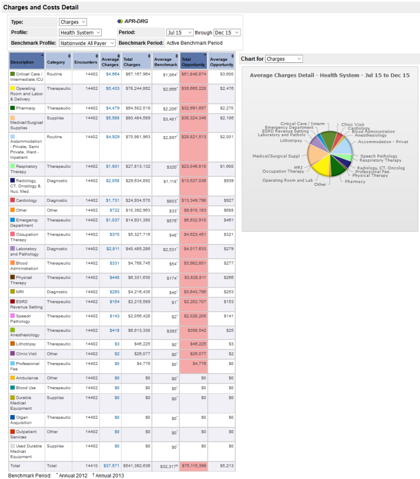
Use the dropdowns to choose which data you want to see. When you have selected your settings, click Rerun to see your data.

The following table lists your parameter options for this section.
| Option | Description |
|---|---|
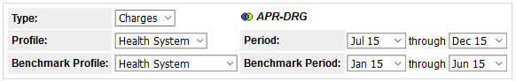
| Profile | Choose the internal or dynamic profile you are interested in. |
| Period | Select the date range for your data of interest. |
| Benchmark Profile |
Choose the benchmark group you want to compare your profile to. You can select an internal profile to compare different time periods (as follows), or select a peer group profile to compare externally.
|
| Benchmark Period |
Choose the period for the benchmark profile. If you select a peer group profile, the dates default to the most recent year of available benchmark data.
|
| Type | Choose between charges and costs. Costs are shown if your facility has submitted cost data. |

Understand the data table
For more details about the calculations in this section, see Charge and Cost Measure calculations. The following table briefly describes each of the columns in the Charges and Costs Detail table. The columns display all Charges or all Costs, depending on your dropdown selection.
| Columns | Description |
|---|---|
| Description | Lists the revenue code groups. The colored squares by the descriptions match the colors on the pie chart. |
| Category | Each revenue code group is categorized as Diagnostic, Routine, Therapeutic, Supplies, or Other. |
| Encounters | The total number of encounters in your selected profile with any charges in any of the defined code groups. This number is the same for all of the revenue code groups. Occasionally, the total row may have a slightly higher number of encounters, which includes any encounters in the profile that did not have any charges in the listed revenue code groups. |
| Average Charges/Costs | Total Charges (or Costs) divided by the total number of Encounters for the selected period and profile. Click the blue numbers in this column to see a DRG-level analysis of the selected code group in Details. |
| Total Charges/Costs | Total Charges (or Costs) for all revenue codes in the description for the selected period and profile. |
| Average Benchmark | This is the arithmetic average of the benchmark values for each grouping level (APR-DRG/SOI or MS-DRG) in the Benchmark Profile. See Benchmark calculations for more information. |
| Total Opportunity |
For each encounter: Charges for the code group - Benchmark Charges for the code group. The software then sums up this difference over all encounters for Total Opportunity. If your profile had higher charges or costs than the benchmark, the box is red. If your profile had lower charges or costs than the benchmark, the box is green. If the two amounts are very close, the box has no color. See the Opportunity page for more information. |
| Average Opportunity | Total Opportunity divided by Encounters. |
Use the pie chart
The pie chart simplifies the data so analysts can see the information at a glance. Each chart shows a breakdown of the charges/costs or opportunity as percentages of the whole.
When you mouse over a slice, a text box pops up listing the full description, the average charge/cost, and its percentage. Click a slice to separate it from the others.

Chart Charges/Costs and Opportunity
Use the dropdown above the pie chart to display either charges/costs or opportunity.

The Charges/Costs chart shows a breakdown of the charges/costs for each domain as percentages of the total charge/cost. The chart loads charges/costs by default.

The Opportunity chart shows only the areas for improvement. The opportunities for each domain display as percentages of the sum of all the red table values.

Switch between costs and charges
If you have Health System Coordinator access to Clinical Analytics, you can choose whether you want the section to display costs or charges by default. This function allows you to place multiple sections on a scorecard so you can compare charges and costs on the same tab.
The Charges and Costs section can be customized to display either charges or costs as default. Open the scorecard customizer and click the pencil icon next to the Charges and Costs section title.
![]()
Clicking the pencil opens a menu where you can select the defaults you want for that particular section. In the Name box, you can rename the section. Choose whether you want to display Charges or Costs, then click Apply. Clicking Cancel closes this options box without saving your changes.
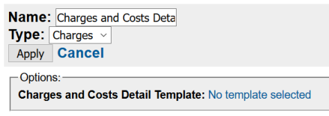
You may also choose the default Details section template for the system to apply when you drill into the data. When you click on a hyperlinked value in the table, the software redirects to a Details section. This is where you can customize the measures, group bys, and other options for the default Details section. Click the hyperlinked blue text in the Options box and select an available Details template.
NOTE: The Details template must already be created in a Details section and saved before it can be selected here.
See Section-specific templates for more information about customizing these template options.
