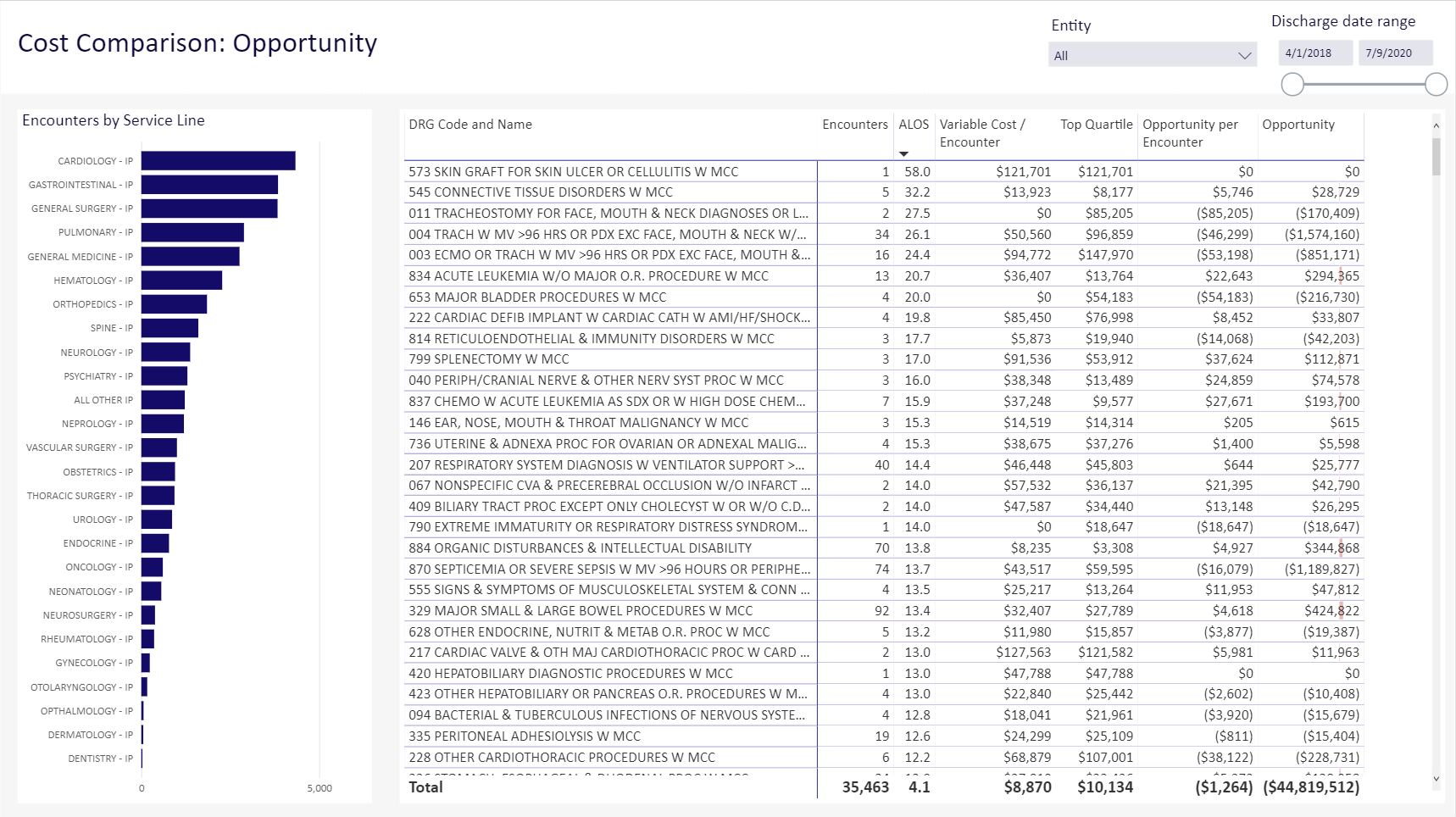
Cost Comparison dashboard
Overview
Click image to view full size
The Cost Comparison dashboard provides counts of encounters by service line and comprehensive profitability by DRG. With this dashboard, you can Identify specific opportunities for cost reduction.
Slicers
This report provides filtering options that let you create a set of data, giving you the option of viewing the precise data you want to view.
Entity
The entity dropdown lists all of the clinics, hospitals, and other entities that comprise your institution. You can choose to view all of those entities, or select a single entity to view.
Discharge date range
This control lets you select a range of dates of discharge. You can use the slider or, for more precision, select each date box to choose a date from a calendar.
TIP: Use the dashboard tools to view, export, and sort the data; view data as table; and more.
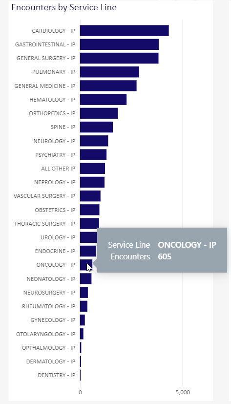
Encounters by Service Line
Click image to view full size
This bar chart shows the number of encounters by service line, from the most to the fewest encounters. You can view the exact number of encounters if you hover over a bar in the chart.
Cost comparisons by DRG
This table provides cost comparisons for all encounters by DRG in the data set you specified.
| DRG Code and Name | Code number and name for a DRG. |
| Encounters | Number of encounters for this DRG in your specified data set. |
| ALOS | Average Length of Stay for this DRG. |
| Variable Cost/Encounter | Variable cost per encounters for this DRG. |
| Top Quartile | Cost in the top quartile of data for this DRG across your institution. |
| Opportunity per Encounter | Profit opportunity for this DRG per encounter. |
| Opportunity | Total opportunity for this DRG for all encounters. |
Navigation
-
Use the tabs at the bottom of the page to view other related reports in the category.
-
Use the Navigation menu in the upper-left corner to return to Recent places that you've visited or to the Intelligence Center.