Using the Metric Explorer
Use this dashboard to evaluate monthly and annual performance of key metric areas for any business segment. You have to filter data before any information will display on the dashboard.
Using filters
The Metric Explorer dashboard is blank by default. You must apply filters to view data.
To apply filters:
-
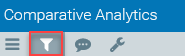
Click the funnel icon in the upper left of the Axiom toolbar to open the Filter menu.
-
Use the drop-down menus to choose focus level, entity, department class, peer group, time period, and chart configuration.
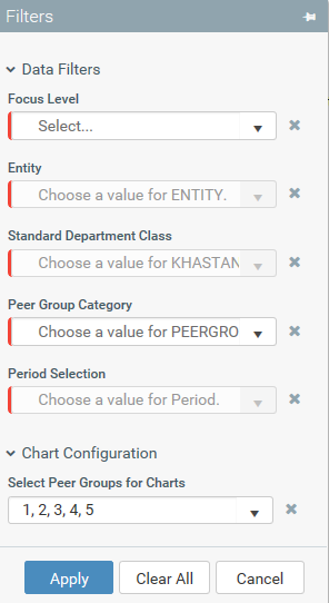
- Click Apply.
TIP: To pin the Filter menu open, click the pin icon in the top-right of the Filter menu. For an overview of toolbars and navigation in Axiom, see Getting started.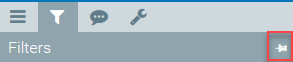
Using the dashboard
Once you apply your filter selections, you can interact with your metrics data in the dashboard.
NOTE: Your access rights determine what you can see on the dashboard. For more information about user roles, see Understanding user roles.
To display filtered data:
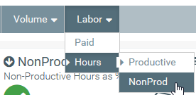
- Click a drop-down menu category.
-
Click a sub-category to display the data for that element. Sometimes, sub-categories will have more specific data sets. For example, depending on your permissions, within the Labor category, you will see an Hours category. You will be able to further select Prod or NonProd.
Axiom Comparative Analytics will display Key Performance Indicators (KPI) in the dashboard as illustrated in the image below:
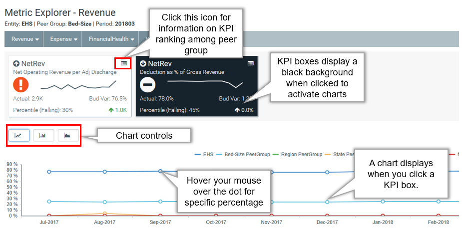
Using the charts feature
NOTE: The charts are based on your filter selections and reflect 12 months of data starting from the most recent period in the table regardless of your filter selection.
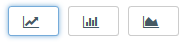
Click the graph controls above the chart to switch between graphical charts. From left-to-right, you can select the Peer Comparison, MoM/YoY Change, or Actuals/Budget graph. As explained in the image above, you can hover over the graph dots with your mouse cursor to display the value for that specific data point.
Understanding KPI boxes
There are several indicators within each KPI box. The following list is an explanation of those items:
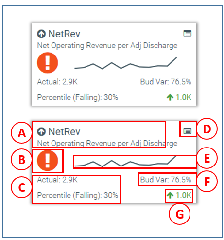
- Title area: The arrow will either face up or down based on the month-over-month change. An upward pointing arrow indicates that the current month is better over the previous month. A downward pointing arrow indicates the current month is worse over the previous month. The large text next to the arrow is the title of the level the metric is on. The text below this is metric description.
-
Performance indicator: There are several different alert icons based on budget variance performance as defined in the table below:
Icon
Description

Indicates a favorable variance to budget. 
Indicates a status of within a 0%-5% threshold of budget. 
Indicates an unfavorable variance by >5% to budget. - Actuals and rank: The first line in this section details the actuals for the period selected. The second line is the percentile rank for the selected period. The text will indicate if the percentile is rising (higher rank than the previous period) or falling (lower rank than the previous period).
- Rank detail icon: Click this icon in the upper right to see more information comparing your institution's KPI ranking among your peer group.
- Trendline: This is a 12 month trend graph from the most recent period of data available.
- Budget variance: This is the budget variance percentage indicator.
- Year-over-year change: The indicator in the lower-right corner of the KPI provides you with the year-over-year (YoY) percentage change value. An upward pointing arrow indicates that the current month is better over the previous month. A downward pointing arrow indicates the current month is worse over the previous month.
