Working with the Metric Explorer dashboard
The Metric Explorer dashboard allows you to evaluate monthly and annual performance of key metric areas for business segments and provides a deeper analysis of data that displays in the Budget Assessment dashboard.
Using the dashboard
The dashboard is comprised of the following areas:
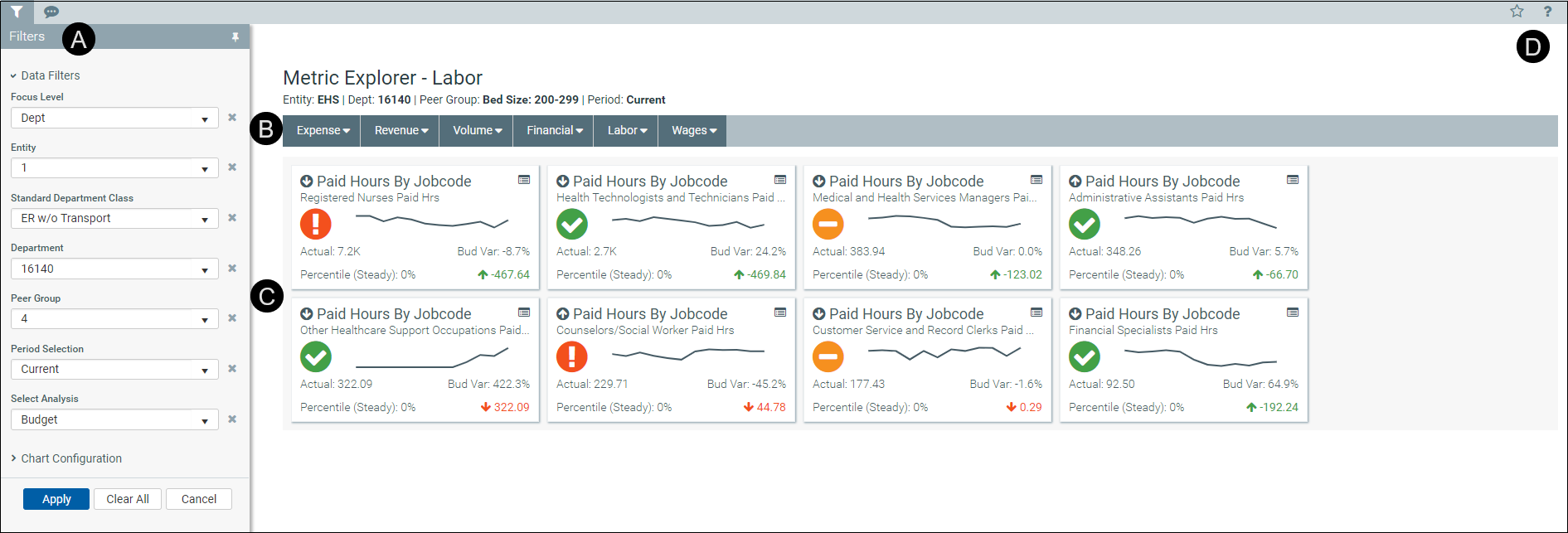
 Filters
Do any of the following:
- Configure the criteria to include in the dashboard by selecting the filter criteria options in the drop-downs, and click Apply.
- To clear a filter criteria option, click the X next to the drop-down.
- To clear all the filter criteria options, click Clear All.
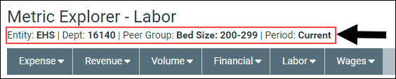
The filter criteria detail you select also display above the tabs.
 Tabs
Tabs
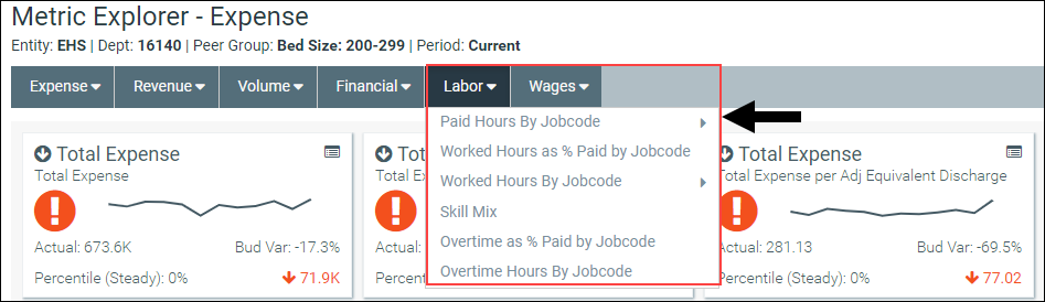
Data metrics are segmented into several categories and sub-categories. Click a drop-down menu category, and click a sub-category to display the data for that element.
 Key Performance Indicators (KPIs)
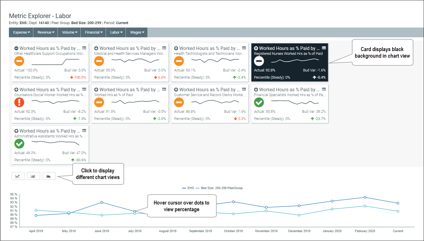
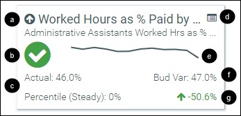
The Metric Explorer dashboard displays Key Performance Indicators (KPI) data in the form of cards, which includes the following visual indicators and data points:

|
An arrow communicates month-over-month change. An up arrow indicates that the current month has improved over the previous month. A down arrow indicates that the current month worsened over the previous month. The large text next to the arrow displays the title of the metric title and the text below displays the metric description. |

|
An alert icon indicates a visual representation of budget variance performance.
|

|
The first line in this section details the actuals for the period selected. The second line displays the percentile rank for the selected period. The text indicates if the percentile is rising (higher rank than the previous period), steady, or falling (lower rank than the previous period). |

|
|

|
A graph displays a 12-month trend from the most recent period of data available. |

|
This area displays the budget variance percentage. |

|
The indicator in the lower-right corner of the KPI provides you with the year-over-year (YoY) percentage change value. An up arrow indicates that the current year has improved over the previous year. A down arrow indicates the current year has worsened over the previous year. |
 - Favorable variance to budget
 - Within a 0%-5% threshold of budget
 - Unfavorable variance by >5% to budget
Click the KPI card to view different charts associated with the data. When the chart view is activated, the card displays a black background. Beneath the cards, the dashboard provides three different chart view options in which to view the card data. Hover your cursor over each dot in any of the graphs to view the percentage details. To exit the chart view, click the card again.