AX1835
The column properties define the presentation of each column in the grid. Using the column properties, you can configure:
- Display properties such as header text, column width, alignment, and number formatting
- Data properties such as column filters, alternate aggregation, and display formats for data
- Grid behavior properties such as inclusion in the total row, and whether end users can sort and filter using the column
In the Report Builder, the column properties are defined in the right-hand Configuration Panel. The column properties can be defined for both table columns and calculated columns.
To configure column properties for a column in a web report:
-
On the Report tab of the Report Builder, in the Report Canvas, click a column name in either the Row Dimensions box or the Column Definitions box to select that column.
You must select the column name in the setup boxes and not the column name in the grid below. Selecting a column name in the preview grid causes the Grid Configuration to display instead of the Column Configuration.
-
Complete the Column Configuration properties that display in the Configuration Panel.
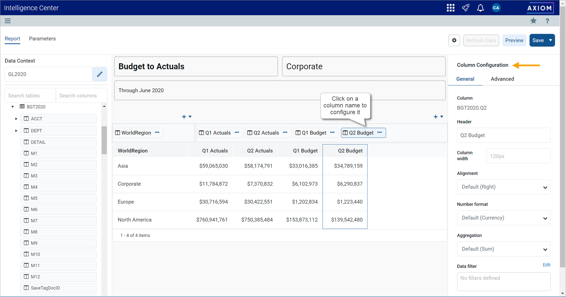
The column configuration properties are separated into two tabs:
- General: Basic column properties that should be reviewed and configured for all columns in the grid.
- Advanced: Advanced column properties to be configured as needed.
General column properties
The following column properties are available for web reports on the General tab of the Column Configuration panel. These properties apply to table columns, calculated columns, and dynamic columns.
| Item | Description |
|---|---|
|
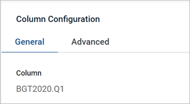
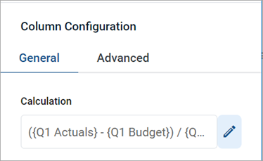
Column or Calculation or Default Column |
The following information displays at the top of the panel to identify the column:
|
|
Dynamic column parameter |
The Column List report parameter to associate with the dynamic column. Only applies when the current column is a dynamic column. For more information, see Using Column List report parameters. |
|
Header |
The header text to display on the column header. Enter the desired header text.
If the column is a dynamic column, the header text is defined in the Column List parameter settings, for each column that is available to be selected. Within the Report Canvas only, the dynamic column displays using the header Dynamic. |
|
Column width |
The width of the column in the grid, in pixels. Enter the desired column width as a whole integer between 30 and 600. The default width depends on the column data type, and is configured at the grid level. If you do not enter a custom width, then the default width displays in the Column width box in gray text. If you leave this default width and the grid-level defaults are changed, then column will update to use the new default width. For more information, see Default column formats. |
|
Alignment |
The alignment of the column values. Select one of the following: Default, Left, Right, Center. The default alignment depends on the column data type, and is configured at the grid level. If a column is set to use Default and the grid-level defaults are changed, the column will update to use the new default alignment. For more information, see Default column formats. |
|
Number Format |
The number format used by the column. Only applies to columns that hold numeric data. Select one of the following:
This option is not available for use with dynamic columns. |
|
Aggregation |
The aggregation type used to aggregate data queried from the database column. Does not apply to calculated columns or to columns used as row dimensions. If you want to override the default aggregation type for a database column, select an aggregation type. |
|
Data filter |
Optional. Defines a filter to limit the data shown in this column. The column-level data filter should be used instead of a grid-level data filter when you want the filter to impact just this column. Click the Edit button to open the Filter Wizard and define a filter. Once you have defined a filter, it displays in the Data filter box. If you want to change or remove the filter, click the Edit link again and change or delete the filter within the Filter Wizard. The Data filter box is not directly editable. Data filters defined at the column level are combined with any filters defined at the column group level and at the grid level. All relevant filters are combined using AND to determine the data that can display in a particular column. NOTES:
|
|
Enable filter |
Specifies whether end users can filter based on the column contents.
This property does not apply to any column in the grid if Use fixed rows is enabled in the Grid Configuration properties. Fixed row reports do not support end-user column filtering. |
|
Hide column |
Specifies whether the column is hidden in the report. Does not apply to columns used as row dimensions.
|
|
Specifies whether you want descriptions to display for dimension values. This option only applies to key columns, alternate key columns, and validated columns that have an associated description column.
NOTE: If the dimension table has multiple description columns (meaning columns where Describes Key is True), then the first description column is used. If the column is a dynamic column, then this option will be applied when the currently selected column has a description column, and ignored when it does not. |
|
|
Include in total row |
Specifies whether the column is included in the total row, if a total row is enabled in the Grid Configuration properties. Does not apply to columns used as row dimensions. Select one of the following:
If a column is included in the total row, it is treated as follows:
This option does not apply if Use fixed rows is enabled in the Grid Configuration properties. Columns will be included or excluded in subtotal or total rows using the default behavior. |
|
Date part to retrieve |
Specifies the date or datetime part to retrieve, if the column is a Date or DateTime column. For example, you can return the full date value, or just the year or month, or the fiscal year or month. For more information, see Date formatting options. |
| Date format |
Specifies the format to display the date values, if the column is a Date or DateTime column. The available format options depend on the specified Date part to retrieve. For more information, see Date formatting options. The label and visibility of this setting varies depending on the selected date part. For example, if you select Month as the date part, then the label for this setting is Month format. If you select a date part that does not have any formatting options, such as Year, then this setting is hidden. |
Advanced column properties
The following column configuration properties are available for web reports on the Advanced tab of the Column Configuration panel. These properties apply to table columns and calculated columns. Dynamic columns do not use these properties.
Header Properties
| Item | Description |
|---|---|
|
Header text (row 1) |
The header text to display on the column header. Enter the desired header text. NOTES:
|
|
Header text (row 2) |
The header text to display on the second row of the column header. Enter the desired header text. This property is only available if Multi-row header has been enabled. |
|
Multi-row header |
Specifies whether the column header has multiple rows:
Keep in mind that enabling a multi-row header is different than wrapping header text. If you enable multi-row headers, then you can define two separate rows of header text. A line break separates each row. If autowrap is enabled, then each row of header text wraps individually. If you just want a single row of header text that wraps, you can leave this option disabled and then enable Autowrap header text. |
|
Autowrap header text |
Specifies whether header text wraps:
|
|
Header alignment |
The alignment of the header text. Select one of the following: Default, Left, Right, Center. All column headers use Default alignment by default. By default, the header text uses the same alignment as the column contents (as determined by the Alignment property on the General tab). If you leave the header alignment set to Default, then the header alignment will adjust to match the column alignment. If, however, you want the header alignment to be different than the column alignment, you can configure this property. |
If a column is a Date or DateTime column, then various formatting options are available to present the date information in the report. This is separated into two options:
- Date part: Specify the part of the date or datetime value that you want to display—such as the full date (or datetime), the year or fiscal year of the date, the month or fiscal month of the date, or the hour or minute from the time.
- Format: Specify the format to display the selected date part. For example, if you select full date, you can display it as 10/15/2020 or October 2020 or Thursday, October 15, 2020. If you select Month, you can display it as 10 (the month number), Oct, or October.
The following tables detail the date part and format options. Where multiple formats are available, the default format is shown in bold.
Standard date and time options
| Part | Description | Format |
|---|---|---|
|
Full Date |
Display the full date stored in the column, using a specified format. Only applies to Date columns. This option is the default part for Date columns. |
|
|
Full DateTime |
Display the full date-time stored in the column, using a specified format. Only applies to DateTime columns. This option is the default part for DateTime columns. |
Same as Full Date, plus the following additional options:
|
|
Year |
Display the year part of the date. |
Full year (2020) |
|
Quarter |
Display the quarter for the date. |
|
|
Month |
Display the month part of the date. |
|
|
Week |
Display the number of the week for the date, within the year. |
Number of the Week (1-52) |
|
Day of Year |
Display the day of the year for the date. |
Number of the Day (1-365) |
|
Day of Month |
Display the day of the month for the date. |
Number of the Day (1-31) |
|
Day of Week |
Display the day of the week for the date. The first day of the week is Sunday. |
|
|
Hour |
Display the hour of the datetime. Only applies to DateTime columns. |
|
|
Minute |
Display the minute of the datetime. Only applies to DateTime columns. | Number of the minute (0-59) |
NOTES:
-
If a column is configured to display the full date or date-time, but the selected format only shows a part of it, the column sorting and filtering remains based on the full date or date-time value.
-
If a DateTime column is configured to display the hour, the column filtering is always based on 0-23, regardless of the display format. For example, if the display format is a 12-hour clock with day period, filtering by 13 displays values of 1 PM.
-
When using a DateTime column, currently it is not possible to filter the column based on date and time. When displaying the full date-time, the column filter options only allow selection of a date. If you want to filter based on time, you must select the hour and/or minute display format.
Fiscal year options
The fiscal year for your system is determined by the system configuration setting ClientFiscalYearEndMonth. By default, this is set to 12, which means the fiscal year is the same as the calendar year. If your organization uses a different fiscal year end, your implementation consultant should adjust this setting accordingly.
For example, if your organization's fiscal year ends in June, the ClientFiscalYearEndMonth setting should be changed to 6. This means:
- A date of 6/1/2021 is in fiscal year 2021 and represents month 12 of the 2021 fiscal year.
- A date of 7/1/2021 is in fiscal year 2022 and represents month 1 of the 2022 fiscal year.
When the fiscal year is different than the calendar year, the fiscal year options will return different date information than the corresponding standard date options. Continuing the example where the fiscal year end is June, the following return values apply to a date of 7/1/2021:
- The Year part will return 2021, whereas the Fiscal Year part will return 2022.
- The Quarter part will return Q3, whereas the Fiscal Quarter part will return Q1.
- The Month part will return 7, whereas the Fiscal Month part will return 1.
| Part | Description | Format |
|---|---|---|
|
Fiscal Year |
Display the fiscal year that the date belongs to. |
Full year (2020) |
|
Fiscal Quarter |
Display the fiscal quarter that the date belongs to. |
|
|
Fiscal Month |
Display the fiscal month that the date belongs to . |
|
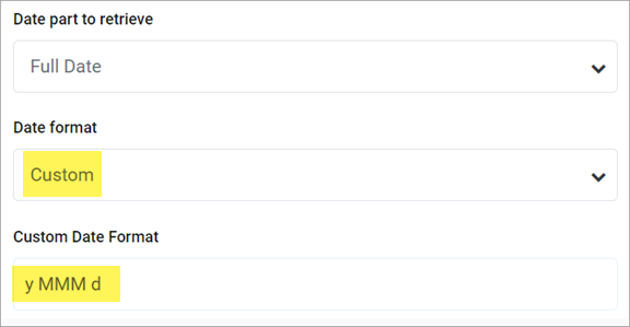
When using the Full Date or Full DateTime parts, you can optionally specify a custom format to display the date or datetime value. When you select Custom as the format, a Custom Date Format box becomes available so that you can enter the custom format syntax. The following case-sensitive syntax can be used in the custom format:
| Desired Date/Time Part | Syntax | Notes |
|---|---|---|
|
Day Period |
a |
Returns the day period AM or PM. |
|
Day of Month |
d |
For the day number (1), use one or two letters (d or dd). dd enforces 2 digits. |
|
Day of Week |
E or e |
|
|
Hour |
H or h |
NOTE: Use k if you want to display the 24 hour clock as 1-24 instead of 0-23. |
|
Minutes |
m |
For the minutes number (1), use one or two letters (m or mm). mm enforces 2 digits. |
|
Month |
M |
|
|
Seconds |
s |
For the seconds number (1), use one or two letters (s or ss). ss enforces 2 digits. |
|
Quarter |
Q |
|
|
Year |
y |
|
For example, to render a date as "2020 Oct 10", you would enter the following into the Custom Date Format box: y MMM d.
Example custom date format
Frequently asked questions
I defined a column filter but it isn't impacting the grid data as I expected—why do I still see rows that don't match the column filter?
A column filter only filters the data coming into that specific column. If you want to define a filter that impacts the entire report, including the row data, then you should define a filter at the report level. Select the report title and then use the Report Configuration properties to define one or more Report filters.
To illustrate the difference, imagine the following uses of a filter to only show data from the West region:
-
Report: When the general filter
Dept.Region='West'is defined for the report, the entire grid is filtered to only show data from the West region. Row dimension values (such as departments) will only display if they belong to the West region, and column data is limited to only show data for the West region. -
Column: When the filter
Dept.Region='West'is defined on a column, that single column is filtered to only show data from the West region. Other columns and row dimension values are not limited by this filter. You might do this if you want to create a report that shows the different region data in different columns, such as to compare data from the West, East, North, and South regions side-by-side.
