About Control Charts
When looking at the Statistical Process Control section in Axiom Clinical Analytics Scorecards, it is important to understand the intent and structure of typical control charts, as compared to the line charts you'll see in the Two Column Section in Clinical Analytics.
Why use a control chart?
A control chart helps you accomplish the following:
- Use signals to differentiate common cause variation from special cause variation
- Monitor an in-control process for changes
Anatomy of a control chart
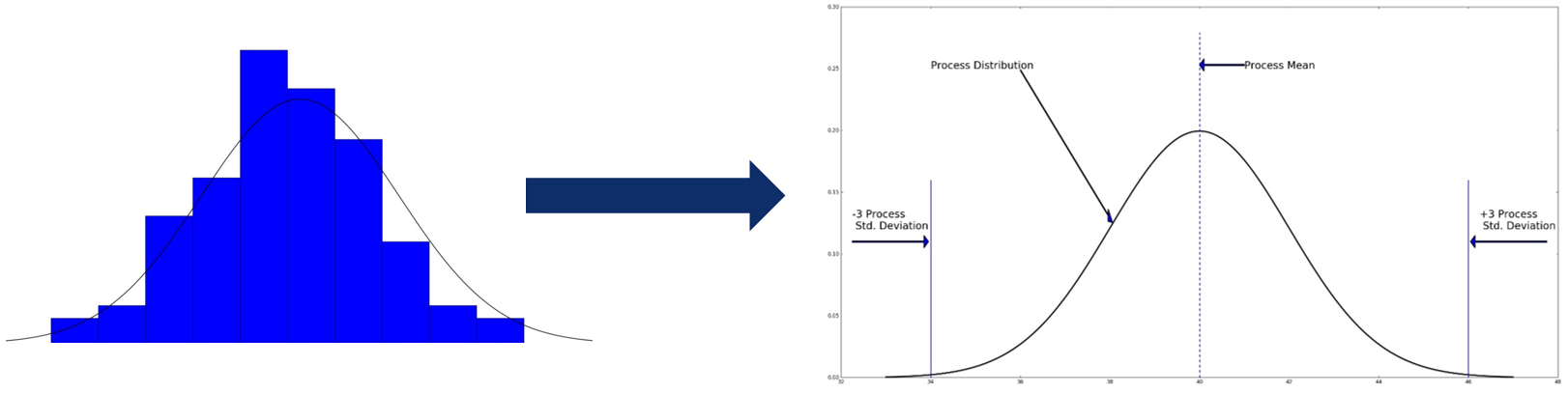
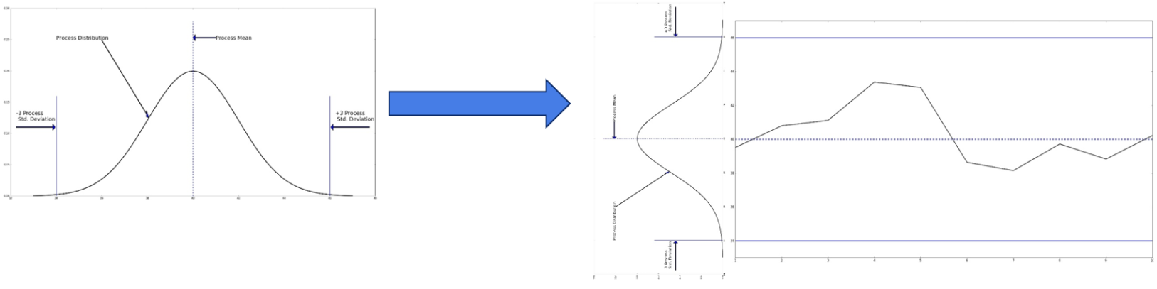
In a control chart, measurements are plotted in chronological order on a line graph with a line indicating the central tendency of the measure value (typically the mean) as well as control bars to indicate degrees of variation (bars are typically placed at 1, 2, and 3 standard deviations above and below the mean). The type of measure data (such as continuous, discrete, or binary) dictates the type of control chart used. Based on the control chart being used, appropriate calculations are made of the measure value’s central tendency and typical variation. In the Clinical Analytics SPC section, all plotted measure values are risk- and volume-adjusted, and take on continuous values, even for discrete and binary measures.
| Data Type | Subgroup Size | Chart |
|---|---|---|
|
Attribute Data Counted as discrete events |
Consistent group size |
c Chart (Number of Defects) |
| Variable group size |
u Chart (Number of Defects per Unit) |
|
| Consistent group size, typically >=50 |
np Chart (Number of Defective Units) |
|
| Variable group size, typically >=50 |
p Chart (Number of Defective Units) |
|
|
Variable Data Measured in a continuous space |
Subgroup size = 1 |
X and Charts (XmR: X and Moving Range) |
| Subgroup size <10 |
and R Charts (Process mean and process range) |
|
| Subgroup size >=10 |
and s Charts (Process mean and process deviation) |
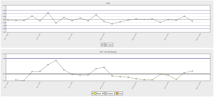
XmR Charts
There are different types of control charts; Clinical Analytics uses XmR (X and Moving Range) charts for every adjusted key measure.
An XmR chart consists of two graphs – one for the observed measure values (X) and one for the moving range (mR). The plotted value for the moving range chart is the absolute value of the difference between two successive points. In Clinical Analytics, the X values are the weekly measure values, whether the average (such at Length of Stay) or the rate (such as Mortality Rate), and the mR chart plots the absolute value of the difference between the measure values for the current week and the previous week.
Choice of XmR Charts
After performing risk adjustment, all measures take on continuous values. For a general control chart with unknown distribution, the XmR chart is the most general control chart that makes the fewest assumptions. We use XmR control charts for all key measures.
X Chart Control Bars
On the plot of the measurement, the center line is the empirical mean, . Upper and lower control limits are plotted as solid lines at y= ± 2.66, which estimates 3 standard deviations (3) above and below the mean. In Clinical Analytics control charts, we also plot dotted lines at y= ± ⅓*2.66, estimating 1 standard deviation (1) above and below the mean, and dashed lines at y=x ± ⅔*2.66, estimating 2 standard deviations (2) above and below the mean, to aid in interpretation.
mR Chart Control Bars
On the moving range chart, the center line is the mean value, . This is used to estimate the standard deviation () of the measurement itself. An upper control bar is plotted at 3.267. Due to the nature of moving range charts, there is no lower control limit line; the values cannot be less than 0.
NOTE: The constants 2.66 and 3.267 used in control bar placement are derived from the normal distribution and industry standards for control charts.
Signals
Using the points and the control lines, we compute signals that represent unusual variation. The signals that can appear in a Clinical Analytics control chart are:
- Outlier: A data point outside the control bars
- Biased: Nine consecutive data points on the same side of the center line
- Trend: 6 Consecutive points during which the measure is either increasing or decreasing.
- Oscillating: The value of the measure oscillates (increase->decrease->increase etc…) for 14 consecutive points
- 2+ Standard Deviations: Two out of three consecutive data points are more than 2/3*2.66 away from the center line on the same side of the center line. (that is, they are outside the dashed red lines defined above.)
- 1+ Standard Deviations: 4 out of 5 consecutive points are more than 1/3*2.66 ̅ from center line on same side of center line. (Outside the red dotted lines above.)
- Low Variance: 15 Consecutive data points inside the dotted red lines above – distance from center line less than 1/3*2.66.
- Spread: Eight consecutive data points more than 1/3*2.66 from center line – outside dotted red lines in either direction.
Signals can also appear on the moving range chart. The possible signals there are:
- Outlier: Moving range value higher than control limit
- Biased: At least 9 consecutive moving range values on same side of center line.
- Trend: At least 6 consecutive moving range values in either an increasing trend or a decreasing trend
- Oscillating: Oscillating pattern in at least 12 consecutive moving range values.
All of these signals are patterns that would occur with very low probability under the assumption of exchangeability. If a signal does appear on the control chart, it suggests that the data point(s) constituting the signal indicate something outside the normal process. These points are a typically a good starting point for further analysis.
How to use a control chart
The control chart shows values of the measure in the context of the measure value’s typical variation and helps distinguish typical common cause variation from unusual special cause variation. Signals on the chart suggest evidence of special cause variation. When a chart has no signals, there is no evidence of special cause variation and the process is thought to be “in control” – the same process occurs every time to produce every measurement plotted.
NOTE: An in-control process is not necessarily satisfactory and vice-versa. Being able to distinguish between special cause variation and common cause variation can be helpful in targeting interventions, if desired.
Addressing common cause variation
Common cause variation is typical variation that is inherent to the process. Length of Stay may be higher than desired or more variable than desired, for example, at a facility with an inefficient discharge process. In order to improve the mean or variation of a process where variation is driven by common cause variation, management needs to change policies or systems. It is generally not appropriate to hold individual employees like doctors or nurses accountable for common cause variation.
Addressing special cause variation
Special cause variation means that something unusual to the process happened. In order to address special cause variation, the cases causing the signal should be examined thoroughly and compared with the rest of the cohort. It may be appropriate to hold individual employees accountable for special cause variation.
Special cause variation may also indicate that a change of process took place during a period of time. It may be useful to compare the time period constituting a multi-week signal like the “Low Variance” signal against the rest of the cohort in order to determine what was different about that time.
NOTE: Some signals may be desirable, such as a “Low Variance” signal or an “Outlier” signal that is below the Lower Control Limit. In that case, comparing the signal against the rest of the cohort may yield differences that can be integrated into the regular process going forward.
Control Charts Vs. Line Charts
The control bars and signals are computed under the assumption that every data point comes from a similar process. External variation is, by definition, outside of the process being analyzed and should be minimized as much as possible in control charts. If the external variation is not accounted for, special cause variation and common cause variation can be confounded by external sources of variation. See SPC Calculations for more information about how Clinical Analytics accounts for external variation for you in the SPC section control charts. The algorithm for these calculations is one of the key differentiators between the Two Column Section line charts in Clinical Analytics and the control charts in the Statistical Process Control section.
NOTE: For more information about control charts in Axiom Clinical Analytics, see About the Statistical Process Control Section.