Summary tab
This plan file worksheet compares the historical data and forecast projections for each month and quarter, presented in monthly or quarterly columns (monthly includes quarterly), and indicates whether each month’s or quarter's figures represent a favorable or unfavorable change from previous months/quarters.
The Summary tab is divided into the following sections:
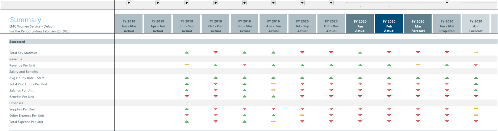
The top portion of the tab is the scorecard section, which contains trend indicator icons for total key statistics, revenue per unit, salary and benefits, and expenses.
TIP: You can hide the Scorecard section: in the Main ribbon tab, in the Change View menu under Row Views, clear the Show Scorecard check box.
The icons indicate the following:
- Green trend up
 – Favorable performance vs. the previous month/quarter
 - Yellow trend flat
 – Unfavorable performance vs. the previous month/quarter
 - Red trend down
 – Unfavorable performance vs. the previous two months/quarters
NOTE: Statistics and Revenue data use less than logic, while Salary, Benefits, and Expenses use greater than logic.
Use the scorecard indicators to review trending patterns to identify anomalies in forecast values that you may not see in the more detailed Forecast tab.
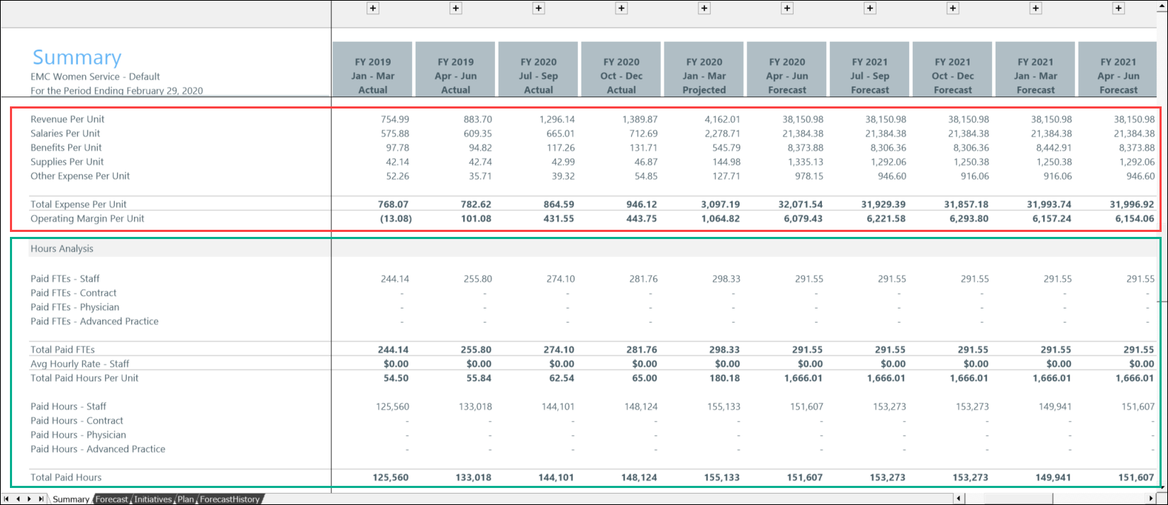
This Financial Summary section shows the profit and loss summary of the history and forecast results.
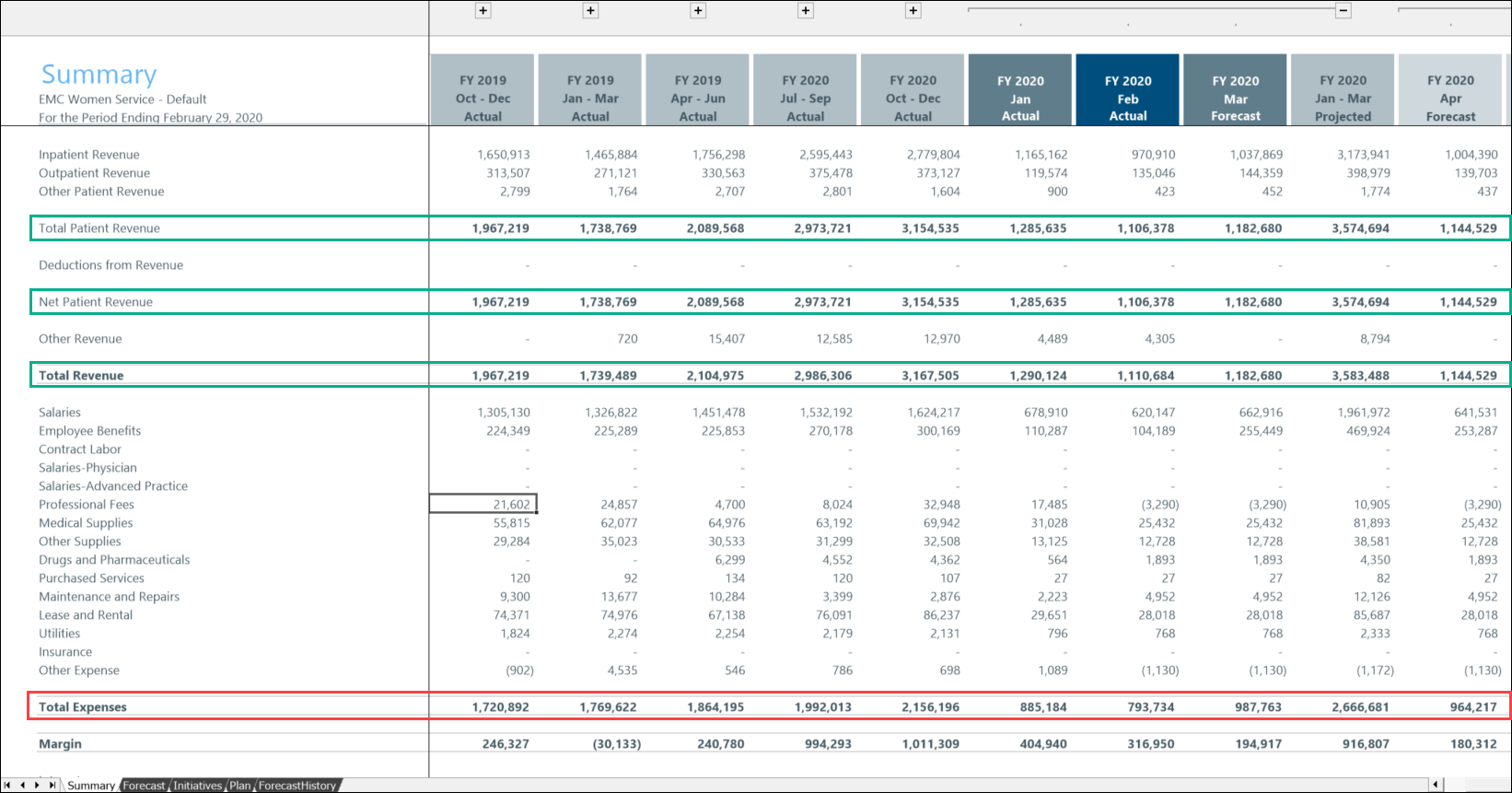
These sections display the history and forecast results for each listed metric.
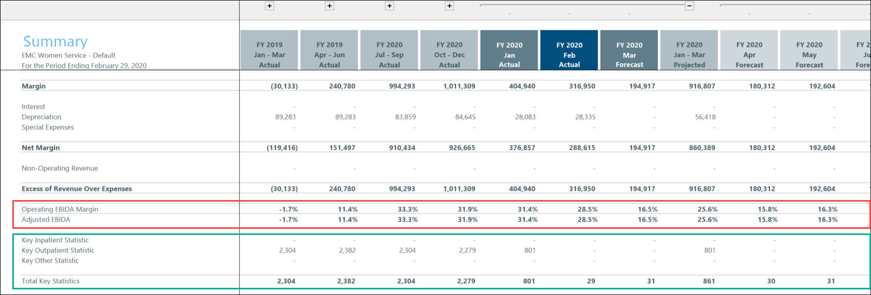
The EBIDA section displays the operating margin and the adjusted margin.
NOTE: The EBIDA section displays only if the display option is selected for this section in the Visibility Options tab of the Configuration Utility.
The Key Statistics section displays Inpatient, Outpatient, and Other statistics, as applicable for the selected plan file. In the following example, the EBIDA section is outlined in red; the Key Statistics section is outlined in green.
These sections are part of the Financial Summary section, and contain a summary of the history and forecast results for each listed metric. In the following example, the Per Unit section is outlined in red, and the Hours Analysis section is outlined in green.
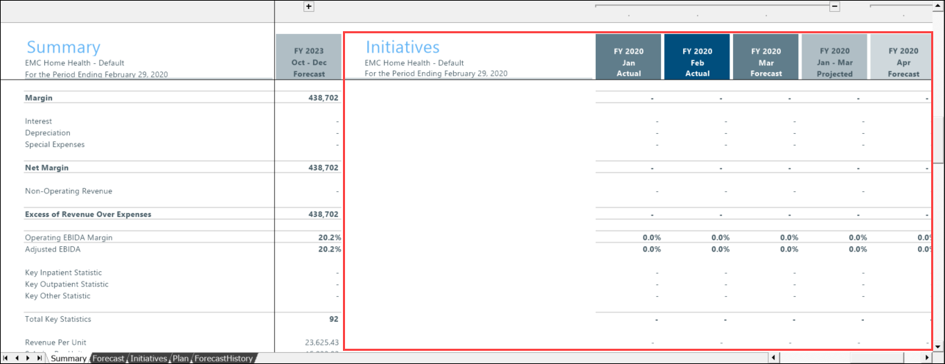
The Initiatives section in the Summary tab combines all approved initiatives from the plan file Initiatives tab, with the same forecast columns as those used in the Forecast tab.
This section compares actual to forecast periods for all approved Initiatives, with the following sections:
- Financial
- EBIDA
- Key Statistic
- Expense per Unit
- Hours Analysis
Approved totals in this section should sum to the values from the Forecast columns on the Summary tab.
To access the Initiatives section, scroll to the right in the worksheet, past the last forecast column.
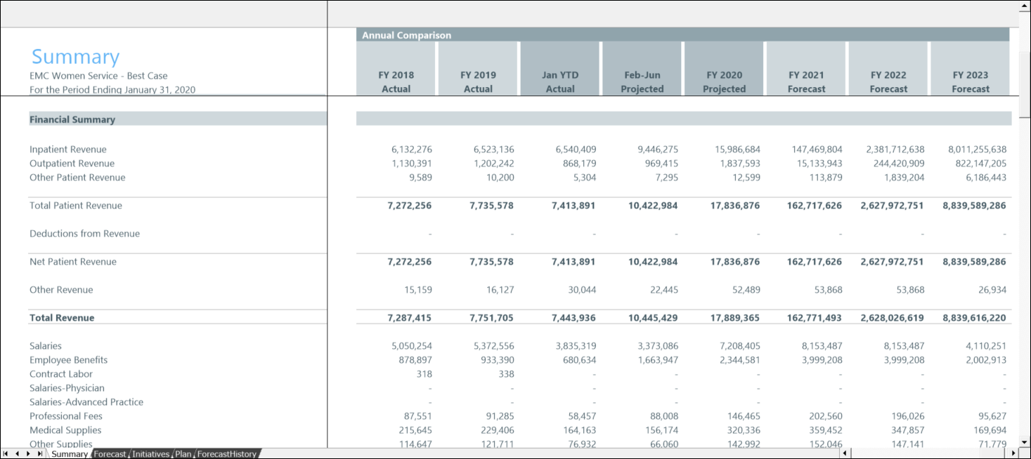
This section provides a payments-and-loss style overview of how your forecast values compare to your historical data. In the first two columns are your last two completed fiscal years, followed by your Year to Date actuals, and then the remaining total projection, which comes from the Forecast tab, as well as all of the future forecasts summarized into the fiscal years.