Cost Comparison dashboard
Why use this feature
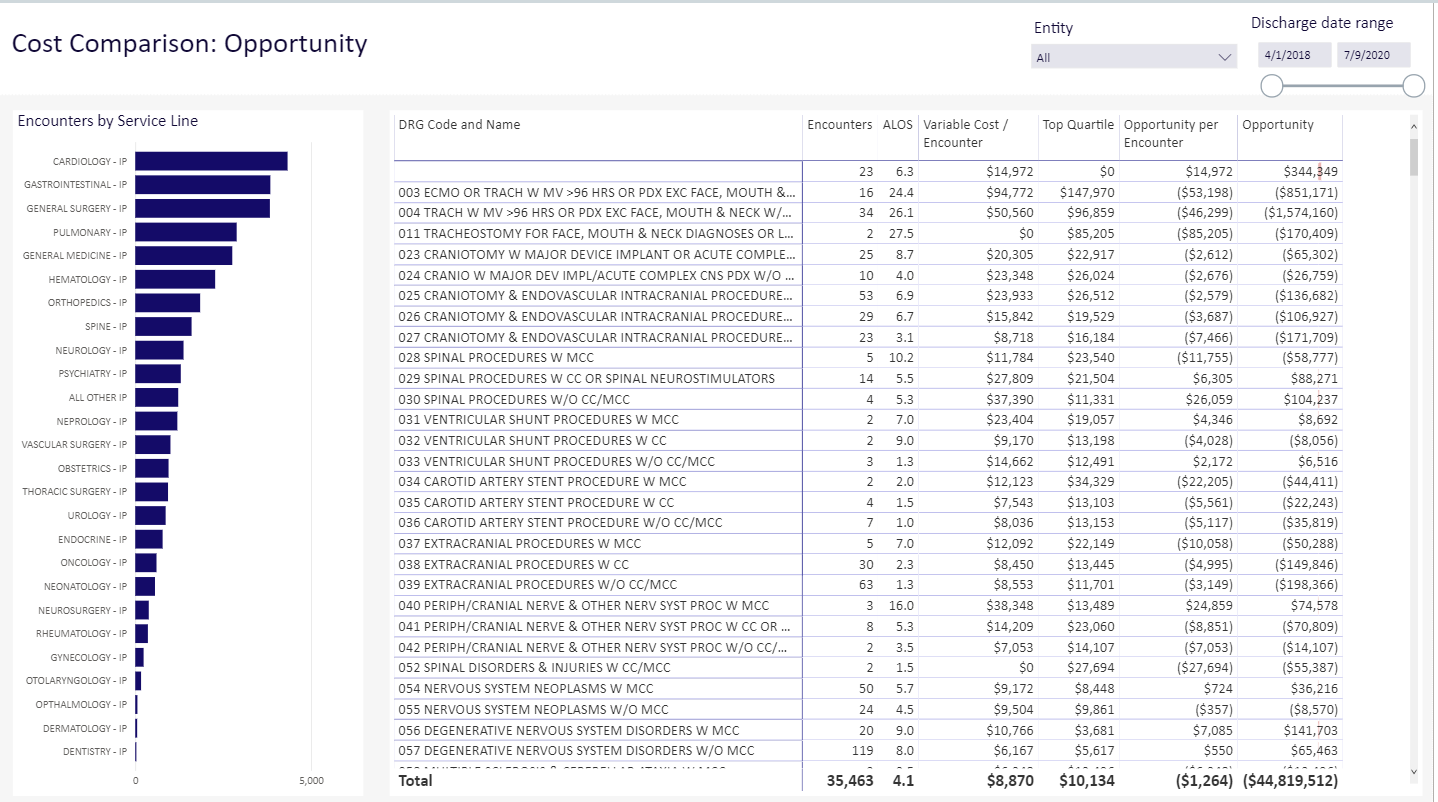
The Cost Comparison dashboard provides comprehensive profitability by service line, physician, case type, and payor mix to quantify volumes, cost, revenue, contribution margin, and net income by service line and physician. With this dashboard, you can Identify specific opportunities for cost reduction.
Click image to view full size
How this feature works
What: You view a dashboard and use slicers and built-in dashboard tools to select the exact entities, service lines, date ranges, and other data elements to select the precise data you want to work with.
Where: From the Enterprise Decision Support home page, in the Reporting section, click Intelligence Center. From the Intelligence Center, click Enterprise Decision Support, then click Standard Dashboards, then Cost Comparison Dashboard
Who: Users assigned the EDS User role profile.
How: Use slicers and other dashboard tools to specify the entities, service lines, and other data types to view the needed subset of the data on each dashboard.
TIP: To use this feature, we recommend that you read all of the associated online help topics listed in the "Where to find more information" section below.
Where to find more information
The following topics in the online help have been added or updated with information and instructions for using this feature:
