Service Line Analytics dashboard
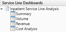
The Service Line Analytics Dashboard includes data grouped into four main areas:
- Summary - Provides an overview of important financial indicators.
- Volume - Provides comprehensive insight into the types of cases that drive revenue and consume resources.
- Revenue - Shows a breakdown of where the reimbursement is coming from so that changes can be noticed early.
- Cost Analysis - Offers a picture of which direction costs are going from one period to the next to identify trouble spots.
IMPORTANT: Before you can use the Service Line Dashboard, your Axiom Decision Support Administrator must set the current year and month for your organization. For more information, see Configuring the Service Line Dashboard.
To use the Service Line Analytics Dashboard:
-
In the DSS Admin or DSS Reporting task panes, in the Service Line Dashboards section, double-click Summary, Volume, Revenue, or Cost Analysis.
TIP: You can access all of the report tabs once you are in the dashboard. The options in the task pane are simply shortcuts to a specific area of the report.
-
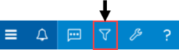
To filter the information in the report, click the funnel icon in the upper left corner of the screen.
-
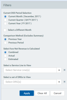
In the filter sidebar, configure any of the following to determine the time period for the dashboard and other settings, and click Apply:
-
Current DSS Period Selection - Select the period in which to view the data. The dashboard uses the Current Month from the DSS Current Month setting as a default. This monthly setting defines the Current Quarter and the Current Year as well.
-
Select a different period - Click the check box to select a specific month, quarter, or year in which to view the data, and select the new period from the drop-down.
TIP: Selecting the Current Month, Current Quarter, or Current Year using the radio buttons drives the different period time frames. Click each button to see that the Select a Different <Period> changes accordingly.
-
Comparison Method (Excludes Summary) - Select whether to compare the current or previous year's data.
TIP: This configuration setting allows you to compare year over year. For example, December 2017 with December 2016 or the previous period December 2017 with November of 2017.
-
Select How Net Revenue is Calculated - Select whether to calculate net revenue as combined, actual, or estimated.
TIP: The Combined option is a way of using Actual Payments when available and Expected Payments when Actual Payments are not available.
-
Select a Service Line to View - Select a service line, which is optional multi-select filter.
-
Select a set of DRGs to View - Select a DRG, which is an optional multi-select filter.
-
-
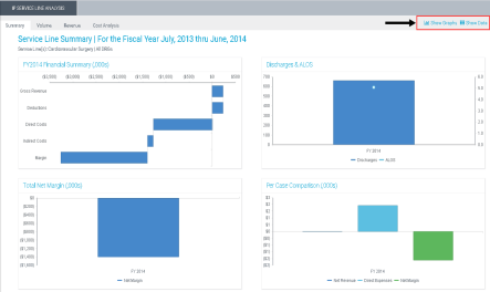
In the upper right corner of the screen, click Show Data and Show Graphs to alternate between viewing the actual data and its graphical representation.
IMPORTANT: The Service Line Dashboard uses the Encounter.ServiceLine1 column in the Encounter Table to present information. Future enhancements to this dashboard are planned that will make it more flexible to use other service line definitions. Additionally, the Service Line picklist for the Dashboard is driven from the Services Reference table. It will need to be populated with the ServiceLine1 values. It may be possible to select a Service Line and date combination for which an encounter does not exist.
