Outcome Analytics Sections
PPE Reporting's Outcome Analytics sections include:
- Hospital Acquired Conditions "HACs" Analysis
- Length of Stay Utilization Analysis
- Readmission Analysis
- Readmission Bar Graph Analysis
Hospital Acquired Conditions "HACs" Analysis
The HACs Analysis Section shows all hospital-acquired conditions that occurred among the report physician’s patients during the report period.
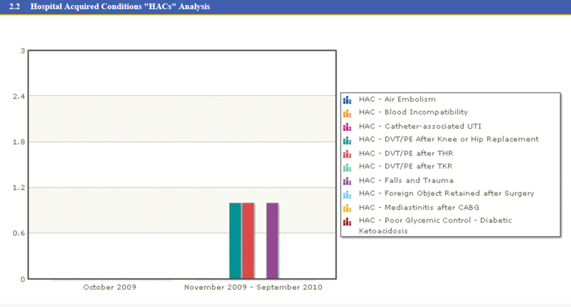
The section consists of a bar graph, with one bar for each HAC observed.
Length of Stay Utilization Analysis
The Length of Stay Utilization Analysis Section lists Length of Stay measures in a table.
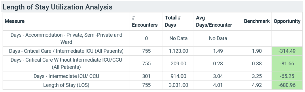
The section consists of a table with one row for each measure.
| Column | Description |
|---|---|
| Measure | Lists the name of the specific length of stay measure |
| # Encounters | Total number of discharges in the report period |
| Total # Days | Total number of patient days spent for the measure |
| Avg Days/Encounters | Total # Days (third column) divided by # Encounters (second column) |
| Benchmark | The benchmark Length of Stay value, listed as an average number of days per encounter; see Benchmark Calculations for more information |
| Opportunity |
Lists the Length of Stay opportunity A negative number in a green box means your total length of stay was that many fewer days than the benchmark. A positive number in a red box means that you had that many more days than the benchmark. See Charge & Cost Measure Calculations for more information about how opportunity is calculated in Clinical Analytics. |
Readmission Analysis
The Readmission Analysis Section lists readmission rates at the standard cutoffs: Same Day, 7 Day, 10 Day, 14 Day, and 30 Day.
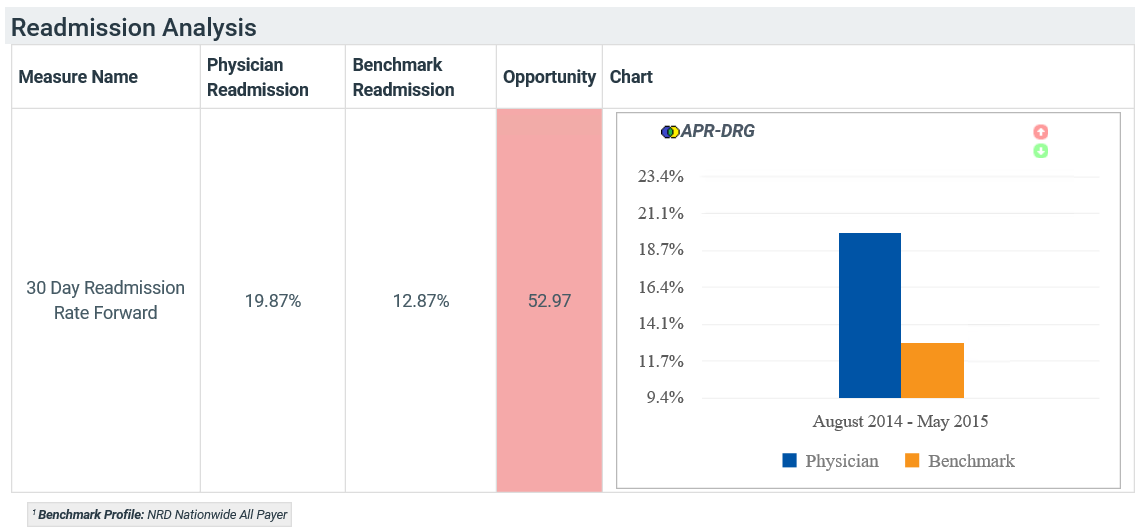
This section lists the readmission rates for both the report physician and the facility during the report period. The last column shows the values on a bar chart so you can compare them at a glance.
Readmission Bar Graph Analysis
The Readmission Bar Graph Analysis Section shows a group of bar graphs for each readmission measure. There are five readmission measures: Same Day, 7 Day, 10 Day, 14 Day, and 30 Day.
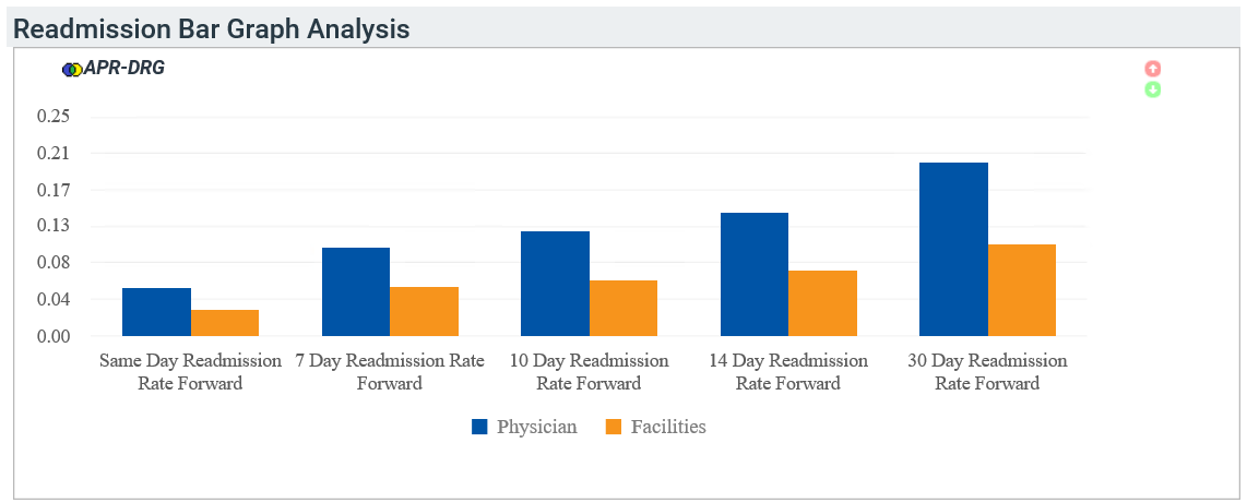
The graphs have either two or four bars for each listed measure on the x-axis.
- Blue bar: Benchmark period physician value
- Pink bar: Report period physician value
- Orange bar: Benchmark period facility value
- Teal bar: Report period facility value