AX1245
Grid refresh variable
Grid refresh variables prompt users to select a value from a designated table column. For example, you may want the user to select an account from the Acct.Acct column. The list of values is displayed in a dialog, using a searchable grid.
There are two ways that you can specify the column to use for the Grid variable:
- Specify the table column directly, from any table.
- Specify a Picklist table name. This automatically uses the Code column as the value column, but also automatically displays the Value and Description columns.
Both ComboBox variables and Grid variables can be used to select a value from a table column. The primary difference between the two variable types is the user interface for selecting the value—using either a drop-down list or a grid dialog. Additionally, only Grid variables allow selection of multiple values.
When using Grid variables, you can also use RelatedColumnValue variables. These are special variables that do not display to users. Instead, they are used to return values from related columns so that these values can be referenced in titles and other areas of the file. For example, if you are prompting users to select an account, then you can use a RelatedColumnValue variable to return the description of that account from the Acct.Description column. For more information, see RelatedColumnValue refresh variable.
NOTES:
-
Grid variables can be used with Axiom forms, but only when multi-select is enabled. If multi-select is not enabled, then the Grid variable will behave like a ComboBox variable, so it is recommended to use a ComboBox variable instead.
-
The Grid variable type was formerly known as ColumnValue. You may have older files that still use this legacy name. The ColumnValue variables will continue to work as is, however, you may want to update them to use the new terminology to avoid confusion. If you work on a ColumnValue variable using the Data Source Assistant, it will be treated as a Grid variable.
Variable behavior
In the Desktop Client, the variable displays as a text box with a Choose Value button next to it. The user can do one of the following to specify a value:
-
Type a value directly into the text box. The entry must match a value in the designated table column for the variable. If the user enters an invalid value, then a validation message displays at the bottom of the dialog. The OK button is disabled until the user enters a valid value.
-
Click the button to open the Choose Value dialog, to select a value from the designated table column for the variable. This dialog has a search box so that the user can type to find values in lengthy lists. If multi-select is enabled for the variable, then the Choose Value dialog has check boxes to enable multiple selections. Once the user has selected a value, the value displays in the text box.

Desktop Client: Example grid variables
The Choose Value dialog uses either the "simple view" or the "full grid view" depending on the data to be displayed in the dialog. If only one column is being shown, or a key column plus description only, then the simple view is used. However, if the target column is a key column and any additional non-description columns are included, then the full grid view is used.
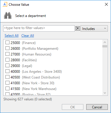
Example Choose Value dialog using "simple view" and with multi-select enabled
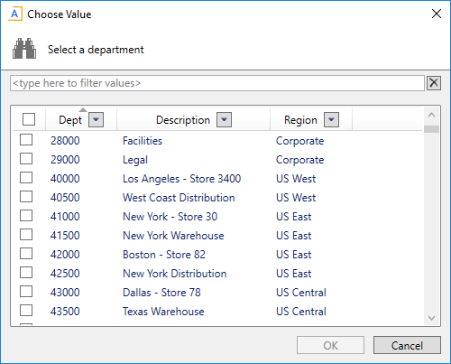
Example Choose Value dialog using "full grid view" and with multi-select enabled
The list of values in the Choose Value dialog is sorted based on the designated table column for the variable. In some cases the values may not be displayed as expected:
-
If the column is from a document reference table, the values will most likely not be displayed in the order they are stored in the source file. When the values are saved to the database from the source file, they are sorted based on the key column of the table (column A of the sheet).
-
If the column is a string column that contains numeric values (values that are all numbers and values that start with numbers), Axiom Financial Institutions Suite will attempt to sort these values in numeric order. Values that start with letters will then be sorted in alphabetical order.
When used with Axiom forms and multi-select is enabled for the variable, the variable initially looks like a ComboBox variable.

However, when the user clicks the down arrow to select a value, a dialog opens instead, allowing the user to select multiple values using check boxes. The behavior of this dialog is the same as when using multi-select with a form combo box.

The "full grid" view is not used with Axiom forms, even if multiple additional columns are specified. The additional column values are concatenated with hyphens. This means that the values cannot be sorted by column, but users can still use the search box to find particular values.
If multi-select is not enabled for the variable, then the variable behaves the same way as a ComboBox variable when used in Axiom forms. Therefore, it is strongly recommended to use a ComboBox variable with Axiom forms instead, if you do not need multi-select.
Variable properties
This section explains how to complete a variable row in the RefreshVariables data source when defining a Grid variable. Some data source columns do not apply in this case and are not discussed here. If any inapplicable columns are present in the data source, they should be left blank on rows that define Grid variable types. If you are using the Data Source Assistant to complete the variable properties, then only the applicable columns will be shown in the task pane.
For more information on the RefreshVariables data source in general, see Defining refresh variables.
General variable properties
All refresh variables use a common set of general properties such as the variable name, display name, and whether the variable is enabled or required. Any special considerations for Grid variables are noted.
| Column Tag | Description |
|---|---|
|
[Name] |
The name of the variable. This name identifies the variable row in the data source, and is also used as the variable display name to users if a separate display name is not defined in the The name should not contain any non-alphanumeric characters such as question marks or periods. If you want the variable name that displays to users to include non-alphanumeric characters, use the display name. The name cannot be dynamic; it must remain static because it is used to identify the variable. If you are configuring a dependent variable and you need the name to change based on the selection of the parent variable, then you must make the display name dynamic instead of the name. |
|
[DisplayName] |
Optional. The display name of the variable. If defined, the display name will be used instead of the name when the variable displays to users. |
|
[VariableType] |
Specifies the variable type. Enter |
|
[IsEnabled] |
Specifies whether the variable is enabled (True/False).
|
|
[SelectedValue] |
The user's selected value for the variable will be placed in this cell. When setting up the file to use the variable value, point your formulas to this cell. If you want to define a default value for the variable, use the |
|
[IsRequired] |
Optional. Specifies whether the user must enter a value for this variable (True/False).
The display of required and optional variables depends on the environment. In the Desktop Client, the text (optional) follows the name of optional variables. In the Web Client, required variables that do not yet have a selected value are indicated with a red bar along the side of the variable field. |
|
[DependsOn] |
Optional. Specifies that the variable is dependent on a "parent" variable. To make a variable dependent on another variable, enter the name of the parent variable. Some variable types require a parent variable, such as RelatedColumnValue variables. Other variable types can be made dependent as needed. Dependent variables can be updated dynamically in response to the selected value for the parent variable. For more information, see Using dependent refresh variables. |
|
[DefaultValueonOpen] |
Optional. Specifies a default value to be copied to the NOTE: If you need to use a formula to determine the default value, the formula may not get calculated before the value is copied to the The default value is copied regardless of whether the variable is currently enabled or not. This allows you to set a default value for dependent variables that may not be initially visible, but will be visible based on the parent variable selection. The default value must be valid in the context of the variable type and configuration. If the default value is not a value that could be entered or selected for the variable, validation errors or refresh errors may occur. |
|
[ClearSelectedValueonSave] |
Optional. Specifies whether the selected value is cleared when the file is saved (True/False).
|
|
[ClearSelectedValueonOpen] |
Optional. Specifies whether the selected value is cleared when the file is opened (True/False).
If you enable this option and also define a default value using |
|
[GroupName] |
Optional. Defines a group name under which the variable will display. This option only applies to refresh variables used with Axiom forms; it will be ignored when using refresh variables with spreadsheet files in the Desktop Client. If a group name is specified, then the variable will be displayed within an expandable / collapsible grouping in the Web Client filter panel (or when the form is viewed as a web tab within the Desktop Client). |
|
[CollapseOnOpen] |
Optional. Specifies whether the group that this variable belongs to should start out collapsed when the form is opened (True/False). By default, groups start out as expanded. This option only applies to refresh variables used with Axiom forms, and only if the variable has a defined group name. The option is ignored when using refresh variables with spreadsheet files in the Desktop Client. If one variable in the group is set to True, then the group is collapsed, regardless of whether other variables in the group may be set to False (or blank). |
Variable-specific properties (table column)
The following additional properties apply to Grid variable types, when specifying a table column directly.
| Column Tag | Description |
|---|---|
|
[ColumnName] |
The column to provide the list of values for the variable. Enter a fully-qualified Table.Column name such as You can specify any column from any client table in your system. System tables such as Axiom.Aliases are not supported for use with variables and cannot be used. When using columns with lookups (including multi-level lookups), the final lookup table is considered the primary table. For example, if you specify When using columns with lookups, the starting table impacts the list of items to be returned from the value column. For example, If the value column is a key column or a validated column, then the corresponding descriptions automatically display with the column values in the grid, unless additional columns are defined. |
|
[AdditionalColumns] |
Optional. One or more additional columns to display in the selection dialog along with the value column. Separate multiple column names with commas or semicolons. Any columns listed should use fully qualified Table.Column syntax. If the value column uses a lookup, then any additional columns must be resolvable from the primary table, or must use a fully qualified path from the starting table. Column-only syntax is only allowed for columns directly on the primary table. NOTES:
|
|
[ColumnFilter] |
Optional. A filter criteria statement to limit the list of values displayed to the user. You can type in the filter statement manually, or right-click the cell and use Axiom Wizards > Filter Wizard. If the value column uses a lookup, then the column in the filter criteria statement must be resolvable from the primary table, or must use a fully qualified path from the starting table. |
|
[PlaceholderText] |
Optional. Defines placeholder text to display within the variable box until a value is selected. This text also displays at the top of the Choose Value dialog, and as a tooltip for the Choose Value button. If blank, then the default text "Choose a value for ColumnName" is used. |
|
[AllowMultiSelect] |
Optional. Specifies whether multiple values can be selected from the designated column (True/False).
This option should be used if you intend to create a filter based on the user's selections, and you want the user to be able to filter on multiple data elements. The filter must use IN syntax, with the comma-separated list placed within the parentheses. For example, if the selected value cell for the variable is Variables!G16, the filter could be built as follows: ="DEPT.DEPT IN ("&Variables!G16&")" Which would result in the filter: |
|
[DisplayFormat] |
Optional. Defines a display format for the items in the list. This only applies to Grid variables when used in the Web Client, to control the display of items in the multi-select dialog. The display format is ignored in the Desktop Client. By default, items in the list are displayed as: KeyColumn - DescriptionColumn If you want to specify a different format and/or use additional columns, then you can indicate the display format here. Use fully qualified Table.Column syntax and place column references in curly brackets. For example, you could indicate something like: {Acct.Acct} - {Acct.Description} ({Acct.Category}) This would display account items in the following format: 8000 - Facilities (Overhead) If a display format is defined, the items in the list are sorted based on the display format instead of the value column. |
|
[TooltipColumn] |
Optional. Specifies a column that defines tooltip text for each value shown in the list. When a user hovers over a value in the list, the corresponding text from this column is shown in a tooltip. If the value column uses a lookup, then the tooltip column must be resolvable from the primary table, or must use a fully qualified path from the starting table. |
|
[AutoQuoteString] |
Optional. Specifies whether the string value is placed in single quotation marks when it is written to the This option is intended to make it easier to create filters based on the selected value, when the selected value is a string and therefore must be wrapped in single quotation marks. For example: NOTE: This option only applies if the value column is a string column, and only if multi-select is not enabled for the variable. If multi-select is enabled, then string values are always quoted. |
The following properties do not apply to Grid variables when using a table column: DataSourceName, ListChoices, Hierarchies, UseAsQuickFilter, MinDate, MaxDate, PrimaryTable, LimitColumn, MinValue, MaxValue, StepFrequency.
Variable-specific properties (Picklist table)
The following additional properties apply to Grid variable types, when specifying a Picklist table.
| Column Tag | Description |
|---|---|
|
[DataSourceName] |
Specifies the picklist table to define the list of values. Use the following syntax: Picklist: TableName For example, When a picklist table is the data source, this is effectively the same as designating the Code column of the picklist table as the source column. The additional picklist columns of Value and Description are also displayed in the grid. |
|
[ColumnFilter] |
Optional. A filter criteria statement to limit the list of codes displayed to the user. You can type in the filter statement manually, or right-click the cell and use Axiom Wizards > Filter Wizard. |
|
[PlaceholderText] |
Optional. Defines placeholder text to display within the variable box until a code is selected. This text also displays at the top of the Choose Value dialog, and as a tooltip for the Choose Value button. If blank, then the default text "Choose a value for ColumnName" is used. |
|
[AllowMultiSelect] |
Optional. Specifies whether multiple codes can be selected from the picklist (True/False).
|
|
[DisplayFormat] |
Optional. Defines a display format for the items in the list. This only applies to Grid variables when used in the Web Client, to control the display of items in the multi-select dialog. The display format is ignored in the Desktop Client. By default, items in the list are displayed as: KeyColumn - DescriptionColumn If you want to specify a different format and/or use additional columns, then you can indicate the display format here. Use fully qualified Table.Column syntax and place column references in curly brackets. For example, you could indicate something like: {Acct.Acct} - {Acct.Description} ({Acct.Category}) This would display account items in the following format: 8000 - Facilities (Overhead) If a display format is defined, the items in the list are sorted based on the display format instead of the value column. When defining a display format for use in the Web Client, you can also optionally use the TooltipColumn property to display tooltip text for each item. This is not applicable in the Desktop Client, because all picklist columns display in the grid in the Desktop Client. |
|
[TooltipColumn] |
Optional. Specifies a column in the picklist table that defines tooltip text for each value shown in the list. When a user hovers over a value in the list, the corresponding text from this column is shown in a tooltip. Although you can specify a tooltip column when using a picklist table data source in the Desktop Client, there is typically no reason to do so, because the grid already shows all columns in the picklist table. |
The following properties do not apply to Grid variables when using a picklist table: ListChoices, ColumnName, AdditionalColumns, Hierarchies, UseAsQuickFilter, MinDate, MaxDate, AutoQuoteString, PrimaryTable, LimitColumn, MinValue, MaxValue, StepFrequency.
Example data source
The following screenshot shows examples of Grid variables. The first variable uses a filter and does not allow multi-selection. The second variable specifies additional columns to display in the grid, and also allows multi-selection. The third variable uses a picklist table.

