AX2141
component for Axiom forms
Using the Formatted Grid component, you can display information in a grid format—such as reporting data, lists of information, or grid "worksheets" with various user inputs. The Formatted Grid component takes a designated section of the source spreadsheet and displays the contents of those cells in the Axiom form.
You can define formatting for the grid contents, such as font size and colors, background colors, text alignment, and borders. To apply formatting, you tag each row and column in the grid with style names. The formatting in the spreadsheet is ignored, with the exception of number formats.
Defining a formatted grid is a two-part process that requires the following:
- Creation of a Grid data source in the spreadsheet to define the portion of the spreadsheet to display in the form, and to define the formatting of the grid contents.
- Placement and configuration of a Formatted Grid component on the Axiom form canvas.
The Formatted Grid component can be used for data display only, or to support rich interactivity such as input cells, combo boxes, and more. Formatted grids are very flexible and support many different features. Each formatted grid can look and act very differently depending on the formatting applied and the features used. For more information, see the related topics such as:
- Interactivity options for Formatted Grids
- Using content tags in Formatted Grids
- Setting up drilling for Formatted Grids
- Applying formatting to Formatted Grids
- Editing grid contents in a spreadsheet editor
- Exporting Formatted Grid contents to a spreadsheet
The Formatted Grid component is one of several options that can be used to display reporting data in an Axiom form, along with the Fixed Report component and the Data Grid component. For more information on the differences between these components and when to use each, see Displaying reporting data in an Axiom form.
NOTES:
-
Older formatted grids may use formatting defined in the spreadsheet, instead of using row and column styles. These older grids are known as spreadsheet-formatted grids. The ability to use spreadsheet formatting is deprecated, and is only supported for backward-compatibility. Many newer features of formatted grids are not supported in spreadsheet-formatted grids. If you have existing spreadsheet-formatted grids and you need information on how to edit them, or if you want information on how to migrate them to the new grid style, see Using spreadsheet formatting with Formatted Grids (deprecated).
-
Formatted grids that use the default formatting method are also known as thematic grids, to differentiate them from the legacy spreadsheet-formatted grids.
Data source tags
A Formatted Grid component must have a defined data source within the file to indicate the data for the grid. The tags for the data source are as follows:
Primary tag
Row tags
Column tags
(missing or bad snippet)The following example shows a Grid data source tagged in a sheet. In real implementations this data would most likely be generated by an Axiom query or another data query method; this example uses fixed sample data in order to show the placement of the tags to the data.
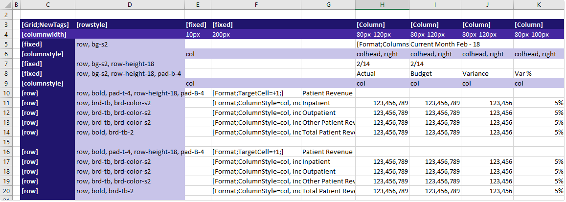
To use the Data Source Wizard to add the tags to a sheet, right-click in a cell and then select Create Axiom Form Data Source > Formatted Grid. You can also highlight a range of data first and then use the wizard to add the tags around that data. The cells in the row above and the column to the left of the selected area must be blank in order for Axiom to place the tags in sheet.
When the form is rendered, this example grid displays as follows:
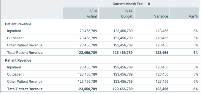
Notice the difference between the formatting in the form versus the formatting (or lack thereof) in the spreadsheet. The formatting in the spreadsheet is ignored. The formatting in the form is determined by the styles applied to the rows and columns in the data source. For example, the subtotal rows use a style such as row,bold,brd-tb,brd-color-s6, to apply bold text and borders to the row.
If desired, you could format the data in the spreadsheet, and that formatting would be ignored when the form is rendered. For example, you might want to bold the header rows and put underlines on the subtotal rows, just so the data is easier to read in the spreadsheet when form designers are working in the file.
You can define the following properties for a Formatted Grid component.
(missing or bad snippet)(missing or bad snippet)| Item | Description |
|---|---|
Data Source | The data source for the grid. You must have defined the data source within the file using the appropriate tags in order to select it for the grid. (missing or bad snippet) |
Data Source Load | (missing or bad snippet) NOTE: Asynchronous loading cannot be used with embedded forms. If the Formatted Grid component will be used inside an embedded form, it must use Inline loading. |
Selected Row ID | The currently selected row in the grid. This setting is optional and should only be used if you want users to be able to select a row in the grid to impact the Axiom form in some way. The data source must have a This setting serves two purposes:
For more information, see Selected row. NOTES:
|
Auto Submit | Specifies whether the Axiom form automatically updates when a user changes the state of the grid. By default this is enabled, which means that the form automatically updates in response to user activity such as:
If this setting is disabled, then edits made to the grid will not trigger an update. The changes will be submitted back to the source file when another component triggers an update, such as a Button component. |
Specifies whether a special lightweight auto-submit behavior applies to input cells in the grid. If enabled, the following items are affected: simple unlocked cells and TextArea tags. (missing or bad snippet)When enabled, the following behavior applies:
No other form values are submitted, and no other form components are updated. The regular form update process does not occur. This option can be enabled by itself or in conjunction with Auto Submit. This option overrides auto-submit behavior for the affected cells, but all other cells can continue to use the regular auto-submit behavior or not as desired. | |
Save On Submit | (missing or bad snippet) |
Title Text | The title text for the component. This text displays in the title bar for the component within the Axiom form, if the title bar is enabled. If the title bar is disabled, then this text does not display at all in the form. It is assumed that if you are not using the title bar, then you have defined title text in the grid itself. (missing or bad snippet) |
Show Title Bar | (missing or bad snippet) |
Collapse Height | (missing or bad snippet) |
Extended Height | Specifies whether the height of the grid should extend to show all rows of the data source. By default this is disabled. If the rows included in the data source exceed the height of the grid component on the form canvas, then a vertical scroll bar will be present on the grid, allowing users to scroll to view all rows. If this option is enabled, then the height of the grid will automatically extend downward to include all rows. If the rows exceed the size of the form window, then the user can scroll the window to view all rows. For more information on the impact of using extended height, see Setting row sizes for Formatted Grids. This option is primarily intended for use when printing to PDF. If you define any PDF Settings, then it is automatically applied along with those settings. For more information, see Configuring a Formatted Grid component for printing to PDF. |
PDF Settings | Defines settings to apply to the grid when generating a PDF of the form. Click the [...] button to open the PDF Settings dialog and complete the settings. You can define the number of rows to show per page and configure header rows to repeat. For more information on these settings, see Configuring a Formatted Grid component for printing to PDF. |
Grid Formatting | Specifies how the contents of the grid are formatted. By default, this is set to Thematic and should not be changed. Thematic formatting refers to the use of row and column styles to format the grid. Older, existing grids may be set to Spreadsheet, which refers to the deprecated approach of using formatting defined in the spreadsheet. If you have an old spreadsheet-formatted grid, keep in mind that many grid features are not supported in this deprecated format. For more information, see Using spreadsheet formatting with Formatted Grids (deprecated). IMPORTANT: This setting is only present on the Form Control Sheet. Generally speaking, the only reason to edit this property is if you are migrating an old spreadsheet-formatted grid to use thematic formatting. Newly created grids should not use spreadsheet formatting, unless you are working in an older system that has not yet migrated to the new approach, and you need to maintain backward-compatibility. |
For Formatted Grid components, the grid-level style only impacts the external grid container; it does not affect the internal grid contents. Row and column styles should be applied to the Grid data source to define the formatting for the grid contents. For more information, see Using row and column styles with Formatted Grids.
(missing or bad snippet)(missing or bad snippet)Using the Data Source Assistant with a Grid data source
You can use the Data Source Assistant to:
- Add column and row tags to the data source.
- Apply styles to rows and columns. For information on using the Data Source Assistant to apply styles, see Using row and column styles with Formatted Grids.
- Edit content tags. For information on using the Data Source assistant to work with content tags, see Creating and editing content tags in Formatted Grids.
The Selection Editor section of the Data Source Assistant is blank if you have your cursor in any of the following areas:
- In the
[ColumnWidth]row or the [RowHeight] column. - In the
[RowID]row. - In a cell that contains a formula, or plain text or numbers.
You must populate these areas manually as needed.
