AX1624
component for Axiom forms
Using the Data Grid component, you can query data from the Axiom Software database and display that data in a grid within an Axiom form. This component is intended to be used to display reporting data.
The Data Grid component queries the data directly from the database, using the primary table defined in the component properties and the columns defined in the associated data source. The resulting data is not returned into the spreadsheet source file; it is only returned into the form. This provides a more efficient and performant method of displaying data in an Axiom form, as compared to querying data into the spreadsheet source file and then tagging it for display in a Formatted Grid component.
The Data Grid component also supports the following features:
-
Drilling: You can enable drilling for the grid. Users can drill down any row in the grid, to see the data in the row at a different level of detail.
-
Icons and commands: You can display icons in the grid. The icons can be used simply as informational signals, or they can be used to trigger a command or open a designated URL. The icons can be persistent in the grid, or they can display on hover only. Conditions can be defined for the icons, so that the icons only display when certain conditions are met.
-
Excel export: You can enable the ability to export the grid contents to an Excel spreadsheet.
-
Built-in grid tools: When viewing the grid, users can sort and filter the data, move between paged data, and use other built-in tools.
-
Save-to-database: You can configure a data grid to allow users to edit certain column values and then save the changed data to the database.
Generally speaking, the Data Grid component does not support user-definable formatting options. You can define the column width, alignment, and numeric formatting. All other formatting is defined by the grid and cannot be changed.
Defining a data grid is a two-part process that requires the following:
-
Creation of a DataGridColumns data source in the spreadsheet that defines the columns to display in the grid, as well as other properties such as the sum by level and frozen columns. Data Grid components also support an additional optional data source, HierarchicalGrid, that can be used to show grouped data in the grid.
-
Placement and configuration of a Data Grid component on the Axiom form canvas. The primary table for the query and the overall data filter are defined in the component properties.
The Data Grid component is one of several options that can be used to display reporting data in an Axiom form, along with the Fixed Report component and the Formatted Grid component. For more information on the differences between these components and when to use each, see Displaying reporting data in an Axiom form.
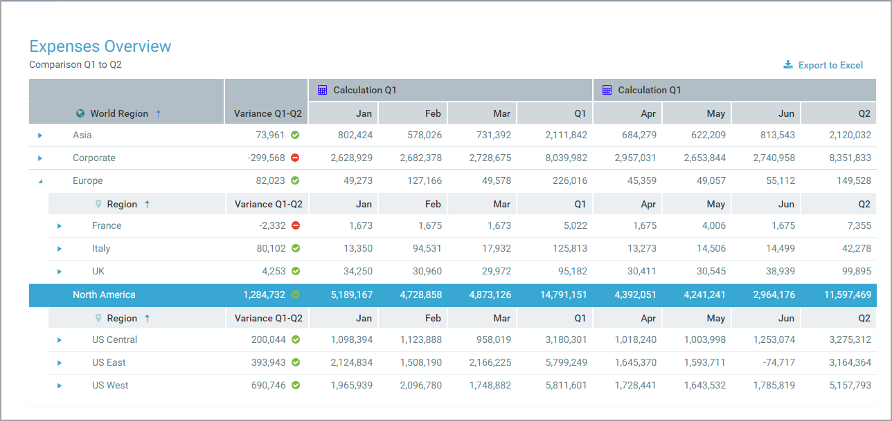
Example Data Grid component in an Axiom form
NOTE: The Data Grid component has special update behavior that does not follow the same rules as other form components. If you want the data in the grid to change based on changes made to other components, you must be aware of this behavior and design accordingly. For more information, see Update behavior.
A Data Grid component must have a defined data source within the file to indicate the columns of data to display in the grid. The tags for the data source are as follows:
Primary tag
Row tags
Column tags
- [ColumnName]
-
Valid entries for this column depend on the row tag:
-
For
[Column]rows, specify the fully qualified Table.Column name to include in the grid. The grid column will display values from the designated table column.The designated table column must be valid to include in the query, based upon the primary table specified in the component properties. The same columns that would be valid to include in the field definition of an Axiom query are valid for inclusion here. You can use regular table columns, calculated fields, and column alias names.
If the column has a defined
[Aggregation]or[ColumnFilter], then you can define a unique name for the column in order to reference it in calculations or icon conditions. Append this unique name to the Table.Column using a semicolon. For example:GL2020.TOT;TOT19Filter. This unique name should not contain spaces or special characters—generally speaking, it should follow the same rules as table column names.NOTE: If only the column name is specified, the table is assumed as the lookup table if the column is validated and flagged as a sum by column. For example, if you specify the column as Dept, then the column used is
Dept.Dept. Otherwise, the primary table is assumed as the table. It is recommended to always fully qualify column names so that you know exactly which Table.Column is being used. -
For
[CalculatedColumn]rows, enter a unique name. It is recommended to define a name that describes the purpose of the calculation. If you plan to use this name in calculations, then the name must not contain spaces or special characters—generally speaking, it should follow the same rules as table column names. -
For
[ColumnGroup]and[EndGroup]rows, this field should be left blank as it does not apply.
If you want to display only icons in the grid column, then use a
[Column]row but leave the[ColumnName]field blank so that it is not associated with a database column. Then, use the[Icon]field to specify the icons to display. -
- [IsVisible]
-
Determines whether the column is visible in the grid (True/False). You can use this property to dynamically hide and show certain columns
Columns are visible in the grid in the order they are defined in the data source, with frozen columns displayed first, followed by all other unfrozen columns.
If you want to dynamically exclude a column from the data source entirely, then you must use formulas to hide or show the row tag.
- [IsEditable]
-
Determines whether the column is editable in the grid (True/False). False is assumed if left blank or omitted. Only applies to
[Column]rows.If True, then values in this column display within editable cells. Users can edit the cell to change the value. If a calculated column in the grid references this column, and
[IsLiveUpdate]is enabled for the calculated column, then the calculated column value will update based on the user's edits. You can save the edited value to the database, or the updated calculated value, or both as needed.This feature is intended to be used in conjunction with the Enable Saving option in the component properties, to allow users to edit grid values and save data back to the database. For more information, see Editing and saving data using a Data Grid.
- [DisplayFormat]
-
Optional. Defines a display format for the grid column contents. This is primarily intended to be used when you want to display the values of multiple database columns together in a single column of the grid. For example, if you have a column for
Dept.Deptbut you want to display the description in the same column as the department code, you can define a display format as follows:{Dept.Dept} - {Dept.Description}
Use fully qualified Table.Column syntax and place column references in curly brackets. The display format can include additional text and characters, such as the hyphen in the previous example. Any column listed in the display format must be valid in the context of the primary table.
If a display format is defined and the grid column is sorted, it is sorted using the display format instead of the base column values.
- [SortOrder]
-
Specifies whether the grid is sorted by the values in this column. Enter a number that indicates the order of the column in the sort. For example, to sort by a single column, enter 1 for that column. To sort by two columns, enter 1 for the first column to designate it as the primary sort, and 2 for the other column to designate it as the secondary sort. All columns that are not included in the sort order should be left blank. If no columns have an assigned sort order, then the grid is sorted based on the sum by columns.
If a column has an assigned sort order, it is always included in the query, regardless of whether it is visible. This means you can use a column to define the sort but not show that column in the grid.
If a column with an assigned sort order has a display format, then that column is sorted using the display format instead of the base column values.
This property defines the initial sort of the grid. Within the form, users can sort by any column by clicking the column header.
- [SortDirection]
-
Specifies the direction of the sort,
ascfor ascending ordescfor descending. Ascending is assumed if left blank. Only applies if the column has an assigned number in the[SortOrder]column. - [IsSumBy]
-
Specifies whether the column defines the "sum by" level for the data query (True/False). The column must be valid for use as the sum by, based upon the primary table specified in the component properties. The same columns that would be valid to use as the sum by for an Axiom query are valid here.
For example, if the sum by level is
Dept.Dept, then each row in the grid represents the sum of data per unique department. If the sum by level isDept.DeptandAcct.Acct, then each row in the grid represents the sum of data per unique department / account combination.If multiple columns are specified, the combined sum by is applied using the order of the columns in the data source. For example, if
Dept.DeptandAcct.Acctare both specified as sum by columns, but Dept is first in the data source, then the sum by is applied asDept.Dept, Acct.Acct.The data source must contain at least one column that is enabled for use as the sum by. It is not possible to "assume" the sum by level for a data grid. If no columns are enabled, an error will occur when attempting to render the grid.
If Show Hierarchical Column Data is enabled in the component properties, then the sum by columns determine the hierarchical grouping levels for the grid. In this case, there must be at least two sum by columns, and the sum by columns must be in the intended hierarchical order within the data source, with the top-level group listed first. For example, if you are grouping by Country > Region > Dept, then
Dept.Countrymust be the first sum by column listed in the data source.If a column is designated as a sum by column, it is always included in the query, regardless of whether it is visible. Generally speaking, sum by columns should always be visible. If Show Hierarchical Column Data is enabled and a column is designated as a sum by column, that column is automatically visible.
- [Width]
-
Optional. The width of the column in the grid, in pixels. If left blank, the default column width is as follows, depending on the column type:
- Numeric, Date, Boolean: 120
- Integer (all variations), Identity (all variations), or DateTime: 150
- String: 200
Calculated columns defined in the grid default to 120. Columns that contain only icons default to 200.
- [Header]
-
Text to display in the grid header for the grid column. If left blank, the
[ColumnName]value is used.For
[ColumnGroup]rows, this defines the header text to display over the column group. If left blank, a blank header row is displayed over the column group. - [HeaderIcon]
-
Optional. The name of an icon to display in the grid column header. You can use the same icon names as for the
[Icon]column (including appending the optional color).If no header text is defined, then the icon displays by itself and honors the
[HeaderAlignment]property directly. If header text is defined, then the icon displays to the left of the header text if the header alignment is left or center, and to the right of the header text if the header alignment is right.An
[IconConfig]data source cannot be used here; only a single icon name can be used. - [HeaderAlignment]
-
Optional. The alignment of the header text. Enter any of the following:
Default,Left,Right, orCenter. If left blank, Default is assumed.By default, the header text uses the same alignment as the grid column contents (as determined by the
[Alignment]property). This setting can be used to apply a different alignment to the header text.For
[ColumnGroup]rows, the default alignment is Center. - [Icon]
-
Optional. Enter one of the following:
- The name of a single icon to display in each row of the grid column.
- The name of an IconConfig data source that defines the icons to display in the grid column, as well as additional icon features.
The valid icon names are the same names allowed for symbols in Formatted Grid components (as well as Label and Button components). You can use any of these features to look up the desired icon name.
TIP: You can right-click the cell and select Insert Formatted Grid Tag > Symbol, then use the Tag Editor to select a symbol name (such as
fa-file-ofor a file symbol). You can then copy and paste the symbol name out of the Tag Editor and into the[Icon]column.When listing a single icon name, you can optionally specify a color for the icon, using the syntax
IconName;ColorName. For example:fa-heart;red. You can specify the color using a color name (red), a hexadecimal color code (#FF0000), or an Axiom style color code (A32). When using an IconConfig data source name, the color is specified within the data source.If you want to use additional icon features—such as displaying multiple icons, conditionally displaying icons, or assigning an action to icons—then you must use an IconConfig data source. For more information on creating and using the IconConfig data source, see Using the IconConfig data source with Data Grid components.
If you want the grid column to only contain icons, then the row should be a
[Column]row and the[ColumnName]property should be left blank. In this case, the icons honor the[Alignment]property directly to determine the alignment of the icons. If the alignment is set to default, the icons are left-aligned.If the row has a defined database column name or a calculation, then the icons display along with the column values
[HideValue]is set to True)- For left and center alignments, the icons display on the left side of the other column contents.
-
For right alignment, the icons display to the right side of the other column contents.
- [HoverActions]
-
Optional. The name of an
[IconConfig]data source, in order to display icons when the user hovers their cursor over the column contents and perform actions by clicking the hover icons. For more information on creating and using the data source, see Using the IconConfig data source with Data Grid components.Hover icons are designed to display on the opposite side of the other column contents. If the column alignment is right, the hover icons display on the left, and vice versa. If the column alignment is center, the hover icons display to the right of the other column contents. (This "opposite" alignment still applies if the icons are the only content in the column.)
- [Total]
-
Optional. Defines the contents of the total row for the grid, if Include Total Row is enabled in the component properties. An example total row in the data source is shown here.
If the total row is enabled, and you want to show a label on the total row, do the following:
-
Enter the desired text for the label—such as "Total"—into the Total Row Header field in the component properties.
-
Enter the keyword
Headerin the[Total]column of the data source, for the grid column where you want the label to display. Typically this would be placed in the same column that holds the row dimension labels, such as the sum by column or its description. If no grid columns are marked with Header, then the total row will not have a label.
In most cases, you can leave the rest of this column blank to include all "data" columns in the total row by default. Numeric value columns and calculated columns are automatically included, while numeric dimension columns and other ineligible columns are omitted. If you do not want a data column to be included in the total row, then you can enter
Falseinto the[Total]column to omit it.The following columns are included in the total row by default:
-
Any column using the following aggregation types: RowSum, LookupSum, RowAvg, LookupAvg, and RowCount. This applies whether the column uses the aggregation type by default, or if you have assigned the aggregation in the
[Aggregation]column. The total row uses the same aggregation as the column data.For example, a Numeric column with a column classification of Value uses RowSum aggregation by default and therefore will be included in the total row. An Integer column with a column classification of Dimension uses Max aggregation by default and therefore will be omitted from the total row. However, if you use the
[Aggregation]column to set the Integer column to use RowCount aggregation instead, now it will be included by default. -
All calculated columns defined in the grid. By default, the calculation is applied to the total row values. However, if
[IsPreAggregationCalculation]is True, then the values in the calculated column are summed for the total row instead.
Columns using Min, Max, or DistinctCount aggregation (whether by default or explicitly specified) are not eligible for inclusion in the total row.
Generally speaking, it is not necessary to flag any columns with
Truebecause all eligible columns are included by default. If an ineligible column is flagged as True, then an error occurs when attempting to render the grid.NOTES:
-
If one or more columns in the grid are enabled for user filtering (meaning
[IsFilterable]is set toTrue), then when the grid is filtered by a column, the values in the total row will update to reflect the current contents of the grid. However, if a column uses AVG or LookupAVG aggregation, then it will be omitted from the total row when the grid is filtered by a column. -
If Show Hierarchical Column Data is enabled, then the Header keyword must be placed in the row for the top-level grouping of the hierarchy, because the total row only displays for the top-level grouping.
-
If the DataGridColumns data source is being used with a HierarchicalGrid data source, then the
[Total]field is only honored if it belongs to the DataGridColumns data source that is associated with the top-level grouping in the HierarchicalGrid data source. The total row only displays for the top-level grouping. - If the total row is enabled, the data cannot be paged. The Page Size property is ignored, and all rows display on a single page.
If Include Total Row is disabled in the component properties, then this field is ignored and no total row displays in the grid.
-
- [SelectedRowValue]
-
System-controlled field. When a row is selected in the grid, this field is populated with the corresponding value in that row for each column. This field only applies if Enable Row Selection is enabled in the component properties.
For example, if the user selects the row containing Dept 40000, then the value 40000 is written to the data source for the row that defines the
Dept.Deptcolumn. You can set up the form to use these selected values in some way, such as to show detailed information about the current row. For more information, see Interactive behavior.Additionally, a filter statement for the currently selected row is written to the Selected Row Filter field for the component on the Form Control Sheet. You can optionally reference this filter statement directly instead of building your own.
Dept.DeptandAcct.Acct, and the user selects the row for Acct 1000 and Dept 40000, then the filter statement is written as(Acct.Acct=1000) and (Dept.Dept=40000).NOTE: It is not possible to define a default selected row value for the grid. When the grid is initially rendered, any values in the
[SelectedRowValue]column are ignored. - [ActionRowValue]
-
System-controlled field. When a user clicks an interactive icon in the grid, this field is populated with the corresponding value in that row for each column. This field only applies if icon actions are being used in the
[Icon]or[HoverAction]fields.For example, if the user clicks on an icon in the row containing Dept 40000, then the value 40000 is written to the data source for the row that defines the
Dept.Deptcolumn. These values can be referenced by the icon action, such as to display more information about the current department in a Dialog Panel.Additionally, a filter statement for the action row is written to the Action Row Filter field for the component on the Form Control Sheet. You can optionally reference this filter statement directly instead of building your own.
Dept.DeptandAcct.Acct, and the user clicks on an icon in the row for Acct 1000 and Dept 40000, then the filter statement is written as(Acct.Acct=1000) and (Dept.Dept=40000). - [NumericFormat]
-
Optional. A valid Excel numeric format string to define the number format used by the grid column. Only applies to columns with numeric data.
To define a display format, enter a valid Excel formatting string. These strings can be obtained as follows:
- Format a cell in a spreadsheet to use the desired display format.
- In the Format Cells dialog, on the Number tab, select the Custom category and copy the string in the Type box.
For example, this is the formatting string for a Currency format that shows the negative numbers in parentheses:
$#,##0.000_);($#,##0.000)Colors (such as red font for negative numbers) are not supported. Additionally, text replacement strings are only supported for zero values. Other advanced or unusual formats may not display as expected, so be sure to verify the column display.
If you do not define a custom display format, then the default formatting for the database column's specified numeric type will be used.
[CalculatedColumn]rows use the Currency numeric type by default. If you do not want this format, you must enter a format string for the column. - [Alignment]
-
Optional. The alignment of the grid column values. Enter any of the following:
Default,Left,Right, orCenter. If left blank, Default is assumed.The default alignment is as follows:
- Values in frozen columns are left-aligned.
- Values in non-frozen columns are left-aligned for strings and right-aligned for numbers.
- [IsFilterable]
-
Optional. Specifies whether users can filter the rendered grid by the aggregated values in the column (True/False). False is assumed if blank or omitted.
If True, then filtering controls are available on the column header in the grid. These controls are visible when a user hovers over the column header.
- [IsFrozen]
-
Specifies whether the grid column is frozen at the left-hand side of the screen for scrolling purposes (True/False). If True, then the column displays in the frozen area, before any unfrozen columns, regardless of its placement in the data source. Within the frozen area, frozen columns display in the order they are defined in the data source.
If Show Hierarchical Data is enabled in the component properties, then frozen columns do not apply and the
[IsFrozen]column is ignored. Columns cannot be frozen when using hierarchical groupings in the grid. - [Aggregation]
-
Optional. Specifies the aggregation type used to aggregate data queried from the database column. In most cases this should be left blank to use the default aggregation for the database column—for example, to sum data columns. Aggregation only applies to
[Column]rows.If you want to override the default aggregation type for a database column, specify a valid aggregation type. The available aggregation types are the same as when using alternate aggregations with an Axiom query field definition.
- [ColumnFilter]
-
Optional. Specifies a filter to limit the data queried from the database column. Enter any valid filter criteria statement. The behavior and requirements are the same as when defining a column filter for an Axiom query field definition.
[Column]rows.Defining a column filter is different than enabling filter controls for the column using
[IsFilterable]. The column filter is part of the database query and limits the data returned into the grid for this column only. The filter controls on the grid allow ad hoc filtering on the displayed values in the column.NOTE: If you want to apply a filter to the entire grid, not just a single column, use the Data Filter option in the component properties instead.
- [Calculation]
-
Defines the calculation to use for the calculated column. Only applies to
[CalculatedColumn]rows. You can enter either of the following:-
The desired calculation as a text string, without an equals sign. For example, the following calculation displays the sum of the two columns for each row:
GL2020.M1+GL2020.M2 -
The name of a ConditionalCalculation data source. For example:
ExpensesCalculations. If a name is entered, then the Data Grid component uses that data source to determine the calculation to apply to each row of the data. The ConditionalCalculation data source should be used when you want different rows of the grid to use different calculations. For more information about defining and using this data source, see Using conditional calculations in Data Grid components.
If you enter a calculation, the calculation must consist of valid column names and one or more of the following operators: addition (+), subtraction (-), multiplication (*), division (/), remainder (%), or unary negation (-). Use parentheses to determine calculation order, such as:
(GL2020.Q1-BGT2020.Q1)/BGT2020.Q1.The following column names are valid for use in the calculation:
-
Database columns: You can use regular table column names (GL2020.M1), calculated field names (GL2020.TOT), and column alias names (CYA_TOT). Table columns and calculated fields must use full Table.Column syntax. You can use any database column that would be valid for inclusion in the
-
Calculated column names defined in the
GL2020.Q1-BGT2020.Q1, and you want the next calculated column to show the percent difference. As long as the[CalculatedColumn]row defining Difference is above the row defining Percent Difference, then you can write the percent difference calculation as follows:Difference/BGT2020.Q1. -
Columns with unique names defined in the
[ColumnName]field—such asGL2020.TOT;TOT20—then you can use this unique name in the calculation.This option is intended for cases where you have defined an alternate aggregation or a column filter for the column, and you want to use these results in the calculation instead of the raw column values. In this example, the unique name
TOT20could be used in the calculation. Assuming this column has a defined column filter, the filtered results will then be used in the calculation.
NOTE: If the property
[IsPreAggregationCalculation]is set to True for the calculated column, then the calculation can only use database columns, and the database columns must be present on the primary table or a lookup table.Numbers can also be used in the calculation—for example,
CPREQ2020.TOT/12. -
- [IsPreAggregationCalculation]
-
Specifies whether a calculation is applied to the aggregated rows in the grid, or to the pre-aggregated data. Only applies to
[CalculatedColumn]rows.-
If
True, then the calculation is applied to the raw data records returned by the query, before data is aggregated based on the sum by level. This is known as a "pre-aggregation calculation." -
If
False, then the calculation is applied to the aggregated data rows as they display in the grid. In other words, the calculation is applied at the sum by level. This is known as a "post-aggregation calculation."False is the default behavior if this property is left blank or omitted from the data source.
This property impacts how calculated columns are handled in the total row, if present. If the calculation is pre-aggregation, then the total row displays the sum of values in the column. If the calculation is post-aggregation, then the calculation is applied to the values in the total row.
NOTE: Pre-aggregation calculations can only use database column names, and those database columns must be present on the primary table or a lookup table. Pre-aggregation calculations cannot reference other calculated columns defined in the data source, and cannot reference named columns in the data source.
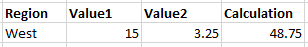
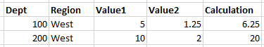
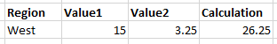
See an example of pre-aggregation and post-aggregation calculations
-
- [IsLiveUpdate]
-
Specifies whether the calculated column updates in response to edits made within the grid (True/False). Only applies to
[CalculatedColumn]rows. False is assumed if blank or omitted.If True, and if the calculation references an editable column in the grid, then the calculated column will update in response to user edits. For example, imagine that the calculation is Table.Column1 * Table.Column2, and Table.Column2 is editable in the grid using the
[IsEditable]property. When a user changes the value in the Table.Column2 column, the calculation updates to reflect the edited value.This feature is intended to be used in conjunction with the Enable Saving option in the component properties, to allow users to edit grid values and save data back to the database. For more information, see Editing and saving data using a Data Grid.
NOTE: Live update calculations can not be pre-aggregation calculations. If both
[IsLiveUpdate]and[IsPreAggregationCalculation]are True for a calculated column, the pre-aggregation setting is ignored and the calculation is applied post-aggregation. - [Save;TABLENAME]
-
Optional. Specifies the target table and columns to save data to the database, if Enable Saving is enabled in the component properties. In order to save data, this column should be completed as follows:
-
The TABLENAME part of the column tag should be replaced with the name of the target table for the save-to-database. For example, change the column tag to
[Save;BGT2021]if you want to save edited grid data to that table. -
For each grid column or calculated column that you want to save data, enter the name of the corresponding target column in the target table. You must include all key columns and any other data columns where you want to save data. You can leave this property blank for any non-key columns that you do not need to save.
For more information on using editable columns and saving data, see Editing and saving data using a Data Grid.
-
- [HideValue]
-
Optional. Specifies whether the column values are hidden (True/False), so that only icons display in the column. False is the default value if this property is blank or omitted.
This property only applies when an icon name or an IconConfig data source is specified in the
[Icon]property. By default, this means that the grid column will display both the specified column contents (or calculation) and the icons. However, if[HideValue]is set to True, then the column contents are hidden and only the icons display in the column.The only reason to use this property is if you need to reference the column value (using the
{value}variable) in the IconConfig data source, but you do not want the column value to display in the grid. If you just want to display an icon in a column, and you do not need to use any column values, then this property is not necessary—instead, you can simply populate the[Icon]property while leaving the[ColumnName]property blank.
NOTES:
- The primary tag must be placed in the first 500 rows of the sheet.
- Formulas can be used to create the tags, as long as the initial bracket and identifying keyword are whole within the formula.
To use the Data Source Wizard to add the tags to a sheet, right-click in a cell and then select Create Axiom Form Data Source > Data Grid. You can also highlight a range of data first and then use the wizard to add the tags around that data. The cells in the row above and the column to the left of the selected area must be blank in order for Axiom to place the tags in sheet.
The following example shows a sample DataGridColumns data source tagged in a sheet:
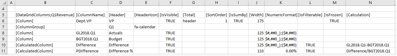
Example DataGridColumns data source
The resulting data grid for the example data source shown above looks as follows:
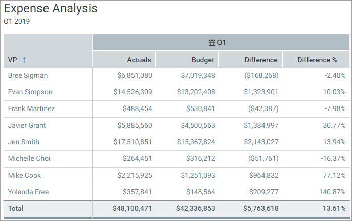
Example data grid
You can define the following properties for a Data Grid component.
Component properties can be configured using the Form Assistant task pane or the Form Designer unless otherwise noted. All properties can also be defined on the Form Control Sheet directly if desired. For example, if you want a property to be dynamic depending on the result of a formula, you can define that formula in the control sheet. To access the control sheet settings for the component, double-click any property name to go to that property in the Form Control Sheet.
Component behavior properties
The following properties control the display and behavior of this particular component type.
| Item | Description |
|---|---|
|
Data Source |
The data source for the grid. You must have defined the data source within the file using the appropriate tags in order to select it for the grid. You can select either of the following types of data sources:
NOTE: In the Form Control Sheet, the selected data source is written as SheetName!DataSourceName. The sheet name is the sheet where the selected data source is located. If a data source is already specified and you want to locate it within the file, click the Show location |
|
Title Text |
The title text for the component. This text displays in the title bar for the component within the Axiom form, if the title bar is enabled. |
|
Show Title Bar |
Specifies whether the title bar is visible. By default this option is enabled, which means that the component will display in a bordered box with a title bar across the top. The defined title text displays within the bar. The formatting of the title bar and its border are determined by the skin specified for the form. If disabled, then the title bar and its border will not display on the component. If the title bar is enabled and the component also has a separately defined border (either via a style or by using the formatting overrides in the advanced component settings), then both borders will display on the component. In some cases this effect may be desired; in other cases one of the borders should be disabled. |
|
Primary Table |
The primary table for the data query that is used to populate the grid. Enter any valid table name from the Table Library. The primary table determines which table columns are valid to include in the grid. System tables (such as Axiom.Columns) cannot be used as the primary table. For example, if you specify GL2020 as the primary table, then the query can retrieve data from that table, plus any reference tables that the primary table looks up to. If you want to include data from multiple data tables, you can include any table that shares keys with the primary table, as well as any shared lookup reference tables. If the component uses a HierarchicalGrid data source, this option does not display. Instead, each grouping level has its own primary table defined within the data source. |
|
Data Filter |
Optional. A filter to limit the data returned by the query and displayed in the grid. Enter a filter criteria statement that is valid in the context of the primary table. If no filter is defined, all data that matches the query is displayed in the grid. If the component uses a HierarchicalGrid data source, this option does not display. Instead, each grouping level has its own data filter defined within the data source. |
|
Suppress Zeros in Data Rows |
Optional. If enabled, then data rows that contain all zeroes are suppressed from showing in the grid. Non-key columns that meet both of the following criteria are evaluated to determine whether a row should be hidden:
If the primary table is a data table, Integer and Numeric columns on lookup reference tables are ignored—meaning these columns may have values, but the row is still suppressed if all applicable data table columns have zero values. There is one exception: reference table columns are considered if the column classification is Values and the numeric type is Currency. Calculated columns defined in the data grid are not evaluated for this purpose and do not prevent a row from being suppressed. If the component uses a HierarchicalGrid data source, this option does not display. Instead, this option can be enabled separately for each grouping level within the data source. |
|
Page Size |
Determines how many rows are shown in each page of the grid. By default, the page size is 50. If the results returned by the query exceed the page size, then the grid data is separated into multiple pages. Users can use the page controls at the bottom of the grid to move among pages. If set to 0, all rows display on the same page. Blank is interpreted as the default page size. NOTES:
|
|
Component Dependencies |
Optional. Specifies one or more components that the Data Grid component is dependent on. If you want the grid to dynamically update based on changes made to other components, list one or more component names in this field. Separate multiple component names with commas. If a component name is listed here, then the grid is refreshed when a form update submits a change to the listed component. If no component names are listed here, or if the listed components are unchanged, then the grid is not refreshed when a form update occurs (unless the update includes a save-to-database). Components listed as component dependencies must be interactive components, such as Combo Box components, Check Box components, and so on. The purpose of this option is that you want to enable refreshing the grid based on a change a user made to an interactive component. Non-interactive components, such as Label components, cannot submit values back to the source file and cannot trigger form updates. Therefore, non-interactive components cannot cause the grid to refresh. NOTES:
For more information, see Update behavior. |
|
Auto Submit |
Specifies whether the Axiom form automatically updates when a user selects a row in the grid. This option only applies if Enable Row Selection is enabled. By default, auto submit is disabled. You should leave this option disabled if you have not enabled row selection. However, if you have enabled row selection, then in most cases you will want to enable auto submit as well. If both auto submit and row selection are enabled, then the form automatically updates when the user selects a row in the grid (by clicking on it). If auto submit is disabled but row selection is enabled, then the user must use a separate Button component (or a different auto-submit component) in order to update the form for the selected row. If the component uses a HierarchicalGrid data source, this option does not display. Instead, this option can be enabled separately for each grouping level within the data source. |
|
Enable Row Selection |
Specifies whether users can select a row in the grid. By default this is disabled, which means rows are not selectable in the grid. If enabled, then rows are selectable in the grid. When a user selects a row, the values for that row are written back to the If the component uses a HierarchicalGrid data source, this option does not display. Instead, this option can be enabled separately for each grouping level within the data source. Total rows cannot be selected. NOTE: If the grid is configured to allow edits and save data, then row selection cannot be enabled. |
|
Allow Multiple Row Selection |
Specifies whether multiple rows can be selected in the grid. Only applies when Enable Row Selection is enabled. By default, this option is disabled, which means only one row can be selected at a time in the grid. If enabled, then the grid rows display with check boxes along the left side of the grid. Users can select one or more check boxes to select those rows. In this case, the values for the selected rows are not written back to the SelectedRowValue column in the DataGridColumns data source. However, a filter representing all selected rows is written back to the Selected Row Filter field on the Form Control Sheet. The form can be configured to change in some way based on this filter. If the grid has a single sum by column, the filter is written as IMPORTANT: If the grid data is paged, users can select one or more values per page. If the user moves to another page and selects one or more rows, the selected rows on the previous page are cleared. It is not possible to select multiple rows across pages. If you need users to be able to select rows from the entire grid, then you should set the Page Size to 0 to disable paging. NOTE: This option cannot be used with Show Hierarchical Column Data. If both options are enabled, multiple row selection is ignored. This option does not display if the component uses a HierarchicalGrid data source. |
|
Enable Excel Export |
Specifies whether users can export the grid contents to an Excel spreadsheet (XLSX).
When a user clicks the Export to Excel button, the contents of the grid are exported to an Excel spreadsheet. Configured number formats are not preserved, but default number formatting is applied based on the column data type. The name of the exported file is the Title Text for the component, if defined. Otherwise, a system generated name is used. It is recommended to define title text for this purpose when using the export feature, even if the title bar is not enabled. The following features are not supported with the export feature:
For more information, see Exporting Data Grid contents to a spreadsheet. |
|
Show Hierarchical Column Data |
Specifies whether data in the grid is grouped based on hierarchical dimensions.
For more information, see Showing data grouped by dimensions. NOTES:
|
|
Include Total Row |
Specifies whether a total row displays on the grid.
If the grid is being used to show grouped data (either by using a HierarchicalGrid data source or by enabling Show Hierarchical Column Data), then the total row only applies to the top level grouping of the hierarchy. Child grouping levels do not have separate total rows. NOTES:
|
|
Total Row Header |
Defines a label for the total row, if Include Total Row is enabled. In order to display this text on the total row, you must enter the keyword |
|
Enable Saving |
Optional. Enables the ability to save data from the grid. If enabled, and if the Saving data from a Data Grid component works differently than the normal Save Type 1 process, and it occurs at a different point in the form update cycle. For more information, see Editing and saving data using a Data Grid. |
|
Enable Drilling |
Optional. Select this check box to enable drilling for the data grid. If enabled, users can "drill down" a row in the grid to see the data in that row at a different level of detail. The remaining properties in this section, such as Drill Button Tooltip and Drilling Hierarchies, only apply if drilling is enabled. For more information about setting up and using drilling for a Data Grid component, see Setting up drilling for Data Grid components in Axiom forms. If the component uses a HierarchicalGrid data source, this option does not display. Instead, this option can be enabled and configured separately for each grouping level within the data source. |
|
Selected File Group |
Optional. Specifies a file group for purposes of reporting on its designated plan file process. Click the [...] button to select a file group or a file group alias. If a file group is specified, then you can include columns from the system tables Axiom.ProcessInstance and Axiom.ProcessStatus in the grid. This is intended to support process reporting. For more information, see Including process columns in a report. In order to include these columns, the primary table for the grid must be the plan code table of the file group. |
|
Selected Row Filter |
A filter statement representing the currently selected row, based on the sum by columns for the row. This system-controlled field is automatically populated when a user selects a row in the grid. This field is only located on the Form Control Sheet, and only applies when Enable Row Selection is enabled. You can optionally reference this value when setting up form interactivity based on the selected row. NOTES:
|
|
Action Row Filter |
A filter statement representing the icon action row, based on the sum by columns for the row. This system-controlled field is automatically populated when a user clicks on an action icon in the grid. This field is only located on the Form Control Sheet. You can optionally reference this value when setting up form interactivity based on the action row. NOTES:
|
 button to the right of the drop-down list. This will move your cursor to the associated data source tag in the file.
The following general properties are available for all components:
| Item | Description |
|---|---|
|
Component Name |
The name of the component. This is for identification in the file; this name does not display on the Axiom form canvas. The name of the component identifies the corresponding settings for the component on the Form Control Sheet. The component names are also useful if you have multiple types of the same component within an Axiom form, so that you can tell which component you are currently editing. Component names must be unique within a file and must start with a letter. Names can only contain letters, numbers, and underscores. Names are validated when the file is saved; an invalid name will prevent the save. NOTE: Spaces are not allowed in component names and will be automatically removed by Axiom Software. For example, if you enter "My Component" as the component name, it will be automatically adjusted to "MyComponent". |
|
Visible |
Specifies whether the component is visible on the Axiom form (On/Off). By default this is set to On. This setting can be used to dynamically show or hide the component using a formula. Keep in mind that if you have multiple components that you need to dynamically show or hide based on the same condition, then it is preferable to place those components on a dedicated layer and then show or hide the entire layer instead of the individual components. NOTE: This setting is only available on the Form Control Sheet; it cannot be set in the Form Assistant or in the Form Designer. |
|
Layer |
The layer that the component belongs to on the Axiom form canvas. In the Form Assistant and the Form Designer, this displays as the layer name (for example: Layer 1). In the Form Control Sheet, this is recorded as the layer ID (for example: 1). If the canvas only has one layer, then the component is automatically assigned to that layer and cannot be changed. If the canvas has multiple layers, you can assign the component to any layer using the drop-down list. By default, the component will be assigned to whichever layer is selected in the Layers box when you initially drag the component onto the canvas. For more information on layers, see Using multiple layers on the canvas. If desired, you can jump to the applicable layer settings on the Form Control Sheet by clicking the binoculars icon |
|
Parent |
The parent component that this component is assigned to. If blank, then the component does not have an assigned parent. Currently, only Panel components can be designated as parents. If a component has an assigned parent, then that component is positioned within the parent instead of within the canvas at large. If the parent is hidden, all "child" components of that parent are also hidden. The parent assignment is automatically completed when a component is dragged into a panel in the Form Designer, and automatically cleared when a component is dragged out of a panel. In most cases, you should not need to manually assign a parent. For more information, see Using panels to group and position components. |
Style and formatting properties
To define the component formatting, you can assign one or more styles to the component. Styles can impact formatting properties such as fonts, borders, and colors.
If you do not want to apply a style to this component, or if you want to override one or more formatting properties in an assigned style, click the Show Advanced Settings link underneath the Style box to display the individual formatting properties. For more information on defining individual formatting properties for a component, see Formatting overrides for Axiom form components.
For Data Grid components, the component-level style only impacts the external grid container; it does not affect the internal grid contents.
| Item | Description |
|---|---|
|
Style |
Optional. The styles used to determine the formatting of the component. You can assign one or more styles. Click the Select component styles button [...] to open the Choose Style dialog. Using this dialog, you can select one or more styles to apply to the component. The available styles depend on the component type and the skin assigned to the form. For more information, see Using component styles. Some components have several styles that are specifically designed for that component type, while other components may only have the "generic" styles that are available to all components. When using a generic style, keep in mind that they may not be useful for all components. You can view a description of each style and view the effective formatting applied by the selected styles within the Choose Style dialog. |
|
Component Theme |
(Deprecated.) The theme to use for the component instead of the form-level theme. If left blank, the component uses the form-level theme. This setting should be left blank unless you need to override the form theme. Generally speaking, themes should be set at the form level and only overridden at the component level when necessary. This setting is available in the advanced component properties (click Show Advanced Settings under the Style box). On the Form Control Sheet, the setting displays using the name Theme Override. NOTE: This setting only applies if your form uses a legacy skin (any skin except the default Axiom2018). The Axiom2018 skin does not use themes. |
You can view the position and size properties for a component by clicking the Show Advanced Settings link under the Style box. If necessary, you can edit these properties directly (instead of automatically modifying them by adjusting the component's position and size on the canvas). For more information on using these settings, see Controlling component position and size.
| Item | Description |
|---|---|
|
Reference Location |
The reference location determines how the x-position and y-position of a component are evaluated. By default the reference location is UpperLeft. NOTE: This setting is not exposed in the advanced component settings. It can be changed on the canvas by double-clicking the corner selection handles of a component, or you can edit the setting on the Form Control Sheet directly. |
|
X Position Y Position |
The x-position determines the component's position along the horizontal axis, and the y-position determines the component's position along the vertical axis. Both are evaluated relative to the reference location. Positions can be set in pixels (default) or percentages. |
|
Width Height |
The width and height determine the size of the component. The width and height can be set in pixels (default) or percentages. Size keywords are also available to support special behavior. |
|
Rendering Order |
The order in which the component is rendered in the layer. A component with a larger order number will display above a component with a smaller order number. For components that support tab navigation (tabbing to the next editable component), the rendering order also determines the tabbing order. NOTE: On the Form Control Sheet, this setting is labeled as Z-Index. |
|
Lock Layout |
If enabled, the component size and position are locked and cannot be changed by dragging and dropping on the canvas. This optional setting is intended to protect against accidentally moving or resizing a component while working on the canvas. |
When the Axiom form is initially rendered, the Data Grid component queries data from the Axiom Software database based on its component settings and its data source settings. This data and the overall grid state (such as visible columns) will remain the same until one of the following occurs:
-
If the form uses refresh variables, applying changed refresh variables via the Filters panel will refresh the grid. This means that the grid can be set up to change its data based on the selected value of a refresh variable.
-
If one or more components are listed in the Component Dependencies property for the Data Grid component, the grid is refreshed when a changed value is submitted for one of those components. Otherwise, if no components are listed, or if no changes are submitted for listed components, then form updates triggered by interactive components do not cause the grid to refresh.
-
If a save-to-database is executed for the form, the grid is automatically refreshed.
By default, when an update is triggered in the form, the grid is preserved as is.
For example, imagine that the form contains a Combo Box component that is set to auto-submit. When a user selects a value from the combo box, this value is submitted to the source file and a form update is triggered. Under normal circumstances, if another component is configured to dynamically change based on the currently selected value for the combo box, this change would be reflected in the form once the form update is complete. However, the Data Grid component does not update in this circumstance. Even if the selected value for the combo box impacts a grid property—such as the primary table, or the data filter, or the visible columns—the grid will not change during this form update.
If you want the Data Grid component to update based on the selected value of the Combo Box component, then you must list the name of the Combo Box component in the Component Dependencies property for the Data Grid component. For example, if the Combo Box component is named ComboRegion because it is used to select a region, you would list ComboRegion as a component dependency.
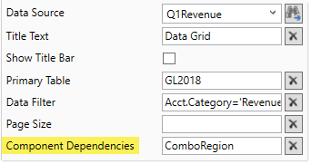
Now when a change is submitted for the Combo Box component named ComboRegion, the Data Grid component is refreshed. The data query is run based on the current component properties and data source properties, and the state of the grid is reset. This occurs at the end of the form update process, when the form display is updated in the browser.
When a form update is triggered, Axiom Software checks to see if any component names are listed in the Component Dependencies property of the Data Grid component. You can list multiple component names, separated by commas. If any components are listed, Axiom Software then checks to see if any of those components are included in the current form submission. If none of the listed components are included, the Data Grid component is not refreshed during the form update. If one or more of the listed components are included, then the Data Grid component is refreshed.
NOTES:
-
The components in Component Dependencies do not have be set to auto-submit in order to refresh the Data Grid component. If an interactive component is changed but it is not configured to auto-submit, then its change will be submitted when the next form update is triggered (either by a Button component, or by a different component that is configured to auto-submit). The Data Grid component will still recognize the component change, even though the change was submitted by a different component.
-
The grid cannot be dependent on a component used in a Dialog Panel component.
-
If the Data Grid component is used in a child embedded form, enabling force refresh in the Menu data source will cause the grid to update in response to changes that would affect the grid state.
If a Data Grid component is not refreshed as part of a form update, the following user changes made to the grid are preserved:
- Filters (to columns with
[IsFilterable]enabled) - Sorting changes
- Column width and order changes
- Expanded or collapsed groupings
- Scroll state
- Currently selected row
- Current page (when grid results are paged)
- Edits made to editable columns
If a Data Grid component is refreshed as part of a form update or as part of applying refresh variables, all user changes are lost and the grid is reset. This is necessary because the previous user changes may no longer be relevant, due to the refreshed data.
If Enable Row Selection is enabled for the Data Grid component, users can select a row in the grid. The values in the selected row are submitted back to the source file, and written to the SelectedRowValue column of the DataGridColumns data source. A filter representing the current row is also written back to the Selected Row Filter field in the Form Control Sheet.
If you want the Axiom form to respond to the currently selected row, then you must set up the file so that another component references one or more of the selected values (or the filter), and changes based on those values. For example, you could have a chart that updates to show information about the department for the currently selected row. For general information on setting up interactive components for an Axiom form, see Using interactive components in an Axiom form.
The row selection feature is the primary means of impacting the form based on user interaction in the grid. However, you can also set up interactive behavior for icons displayed in the grid, to execute a command when a user clicks on an icon. For more information on using actions with icons, see Using the IconConfig data source with Data Grid components.
Example
A data grid could display data summed by department:
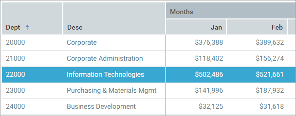
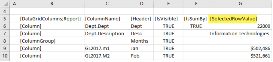
If a user selects the row for Dept 22000, then the values in that row are submitted back to the source file and written to the SelectedRowValue column in the DataGridColumns data source:
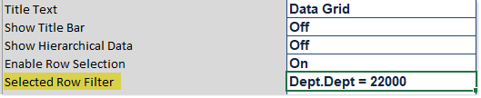
The filter for the current row (based on the sum by columns) is also written to the Selected Row Filter in the Form Control Sheet:
There are a number of ways that the form could respond to the selected value in the grid. For example, you might want to display detailed information about the selected row in another grid or in a chart. The grid or chart would need to be set up with formulas that look to the appropriate cells of the SelectedRowValue column (or to the Selected Row Filter field), so that the data in the grid or chart changes based on the currently selected row.
Behavior with grouped data
If the Data Grid component is grouped, users can still select rows in the grid. In this case, row values are written back for the selected grouping level and all grouping levels above it, but not for any grouping levels below it.
For example, imagine that you have a grid that shows data grouped by Country > Region > Dept. If you select a row in the Country grouping, then the current country value is written back but the region and department values are not. This is because the selected country row does not have an associated region or department. However, if the user expands the groupings down to the lowest level, and then selects the row for Dept 40000, in Region Northwest, in Country United States, then all three dimension values are written back to the data source.
Similarly, the filter written to the Selected Row Filter field of the Form Control Sheet represents the full filter path for the current row (including the grouping levels above it).
When using a HierarchicalGrid data source to define grouped data instead of the Show Hierarchical Column Data option, the behavior is essentially the same but the values are written back to different locations:
-
Row values are written back to the corresponding DataGridColumns data source for the current grouping level, as well as to the separate DataGridColumns data sources for the grouping levels above the selected row.
-
The filter representing the selected row is written back to the HierarchicalGrid data source, in the SelectedRowFilter column. In this case the filter is written separately for the current grouping level and the grouping levels above it (instead of concatenated into a single field).
Behavior when multiple rows can be selected
If Allow Multiple Row Selection is enabled, then values are not written back to the SelectedRowValue column of the DataGridColumns data source. However, a filter representing all selected rows (based on the sum by columns for the grid) is still written to the Selected Row Filter field of the Form Control Sheet. This filter can be referenced to impact the form in some way.
If the grid has a single sum by column, the filter is written as Table.Column IN (RowValue1, RowValue2). If the grid has multiple sum by columns, the filter is written as (Table.Column1=RowValue1 AND Table.Column2=RowValue1) OR (Table.Column1=RowValue2 AND Table.Column2=RowValue2).
IMPORTANT: If the grid data is paged, users can select one or more values per page. If the user moves to another page and selects one or more rows, the selected rows on the previous page are cleared. It is not possible to select multiple rows across pages. If you need users to be able to select rows from the entire grid, then you should set the Page Size to 0 to disable paging.
Showing data grouped by dimensions
You can show data in the grid grouped by hierarchical dimensions. Instead of flat rows of data, data is shown in expandable / collapsible groups with nested data. There are two ways to accomplish this:
-
You can use the basic option Show Hierarchical Column Data. When using this option, data is automatically grouped based on the sum by columns for the grid. All grouping levels use the same columns and the same grid features. This option is the easiest to set up, but it is less flexible in how data is displayed.
-
You can use the advanced option to define a HierarchicalGrid data source. When using this option, you define the columns for each grouping level separately, using their own DataGridColumn data sources. You then set up each grouping level in the HierarchicalGrid data source, by specifying the DataGridColumn data source to use for each grouping level, as well as to define the grid properties for each level. This option is more time-consuming to set up, but it allows more flexibility in how data is displayed. For more information, see Using the HierarchicalGrid data source with Data Grid components.
To use the basic grouping option:
- In the component properties, enable Show Hierarchical Column Data.
- In the data source, define the grouping levels by adding the appropriate reference table columns, and set them to
Truein the [IsSumBy]column. The top-level grouping must be listed first, followed by the next level, and so on. There must be at least two sum by columns defined in the data source to create a grouping.
The following example data source shows sum by columns of Dept.WorldRegion, Dept.Region, and Dept.Dept (in that order). This means that WorldRegion is the top-level grouping, and Dept is the lowest level.
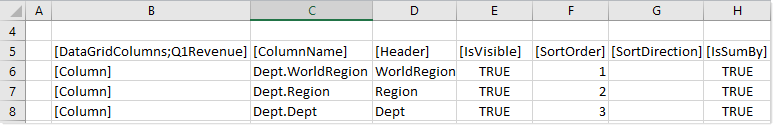
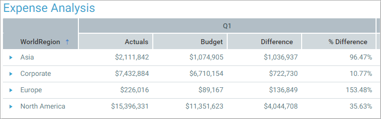
When this grid is rendered, it will display as follows, with data initially grouped by world regions.
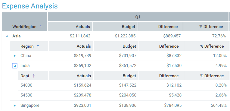
You can expand a world region to see the region data underneath it, and then expand a region to see the department data for that region.
The other columns in the data source are the same for all levels. For example, if the column GL2020.Q1 is included in the grid, then you will see that data at the world region level, then the region level, then the department level.
If you want to show descriptions for certain grouping levels, then you must use the DisplayFormat to concatenate the descriptions with the column values. For example, if you want to show descriptions for the Dept level, you can define a display format for the Dept column that is something like {Dept.Dept} - {Dept.Description}. This will display both the department code and the description within the Dept column. You cannot simply add Dept.Description as a visible column to the grid in this case, because then it will display for all grouping levels.
NOTES:
-
The column width of the first (top-level) sum by column determines the column width for all of the grouping columns. Column widths set for the other sum by columns are ignored. All of the grouping columns are displayed within the same column space, nested underneath each other. Each nested grouping is indented slightly from the parent grouping. Additionally, each parent grouping has to reserve space for the expand / collapse icons shown to the right of the column values. Therefore the first sum by column must have a column width that is wide enough to accommodate all nested levels of groupings. You may need to test various width settings before determining the appropriate column width for the top-level column.
-
Frozen columns are not supported with hierarchical data. The
[IsFrozen]column is ignored. -
If hierarchical data is enabled, all designed sum by columns are automatically visible (regardless of
[IsVisible]) and automatically displayed in the far left column of the grid (regardless of where they are located in the data source). -
If hierarchical data is enabled, the grid columns are resized as needed so that they fill the entire component width. However, if the columns exceed the component width, the column width values are honored.
Creating column groups for the grid header
You can create column groups in the
-
The row tag
[ColumnGroup]indicates that you want to start a group. All columns that follow this tag belong to the group, until the group is ended.The data source properties of
[Header]and[HeaderAlignment]can be used with[ColumnGroup]rows, to indicate the header text for the column group, and to indicate the alignment of that text across the grouped columns. If no alignment is specified, the default is centered. No other data source properties apply, and will be ignored if set. -
The row tag
[EndGroup]indicates that you want to end a column group. This tag can be omitted if the group extends to the end of the column list. Data source properties do not apply to[EndGroup]rows. If an[EndGroup]tag cannot be matched to a corresponding[ColumnGroup]tag, an error occurs when rendering the component.
For example, you may want to define grouped header text such as "Q1" for the columns representing the months of the first quarter. You can place those columns in a column group and define header text for the group using the [Header] property. After the last column in the first quarter, you can end the group and then start a new group for Q2.
Groups can be nested for multiple levels of column headers. The [EndGroup] tag ends the closest column group to the tag, leaving any other column groups open. If you want to end multiple groups, you must have multiple end tags.
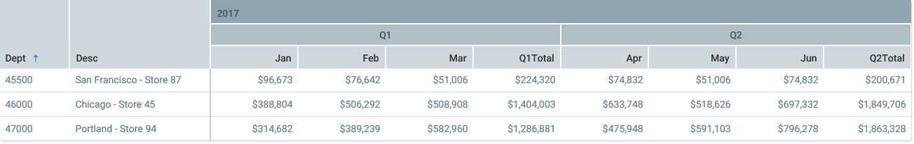
The following example data source shows two levels of column groups. The first, top-level column group indicates the year for the columns (2017). Then multiple, second-level column groups indicate the relevant quarter (Q1, Q2, etc.). In this example, the [HeaderAlignment] property is used to align the year header text on the left side of the group, while the header text for the quarters uses the default center alignment.
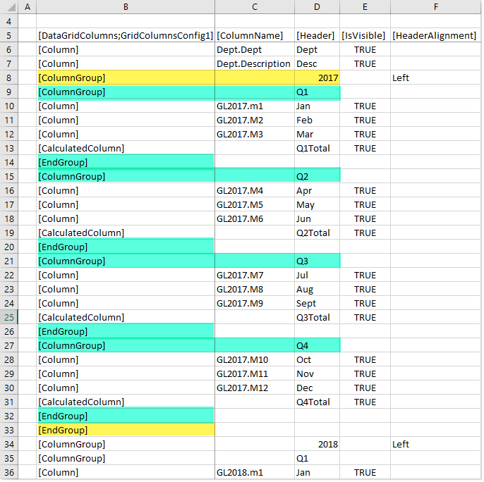
Example data source with nested groups
The first end tag in row 14 ends the closest column group, which is the Q1 group. The next tag in the data source starts the Q2 column group. The 2017 column group is left open to continue to span over all of the quarter groups. When the end of the Q4 group is reached, there are two end tags to end both the Q4 group and the 2017 group (rows 32 and 33). Then the groups start again with 2018 and its first quarter.
When the component is rendered, the headers look as follows:
NOTES:
-
Header text for a column group is optional. You may want to use column groups with no header text as "spacer" rows, to accommodate headers with varying levels of groupings.
-
Column groups cannot be used within frozen columns. If a column belongs to a column group but is also flagged as a frozen column, the frozen status is ignored. It is not possible to define column groups within the frozen columns area.
-
If Show Hierarchical Column Data is enabled, column groups cannot be used with the sum by columns. If a sum by column is part of a column group, this will be ignored and the column will not show underneath the group header.
The following design considerations apply when generating a PDF of an Axiom form with a Data Grid component:
-
The grid is automatically extended to show all rows in the PDF. It does not matter which rows are currently visible in the form.
-
Grid columns are resized to fit the component width in the PDF, regardless of their configured column size. If the columns exceed the page width, the remaining columns are omitted from the PDF. You should set the PDF page size and orientation as needed to fit the columns. For example, a wide grid with many columns should be set to Landscape.
-
User changes to the grid are not reflected in the PDF. This includes filtered columns, sorting, and reordered columns.
-
If the grid is grouped using Show Hierarchical Column Data, the groupings are flattened in the PDF and all rows are shown.
-
If the grid uses a HierarchicalGrid data source, only the top-level grouping is shown in the PDF.
-
Header groups are all shown in the same shade of gray in the PDF, instead of the varying shades shown in the form.
-
Any unsaved edits made to editable columns in the grid are not reflected in the PDF. The PDF displays the data as it was originally queried.
Design alternatives
The Data Grid component is designed to handle a very specific purpose, to display reporting data. If you need more flexibility in how data is presented, you can use a Formatted Grid component or a Fixed Report component. For example, you might use these components in the following cases:
-
When you need to use more advanced data query configurations or features. You can use Axiom queries to bring data into the source file, and then use the Formatted Grid component to display that data in the form.
-
When you need to use a fixed-row format for the rows, including headers, subtotals, and totals. You can use the Fixed Report component or the Formatted Grid component to build this structure, depending on your particular needs.
-
When you need to provide more advanced user input controls and save-to-database options. Formatted Grid components support many options for editing data.
-
When you need the ability to format the grid contents at a more granular level. Formatted Grid components support a variety of formatting options to format grid contents, including fonts, colors, and borders.
