AX1729
You can use the Chart content tag within a Grid data source to display a chart within a grid cell. Any chart type that uses the XYChart data source can be displayed in the grid, including line, bar, column, area, and waterfall charts.
The Chart tag has no effect within the source file itself, but when the file is viewed as an Axiom form, the Chart tag will be resolved as a chart.
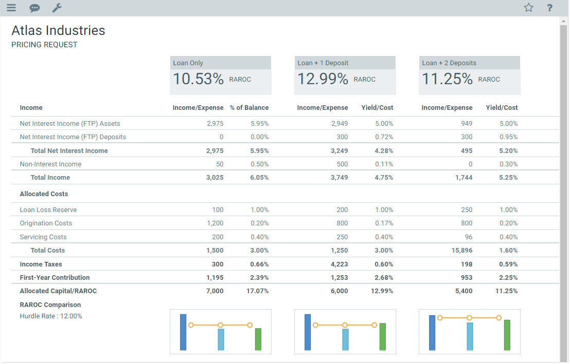
Example formatted grid using Chart tags
NOTES:
-
Your Axiom Software license determines whether you have access to chart components. For more information, see Licensing requirements for Axiom forms.
-
If you want to display a sparkline chart instead of a full chart (including bullet charts), use the Sparkline tag.
Content tag syntax for charts
The syntax for the Chart content tag is as follows:
[Chart; DataSourceName=Sheet!DSName; SeriesName=Name; GridLines=True/False; Axes=True/False; LabelRotation=Number; YAxis=LabelText; LegendPosition=Position; ColumnStyle=StyleName; Columns=Number]
Parameters can be listed in any order after the Chart tag. Optional parameters can be omitted.
To create the tag, you can manually type it within a cell, or you can use the Data Source Assistant / Tag Editor. For more information, see Creating and editing content tags in Formatted Grids.
| Parameter | Description |
|---|---|
|
DataSourceName |
The name of the data source to provide the data for the chart. This parameter uses the following syntax: SheetName!DataSourceName. For example: Sheet2!Executive. The specified data source must be an XYChart data source. This means that all of the following chart types can be shown in the grid: line, column, bar, area, and waterfall (including horizontal waterfall). The chart type is determined by the Kind column in the data source. |
|
SeriesName |
Optional. The name of a series in the data source, to display only that series in the chart. If omitted, then all series will display in the chart. |
|
GridLines |
Optional. Specifies whether gridlines show on the chart (True/False). If omitted, the default is False, meaning that gridlines do not show on the chart. |
|
Axes |
Optional. Specifies whether axis labels show on the chart (True/False). If omitted, the default is False, meaning that axis labels do not show on the chart. This includes both labels and scale values. |
|
LabelRotation |
Optional. The degree of rotation for the chart names (the XValueNames from the data source). If omitted, the names are not rotated. To rotate the names, specify a number from -360 to 360. The purpose of this setting is to allow displaying longer names as vertical or slanted. For example, a value of -45 displays the name as slanted upward, whereas a value of 45 displays the name as slanted downward. |
|
YAxis |
Optional. Defines a label for the Y-axis. The label only displays if the Axes parameter is set to True. |
|
LegendPosition |
Optional. Specifies whether a legend is present, and if so, where it is located:
|
|
Columns |
Optional. Specifies how many columns the cell contents will span in the grid. If this parameter is omitted or set to 1, then content generated by the tag will only span the current column. If you want the content to span multiple columns, enter a number such as 2 to span 2 columns. The column span extends to the right. NOTE: The row and column styles used in the grid impact how the column span displays. For example, if the content in the starting column is left-aligned and does not naturally exceed the width of the starting column, then the spanned columns will simply be blank because no content is extending to those columns. However, if the content is long enough to extend out of the starting column, or if the content has external borders (such as a text box), or if the content is center-aligned or right-aligned, then content will display in the spanned columns. |
|
ColumnStyle |
Optional. Specifies one or more column styles to apply to the current cell. The specified styles override the current column styles set by the Enter one or more valid column style names, separated by commas. If you are using the Data Source Assistant / Tag Editor, you can click the [...] button to open the Choose Styles dialog and select from available styles. The available styles depend on the skin specified for the form. For more information, see Using row and column styles with Formatted Grids. Alternatively, you can use a bracketed cell reference to read the style from the referenced cell. This approach is useful if you want to dynamically determine the style, because then the formula can be in the referenced cell instead needing to construct the tag using a formula. For more information, see Referencing cells in content tag parameters. Generally speaking, column styles are not useful with Chart tags because the styles do not affect the chart contents. |
Defining the chart data source
Chart tags require an XYChart data source to be defined in the source file, to define the data to display in the chart. This is the same data source used by the following chart components: Line, Bar, Column, Area, and Waterfall. All of these kinds of charts can be displayed in a Formatted Grid component by using the Chart tag. For more information on defining the data source for any of these types of charts, see the linked topic for that component.
Note the following limitations when displaying a chart within a Formatted Grid component:
- Interactivity is not supported. Items in the chart are not selectable.
- Charts cannot have title boxes or title text.
- Most y-axis options are not available, such as the ability to define a number format, minimum and maximum values, and scaling. Charts cannot have a secondary y-axis.
- The composition kind and opacity cannot be configured. The composition is side-by-side and the opacity is opaque.
Behavior notes
The chart is sized to fit the cell that contains the Chart tag in the Formatted Grid. The row and column sizes must be set large enough to handle the minimum necessary space of the chart. The minimum necessary space varies depending on the chart configuration, but generally speaking, the row should be at least 100 pixels tall and the column should be at least 200 pixels wide. In most cases, larger sizes are necessary, especially if you want to show the axis labels and/or a legend, or if the chart just contains many values.
Sparkline tag examples
[Chart; DataSourceName=Data!Revenue]
This example will render the chart defined by the Revenue data source on the Data tab, displaying all series. No other options are specified. The chart will have no axis labels or legend, and no grid lines.
[Chart; DataSourceName=Data!Revenue; SeriesName=Europe]
This example is the same as the previous example, except that only the Europe series is being shown in the chart.
[Chart; DataSourceName=Data!Revenue; Axes=True; GridLines=True; YAxis=Dollars in Millions; LegendPosition=Bottom; Columns=2]
In this example, gridlines and axis labels are visible, a label is defined for the y-axis, a legend is shown at the bottom of the chart, and the chart spans the width of two columns.
