Monitor performance with the Health Network Summary Dashboard
Why use this feature
The Health Network Summary Dashboard provides an easy and clear way to understand your overall performance as well as identify opportunities for improvement.
How this feature works
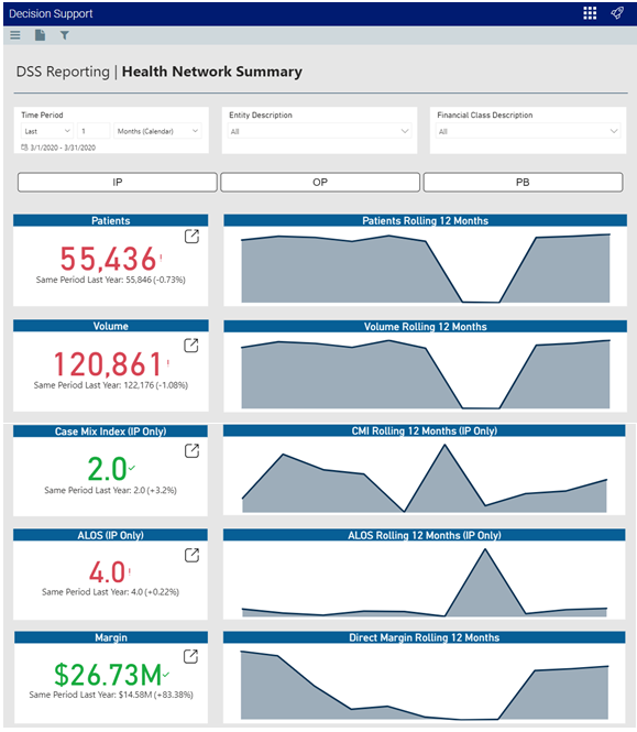
What: The Health Network Summary Dashboard provides data regarding patients, volume, Case Mix Index (CMI), ALOS, and margin analysis.
Where: From the Axiom Decision Support home page, click the Navigation icon in the far-left corner of the page, and click Report Designer. Under the Axiom Intelligence Reports section, double-click Health Network Summary.
Who: All Axiom Decision Support users.
How: After opening the dashboard, you can view the following KPI information:
- Patient Analysis - The Patients KPI card shows the number of patients over a specified time period, including the percentage of change over the same period the previous year. The Patients Rolling 12 Months card displays a graph of the number of patients over a rolling 12-month period.
- Volume Analysis - The Volume KPI card shows the case volume over a specified time period, including the percentage of change over the same period the previous year. The Volume Rolling 12 Months card displays a graph of the number of cases over a rolling 12-month period.
- Case Mix Index (CMI) Analysis - The Case Mix Index KPI card shows the Case Mix Index (CMI) for In Patient over a specified time period, including the percentage of change over the same period the previous year. The CMI Rolling 12 Months card displays a graph of CMI data over a rolling 12-month period.
- ALOS Analysis - The ALOS KPI card shows the Average Length of Stay (ALOS) for In Patient over a specified time period, including the percentage of change over the same period the previous year. The ALOS Rolling 12 Months card displays a graph of the ALOS for patients over a rolling 12-month period.
- Margin Analysis - The Margin KPI card shows the profit margin over a specified time period, including the percentage of change over the same period the previous year. The Direct Margin Rolling 12 Months card displays a graph of the direct margin dollars over a rolling 12-month period.
At the top of the dashboard, filter data by time (days, weeks, months, years), entity, financial class, and service line type. To view In the Rolling 12 Months cards, hover your cursor over any of the graphs to view the values for a specific month. To open the report that includes the data behind each KPI, click the drill icon in the following cards: Patients, Volume, Case Mix Index, ALOS, and Margin.
Where to find more information
The following topics in the online help include instructions on using Axiom Intelligence:
