Mortality Analysis report
Overview
This report provides KPI metrics and details regarding mortality rates at your organization and across service lines. To return to the Inpatient Executive Summary Dashboard, click the arrow in the upper right corner.
Click image to view full size
Opening the report
TIP: You can open this report individually or through the Inpatient Executive Dashboard.
To open the dashboard:
- Open Axiom Report Designer in the Web Client.
-
In the Axiom Intelligence Reports section, click Mortality Analysis.

Click image to view full size

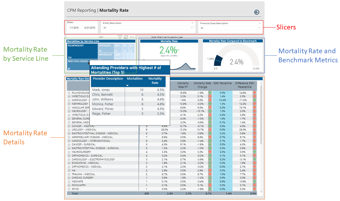
Slicers
This section allows you to filter data by date range, entity, and financial class. From the drop-downs, you can select a combination of the available options to define the data parameters to include in the report.

Click image to view full size
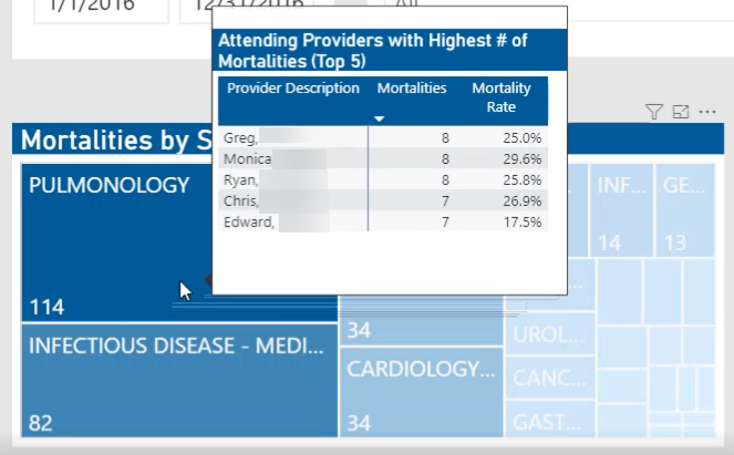
Mortalities by Service Line
This section allows you to view the providers and their mortality rates by hovering your cursor over a service line square. When you click a square, the system greys out the details across the page except for data specific to the service line you selected. To enable all of the data across service lines on the page again, click the square again.
Click image to view full size
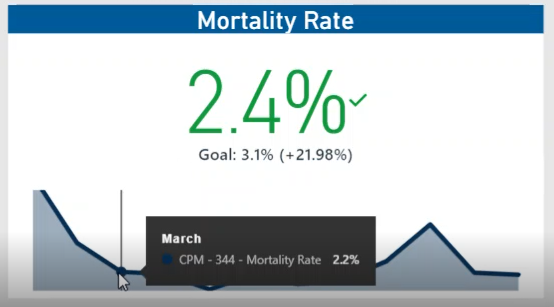
Mortality Rate Metric
This section shows the current year mortality rate and the goal set in the previous year. Hover your cursor over the graph at the bottom of the card to view a tool tip of the data specific to a month. When you click on the graph, the current year data and goal percentage in the parentheses will adjust to the selected time period.
Click image to view full size
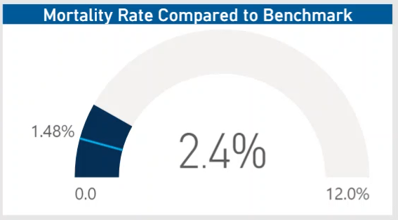
Mortality Rate Compared to Benchmark
This section displays a gauge that compares your current mortality rate with the benchmark.
Click image to view full size
Mortality Rate Detail
This section displays the details related to morality rate for each service line, including the number of mortalities, the current year mortality rate compared to the previous year, and the benchmark details.
From this section, you can do the following:
-
View the details for a specific service line by clicking a row. The system greys out the details for the other service lines across the page except for data specific to the service line you selected.
-
Sort the table by columns in ascending or descending order by clicking the column header.
-
Drill up or down through the data by right-clicking the row, and then selecting Drill Up or Drill Down.
Including or excluding data
From some visualization charts and tables, you can exclude data by right-clicking the image or table row, and clicking Exclude. To show only one data element in the visualization or table, right click the image or a table row, and click Include.
Viewing data
You can view the underlying data for visualization graphs and tables by right-clicking the image or table, and clicking Show Data. A data table displays underneath the visualization graphic or table. To return to the dashboard, click Back to report in the upper left corner of the page.
Copying data for other reports
If you have permissions to edit or create Axiom Intelligence reports, you can copy visuals to create a new report. For tables, you can also copy values and selections.
To copy, right-click in the section, and select Copy Visual, Copy Selection (tables only), or Copy Value (tables only).
NOTE: This function only applies to users that have permission to edit and manage Axiom Intelligence reports.
