AX1325
Using spreadsheet formatting with Formatted Grids (deprecated)
Older Formatted Grid components may be using a legacy feature where the formatting of the grid contents is determined by the formatting defined in the spreadsheet. This section explains various options and behaviors that only apply when this legacy feature is used. All other documentation for the Formatted Grid component assumes use of the "thematic" formatting option, which is the default behavior and the focus of all future development.
You can tell whether an older grid is a spreadsheet-formatted grid by checking the Grid Formatting property on the Form Control Sheet. If this is set to Spreadsheet, then the grid uses spreadsheet formatting. All new grids are set to Thematic.
IMPORTANT: The spreadsheet formatting option for Formatted Grid components is deprecated, and only exists to support backward-compatibility for older forms. All new formatted grids should use the default thematic formatting, where formatting is determined by assigning row and column styles within the Grid data source.
Component properties
The following component properties are unique to spreadsheet-formatted grids, or have special behavior.
| Item | Description |
|---|---|
|
Fit Columns |
Specifies whether columns are scaled to fit within the component width. This option only applies to spreadsheet-formatted grids.
If this option is enabled for a spreadsheet-formatted grid, then the |
|
Use Lightweight Auto Submit |
This option does not apply to spreadsheet-formatted grids. |
|
Extended Height |
Certain grid features are not compatible with use of the Extended Height option in spreadsheet-formatted grids. The following content tags will not operate as expected: Checkbox, TextArea, and Sparkline. Also, disabling Auto-Submit will not work as expected if Extended Height is enabled. |
How spreadsheet formatting is applied in the grid
The adoption of the spreadsheet formatting in the Axiom form is as close as possible, but some limitations and exceptions apply. The following table summarizes the spreadsheet formatting options and how they apply to the formatted grid in the Axiom form:
| Spreadsheet Format | Notes and Limitations |
|---|---|
|
Borders |
Inherited as defined in the spreadsheet. |
|
Column width |
Column width can be set using the spreadsheet column widths, or by using the To use the column width in the spreadsheet, remove the
|
|
Conditional formatting |
Conditional formatting can be used with some limitations. See Using Conditional Formatting in spreadsheet-formatted grids. |
|
Data validation |
The following types of Data Validation are supported:
For more information, see Using Data Validation in spreadsheet-formatted grids. |
|
Fill formatting |
|
|
Font formatting |
Inherited as defined in the spreadsheet, with one exception: if content tags are used to specify the foreground color, this overrides the font color. It is strongly recommended to use a common font such as Arial, which all client machines and devices are likely to support. If the font used in the spreadsheet is not found on the client machine, then the font specified by the form-level skin is used. NOTE: Underlined text is not supported by Mozilla Firefox. |
|
Number formatting |
Inherited as defined in the spreadsheet. |
|
Protection |
The cell Locked status is used to determine whether a cell in the grid is editable or not. The sheet does not have to be protected in order for this setting to take effect in the Axiom form. |
|
Row height |
Inherited as defined in the spreadsheet. |
|
Text alignment |
Inherited as defined in the spreadsheet. |
|
Text controls |
|
Content tags
Formatted Grid components support a set of content tags to display interactive controls or special formatting in the grid. The following limitations and design considerations apply to spreadsheet-formatted grids.
| Content Tag | Notes and Limitations |
|---|---|
|
AddRows |
Only supported for spreadsheet-formatted grids. See Using an AddRows tag. |
|
Button |
Not supported in spreadsheet-formatted grids. If used, displays as raw text in the cell. |
|
Chart |
Not supported in spreadsheet-formatted grids. If used, displays as raw text in the cell. |
|
Checkbox |
The option to display as a toggle switch instead of a check box is not supported in spreadsheet-formatted grids. If any of the parameters relating to toggle switches are used, the control continues to display as a check box. The following additional parameters can be used: NoAutoSubmit, Foreground, Background. The following behavior notes apply:
|
|
DatePicker |
Not supported in spreadsheet-formatted grids. If used, displays as raw text in the cell. |
|
Format |
The following additional parameters can be used: Foreground, Background. |
|
Hyperlink |
The following additional parameters can be used: Foreground, Background. Hyperlinks display as they are formatted in the spreadsheet. Axiom Software does not apply any automatic formatting to the hyperlinks. |
|
Select |
The following additional parameters can be used: Foreground, Background. The foreground and background colors apply to the cell display, not to the drop-down control. |
|
Sparkline |
The following additional parameters can be used: Background. |
|
Symbol |
The following additional parameters can be used: Foreground, Background. |
|
TextBox |
The following additional parameters can be used: Foreground, Background. The following behavior notes apply:
|
Spreadsheet-formatted grids do not support the following tag parameters for any content tag: AutoSubmit, Columns, and ColumnStyle. If used, they will be ignored.
Spreadsheet-formatted grids support the following additional tag parameters:
| Parameter | Description |
|---|---|
|
NoAutoSubmit |
Optional. Specifies whether the check box is prevented from using auto-submit behavior.
If omitted, the default behavior is False. This parameter does not display in the Tag Editor / Data Source Assistant for spreadsheet-formatted grids. If you want to add the parameter, you must manually edit the tag. If you later edit the tag using one of these helpers, the tag will be converted as follows:
|
| Foreground |
Optional. The foreground color to use for rendering the cell contents (text, symbol, etc.). This parameter only applies to spreadsheet-formatted grids. It will be ignored by thematic grids. By default, the text uses the font color defined for the cell in the spreadsheet. If you want to override this formatting and specify a color in the tag itself, you can use the Foreground parameter. The advantage of this approach is that the color can be made dynamic using a formula. The color can be specified using either the color name (i.e. "yellow") or the hexadecimal code for the color (#FFFF00 for yellow). For example, see a list of colors here: http://www.w3.org/TR/css3-color/#svg-color. When using the Data Source Assistant / Tag Editor, you can click the arrow button to the right of the box to bring up the color selector. You can select from the displayed colors, or you can enter a RGB value or a hexadecimal code. The selected color will be inserted in the tag using its hexadecimal code. To clear the selected color, click the Clear color Alternatively, you can use a bracketed cell reference to read the color from the referenced cell. This approach is useful if you want to dynamically determine the color, because then the formula can be in the referenced cell instead needing to construct the tag using a formula. For more information, see Referencing cells in content tag parameters. |
| Background |
Optional. The background color to use for the cell in the grid. This parameter only applies to spreadsheet-formatted grids. It will be ignored by thematic grids. By default, the grid cell uses the fill color defined for the cell in the spreadsheet. If you want to override this formatting and specify a color in the tag itself, you can use the Background parameter. The advantage of this approach is that the color can be made dynamic using a formula. The color can be specified using either the color name (i.e. "yellow") or the hexadecimal code for the color (#FFFF00 for yellow). For example, see a list of colors here: http://www.w3.org/TR/css3-color/#svg-color. When using the Data Source Assistant / Tag Editor, you can click the arrow button to the right of the box to bring up the color selector. You can select from the displayed colors, or you can enter a RGB value or a hexadecimal code. The selected color will be inserted in the tag using its hexadecimal code. To clear the selected color, click the Clear color Alternatively, you can use a bracketed cell reference to read the color from the referenced cell. This approach is useful if you want to dynamically determine the color, because then the formula can be in the referenced cell instead needing to construct the tag using a formula. For more information, see Referencing cells in content tag parameters. |
 icon.
icon.Spreadsheet-formatted grids support an additional content tag of AddRows, which can be used to insert new rows. The AddRows content tag will display as a clickable hyperlink when the file is viewed as an Axiom form. Users can then click on the hyperlink to add a new row.
The syntax for the AddRows tag is as follows:
[AddRows; Sheet=SheetName; Column=ColumnLabel; Row=RowLabel; Text=DisplayText; Foreground=color; Background=color]
Parameters can be listed in any order after the AddRows tag. You do not need to indicate omitted parameters with an "empty" semi-colon.
| Parameter | Description |
|---|---|
|
Sheet |
The sheet name where the calc method is to be inserted. |
|
Column |
The header label defined in the InsertCMColumn tag. |
|
Row |
The insertion point label defined in the InsertCM tag. This is where the calc method will be inserted. |
|
Text |
The display text for the hyperlink that displays in the formatted grid. Users will click this hyperlink to insert the new row. |
The Foreground and Background parameters work the same way as described in the previous section.
The AddRows tag works in the same way as the Add Rows command in the Command Library. When the user clicks on the hyperlink, Axiom will create an Add Rows command string using the parameters listed here, and then perform the Add Rows action. For more information, see Inserting calc methods in an Axiom form.
For example:
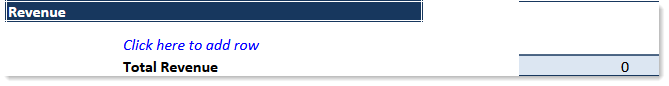
[AddRows;Sheet=Budget;Column=CMInsert;Row=InsertNewRow;Text=Click here to add row]
When a user views the file as an Axiom form, this will display as a hyperlink that says "Click here to add row". When the user clicks on the hyperlink, a calc method will be inserted on the specified sheet, using the specified column and row labels to determine the location.
The following screenshot shows an example of how the AddRows tag might look in the spreadsheet:

When this file is viewed as an Axiom form, the tag will be rendered in the form as a clickable hyperlink:
NOTES:
-
Use of this tag to perform an Add Rows action automatically triggers a refresh of the Axiom form. First, updated values will be submitted from the form to the source file. Then, the Add Rows action will occur in the source file. Lastly, the source file will be refreshed and then the Axiom form will be updated.
-
Remember that the insert location is not necessarily the row that contains the AddRows tag; it is whatever location is specified by the Sheet / Column / Row parameters (which can be the current row but does not have to be). In other words, this tag does not behave like the GetCalcMethod function for Axiom files (which always inserts on the current row).
Additional behavior notes and limitations
The following additional behavior notes and limitations apply to spreadsheet-formatted grids:
| Item | Description |
|---|---|
|
Drilling |
Not supported with spreadsheet-formatted grids. |
| Editable (unlocked) cells | No special formatting is applied to indicate that the cell is editable. You should format the spreadsheet as desired—for example, you may want to display the cell with a border and a background color as a signal to the user that they can edit the cell. |
|
Edit Grid Data in Spreadsheet |
Not supported with spreadsheet-formatted grids. |
|
Export to Spreadsheet |
Most formatting defined in the source spreadsheet is preserved when the grid is exported, such as fonts and colors. However, row heights and column widths are not applied to the exported data. |
