AX1528
Certain chart types can be combined into a single chart, so that some data series in the chart use one chart type, and other data series use a different chart type. A common example of a combination chart is a column chart that also contains a line series, where the line indicates a target or an average to compare to the column data.
Only chart types in the same chart family can be combined. For example, columns and lines can be combined in a single chart because they both belong to the XYChart family.
Creating a combination chart
To create a combination chart, you must use the [Kind] column in the data source to indicate which chart type you want each series to be. For example, if you want to create a combination column and line chart, you could do this as follows:
-
Set up your data in the sheet, and then use Create Axiom Form Data Source > Column Chart to insert the data source tags. This means that any existing data in the data source will be configured to use
Columnas the chart type. -
Modify the
[Kind]column to putLineon the series you want to display as a line.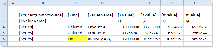
- Drag and drop a Column Chart component onto the canvas, and configure that component to use this data source.
You could also insert the data source tags first, and then configure the data and the [Kind] column as needed for each series. It does not matter which type of data source you insert or which type of chart component you place on the canvas, as long as they belong to the appropriate chart family (XYChart in this example). The data source type and component type simply determine the default series kind used by the chart. However, when the chart is rendered, the ultimate determiner of the chart type is the series kind in the data source.
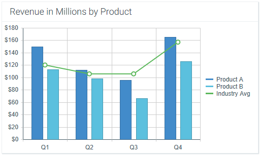
In this example, the resulting combination XYChart would appear as follows. The chart has two column series and one line series, as determined by the data source.
In this example, the line series is using the same scale as the column series. However, it is also possible to use a second Y-axis scale for the line series. For more information, see Using two Y-axis scales with combination XYCharts.
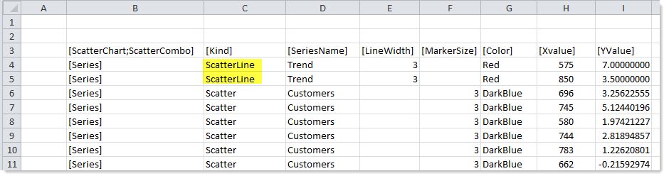
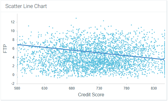
The same basic approach applies to ScatterChart combinations. The following screenshot shows an example ScatterChart data source with two series types in the [Kind] column. The majority of the series are Scatter, with two ScatterLine points to display a trend line.
The resulting combination ScatterChart would appear as follows:
Supported combinations and design considerations
XYChart types can be combined together in one chart, and ScatterChart types can be combined together in one chart. The following chart combinations are the most commonly used:
- Column and Line (XYChart)
- Bar and Line (XYChart)
- ScatterLine and Scatter (ScatterChart)
Other combinations may not be valid or may not render as expected. Note the following design considerations for each series kind:
| Series Kind | Design Considerations for Combination Charts |
|---|---|
|
Area |
Although it is possible to combine area series with other series kinds, the results may not be as you expect. One issue to consider is the chart margin. When using area series, the XValues extend to the very edges of the chart space, so that the areas fill the entire chart space. But when using column, bar, or line series, the XValues are offset from the edges of the chart space, so that the first and last XValues in the chart do not bump up against the chart edges. When you combine an area series with one of the other series kinds, the margins for all series will be offset, which looks odd with area series. |
|
Bar |
|
|
Bubble |
No special design considerations to note. |
|
Column |
It is not possible to combine column and bar series, as they are basically the same type of series with different orientation. If a chart has column and bar series, the chart will interpret all of these series as the first type it encounters. For example, if the first series in the data source is a column, then all subsequent column or bar series will be columns. |
|
Line |
No special design considerations to note. |
|
Scatter |
No special design considerations to note. |
|
ScatterLine |
No special design considerations to note. |
|
Waterfall |
Waterfall charts are very different than other XYChart types. In some cases you might want to display a line series with a waterfall series, to indicate an average or trend for comparison, but other XYChart types do not combine well with waterfall series. |
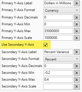
Using two Y-axis scales with combination XYCharts
By default, XYCharts have one primary Y-axis scale along the left-hand side of the chart. If desired, you can use a second Y-axis scale along the right-hand side of the chart, and then specify which scale each series uses. This is primarily used with combination charts, so that one series type can use the primary Y-axis, and the second series type can use the secondary Y-axis.
To use a secondary Y-axis, you must:
- Enable a secondary Y-axis for the chart by selecting the Use Secondary Y-Axis check box. This exposes a second set of Y-axis properties for the secondary axis. You can then define the properties for both the primary and the secondary Y-axis as appropriate.
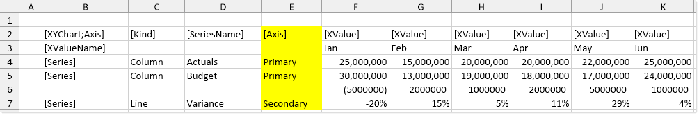
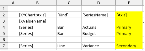
- In the data source for the chart, add an
[Axis]tag to the control row. For each series, enter eitherPrimaryorSecondary, depending on which Y-axis the series should belong to. If a series does not have a tag in the Axis column, then the primary axis is assumed.
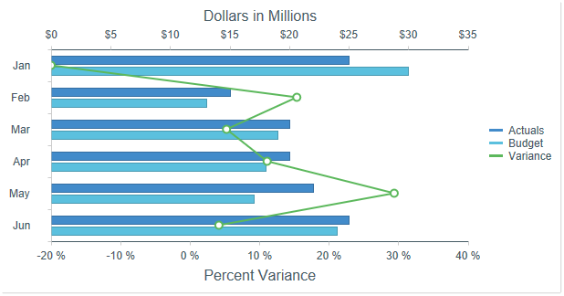
For example, you may have a chart with two column series that show dollars, and then you want a third line series that displays a variance percent. The properties for the chart would appear as follows:
The data source for the chart would appear as follows:
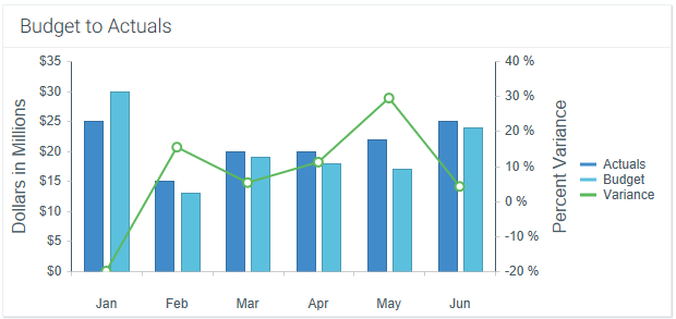
The resulting chart would appear as follows:
Note that if one of the series in the combination chart is a bar chart, then the chart is flipped so that the two Y-axes display along the top and bottom instead of the left and right. For example, the following screenshot shows a combination data source with bar and line series.
The resulting chart would appear as follows: