AX1143
You can use the Select content tag within a Grid data source to allow users to select an item from a column in a table.
The list of items displays as a combo box, allowing selection from a drop-down list and/or typing into the box to find a specific value. Only the first 100 items display in the drop-down list, but all items can be selected by typing to search. The Select tag has no effect within the source file itself, but when the file is viewed as an Axiom form, the cell containing the Select tag will render as the combo box.
Content tag syntax for table column drop-down lists
The syntax for the Select content tag is as follows:
[Select; TargetCell=CellAddress; FormState=KeyName; SharedVariable=VariableName; DisplayCell=CellAddress; ValueColumn=ColumnName; DescriptionColumn=ColumnName; SortColumn=ColumnName; DisplayFormat=Text; Searchable=True/False; Placeholder=Message; MultiSelect=True/False; Filter=FilterStatement; ReadOnly=True/False; AutoSubmit=Enabled/Disabled/Grid; Tooltip=Text; ColumnStyle=StyleName; Columns=Number;]
Parameters can be listed in any order after the Select tag. Optional parameters can be omitted.
To create the tag, you can manually type it within a cell, or you can use the Data Source Assistant / Tag Editor. For more information, see Creating and editing content tags in Formatted Grids.
When using the Data Source Wizard / Tag Editor, you must specify the List Items Source as Table in order to configure the tag to use a table column. This selection is used to show the correct parameters for this configuration.
| Parameter | Description |
|---|---|
|
TargetCell |
The cell to place the selected value. You can specify the cell using one of the following options:
For more information, see Referencing cells in content tag parameters. The target cell cannot be the same cell that contains the Select tag. The target cell can be anywhere in the spreadsheet and does not need to be visible within the formatted grid. If there is content in the target cell, that content will be displayed as the selected value for the combo box (unless a DisplayCell is specified). If you want to display a previously selected value that was saved to the database (such as when the form is subsequently opened and a value is queried back in), then you can use a formula in the target cell to bring in this value. NOTES:
|
|
FormState |
The key name under which the selected value will be stored in form state memory. For example, VPName. When a form state key name is defined, the user's selected value is not placed anywhere in the source file. Instead, it is stored in form state memory for the current file. If you need to reference the value within the form, you can use the GetFormState function to return the value into a cell. The FormState parameter should only be used if the form is intended to be used as a dialog in the Desktop ClientGeneral term for using either the Excel Client or the Windows Client, both of which are installed to the user's desktop., and you need to be able to pass values from the form to the currently active spreadsheet. For more information, see Passing values between an Axiom form and the active client spreadsheet (form state). |
| SharedVariable |
The shared variable name to save the selected value as. For example, ProposalName. When a variable name is defined, the user's selected value is not placed anywhere in the source file. Instead, it is saved to the variable list that is stored in memory for the shared form instance. If you need to reference the value within the form, you can use the GetSharedVariable function to return the value into a cell. The SharedVariable parameter should only be used if the form is intended to be used in an embedded form context (as either the parent form or a child form), and you need to share this value with other forms in the shared form instance. For more information, see Sharing variables between parent and child forms. |
|
ValueColumn |
The column to provide the list of values for the combo box. Enter a fully-qualified Table.Column name such as You can specify any column from any client-defined table in your system. System tables such as Axiom.Aliases are not supported for use with refresh variables and cannot be used. When using columns with lookups (including multi-level lookups), the final lookup table is considered the primary table. For example, if you specify When using columns with lookups, the starting table impacts the list of items to be returned from the value column. For example, |
|
DescriptionColumn |
Optional. The column that contains descriptions for the value column, specified using a fully qualified Table.Column name or an alias name. For example: Acct.Description. This property only applies if the value column is a key column or a validated column. By default, the primary table's first description column will be displayed in the list if no alternate description column is specified in the tag. You only need to complete the DescriptionColumn parameter if the table has more than one description column and you want to specify a different description column. However, if you are using the DisplayFormat parameter to define a custom display format, then the DescriptionColumn parameter does not apply. Instead, you should include the description column in the custom display format as desired. |
|
Filter |
Optional. A filter criteria statement to limit the values available for selection. The filter impacts both what displays in the drop-down list, and what is available when searching using the filter box. If the value column uses a lookup, then the column in the filter criteria statement must be resolvable from the primary table, or must use a fully qualified path from the starting table. |
|
SortColumn |
Optional. The column by which to sort the list of values. By default, the list is sorted by the display format if defined, and by the value column if no display format is defined. You can use this property to override the default sort and instead specify a different column to sort by. If the value column uses a lookup, then the column must be resolvable from the primary table, or must use a fully qualified path from the starting table. |
|
DisplayCell |
Optional. The cell that contains content that you want to display in the combo box other than the selected value. You can specify the cell using one of the following options:
For more information, see Referencing cells in content tag parameters. For example, due to limited space in the grid, you may want to display the value's description in the cell instead of the literal selected value. The display cell can contain the description of the selected value (as returned via a GetData function). The display cell contents only display if a value has been selected (meaning, the target cell has content). The display cell is not meant to be a substitute for the placeholder text. |
|
DisplayFormat |
Optional. Defines a display format for the items in the list, and specifies additional columns to display. By default, items in the list are displayed as: KeyColumn - DescriptionColumn If you want to specify a different format and/or use additional columns, then you can indicate the display format here. Use fully qualified Table.Column syntax and place column references in curly brackets. For example, you could indicate something like: {Acct.Acct} - {Acct.Description} ({Acct.Category}) This would display account items in the following format: 8000 - Facilities (Overhead) Any columns listed should use fully qualified Table.Column syntax. If the value column uses a lookup, then any additional columns must be resolvable from the primary table, or must use a fully qualified path from the starting table. Additional columns included in the display format are searchable within the list. |
|
AutoSubmit |
Optional. Specifies how interactive controls submit values back to the source file:
If omitted, the default behavior is Grid. |
|
Placeholder |
Optional. A message to display within the combo box when no value has yet been selected. This only applies when the target cell does not have any contents, or when the form state key or shared variable does not currently have an assigned value. For example: "Select a Department." Once a value has been selected, the contents of the target cell (or the stored form state / shared variable value) display instead of the placeholder text. You can define the placeholder text within the tag directly, or you can use a bracketed cell reference to read the placeholder text from another cell. For more information, see Referencing cells in content tag parameters. NOTES:
|
| Tooltip |
Optional. Specifies tooltip text to display when a user hovers the cursor over the cell contents. Alternatively, you can use a bracketed cell reference to read the tooltip text from the referenced cell. This approach is useful if you want to dynamically determine the text, because then the formula can be in the referenced cell instead needing to construct the tag using a formula. For more information, see Referencing cells in content tag parameters. |
|
ReadOnly |
Optional. Specifies whether the drop-down list is "active" (True/False). The default value, False, means that the list is active and that the user can select values as needed. If True, then the cell becomes "frozen" and no further edits can be made. The cell will display the current selected value of the list (or the display cell value, if applicable). This parameter can be used to control whether a user can edit the cell's value. Generally speaking, this parameter would only be used within a formula to dynamically enable / disable the combo box. |
|
Searchable |
Optional. Specifies whether the list is searchable (True/False). By default, this is True, which means the list is searchable by typing values into the combo box. If you want the list to be a static drop-down list instead, indicate False. If the list has more than 100 items, then the list must be searchable or else users will not be able to select all items in the list. Only the first 100 items are displayed in the drop-down list, but all items can be found by searching. NOTE: If MultiSelect is True, then this parameter does not apply. The dialog box where users can select multiple values always has a search box to filter the list. It is recommended to disable this parameter so that users cannot attempt to type inside the combo box (which will just cause the multi-select dialog to open). |
|
MultiSelect |
Optional. Specifies whether users can select multiple values in the list (True/False). By default this is False, which means that users can only select a single value. If True, then users can select multiple values in the list. When the user clicks on the combo box, a dialog opens instead of a drop-down list. The user can select check boxes for the values they want to select. When the user clicks OK to close the dialog, the selected items are written back to the target cell using a comma-separated list. If the items are from a string column, they are automatically wrapped in single quotation marks so that they can be used in a filter using an IN operator. The combo box in the form displays the same list, unless a display format cell is being used to change the display. For more information on how users interact with the multi-select dialog, see Multi-select dialog behavior. NOTE: If multi-select is enabled, it is recommended to define placeholder text because that text will display as the title of the multi-select dialog. |
|
Columns |
Optional. Specifies how many columns the cell contents will span in the grid. If this parameter is omitted or set to 1, then content generated by the tag will only span the current column. If you want the content to span multiple columns, enter a number such as 2 to span 2 columns. The column span extends to the right. NOTE: The row and column styles used in the grid impact how the column span displays. For example, if the content in the starting column is left-aligned and does not naturally exceed the width of the starting column, then the spanned columns will simply be blank because no content is extending to those columns. However, if the content is long enough to extend out of the starting column, or if the content has external borders (such as a text box), or if the content is center-aligned or right-aligned, then content will display in the spanned columns. |
|
ColumnStyle |
Optional. Specifies one or more column styles to apply to the current cell. The specified styles override the current column styles set by the Enter one or more valid column style names, separated by commas. If you are using the Data Source Assistant / Tag Editor, you can click the [...] button to open the Choose Styles dialog and select from available styles. The available styles depend on the skin specified for the form. For more information, see Using row and column styles with Formatted Grids. Alternatively, you can use a bracketed cell reference to read the style from the referenced cell. This approach is useful if you want to dynamically determine the style, because then the formula can be in the referenced cell instead needing to construct the tag using a formula. For more information, see Referencing cells in content tag parameters. |
Tag examples
[Select; TargetCell=K; ValueColumn=Acct.Acct; Searchable=False; Placeholder=Select Account; Filter=Acct.Category='Revenue']
This example allows the user to select from a list of revenue accounts. The cell will display the text "Select Account" until an account is selected. The selected value will be placed in column K on the current row (for example if the tag is defined on row 24, then the target cell is K24). The optional Searchable parameter is set to False, so users will not be able to filter this list. There are probably only a handful of revenue accounts so a static drop-down list is appropriate.
[Select; FormState=Location; ValueColumn=Loc.Loc]
This example allows the user to select from a list of defined locations. The selected location will be stored in form state memory for the Axiom form, under the key name Location. When the Axiom form is used as a dialog or a task pane, this location value can be passed to the currently active spreadsheet file.
[Select; SharedVariable=Location; ValueColumn=Loc.Loc]
This example is the same as the previous example, except that it is using a shared variable instead of form state. The selected location will be stored in the list of variables for the shared form instance, as the value for the variable Location. For example, you might do this so that the user can select a location in a parent form, and then that location can be referenced in child forms displayed using the Embedded Form component.
[Select; TargetCell=K; DisplayCell=L; ValueColumn=Acct.Acct; DescriptionColumn=Acct.FullDescription; Placeholder=Select Account]
In this example, the selection will be placed in column K within the current row. Additionally, the display cell parameter is used so that when a user selects an account from the list, the Select cell will display the contents of cell L24 instead of the account code placed in K24. The DescriptionColumn parameter is used to explicitly indicate a description column (perhaps in this case the table has two description columns).
[Select; TargetCell=B10; ValueColumn=Dept.Dept; DisplayFormat={Dept.Dept} ({Dept.Description}) - {Dept.Company}; Placeholder=Select Department]
In this example, a specific cell is indicated as the target cell instead of assuming the current row. The DisplayFormat parameter is used to define an alternate display for the items in the list. The additional column listed in the display format is also searchable.
[Select; TargetCell=K; ValueColumn=Acct.Acct; Placeholder=Select Account; Columns=2; ColumnStyle=center]
In this example, the Columns parameter is used to span the combo box across two columns, and the ColumnStyle parameter is used to apply the center style to this cell, regardless of which style is currently being applied to the column.
[Select; TargetCell=K; ValueColumn=Dept.Dept; Placeholder=Select Departments; MultiSelect=True]
In this example, the MultiSelect parameter is used to enable selection of multiple values. Values are displayed in a dialog so that the user can select multiple values using check boxes. The search box at the top can be used to filter the list and search for specific values.
Displaying starting values in the Select cell
The Placeholder parameter can be used to display text such as "Select a department" when no item has been selected yet. However, once the user has selected an item, and that item has been saved to the database, you likely want that item to be displayed in the cell the next time the file has opened. You can do this as follows:
- Use a formula in the target cell that returns the saved item in the database if applicable, otherwise the cell is blank.
- If the target cell contains a value, that value is displayed in the cell with the drop-down list. If the target cell does not yet contain a value, then the placeholder text is used.
- If the user selects a new value from the list, that value will overwrite the formula in the target cell. When the save-to-database is performed, that new value will replace the old value in the database. However, because the file itself is not saved, the formula is preserved the next time the file is opened, and it will now return the new value in the database.
If you are using a display cell as well, then that cell should also use a formula so that it displays the desired value when the target cell contains a value, otherwise it returns blank (so that the Placeholder text can be used).
This discussion does not apply when using form state or a shared variable. In that case, you can use either the GetFormState function or the GetSharedVariable function to set a starting value, which will then display as the selected value for the list. The functions can be located anywhere in the file.
When using the multi-select dialog, users can select and clear values as follows:
-
Users can use the search box in the dialog to find any value in the list. Users can select an item, then clear the search or define a different search, and select other items. All selected items will be remembered and applied when the user clicks OK.
-
Select All selects all currently visible items, whereas Clear All clears all selected items. Select All is primarily intended to be used when the user filters the dialog and then wants to select all items resulting from the filter. Clear All is intended to provide a way to clear all selected values and start over.
-
If a user selects items and clicks OK, then the user re-opens the multi-select dialog, all previously selected items remain selected even if they are not currently visible in the dialog. If the user selects more items without clearing any items, those items are added to the previously selected items. If the user wants to clear all items and start over, they must click Clear All to clear the previous selections.
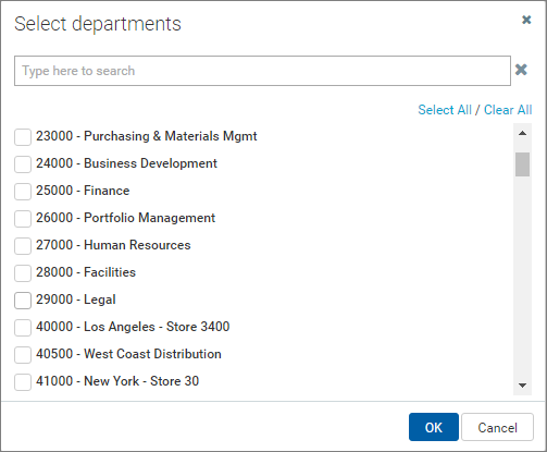
Example multi-select dialog
