AX2142
for Axiom forms
The Hyperlink component can be used to display a hyperlink to one of the following: a web page, an Axiom form, or an Axiom file. Users can launch the hyperlink by clicking the link text on the Axiom form.
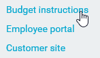
Example Hyperlink components in a form
You can define the following properties for a Hyperlink component.
Component properties can be configured using the Form Assistant task pane or the Form Designer unless otherwise noted. All properties can also be defined on the Form Control Sheet directly if desired. For example, if you want a property to be dynamic depending on the result of a formula, you can define that formula in the control sheet. To access the control sheet settings for the component, double-click any property name to go to that property in the Form Control Sheet.
Component behavior properties
The following properties control the display and behavior of this particular component type.
| Item | Description |
|---|---|
|
Text |
The display text for the hyperlink. |
|
URL |
The URL to launch when the button is clicked. The URL must use full HTTP syntax—meaning, use The URL can be to a web page, an Axiom form, or an Axiom file. See Generating a URL to a file in the Axiom file system for more details. The standard HTML "mailto" syntax can also be used here, to open an email with the specified parameters. For example: mailto:someone@example.com?subject=This%20is%20the%20subject |
|
Tooltip |
Optional. The tooltip text for the component. When a user hovers the cursor over the component, the text displays in a tooltip. |
|
Use New Window |
Specifies whether the link is opened in a new window. By default this is enabled, which means the link is opened in a new window. Disable this option if you want the link to open within the same window (replacing the current Axiom form). NOTE: Disable this option if you have linked to an Axiom file (to be opened in the Excel Client or the Windows Client) but this Axiom form will be viewed in the Web Client. Otherwise, a new blank window will be opened in the browser in addition to opening the specified file. |
|
Enabled |
Specifies whether the component is enabled. By default this is set to On, which means that the component displays normally and users can interact with it (if applicable). This setting can be used to dynamically enable or disable the component using a formula. If set to Off, then the component displays as grayed out. If the component is normally interactive, users cannot interact with the component while it is disabled. Disabled components cannot trigger update events for the form. NOTE: This setting is only available on the Form Control Sheet; it cannot be set in the Form Assistant or in the Form Designer. |
The following general properties are available for all components:
| Item | Description |
|---|---|
|
Component Name |
The name of the component. This is for identification in the file; this name does not display on the Axiom form canvas. The name of the component identifies the corresponding settings for the component on the Form Control Sheet. The component names are also useful if you have multiple types of the same component within an Axiom form, so that you can tell which component you are currently editing. Component names must be unique within a file and must start with a letter. Names can only contain letters, numbers, and underscores. Names are validated when the file is saved; an invalid name will prevent the save. NOTE: Spaces are not allowed in component names and will be automatically removed by Axiom Software. For example, if you enter "My Component" as the component name, it will be automatically adjusted to "MyComponent". |
|
Visible |
Specifies whether the component is visible on the Axiom form (On/Off). By default this is set to On. This setting can be used to dynamically show or hide the component using a formula. Keep in mind that if you have multiple components that you need to dynamically show or hide based on the same condition, then it is preferable to place those components on a dedicated layer and then show or hide the entire layer instead of the individual components. NOTE: This setting is only available on the Form Control Sheet; it cannot be set in the Form Assistant or in the Form Designer. |
|
Layer |
The layer that the component belongs to on the Axiom form canvas. In the Form Assistant and the Form Designer, this displays as the layer name (for example: Layer 1). In the Form Control Sheet, this is recorded as the layer ID (for example: 1). If the canvas only has one layer, then the component is automatically assigned to that layer and cannot be changed. If the canvas has multiple layers, you can assign the component to any layer using the drop-down list. By default, the component will be assigned to whichever layer is selected in the Layers box when you initially drag the component onto the canvas. For more information on layers, see Using multiple layers on the canvas. If desired, you can jump to the applicable layer settings on the Form Control Sheet by clicking the binoculars icon |
|
Parent |
The parent component that this component is assigned to. If blank, then the component does not have an assigned parent. Currently, only Panel components can be designated as parents. If a component has an assigned parent, then that component is positioned within the parent instead of within the canvas at large. If the parent is hidden, all "child" components of that parent are also hidden. The parent assignment is automatically completed when a component is dragged into a panel in the Form Designer, and automatically cleared when a component is dragged out of a panel. In most cases, you should not need to manually assign a parent. For more information, see Using panels to group and position components. |
 next to the drop-down list.
Style and formatting properties
To define the component formatting, you can assign one or more styles to the component. Styles can impact formatting properties such as fonts, borders, and colors.
If you do not want to apply a style to this component, or if you want to override one or more formatting properties in an assigned style, click the Show Advanced Settings link underneath the Style box to display the individual formatting properties. For more information on defining individual formatting properties for a component, see Formatting overrides for Axiom form components.
By default, Hyperlink components display in blue text with no underline. The following styles can be used to change this presentation:
- text-color: Removes the blue color and instead displays in the default text color.
- underlined: Applies an underline to the text.
| Item | Description |
|---|---|
|
Style |
Optional. The styles used to determine the formatting of the component. You can assign one or more styles. Click the Select component styles button [...] to open the Choose Style dialog. Using this dialog, you can select one or more styles to apply to the component. The available styles depend on the component type and the skin assigned to the form. For more information, see Using component styles. Some components have several styles that are specifically designed for that component type, while other components may only have the "generic" styles that are available to all components. When using a generic style, keep in mind that they may not be useful for all components. You can view a description of each style and view the effective formatting applied by the selected styles within the Choose Style dialog. |
|
Component Theme |
(Deprecated.) The theme to use for the component instead of the form-level theme. If left blank, the component uses the form-level theme. This setting should be left blank unless you need to override the form theme. Generally speaking, themes should be set at the form level and only overridden at the component level when necessary. This setting is available in the advanced component properties (click Show Advanced Settings under the Style box). On the Form Control Sheet, the setting displays using the name Theme Override. NOTE: This setting only applies if your form uses a legacy skin (any skin except the default Axiom2018). The Axiom2018 skin does not use themes. |
You can view the position and size properties for a component by clicking the Show Advanced Settings link under the Style box. If necessary, you can edit these properties directly (instead of automatically modifying them by adjusting the component's position and size on the canvas). For more information on using these settings, see Controlling component position and size.
| Item | Description |
|---|---|
|
Reference Location |
The reference location determines how the x-position and y-position of a component are evaluated. By default the reference location is UpperLeft. NOTE: This setting is not exposed in the advanced component settings. It can be changed on the canvas by double-clicking the corner selection handles of a component, or you can edit the setting on the Form Control Sheet directly. |
|
X Position Y Position |
The x-position determines the component's position along the horizontal axis, and the y-position determines the component's position along the vertical axis. Both are evaluated relative to the reference location. Positions can be set in pixels (default) or percentages. |
|
Width Height |
The width and height determine the size of the component. The width and height can be set in pixels (default) or percentages. Size keywords are also available to support special behavior. |
|
Rendering Order |
The order in which the component is rendered in the layer. A component with a larger order number will display above a component with a smaller order number. For components that support tab navigation (tabbing to the next editable component), the rendering order also determines the tabbing order. NOTE: On the Form Control Sheet, this setting is labeled as Z-Index. |
|
Lock Layout |
If enabled, the component size and position are locked and cannot be changed by dragging and dropping on the canvas. This optional setting is intended to protect against accidentally moving or resizing a component while working on the canvas. |
Generating a URL to a file in the Axiom file system
If you want to hyperlink to a file in the Axiom file system, you need to be able to provide a URL to that document. The following functions can be used to generate the URL, depending on what type of file you want to open using the hyperlink:
| File to Open | Function |
|---|---|
|
Axiom form |
Use GetFormDocumentURL to generate a URL to another Axiom form, given a file path or a document ID. Various methods are available to return the file path or the document ID of a particular file, and/or to generate a list of files and IDs.
When using GetFormDocumentURL, you can optionally apply a sheet filter to the target form, and/or optionally pass variable values to the target form. |
| Web report |
Use GetWebReportDocumentURL to generate a URL to a web report, given a file path or a document ID. You can look up the ID or file path of any individual file in Axiom Explorer, or you can query the Axiom.FileSystemInfo table to get a list of files, paths, and IDs. |
|
Plan file attachment |
Use GetFormResourceURL to generate a URL to a plan file attachment, given a file path or a document ID. The document IDs for plan file attachments can be returned by querying the Axiom.PlanFileAttachments table. File paths can be returned by querying the Axiom.FileSystemInfo table. |
|
Other Axiom file |
Use GetDocumentHyperlink to generate a URL to an Axiom file, given a file path or a document ID. URLs generated using GetDocumentHyperlink will open the specified file within the Desktop ClientGeneral term for using either the Excel Client or the Windows Client, both of which are installed to the user's desktop.. Therefore linking to regular Axiom files from within an Axiom form should only be done when the form is intended to be viewed within the Desktop Client (or in a browser on client machines where the users have access to the Desktop Client). You can look up the ID or file path of any individual file in Axiom Explorer, or you can query the Axiom.FileSystemInfo table to get a list of files, paths, and IDs. |
Alternatively, you can click the browse button [...] to the right of the URL field to select any file within the Axiom file system. This places a document reference in the URL field, which will be dynamically converted to a URL when the form is rendered. However, this approach has some limitations. For example, if you select a form-enabled file, it is not possible to configure the document reference to open as a form instead of opening the spreadsheet.
If the URL is for a spreadsheet Axiom file, that file will be opened in the Excel Client or the Windows Client. If the Desktop Client is not already installed on the user's computer, Axiom Software will attempt to install it. Therefore you should only link to spreadsheet Axiom files if either of the following is true:
- Users will view the Axiom form within the Excel Client or Windows Client.
- Users will use the Web Client on a Windows PC, and either the Excel Client or Windows Client is already installed on that machine or it is acceptable for the user to install it.
When using an Axiom function to generate the URL, you can edit the Form Control Sheet directly to place the function in the URL cell (or reference another cell that contains the function). You can quickly jump to this location in the Form Control Sheet by double-clicking the URL label in the Form Assistant.
Design alternatives
Axiom forms often support several different ways of performing the same task, to provide a broad range of display options and user interface behavior. Depending on your form design, you may want to consider the following alternatives:
-
Formatted Grids: You can display hyperlinks within Formatted Grid components, using the HREF content tag. This is especially useful when you want to generate links using an Axiom query, and display the links embedded within the other grid content (such as one hyperlink per row of the grid). See Using hyperlinks in Formatted Grids.
-
Images: You can link to a URL using an Image component. The user can click on the image to launch the URL.
-
Shapes: You can link to a URL using the Rectangle or Ellipse components. The user can click on the shape to launch the URL.
Although it is possible to configure a Button component to open a designated URL or a file, this is not recommended. The Button component is not designed to serve as a hyperlink and does not support the full set of hyperlink options.
