AX1588
Using different button styles
Button components can be presented using three different button styles:
-
Push: The button displays as a standard rectangular button. The user clicks the button to perform the button action.
-
Link: The button displays as if it is a hyperlink. The user clicks the link to perform the button action. The button text defines the hyperlink text.
-
Image: The button displays as an image. The user clicks on the image to perform the button action.
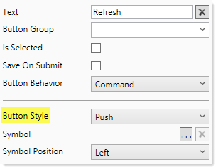
The button style is specified using the Button Style property, as shown in the following screenshot:
By default, all buttons are push buttons unless the button style is changed. Some of the preconfigured button alternatives start with a different button style—for example, the Link Button alternative is automatically set to use the link button style.
The choice of which button style to use is primarily a design decision. The button style does not impact the button functionality; it only impacts how the button displays to form users.
All button styles can also use symbols from the symbol library. These are the same symbols that are available when using the Symbol tag in a Formatted Grid component.
Push buttons
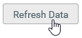
Push buttons use the standard button appearance that you are used to seeing in software dialogs and web pages. Users click the button to perform an action.
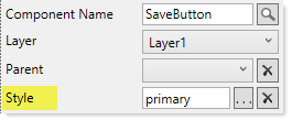
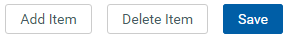
Push buttons can use the primary style to designate a button as the primary action for the form. For example, if you have a row of buttons that perform actions, but you want to call attention to the Save button, you can apply the primary style to that button using the Style property.
|
Component properties with primary style applied |
Push button using primary style |
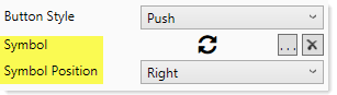
The text on a push button can include a symbol. To apply a symbol, click the [...] button for the Symbol property to select a symbol, and then specify whether the symbol should display on the left or right side of the button.
|
Component properties with symbol selected |
Push button using symbol with right position |
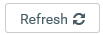
If you want the button to only contain a symbol, then you can leave the text blank. In this case the symbol position does not apply, and the symbol is centered in the button.

Push button using only a symbol
Link buttons
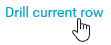
Link buttons display as hyperlink text. Instead of clicking a button to perform an action, users click the hyperlink text.
By default, link buttons display in blue font and without an underline. If desired, you can apply the following styles to the button to impact the display:
- text-color: Removes the blue color and instead displays in the default text color.
- underlined: Applies an underline to the text.
You can also use the formatting overrides in the advanced component settings to change the font properties.
The text on a link button can include a symbol. To apply a symbol, click the [...] button for the Symbol property to select a symbol, and then specify whether the symbol should display on the left or right side of the button.
|
Component properties with symbol selected |
Link button using symbol with left position |
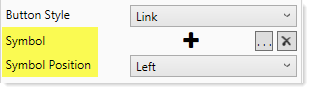

Image buttons
Image buttons display as an image. Instead of clicking a button to perform an action, users click the image.

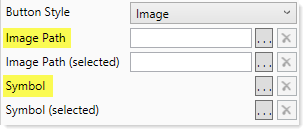
When configuring an image button, you must specify either an Image Path or a Symbol. If an image is selected, then the symbol fields will become hidden, and vice versa. Click the applicable [...] button to browse to the desired image, or to select the desired symbol.
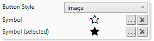
If the button is part of a button group, then you can optionally specify a "selected" image or symbol. When the button is the currently selected button in the button group, then the button will use the selected image / symbol instead of the primary image / symbol. For example, this button will use the regular star when it is not selected, and switch to the filled star when it is selected.