AX3110
Axiom forms are created by dragging and dropping various components onto the form canvas using the Form Designer, and then configuring the data and display properties of those components.
To open the canvas for editing, do one of the following. The file must already be form-enabled in order to use these options.
-
In the Form Assistant task pane, click the Edit Layout button. If the canvas is currently empty, you can also click the Open layout editor link that displays in the thumbnail area.
-
On the Axiom ribbon tab, in the File Options group, click Forms > Launch Form Designer.
Either action opens the Form Designer dialog. The left-hand side of the dialog displays the available Axiom form components. The middle section is the canvas. When you select an item on the canvas, properties for that item display on the right-hand side of the dialog.
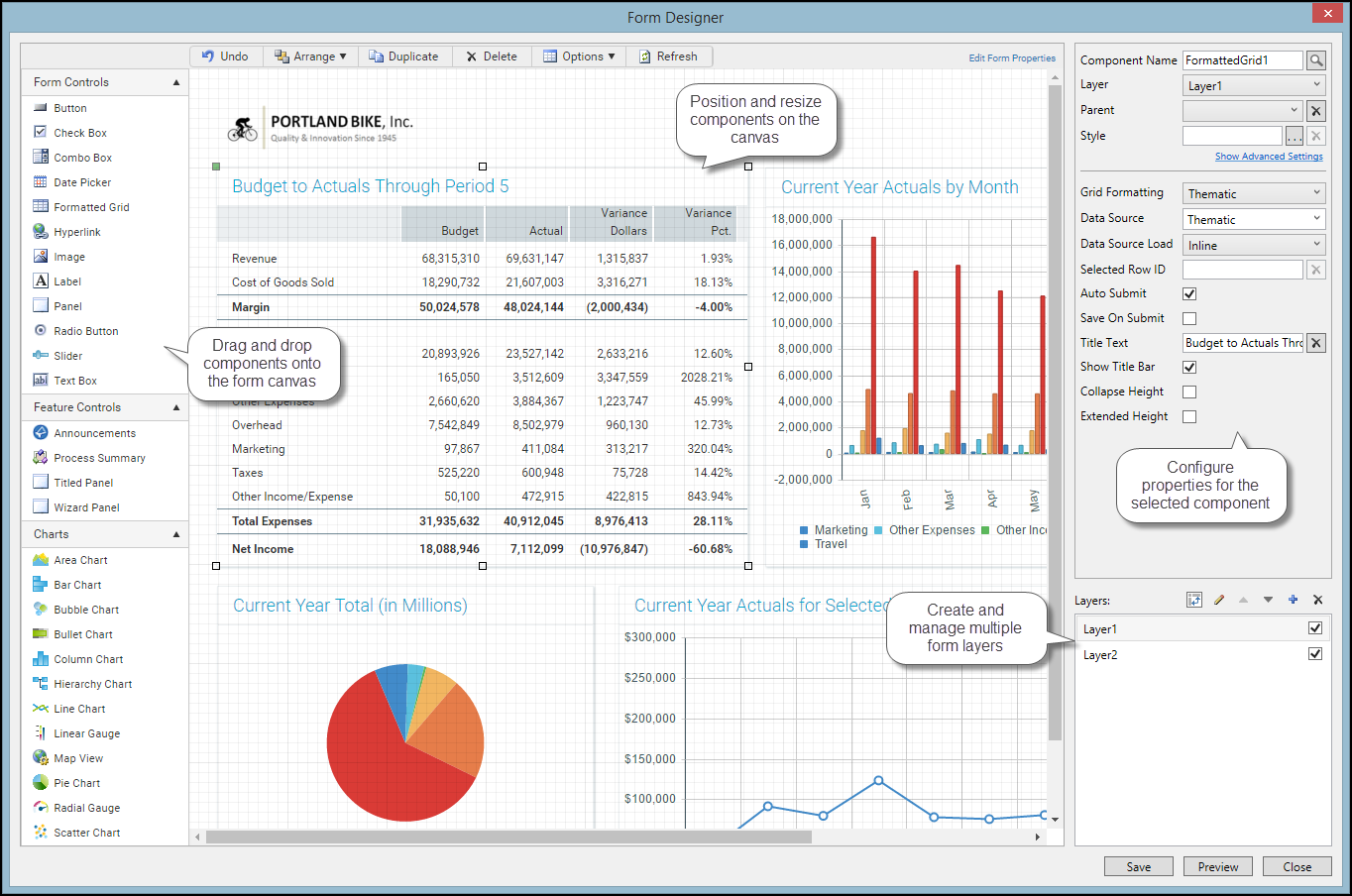
Example Form Designer dialog
The toolbar contains several commands to help arrange and design the components on the canvas, as described in the following sections. An Undo command is available to undo any change made to the canvas in the current session.
The form contents display using actual size and location within the Form Designer dialog. In order to view all of the form contents, you may need to scroll within the dialog or size the dialog larger.
The Form Designer displays the form contents as they will display in the form web page, with a few minor differences and limitations. The intent of the Form Designer is to provide you with a good idea of how the form will render, not to display a live working form. You should always view the form in its intended environment to truly test the design. Note the following display differences in the Form Designer:
-
Interactive components are not interactive in this environment. For example, if you place a CheckBox component on the canvas, you will see the check box as it will display in the rendered form, but you cannot actually check or clear the check box.
-
For components that use data sources, actual data is read into the component, but only enough to provide a reasonable representation of the component. Data does not update in real time, and some aspects of the component may not render as they will in a live form.
-
If a component is configured as not visible (because a formula is being used to dynamically show or hide it), then that component still displays on the canvas in the Form Designer. This behavior is so that you can continue to work with the component on the canvas, without having to change or remove any formulas that determine the component's visibility in the rendered form. If you want to be able to hide and show components within the Form Designer, you can use layers. See Using multiple layers on the canvas.
- When you select a component on the canvas, that component will temporarily display "above" any other components. This is so that you can configure the component on the canvas without needing to adjust the component's rendering order (by moving to front or back). Once the component is no longer selected, it will revert to its actual rendering order. This behavior is only noticeable when you have components stacked on top of other components.
Adding, copying, and deleting components
You can add new components to the canvas, copy existing components, and delete components. For more information on the available component types and their properties, see Axiom form components.
-
To add a component to the canvas, select the component type from the left-hand side of the dialog, and then drag and drop the component to the desired place on the canvas. You can add as many components as needed, including multiples of the same component type.
When you add a component to the canvas, a section is automatically added to the Form Control Sheet to define the properties for that component. The properties also display in the right-hand side of the Form Designer dialog when the component is selected on the canvas.
In most cases, you can define the component properties in the Form Designer or in the Form Assistant instead of editing the Form Control Sheet directly (unless you want to use a formula for that property, in which case you must edit the control sheet). If you want to manually edit the control sheet properties for a component, you can jump to the appropriate section in the control sheet by double-clicking on any property name—your cursor will be placed in that property for the current component.
-
To copy an existing component, select the component that you want to copy, and then click Duplicate.
-
To delete a component from the canvas, select the component and then click Delete. This will remove the component from the canvas and from the Form Control Sheet.
Moving and resizing components
Once a component has been added to the canvas, you can move it to different locations, and you can resize it.
-
To move a component, select the component on the canvas and then drag and drop the component to the desired location. You can also use the arrow keys to move the component in the arrow direction (up, down, left, right).
-
To resize a component, select the component on the canvas and then hover your cursor over one of the selection handles on the corners and sides of the component, so that the cursor becomes a two-sided arrow. You can then resize the component to a larger or smaller size by dragging the selection handle.
To maintain the current proportions when you resize, hold down the SHIFT key and drag any of the non-corner selection handles. For example, if you want to resize an image but maintain the current aspect ratio.
-
To make two components the same size, select the component that is the size you want to copy, and then select one or more additional components (using SHIFT or CTRL). Click Arrange > Make Same Size. All selected components will be resized to match the size of the first component.
-
To move a component forward or backward on the canvas (within the current layer), select the component. Click Arrange and then select either Send to Back in Layer or Bring to Front in Layer. For example, if you select Arrange > Send to Back in Layer, then the selected component will be moved to the back of the canvas, underneath all other components in the layer.
-
To move a component to another layer on the canvas, use Arrange > Move to Layer. For more information, see Using multiple layers on the canvas.
NOTE: The Snap To Grid option and the built-in alignment lines may impact the placement and size of a component when adjusting it on the canvas. See the following sections on these features for more information.
This section describes the simple behavior of setting component size and position by modifying the component on the canvas. When using this behavior, all components are positioned relative to the upper left corner of the canvas (or of the parent panel, if the component is a child of a panel), and all sizes and positions are defined in pixels. Alternatively, you can use the advanced component settings to define dynamic size and position options, such as percentage-based sizes and positions. For more information, see Controlling component position and size.
Using grid lines
By default, the canvas area displays with grid lines to help you size and position items on the canvas. Each minor line in the grid represents 10px and each major line in the grid represents 100px. The grid lines only display in the Form Designer; they will not display in the rendered form.
When moving and resizing components on the canvas, you can choose whether components snap to the nearest grid line. The "snap to grid" behavior is available regardless of whether the grid is currently shown on the canvas.
To configure grid options for the Form Designer:
- To toggle the grid lines on or off, click Options > Show Grid.
- To toggle the snap to grid behavior, click Options > Snap To Grid.
NOTE: When grid lines are shown, they display on top of components on the canvas. This behavior allows gridlines to be seen even when using form designs that include full-page panels, such as the Wizard Panel or the Titled Panel.
Aligning components
You can align components on the canvas with other components. To do this:
- Select the component that you want to use as the "anchor" for the alignment.
- Select one or more additional components (using SHIFT or CTRL).
- Click Arrange > Align > AlignmentPoint.
The components will be aligned with the "anchor" component, according to the selected alignment point. For example, if you click Arrange > Align > Left, then all selected components will be aligned with the left side of the "anchor" component.
When you move a component by dragging it on the canvas, Axiom will display red alignment lines when the component is close to becoming aligned with another component. If you release the component ("drop" it) when a red alignment line is visible, the component will be automatically aligned along that axis.
NOTES:
- If Snap to Grid is enabled and you move a component near another component that is not on a grid line, then the alignment guides will not display. If you want the alignment lines to show in this case, you can disable Snap to Grid. The Align command will work regardless of whether Snap to Grid is enabled.
- If components use differing units for position—for example, one uses pixels and one uses percentage, then alignment lines will not display for these components. If you use Arrange > Align to align these components, the components will be changed to use the units of the anchor component. For example, if the anchor component uses percentage and the other selected components use pixels, the other components will be changed to percentage.
Distributing components
You can distribute three or more components evenly on the canvas, either horizontally or vertically. The components are distributed within the area bounded by the two outermost components (not across the entire width or height of the canvas). To distribute components:
- Select three or more components on the canvas (using SHIFT or CTRL).
- Click Arrange > Align, and then select either Distribute Horizontally or Distribute Vertically.
The components are distributed so that they are equidistant from each other.
For example, imagine that you have three labels placed on the canvas, and you want these labels to be equal distance from each other:
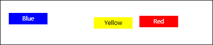
Before distribution
After selecting all three components and then clicking Arrange > Align > Distribute Horizontally, the labels would be evenly distributed as follows:
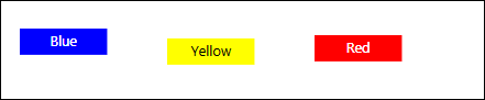
After distribution
Notice that the components are distributed in the area defined from the edge of the blue component to the edge of the red component, not within the overall canvas width. Assuming these components should also be aligned with each other, you could then select the blue component (or whichever component was at the desired location) and then click Arrange > Align > Top.
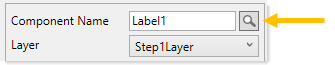
You can search for any component on the form canvas, so that its properties display in the Form Designer or Form Assistant. You might want to do this if the component is on a layer that is not currently shown in the Form Designer, or if there are just a lot of components on the form and it is difficult to find and select the component. Also, you might know the name or type of component that you want to edit, but you might not be sure where it is placed on the canvas.
To search for a component:
-
Click the Search button to the right of the Component Name box. You must already have a component selected in order to do this.
The Components dialog opens, displaying a list of all components in the form. Components are listed by name, type, parent, and layer. To sort based on any of these columns, click the column header.
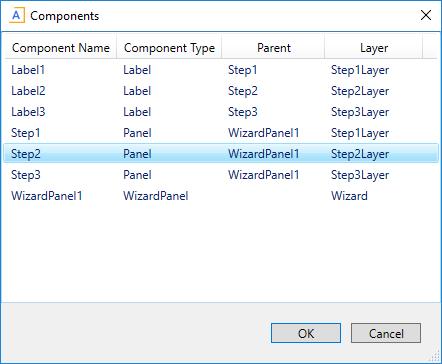
- Once you have located the component that you want to view, select that row and click OK.
The Form Designer and Form Assistant update to show the properties of the selected component. If the component is visible on the form canvas, it also becomes selected on the canvas.
