AX1488
for Axiom forms
The Titled Panel is intended to be used as a template to create forms with consistent title and content areas. Technically it is not a unique component type; rather it is a collection of preconfigured components. However, you add it to a form in the same way you add other components.
The Titled Panel "template" consists of the following components. All of these components will be added to the form when you drag and drop a Titled Panel on to the form canvas:
- A parent Panel component that is used to position and group the other components.
- Three Label components at the top of the panel, which are used to display a main title and two subtitles.
- A Formatted Grid component, which is intended to display the form contents.
By default, the Titled Panel template is intended to use the entire page. When you drag and drop the Titled Panel onto the canvas, the parent Panel component is automatically configured to fill the canvas. It is recommended to start with a new form file when using this template, as the panel will cover up any existing components on the canvas. If you need to add other components to the form, it is best to add them after the panel is already in place, so that the components are automatically assigned to the panel as you place them on the canvas.
The Titled Panel component can be used for a variety of purposes. For example, you can use the Formatted Grid component to display reporting data or to gather data inputs. Or, you can delete the grid and instead create your own content area. For example, you might populate the area with various charts to create a dashboard-style report, or create a data input area using individual form controls.
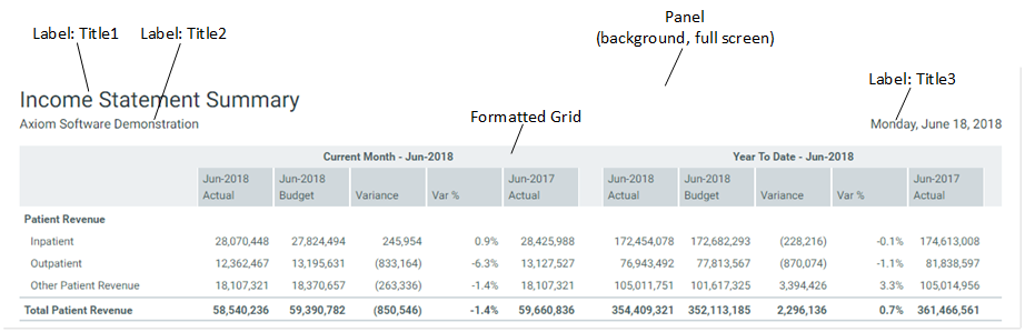
Titled Panel example
The following screenshot shows an example of a form that was created using the Titled Panel. The grid is configured to show reporting data.
Component properties
When you drag a Titled Panel on the Axiom form canvas, the following preconfigured components are added to the form. See the previous section for an example of how these components are positioned and formatted.
By default, styles are used to set the size and position of all components, so the component size and position properties are blank. The components are also locked on the canvas, so that you do not accidentally move or resize the components as you are working in the Form Designer. If you want to move or resize a component, you can do so by manually adjusting the size and position properties in the advanced component settings. Alternatively, you can disable Lock Layout so that you can edit the size and position on the canvas.
For more information about any of the styles used by the components, select the component in the Form Designer and then open the Choose Style dialog to view the effective formatting of the style. If necessary, you can use advanced settings to override certain style properties—for example, if you want the panel background to be a different color.
You will not see any entry in the Form Control Sheet for Titled Panel. This does not exist as a separate component; it only exists in the component sidebar as a way to place these preconfigured components on the canvas.
Panel component
The Panel component uses the following styles:
-
docked-to-container: This style sets background formatting and causes the panel to dynamically fill the entire page.
-
page-padding: This style adds standard page-level padding along all sides of the page, so that content does not extend all the way to the edges.
The panel provides an easy way to manage the positioning of all the other components. If you intend to use the default behavior of a full-page panel, then there should be no need to adjust the positioning of the panel.
If you want to use the panel as a partial-page component, then you must manually adjust the component's position and/or size properties as appropriate. These component-level settings will override the style-level settings. For example, you could set the X Position to 200px to move the entire panel over to the right, so that you could display some other content as a left-hand sidebar. Because the other components in the panel are positioned and sized relative to the panel, they will automatically adjust to the new settings.
Label components
Three different Label components are used to create the main title and the subtitles:
- Title1: This defines the main title at the top of the page. It uses the style page-title. This style applies title formatting and sizes the title to fill the full width of the page.
- Title2 and Title3: These define the two sub-titles located underneath the main title. Both use the style page-subtitle to define sub-title formatting and vertical positioning. Title2 is left-aligned and Title3 is right-aligned. Title3 also uses UpperRight as its reference location so that it is positioned relative to the right side of the parent panel.
If you want a second row of subtitles, you can duplicate the existing subtitles and then manually modify the Y Position to move them down. You would have to also modify the Y Position of the Grid to push it down as well.
Formatted Grid component
By default, the Formatted Grid component is assumed to provide the content of the form. It could be used to display reporting data or gather user inputs. You must create the data source for the grid as normal and assign it to the component.
The grid uses the style titledpanel-body. This style positions the component vertically and horizontally, and causes it to extend to fill the remaining width and height of the parent panel. If you add or remove titles, or modify the sizing of the titles, you will need to manually override the Y Position to move the grid up or down as appropriate.
Using different components for the content
If you do not want to use a Formatted Grid component to provide the form contents, you can delete the grid and populate the page as desired with other components. If you do this, it is recommended to first replace the grid with a Panel component. This makes it easier to control the positioning and sizing of the child components and ensure that they remain in the designated "content area" outlined by the panel.
To do this:
- Drag and drop a Panel component onto the canvas (after deleting the grid).
- Set the Style for the panel to titledpanel-body. This gives it the same style as the original grid.
- Click Show Advanced Settings and clear out X Position, Y Position, Width, and Height. This allows the component to inherit size and position from the style. You may also want to enable Lock Layout so that you do not accidentally move or resize the panel later.
- Refresh the canvas and now you should see the panel take up the same space that the grid used to.
- In most cases, you should also disable Show Title Bar, so that the panel is just a design tool for organizing components instead of visible on the form.
You can now drag and drop other components into this panel, and the size and position of those components can be controlled relative to the panel. For example, you can place two charts side by side, and set the Reference Location of one to UpperLeft and the other to UpperRight. Set the X Position and Y Position for both charts to 0, so that they align with the top of the panel and their respective reference locations. Lastly, set the Width and Height of each to 50%. Now you have two charts of equal width side by side, filling up the top half of the panel. This is just an example of how you can control size and position of child components within the panel.
