AX1589
for Axiom forms
Using the Dialog Panel component, you can display a dialog in an Axiom form. When the dialog is launched, it "takes over" the current form, so that the user must interact with the dialog before they can go back to using the form. The content of the dialog is entirely customizable.
Defining a dialog panel is a multi-step process that requires the following:
- Placement and configuration of a Dialog Panel component (and its child components) on the Axiom form canvas.
- Placement and configuration of the dialog contents, using other Axiom form components as needed.
- Placement and configuration of a separate Button component that uses the Show Dialog Panel button behavior. This button is how users open the dialog from within the form.
The Dialog Panel component is a composite component. All of the following components will be added to the form when you drag and drop a Dialog Panel component on to the form canvas:
- A parent Dialog Panel component that is used to define the overall size of the dialog, and to position and group the other child components.
- A child Panel component to contain the contents of the dialog (content panel).
- A child Panel component to contain and position the action buttons for the dialog (button panel).
- Three Button components to perform the dialog actions of OK, Apply, and Close.
NOTE: The Dialog Panel component is only intended for use within an Axiom form—where the primary "application" is the form web page, and you want to present a dialog within that web page. The Dialog Panel component is not intended for use when creating a form for use as a custom dialog in the Desktop ClientGeneral term for using either the Excel Client or the Windows Client, both of which are installed to the user's desktop., such as an Add File Form or a RefreshDialog refresh form. When creating a form dialog for use in the Desktop Client, the entire form is the dialog. For more information, see Using Axiom forms as custom dialogs and task panes in the Desktop Client.
Dialog Panel overview
When you drag and drop a Dialog Panel component on to the canvas, you get a composite component like the following:
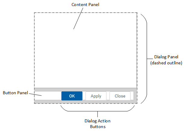
For purposes of differentiating the various components in this diagram, borders have been added to the content and button panels, and a background color has been added to the parent dialog panel. On the canvas, all of the panels are white and do not have any borders. (The Dialog Panel itself displays on the canvas with a dashed border as shown here, but this is only so that you can find it on the canvas—it does not render on the component.)
Notice that no title bar shows on the dialog in the Form Designer. When the dialog is opened in the rendered form, it will have a typical dialog title bar that includes title text and a close icon in the top right corner.
Sizing and positioning the Dialog Panel component in the form
Before dragging and dropping the Dialog Panel component on the canvas, it is a good idea to first create a new layer to hold the panel. Make that layer the active layer, and then drag and drop the component on the canvas. This ensures that all of the composite components will belong to the same layer. If you want to change the layer later, you will have to manually update all composite components to move them to the new layer.
The layer is not required to manage the dialog behavior; it is simply convenience for the file designer. You can show the layer in the Form Designer when you want to work on the dialog, and hide the layer when you want to work on the rest of the form contents.
It is not necessary to dynamically configure the visibility of the Dialog Panel component or the layer that it is on. In the form, the dialog only becomes visible when it is launched by a Show Dialog Panel button. Once the dialog becomes visible, it is only closed (hidden) by a Dialog Panel Action button. Similarly, it is not necessary to manually "fade out" the main form contents when the dialog is visible; the form contents will be masked by a translucent gray layer automatically.
Note the following when sizing and positioning the Dialog Panel component:
-
It does not matter where the Dialog Panel component is placed on the form canvas. When the dialog is opened, it is always centered in the middle of the visible form window.
-
The size of the Dialog Panel component determines the size of the dialog when it is opened in the form. The dialog cannot be resized by form users.
-
To define the size of the dialog, you can resize the Dialog Panel component on the canvas or by manually editing the width and height in the advanced component settings. The child panels will automatically adjust to fit the new size. The width and height must be set using a fixed number of pixels; dynamic sizes are not supported.
It can be difficult to select the Dialog Panel component on the canvas. You can use the component search feature to find and select the Dialog Panel component, or you can try clicking on the very bottom of the dialog outline on the canvas. Another tip is to click on the content panel and then quickly click again to move the selection to the component directly underneath (which in this case is the Dialog Panel). Check the Component Name property to verify that you have selected the Dialog Panel component before attempting to move or resize the dialog.
Component properties
When you drag a Dialog Panel on the Axiom form canvas, the following preconfigured components are added to the form. See the previous section for an example of how these components are positioned.
Dialog Panel
The Dialog Panel component is named DialogPanel1 by default (subsequent components will increment the number). The Dialog Panel component is a unique component type for purposes of managing the behavior of opening and closing the dialog.
For its component properties, the Dialog Panel component has the same properties as the regular Panel component, with the following exceptions:
-
Title Text: This property defines the window title text for the dialog. Note that this window title bar is not visible in the Form Designer, but it will display when the dialog is rendered in the form.
-
Show Title Bar: This property does not apply to Dialog Panel components. The rendered dialog uses a standard window title bar that includes the defined title text.
Content Panel
The content panel is a regular Panel component named DialogPanel1_Content by default. The content panel is preconfigured to automatically fill the majority of the parent Dialog Panel component, with the exception of the button area along the bottom. The content panel is intended to hold the contents of the dialog.
It is not recommended to manually move or resize the content panel. By default, Lock Layout is enabled for this panel so that it cannot be accidentally adjusted while working on the canvas. The content panel will automatically resize as the parent Dialog Panel is resized.
The dialog contents are entirely up to the form designer. To define the dialog contents, add components to the content panel as desired. The content panel can use any form component, such as labels, images, grids, text boxes, combo boxes, and more. Keep in mind the following:
-
If the dialog contents contain an auto-submit component or a regular Button component, the dialog will refresh to show changes but the main form underneath does not refresh until the OK button or the Apply button is clicked.
-
Clicking the Close button prevents any unsubmitted changes in the dialog from being submitted, but it does not revert any changes that were already submitted.
Button Panel
The button panel is a regular Panel component named DialogPanel1_Buttons by default. The button panel is preconfigured to fill the bottom of the Dialog Panel and to position the child Button components in the lower right area of the dialog.
It is not recommended to manually move or resize the button panel. By default, Lock Layout is enabled for this panel so that it cannot be accidentally adjusted while working on the canvas. The button panel will automatically resize as the parent Dialog Panel is resized (note that you may need to refresh the canvas after resizing the parent panel).
In order to automatically position the buttons, the button panel uses a flow layout with a right-to-left direction.
Action Buttons
Three regular Button components are present in the button panel by default, to control the dialog actions. All three buttons are push-style buttons that are preconfigured to use the Dialog Panel Action button behavior.
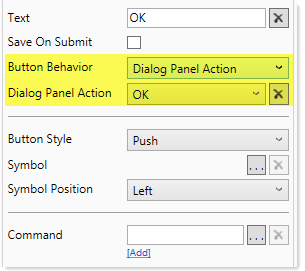
The text of the button corresponds to the Dialog Panel Action it is configured to perform. The following actions are available:
| Button | Description |
|---|---|
|
Close |
The Close action closes the dialog without performing a form update, and returns the user to the main form. If the dialog contents contain any interactive components with changes that have not yet been submitted back to the source file, these changes will be lost. By default, this button is named DialogPanel1_Button1. NOTES:
|
|
Apply |
The Apply action triggers a full form update, including a save-to-database if Save on Submit is enabled for the button. The dialog remains open, and the main form is refreshed "underneath" the dialog. By default, this button is named DialogPanel1_Button2. |
| OK |
The OK action is the same as the Apply action, except that the dialog is closed at the end of the process and the user is returned to the main Axiom form. By default, this button is named DialogPanel1_Button3, and it uses the primary style to designate it as the primary action button. |
All three buttons are child components of the button panel, and have Lock Layout enabled by default. The buttons do not have defined positions because their parent panel uses flow layout. The buttons automatically flow from right to left within the button panel.
The action buttons are designed to be customized as follows:
-
Save data: You can optionally enable Save on Submit for the OK button and the Apply button, if you intend the dialog to perform a save-to-database. Save on Submit cannot be enabled for the Close button, as the Close action only closes the dialog and does not trigger the form update cycle.
-
Perform commands: You can optionally add commands to the Apply button and/or the OK button, to perform additional actions when the button is clicked. For example, you could process action codes, run a scheduler job, execute data lookups, or add a new record to an identity table. Commands cannot be added to the Close button, as the Close action only closes the dialog and does not trigger the form update cycle.
Keep in mind that some form commands do not apply to the dialog context and will either be ignored or will not work as expected: About Axiom Software, Apply Form State, Close Dialog (this is only for use with custom form dialogs in the Desktop Client), Export Grid, and Forms Logout.
-
Remove unneeded buttons: You can delete the Apply button if the dialog does not need to support the ability to update and save without closing the dialog. Once the Apply button is deleted, the OK button will automatically re-position itself due to the flow layout behavior.
You can delete both the Apply button and the Close button if the dialog is only being used to display information to the user, and no action needs to be taken other than dismissing the dialog when the user is finished reading it. It is recommended to use the OK action for this, because it will cause the display of the main form to be refreshed for any changes that were submitted when the dialog was launched using the Show Dialog Panel button (see the following section). You can optionally rename the text of the OK button to Close for this use case.
-
Customize text and size: You can change the text or sizes of the buttons. By default, the buttons are all sized to 80px width and 30px height. If you change the text on a button, you may need to adjust the width larger to fit. Because Lock Layout is enabled for the buttons by default, you must adjust the width manually in the advanced component properties.
If needed, you can add other Button components that do not use the Dialog Panel Action behavior to the button panel or the content panel. You might do this if you need the user to be able to perform an action independently from the dialog actions. Keep in mind that the main form contents underneath the dialog will not refresh to show changes when a regular button is used; only the dialog contents will refresh. The main form contents are only refreshed when an OK or Apply button is clicked.
NOTE: Nested Dialog Panel components are not supported. You cannot use a button to launch a second Dialog Panel component while the first dialog remains open.
Configuring a button to open a Dialog Panel
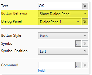
In order for users to open the dialog created by the Dialog Panel component, the form must contain a button that is configured to use the Show Dialog Panel button behavior. You must separately add this button to your form; placing a Dialog Panel component in your form does not add this button. The Show Dialog Panel button behavior is available for both Button components and Button tags for Formatted Grid components.
Once this behavior is selected, use the Dialog Panel property to specify the Dialog Panel component to open when the button is clicked. You can select any Dialog Panel component that is currently defined in the form, using the component name.
NOTE: Dialog panels can also be opened by using the Show Form Dialog Panel command. This command is primarily intended for use with components that do not have access to button behaviors, such as the KPI Panel. Although it is possible to use the command with a Button component and use Command behavior instead of Show Dialog Panel behavior, other button options that are available with Command behavior are still not supported when opening a dialog panel, such as Save on Submit.
When the button is clicked, the specified Dialog Panel component is opened as a modal dialog over the main form contents. The main form contents are masked in translucent gray.
The dialog remains open until it is closed by using one of the following:
- The X in the right-hand corner of the dialog title bar. This performs the same action as the Close action for buttons.
- A Dialog Panel Action button configured to use the Close action.
- A Dialog Panel Action button configured to use the OK action.
While the dialog is opened, users cannot interact with the main form contents. Only the dialog contents are active.
Form update behavior for Show Dialog Panel buttons
When a Show Dialog Panel button is clicked, the form update cycle proceeds as normal up through the After AQ Refresh processing step (see Axiom form update process for more information). After that point, the specified Dialog Panel component is opened as a dialog and the remainder of the form update cycle is aborted. This means:
-
The save-to-database portion of the cycle is skipped. The Show Dialog Panel button cannot be configured to save on submit. Any Axiom queries and commands that are configured to execute after saving data will not be run.
-
The display of the main form is not refreshed. Instead, the specified Dialog Panel component opens and overlays the form. The contents of the dialog can be impacted by submitted values and the by results of the data refresh, but the display of the main form will not be refreshed until either the OK button or the Apply button is clicked on the dialog. If these buttons are not used and instead the dialog is closed via the Close button (or the X button in the title bar), then the display of the main form will not be refreshed.
-
You can assign commands to a Show Dialog Panel button and execute those commands as part of opening the dialog. These commands must be run by the After AQ Refresh processing step or earlier.
Dialog Panel behavior
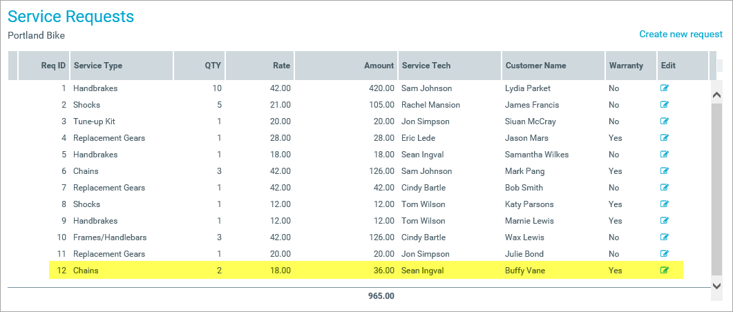
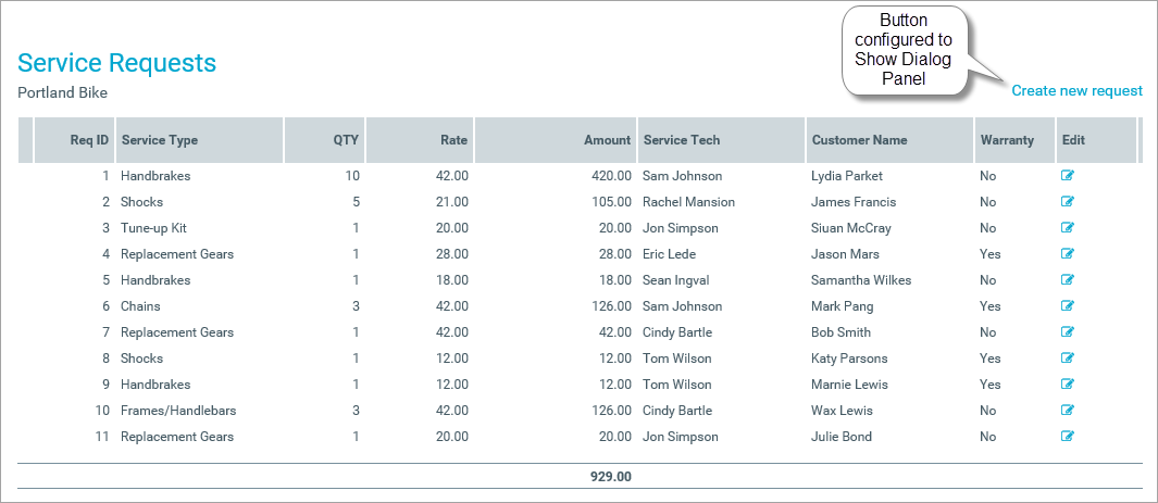
The following example shows how a Dialog Panel can be used within a form. This form displays a list of current service requests for the organization, generated by an Axiom query. If a user wants to create a new service request, they can click the button at the top of the form. This button is configured to use the Show Dialog Panel action.
When the user clicks the button, the Dialog Panel opens. In this case, the contents of the dialog contain the fields necessary to create a new service request. Additionally, the OK button is configured to trigger a save-to-database. When the user completes the fields and then clicks OK, the new request is saved to the database.
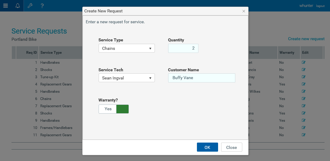
When the user returns to the main dialog, the Axiom query for the service requests has been refreshed and the new request now displays in the list.