Display icons in Data Grids using if-then-else conditions
When using an IconConfig data source to display conditional icons in a Data Grid component, you can now define condition groups to be evaluated as a set of if-then-else conditions.
The new property [ConditionGroup] is used to assign a set of icon conditions to the same group. This property is added by default to all new IconConfig data sources. If you have an existing data source, you can add the property manually. For example, a condition group could be defined as follows:
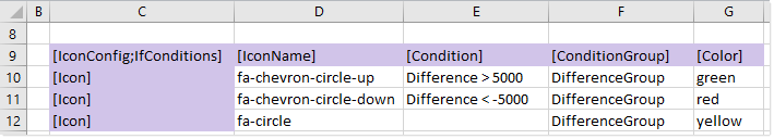
Example condition group in an IconConfig data source
This condition group shows an icon based on the Difference value, where Difference is the name of a calculated column defined for the grid. If the first condition is true for a row in the grid, then the row uses the fa-chevron-circle-up icon, and no further conditions in the group are evaluated. If the first condition is not true, then the second condition is evaluated, and so on. The row with the blank condition serves as a catch-all "else" statement, so that all rows in the grid will match one of the icons in this group. (Note that if you want to use this kind of catch-all row, it must be the last row in the group. Rows with a blank condition automatically end the group.)
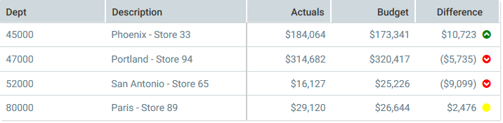
The following example shows how this grid would be rendered using the icon conditions:
Example data grid showing the if-then-else icon conditions
