AX1141
You can use the Select content tag within a Grid data source to allow users to select an item from a defined list of values. This list is created by using a ComboBox data source.
By default, the list of items displays as a combo box, allowing selection from a drop-down list and/or typing into the box to find a specific value. The Select tag syntax has no effect within the source file itself, but when the file is viewed as an Axiom form, the cell containing the Select tag will render as the combo box.
Content tag syntax for data source drop-down lists
The syntax for the Select content tag is as follows:
[Select; TargetCell=CellAddress; FormState=KeyName; SharedVariable=VariableName; DataSourceName=Sheet!DSName; Placeholder=Message; MultiSelect=True/False; ReadOnly=True/False; Searchable=True/False; AutoSubmit=Enabled/Disabled/Grid; Tooltip=Text; ColumnStyle=StyleName; Columns=Number;]
Parameters can be listed in any order after the Select tag. Optional parameters can be omitted.
To create the tag, you can manually type it within a cell, or you can use the Data Source Assistant / Tag Editor. For more information, see Creating and editing content tags in Formatted Grids.
When using the Data Source Wizard / Tag Editor, you must specify the List Items Source as Named Data Source in order to configure the tag to use a ComboBox data source. This selection is used to show the correct parameters for this configuration.
NOTE: These parameters assume that you are using a thematic formatted grid. If you are using a legacy spreadsheet-formatted grid, some parameters may not be available.
| Parameter | Description |
|---|---|
|
TargetCell |
The cell to place the selected value. You can specify the cell using one of the following options:
For more information, see Referencing cells in content tag parameters. The target cell cannot be the same cell that contains the Select tag. The target cell can be anywhere in the spreadsheet and does not need to be visible within the formatted grid. If there is content in the target cell, that content will be displayed as the selected value for the combo box (using its corresponding label from the data source). If you want to display a previously selected value that was saved to the database (such as when the form is subsequently opened and a value is queried back in), then you can use a formula in the target cell to bring in this value. NOTES:
|
| FormState |
The key name under which the selected value will be stored in form state memory. For example, VPName. When a form state key name is defined, the user's selected value is not placed anywhere in the source file. Instead, it is stored in form state memory for the current file. If you need to reference the value within the form, you can use the GetFormState function to return the value into a cell. The FormState parameter should only be used if the form is intended to be used as a dialog in the Desktop ClientGeneral term for using either the Excel Client or the Windows Client, both of which are installed to the user's desktop., and you need to be able to pass values from the form to the currently active spreadsheet. For more information, see Passing values between an Axiom form and the active client spreadsheet (form state). |
| SharedVariable |
The shared variable name to save the selected value as. For example, ProposalName. When a variable name is defined, the user's selected value is not placed anywhere in the source file. Instead, it is saved to the variable list that is stored in memory for the shared form instance. If you need to reference the value within the form, you can use the GetSharedVariable function to return the value into a cell. The SharedVariable parameter should only be used if the form is intended to be used in an embedded form context (as either the parent form or a child form), and you need to share this value with other forms in the shared form instance. For more information, see Sharing variables between parent and child forms. |
|
DataSourceName |
The name of the ComboBox data source to use as the source for the list. This parameter uses the following syntax: SheetName!DataSourceName. For example: Sheet2!Category. For more information on creating the data source, see Creating a ComboBox data source for the Select tag. The |
|
AutoSubmit |
Optional. Specifies how interactive controls submit values back to the source file:
If omitted, the default behavior is Grid. This parameter only applies to tags that generate interactive controls: CheckBox, DatePicker, Select, TextBox. |
|
Placeholder |
Optional. A message to display within the combo box when no value has yet been selected. This only applies when the target cell does not have any contents, or when the form state key or shared variable does not currently have an assigned value. For example: "Select a Department." Once a value has been selected, the contents of the target cell (or the stored form state / shared variable value) display instead of the placeholder text. You can define the placeholder text within the tag directly, or you can use a bracketed cell reference to read the placeholder text from another cell. For more information, see Referencing cells in content tag parameters. NOTES:
|
| Tooltip |
Optional. Specifies tooltip text to display when a user hovers the cursor over the cell contents. Alternatively, you can use a bracketed cell reference to read the tooltip text from the referenced cell. This approach is useful if you want to dynamically determine the text, because then the formula can be in the referenced cell instead needing to construct the tag using a formula. For more information, see Referencing cells in content tag parameters. |
|
ReadOnly |
Optional. Specifies whether the drop-down list is "active" (True/False). The default value, False, means that the list is active and that the user can select values as needed. If True, then the cell becomes "frozen" and no further edits can be made. The cell will display the current selected value of the list (or the display cell value, if applicable). This parameter can be used to control whether a user can edit the cell's value. Generally speaking, this parameter would only be used within a formula to dynamically enable / disable the combo box. |
|
Searchable |
Optional. Specifies whether the list is searchable (True/False). By default, this is True, which means the list is searchable by typing values into the combo box. If you want the list to be a static drop-down list instead, indicate False. NOTE: If MultiSelect is True, then this parameter does not apply. The dialog box where users can select multiple values always has a search box to filter the list. It is recommended to disable this parameter so that users cannot attempt to type inside the combo box (which will just cause the multi-select dialog to open). |
|
MultiSelect |
Optional. Specifies whether users can select multiple values in the list (True/False). By default this is False, which means that users can only select a single value. If True, then users can select multiple values in the list. When the user clicks on the combo box, a dialog opens instead of a drop-down list. The user can select check boxes for the values they want to select. When the user clicks OK to close the multi-select dialog, the selected values are written back to the target cell using a comma-separated list. When using a ComboBox data source, each selected value is always wrapped in single quotation marks. Although the target cell contains the comma-separated list of values, the combo box in the form displays a comma-separated list of the corresponding labels (with no quotation marks). For more information on how users interact with the multi-select dialog, see Multi-select dialog behavior. NOTE: If multi-select is enabled, it is recommended to define placeholder text because that text will display as the title of the multi-select dialog. |
|
Columns |
Optional. Specifies how many columns the cell contents will span in the grid. If this parameter is omitted or set to 1, then content generated by the tag will only span the current column. If you want the content to span multiple columns, enter a number such as 2 to span 2 columns. The column span extends to the right. NOTE: The row and column styles used in the grid impact how the column span displays. For example, if the content in the starting column is left-aligned and does not naturally exceed the width of the starting column, then the spanned columns will simply be blank because no content is extending to those columns. However, if the content is long enough to extend out of the starting column, or if the content has external borders (such as a text box), or if the content is center-aligned or right-aligned, then content will display in the spanned columns. |
|
ColumnStyle |
Optional. Specifies one or more column styles to apply to the current cell. The specified styles override the current column styles set by the Enter one or more valid column style names, separated by commas. If you are using the Data Source Assistant / Tag Editor, you can click the [...] button to open the Choose Styles dialog and select from available styles. The available styles depend on the skin specified for the form. For more information, see Using row and column styles in a thematic grid. Alternatively, you can use a bracketed cell reference to read the style from the referenced cell. This approach is useful if you want to dynamically determine the style, because then the formula can be in the referenced cell instead needing to construct the tag using a formula. For more information, see Referencing cells in content tag parameters. |
Parameters for spreadsheet-formatted grids
If you are using a legacy spreadsheet-formatted grid, the following parameters do not apply: AutoSubmit, MultiSelect, Columns, ColumnStyle.
Spreadsheet-formatted grids support the following additional parameters: Foreground=Color; Background=Color.
| Parameter | Description |
|---|---|
| Foreground |
Optional. The foreground color to use for rendering the cell contents (text, symbol, etc.). This parameter only applies to spreadsheet-formatted grids. It will be ignored by thematic grids. By default, the text uses the font color defined for the cell in the spreadsheet. If you want to override this formatting and specify a color in the tag itself, you can use the Foreground parameter. The advantage of this approach is that the color can be made dynamic using a formula. The color can be specified using either the color name (i.e. "yellow") or the hexadecimal code for the color (#FFFF00 for yellow). For example, see a list of colors here: http://www.w3.org/TR/css3-color/#svg-color. When using the Data Source Assistant / Tag Editor, you can click the arrow button to the right of the box to bring up the color selector. You can select from the displayed colors, or you can enter a RGB value or a hexadecimal code. The selected color will be inserted in the tag using its hexadecimal code. To clear the selected color, click the Clear color Alternatively, you can use a bracketed cell reference to read the color from the referenced cell. This approach is useful if you want to dynamically determine the color, because then the formula can be in the referenced cell instead needing to construct the tag using a formula. For more information, see Referencing cells in content tag parameters. |
| Background |
Optional. The background color to use for the cell in the grid. This parameter only applies to spreadsheet-formatted grids. It will be ignored by thematic grids. By default, the grid cell uses the fill color defined for the cell in the spreadsheet. If you want to override this formatting and specify a color in the tag itself, you can use the Background parameter. The advantage of this approach is that the color can be made dynamic using a formula. The color can be specified using either the color name (i.e. "yellow") or the hexadecimal code for the color (#FFFF00 for yellow). For example, see a list of colors here: http://www.w3.org/TR/css3-color/#svg-color. When using the Data Source Assistant / Tag Editor, you can click the arrow button to the right of the box to bring up the color selector. You can select from the displayed colors, or you can enter a RGB value or a hexadecimal code. The selected color will be inserted in the tag using its hexadecimal code. To clear the selected color, click the Clear color Alternatively, you can use a bracketed cell reference to read the color from the referenced cell. This approach is useful if you want to dynamically determine the color, because then the formula can be in the referenced cell instead needing to construct the tag using a formula. For more information, see Referencing cells in content tag parameters. |
 icon.
icon.NOTE: For Select tags, the foreground and background color does not apply to the combo box control, it only applies to the cell display.
Tag examples
[Select; TargetCell=K23; DataSourceName=Lists!CategoryList; Placeholder=Select Category]
This example allows the user to select from a list of categories defined in the CategoryList data source. The cell will display the text "Select Category" until a category is selected. The selected value will be placed in cell K23. Note that omitted parameters do not need to be delimited with an "empty" semicolon.
[Select; TargetCell=K; DataSourceName=Lists!CategoryList; Placeholder=Select Category]
This is the same as the first example, except now only a column letter is specified for the target cell, so the user's selection will be placed in column K within the current row.
[Select; FormState=Category; DataSourceName=Lists!CategoryList]
This is the same as the first example, except that instead of storing the user's selection in a target cell, the selection will be stored in the form state under the key name of Category. When the Axiom form is used as a dialog, this category value can be passed to the currently active spreadsheet file. Placeholder text is not defined in this example, because in most cases you will use a GetFormState function to define a default value for Category instead. However, the placeholder text can still be used if desired.
[Select; SharedVariable=Category; DataSourceName=Lists!CategoryList]
This example is the same as the previous example, except that it is using a shared variable instead of form state. The selected category will be stored in the list of variables for the shared form instance, as the value for the variable Category. For example, you might do this so that the user can select a category in a parent form, and then that category can be referenced in child forms displayed using the Embedded Form component.
[Select; TargetCell=K; DataSourceName=Lists!CategoryList; Placeholder=Select Category; Columns=2; ColumnStyle=center]
In this example, the Columns parameter is used to span the combo box across two columns, and the ColumnStyle parameter is used to apply the center style to this cell, regardless of which style is currently being applied to the column. These parameters only apply to thematic grids.
Creating a ComboBox data source for the Select tag
The ComboBox data source used by the Select tag is the same data source used by the Combo Box component. To create a new data source, right-click in a cell and then select Create Axiom Form Data Source > Combo Box.
The tags for the Combo Box data source are as follows:
Primary tag
Row tags
Column tags
NOTES:
- The primary tag must be placed in the first 500 rows of the sheet.
- Formulas can be used to create the tags, as long as the initial bracket and identifying keyword are whole within the formula.
The following example shows how a ComboBox data source might look in a file:
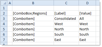
In this example, if the user selects the label "Consolidated" from the combo box, the value "All" will be placed in the target cell (or stored in form state / shared variable memory). The combo box displays the label of the selected value.
