On this page
AX1678
for web reports
The Data Grid component queries data from the Axiom Software database and displays that data in a grid within the web report. This component is the primary means of returning data into a web report.
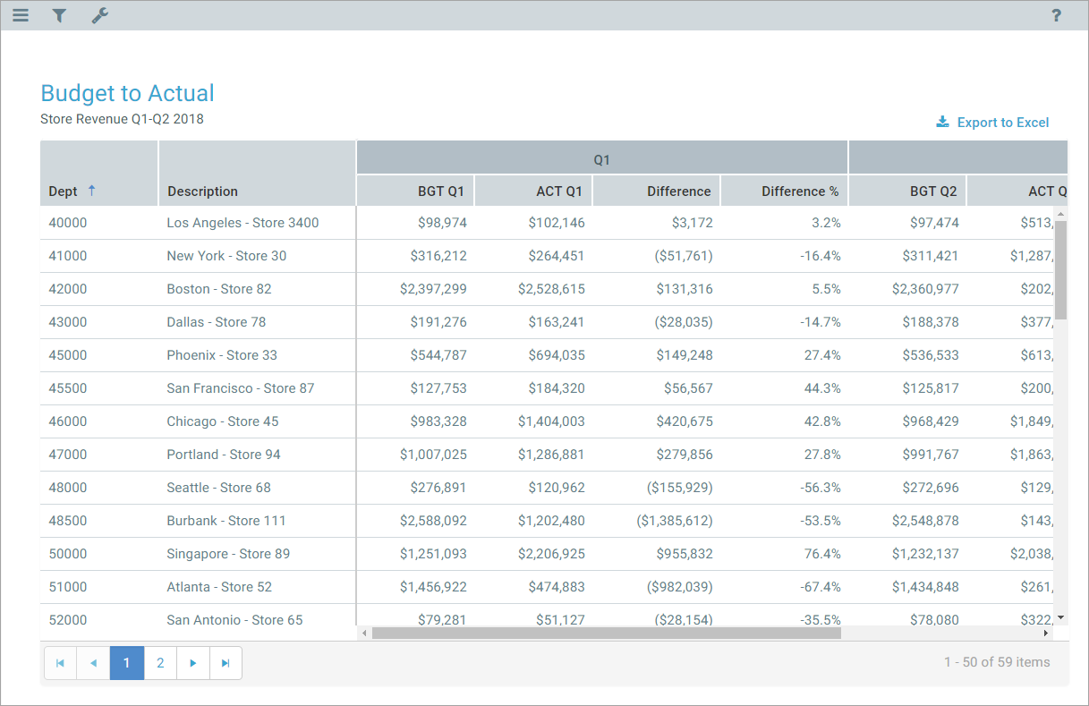
Example data grid in a web report
In order to configure a Data Grid, you must complete the following properties:
-
Data Source: You must define a data source for the web report, and then assign that data source to the grid in the component properties. The data source determines the table columns available for display in the grid, and also determines whether users can filter the data grid using refresh variables. For more information, see Defining data sources for Data Grid components.
-
Columns: You select a set of table columns to display in the grid, as well as their order in the grid and other display properties. The columns available to show in the grid depend on the primary table specified in the data source for the report. If the data source has a filter, the data grid also honors that filter when querying the data to display in the grid. See Defining columns for the grid.
-
Sum By: You specify the sum level of the rows in the grid by configuring one or more columns as "sum by" columns. For example, if the sum by level is Dept.Dept, then each row in the grid represents the sum of data per unique department. If the sum by level is Dept.Dept and Acct.Acct, then each row in the grid represents the sum of data per unique department / account combination. See Specifying sum by columns for the grid.
You can also optionally configure the following for a data grid:
-
Calculations: You can create one or more calculated columns, to show the results of calculated data in the grid. For example, you can show the summed total of a set of columns, or the difference between two columns, and so on. See Defining calculated columns for the grid.
-
Group Headers: You can create column groups, in order to display header text over groups of columns. For example, you may want the header text "Q1" over the three columns in the first quarter, "Q2" over the next three columns, and so on. See Defining group headers for the grid.
-
Sort Order: You can define an initial sort order for the grid, by specifying one or more sort columns and the sort direction. When users view the grid, they can change the sort to use any column. See Specifying the sort order for the grid.
- Additional features: You can enable grid features such as hierarchical groupings, drilling, and export to spreadsheet. See General properties.
To configure component properties in the Report Builder, select the component in the report and then edit the properties as needed using the Components panel.
The general properties for a Data Grid component are located at the top of Components panel, in the Grid Properties section.
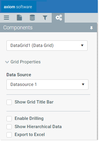
Example general properties for a data grid
You can define the following general properties for a Data Grid component. The Data Source is required; all other properties are optional.
| Item | Description |
|---|---|
|
Data Source |
Specifies the data source for the data grid. The data source determines the columns available for use in the grid. By default, new grids use the default data source for the web report. This data source is named Datasource 1, but it can be renamed. You can continue to use this default data source, or you can edit the grid properties to use any data source that you have defined on the Data Source tab. IMPORTANT: In order to configure the Data Grid component, at least one data source must be configured on the Data Source tab. If you are using the default data source, at minimum it must be assigned a primary table before the data grid can be configured. For more information, see Defining data sources for Data Grid components. |
|
Show Grid Title Bar |
Specifies whether the component has a title bar.
|
|
Title |
The title text for the component. This text displays in the component title bar, if the title bar is enabled. If the title bar is disabled, then this text does not display at all in the web report. If Export to Excel is enabled, the name of the export file is the title if it is defined. If you want to define a title for use with the export but not show the title in the web report, then you can enable Show Grid Title Bar for purposes of defining the title text, then disable the title bar again. The title text will be retained for use with the export. |
|
Enable Drilling |
Specifies whether drilling is enabled for the data grid.
If you enable this option, then you must also complete the Drilling Hierarchies. For more information on the drilling options and how end users drill the grid, see Setting up drilling for Data Grid components in web reports. |
|
Drilling Hierarchies |
The hierarchies available for drilling, if Enable Drilling is enabled. For more information on the drilling options and how end users drill the grid, see Setting up drilling for Data Grid components in web reports. |
|
Show Hierarchical Data |
Specifies whether data in the grid is grouped based on hierarchical dimensions.
|
|
Export to Excel |
Specifies whether users can export the grid contents to an Excel spreadsheet (XLSX).
When a user clicks the Export to Excel button, the contents of the grid are exported to an Excel spreadsheet. Configured number formats are not preserved, but default number formatting is applied based on the column data type. User changes to the grid, such as changing the sort order or filtering a column, are not preserved. However, if a refresh variable is used to filter data in the grid, this is preserved. The name of the exported file is the Title for the component, if defined. Otherwise, a system generated name is used. It is recommended to define title text for this purpose when using the export feature, even if the title bar is not enabled. The following features are not supported with the export feature:
|
|
Rows Per Page |
Determines how many rows are shown in each page of the grid. By default, the page size is 50. If the results returned by the query exceed the page size, then the grid data is separated into multiple pages. Users can use the page controls at the bottom of the grid to move among pages. If set to 0 or blank, all rows display on the same page. NOTE: The Report Builder is limited to showing no more than 50 rows per page, regardless of the grid configuration. If you have set your rows per page to more than 50, you must preview the report to see the result. |
The columns in the data grid determine the data to display in the grid. You specify which columns to include and their order, as well as other display properties such as alignment and number format.
If columns have already been added to the grid, these columns are listed in the Column Properties section of the Components panel. From here you can add new columns, reorder existing columns, edit column properties, and delete columns.
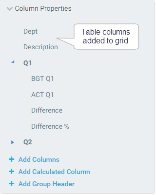
Example columns in the Column Properties section
To add columns in the grid:
-
In the Column Properties section of the Data Grid component properties, click Add Columns.
TIP: If you want to add one or more columns to a column group, select the column group before clicking Add Columns. The new columns will be added to the group instead of at the end of the columns list.
-
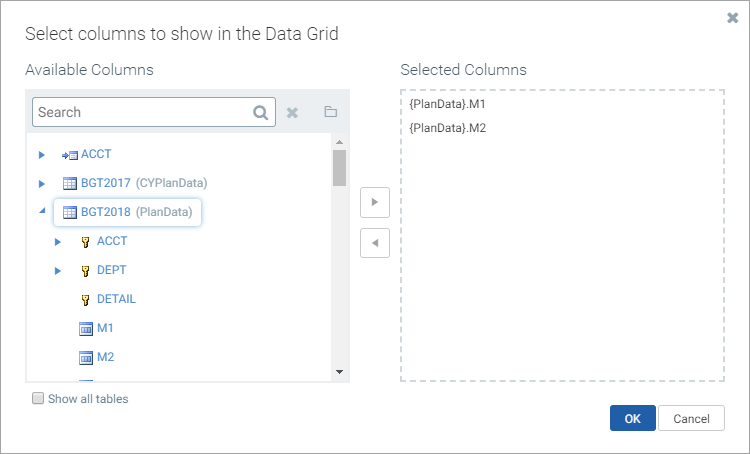
In the column selection dialog, locate the desired columns in the Available Columns box, and add them to the Selected Columns box. You can add regular table columns and calculated fields.
Available columns are listed by table in a treeview. You can click the folder icon
 to toggle the treeview from showing tables by folders or by table name. You can also use the Search box to filter the view by table name.
To add a column to the Selected Columns box, you can double-click it, or select it and use the arrow keys, or drag and drop it. Repeat this process for as many columns as you want to add at this time. Currently, it is not possible to multi-select columns in this dialog; you must add the columns to the Selected Columns box one-by-one.
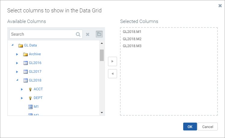
Example column selection dialog for data grids
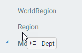
If the report has an associated file group, then the column selection dialog is limited by default to showing tables associated with the file group (and related lookup tables). Table variable names display in parentheses after the table names. If you add a column from a table with a variable, the column reference is stored using that variable name, so that it can dynamically change as the variable value changes.
Example column selection dialog limited by an associated file group
If you want to add a column from a table that is not associated with the file group, select Show all tables at the bottom of the dialog. The dialog updates to show all eligible tables, based on the primary table for the data source.
Eligible table columns
Only the tables that are eligible to be included in the grid are displayed in this dialog, based on the primary table specified for the web report's data source. This is determined as follows:
-
If the primary table of the data source is a data table, you can include any column from the data table, as well as any reference table it looks up to (including multiple-level lookups). You can also include any column from other data tables that share at least one validated key column with the primary table.
-
If the primary table of the data source is a reference table, you can include any column from the reference table, as well as any reference tables it looks up to. You can also include any column from a data table that looks up to the reference table.
NOTE: The column selection dialog only shows tables that meet these rules. However, tables that meet these rules may become invalid for inclusion in the grid based on other configuration settings in the grid. For example, imagine that the primary table is a data table with validated key columns of Dept and Acct. You can include a column from another data table if it also has a validated key of Dept. But if the sum by level for the grid is set to Acct, then the column from the other data table is no longer valid for inclusion, because it does not have the Acct key.
-
- Click OK to add the selected columns to the data grid. The columns now display in the columns list.
Once columns have been added to the grid, you can reorder, edit, and delete columns as follows:
-
Reorder: To reorder columns, drag and drop them in the columns list. When you drag a column above or below an existing column, you will see an icon as shown in the following screenshot. If you drop the column when that icon shows, the column will be moved to that location.
-
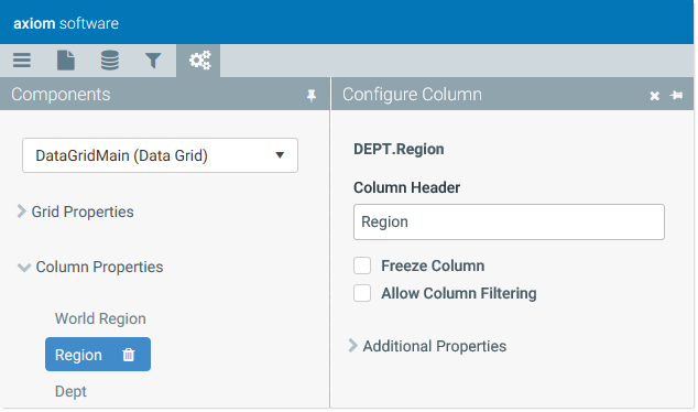
Edit: To edit column properties, select the column in the columns list. This opens the Configure Column panel to the right. (You can also hover over the column name and click the pencil icon to open the panel.)
-
Delete: To delete a column, select the column in the columns list and then click the Delete icon. (The icon is also available on hover.)

General column properties
The following general properties can be defined for each column in the grid.
| Item | Description |
|---|---|
|
Column Header |
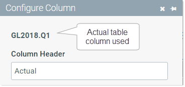
The text to display in the grid header for the column. By default, the Table.Column value is used. Once header text is defined, the column displays using the header text in the column list. In order to see the actual Table.Column being displayed in the grid, you can view the column name at the top of the Configure Column panel.
If the report has an associated file group, and the column was selected from a file group table variable, then the table variable name displays after the actual Table.Column name. |
|
Freeze Column |
Specifies whether the column is frozen at the left-hand side of the screen for scrolling purposes.
If Show Hierarchical Data is enabled for the grid, then this option is unavailable. Columns cannot be frozen when using hierarchical groupings in the grid. |
|
Allow Column Filtering |
Specifies whether users can filter the grid by the displayed values in the column.
|
Additional properties
The following optional properties can be used to impact the display of the column and the data shown in the column.
| Item | Description |
|---|---|
|
Header Alignment |
The alignment of the column header text. Select one of the following: Default, Left, Right, or Center. By default, the header text uses the same alignment as the column values. |
|
Column Alignment |
The alignment of the column values. Select one of the following: Default, Left, Right, or Center. The default alignment is as follows:
|
|
Column Width |
The width of the column in the grid, in pixels. If left blank, the default column width is as follows, depending on the column type:
|
|
Number Format |
A valid format string to define the display format used by the column. To specify a format, click the edit icon
If you do not define a format for columns with numeric data, then the default format for the column's specified numeric type is used. |
|
Visible on Grid |
Determines whether the column is visible in the grid. This property is enabled by default. You can optionally use this property to include the column in the query but not display it in the grid. If a column is not visible but it is specified as a "sum by" column or as a sort column, then it will still be included in the data query and will impact the results. Columns are visible in the grid in the order they are defined in the column list, with frozen columns displayed first, followed by all other unfrozen columns. |
|
Filter Column Data |
An optional filter to limit the data queried for the column. Click the filter icon Defining a column filter is different than enabling filtering in the grid using Allow Column Filtering. The column filter is part of the database query and limits the data returned into the grid for this column (same behavior as column filters in Axiom queries). In contrast, the filter controls on the column header allow users to perform ad hoc filtering based on the values displayed in the column. Also keep in mind that the column filter only affects the data in this particular column. If you want to filter the data coming into the entire data grid, then you must define a filter on the data source used by the grid. NOTE: If the report has an associated file group, the tables in the Filter Wizard show with table variable names (as applicable), but the filter is not stored using these variable names. The filter does not update for changes to the table variable values. |
|
Aggregation |
Specifies the aggregation type used to aggregate data in the column. In most cases this should be left at Default to use the default aggregation for the column—for example, to sum data columns. If you want to override the default aggregation type for a column, select a valid aggregation type. The behavior of the aggregation types is the same as when using an alternate aggregation in an Axiom query. For more information, see Specifying an alternate aggregation method (in Desktop Help). |
 in the right-hand side of the box. You can then select from several predefined formatting options. When you click Apply, the selected format string is placed in the Format box.
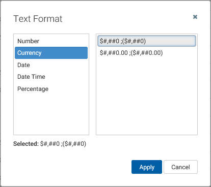
 to create a filter using the
 Specifying sum by columns for the grid
Each data grid must have at least one column specified as the "sum by" column for the grid. This determines the level of summation for each row of data in the query. The sum level is not assumed; it must be explicitly specified.
For example, if the sum by level is Dept.Dept, then each row in the grid represents the sum of data per unique department. If the sum by level is Dept.Dept and Acct.Acct, then each row in the grid represents the sum of data per unique department / account combination.
If Show Hierarchical Data is enabled for the data grid, then the sum by columns determine the hierarchical grouping levels for the grid. In this case, there must be at least two sum by columns, and the sum by columns must be in the intended order, with the top-level group listed first. For example, if you are grouping by Country > Region > Dept, then Dept.Country must be the first sum by column in the list.
If a column is designated as a sum by column, it is always included in the query, regardless of whether it is visible. Generally speaking, sum by columns should always be visible. If Show Hierarchical Data is enabled and a column is designated as a sum by column, that column is automatically visible.
The sum by columns are configured in the Column Properties section of the Components tab, using the Sum By Columns property. If sum by columns have already been specified, the names of the columns display in this field.
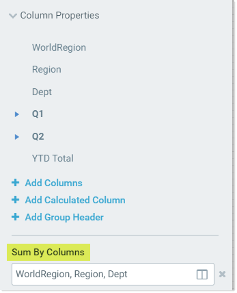
Example sum by columns for a data grid
NOTE: The column must already be added to the grid in order to use it as a sum by column.
To specify the sum by columns for a data grid:
- Click the table icon
 in the right-hand side of the Sum By Columns box.
 -
Locate the desired columns in the Available Items box, and move them to the Selected Items box.
You can select one or more columns (using CTRL or SHIFT to select multiple), and then use the arrow keys in the middle to move them between boxes. You can also double-click on an individual column to move it between boxes.
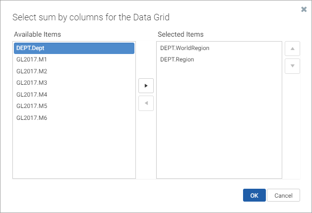
The Available Items box lists all columns that have been added to the grid.
-
If Show Hierarchical Data is enabled for the grid, use the up and down arrows to order the sum by columns in the order that you want the groupings to display. The top column in the list is the top-level grouping.
If you are not grouping by hierarchical data, then the order of the sum by columns does not matter.
- Click OK to set the sum by level of the grid to the selected columns.
You can change the sum by columns using the same process, and you can clear the currently selected columns by clicking the X button to the right of the box. However, the data grid will not be valid unless at least one sum by column is specified (or two, if Show Hierarchical Data is enabled).
If the report has an associated file group, and a selected sum by column is from the target table of a table variable in the file group, then the column is stored using the variable so that it can change dynamically.
Valid sum by columns
The following columns are valid to be used as sum by columns for the grid, depending on whether the primary table of the data source is a data table or a reference table. The sum by dialog does not filter out invalid column selections. If you select an invalid column, an error will occur when the sum by level is applied to the data grid.
When the primary table is a data table and no other data tables are included in the grid, the following database columns can be used to define the sum level:
- Any column in the primary table.
- Any column in a lookup tableA table that is the target of a Lookup Column relationship in another table. For example, if the column GL2018.Acct links to the column Acct.Acct, then the Acct reference table is known as a "lookup reference table"..
When the primary table is a data table and additional data tables are included in the grid, the following database columns can be used to define the sum level:
-
Any shared validated columnA column that has a defined lookup relationship with a column in another table, to define the valid values for the column. For example, if Acct.Acct is assigned as a Lookup Column for GL2014.Acct, then GL2014.Acct is known as a validated column and Acct.Acct is known as a lookup column. in the data tables, key or non-key. The sum by must be set to the shared lookup column, not to the column in the data tables. For example, you can specify
Dept.Deptas the sum by, but notGL2018.Dept. (Though if GL2018 is the primary table, this will still work and will be assumed asDept.Dept.) -
Any shared non-validated column in the data tables, key or non-key. In this case you must specify the column from the primary table with the shared name. For example, if all of the data tables in the query have a column named Date, and the primary table is GL2018, you can specify
GL2018.Dateas the sum by.
When the primary table is a reference table, the following database columns can be used to define the sum level:
- Any column in the primary table.
- Any column in a lookup tableA table that is the target of a Lookup Column relationship in another table. For example, if the column GL2018.Acct links to the column Acct.Acct, then the Acct reference table is known as a "lookup reference table"..
Defining calculated columns for the grid
You can optionally add calculated columns to the data grid, to display custom calculations. Calculated columns can be used to display totals, differences, percentages, and other calculations.
NOTE: In this context, "calculated column" refers to a custom calculation that you define for use in the grid. It does not refer to calculated fields defined on tables. Calculated fields can be added to the grid like regular table columns, using Add Columns.
If calculated columns have already been added to the grid, these columns are listed in the Column Properties section of the Components panel. From here you can add new calculated columns, reorder existing columns, edit column properties, and delete columns.
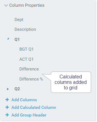
Example calculated columns in the Column Properties
To add a calculated column to the grid:
-
In the Column Properties section of the Data Grid component properties, click Add Calculated Column.
-
In the Create New Calculated Column dialog, define the Column Header text for the column, and the Calculation.
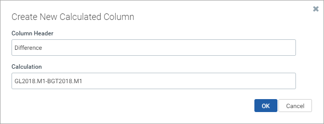
For more information on how to define the calculation, see the calculated column properties. If you are not ready to define the calculation at this point, you can enter anything into the Calculation field and then edit it later (however, the data grid may be invalid in the meantime).
- Click OK to add the calculated column to the data grid. The column now displays in the columns list.
Once calculated columns have been added to the grid, you can reorder, edit, and delete them just like regular columns.
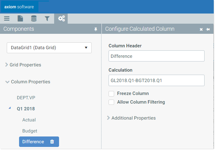
Example calculated column properties
General calculated column properties
The following general properties can be defined for each calculated column in the grid.
| Item | Description |
|---|---|
|
Column Header |
The name to display in the grid header for the column. This text is required for a calculated column. |
|
Enter the desired calculation as a text string, without an equals sign. The calculation must consist of valid database column names and one or more of the following operators: addition (+), subtraction (-), multiplication (*), division (/), remainder (%), or unary negation (-). For example: GL2018.M1+GL2018.M2 This calculation displays the sum of the two columns, for each row of the grid. Use parentheses to determine calculation order, such as: The calculation can use regular table column names, calculated field names, column alias names, and numbers. Table columns and calculated fields must use full Table.Column syntax. You can use any database column that would be valid for inclusion in the data grid, though the column does not have to be added to the grid in order to be used in the calculation. NOTE: Currently, it is not supported to use table variables in calculations when the report has an associated file group. |
|
|
Freeze Column |
Specifies whether the column is frozen at the left-hand side of the screen for scrolling purposes.
If Show Hierarchical Data is enabled for the grid, then this option is unavailable. Columns cannot be frozen when using hierarchical groupings in the grid. |
|
Allow Column Filtering |
Optional. Specifies whether users can filter the grid by the displayed values in the column. If enabled, then filtering controls are available on the column header in the rendered grid. These controls are visible when a user hovers over the column header. |
Additional properties
The following optional properties can be used to impact the display of the calculated column.
| Item | Description |
|---|---|
| Header Alignment |
The alignment of the column header text. Select one of the following: Default, Left, Right, or Center. By default, the header text uses the same alignment as the column values. |
|
Column Alignment |
The alignment of the column values. Select one of the following: Default, Left, Right, or Center. The default alignment is as follows:
|
|
Column Width |
The width of the column in the grid, in pixels. The default column width is 200px. |
|
Number Format |
A valid format string to define the display format used by the column. To specify a format, click the edit icon
|
|
Visible on Grid |
Determines whether the column is visible in the grid. This property is enabled by default. Columns are visible in the grid in the order they are defined in the column list, with frozen columns displayed first, followed by all other unfrozen columns. |
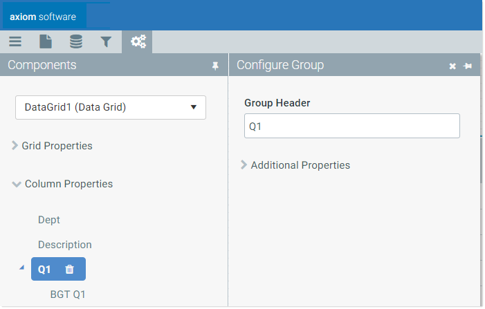
Defining group headers for the grid
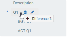
You can optionally add group headers, to define header text that spans across multiple columns. For example, you may want the header text "Q1" over the three columns in the first quarter, "Q2" over the next three columns, and so on.
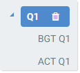
If group headers have already been added to the grid, these groups are listed in the Column Properties section of the Components panel. From here you can add new groups, reorder existing groups, edit group properties, and delete groups.
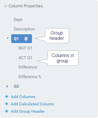
Example group header in the Column Properties
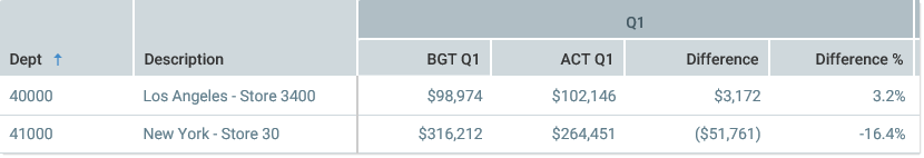
Example group header in rendered data grid
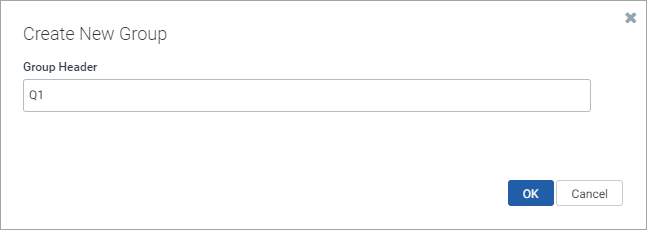
To add a group header to the grid:
-
In the Column Properties section of the Data Grid component properties, click Add Group Header.
TIP: If you want to create a nested group, select the existing parent group name first, then click Add Group Header. The new group will be created within the existing group. Alternatively, you can drag and drop groups to create nested groups.
-
In the Create New Group dialog, enter the Group Header name to use for this group. For example, the name might be something like Q1, Months, or 2018 Actuals. Click OK to add the group to the column list.
- To add columns to the group, you can do either of the following:
Drag and drop existing columns to the group. When you drag a column onto the group name, you will see a plus icon. If you drop the column at that point, it is added to the group.
Select the group name and click Add Columns to add new columns directly to the group.
Once the group has been created, you can reorder it, edit it, and delete it as follows:
-
Reorder: You can drag and drop columns within the group to change their order in the group. You can also select the group and move the entire column group to different locations within the column list (including underneath another group).
-
Edit: To edit the group properties, select the group name in the column list. This opens the Configure Group panel to the right. (You can also hover over the name and click the pencil icon to open the panel.)
-
Add or Remove Columns: You can drag and drop columns in and out of the group as needed. You can also delete columns in the group.
-
Delete Group: To delete the entire group, select the group name and click the Delete icon. (The icon also displays on hover.)
If you delete a group, all columns in the group are also deleted. A confirmation dialog displays before proceeding, so you have an opportunity to cancel the process. If you don't want the columns to be deleted, remove the columns from the group before deleting the group.
General group properties
The following general properties can be defined for each group in the grid.
| Item | Description |
|---|---|
|
Group Header |
The text to display in the group header. The group header spans above the columns in the group. |
Additional properties
The following optional properties can be defined for each group in the grid.
| Item | Description |
|---|---|
|
Header Alignment |
The alignment of the group header text. Select one of the following: Default, Left, Right, or Center. By default, group header text is centered across the columns in the group. |
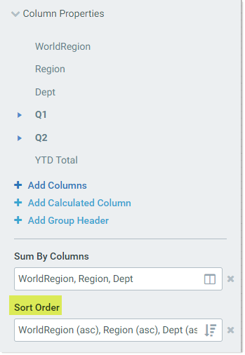
Specifying the sort order for the grid
You can optionally specify one or more sort columns to determine the initial sort order for the grid. Once the grid is rendered, users can change the sort as desired by clicking on a column header to sort by that column. Each click toggles between ascending sort, descending sort, and no sort.
For example, you can specify Dept.Dept as a sort column to sort the grid by departments. Or you can specify both Dept.Region and Dept.Dept to sort the grid first by region and then by department.
Sort columns can be table columns or calculated columns. The sort can be ascending or descending. If you do not define a sort column, by default the grid is sorted in ascending order using the sum by columns.
The sort columns are configured in the Column Properties section of the Components panel, using the Sort Order property. If sort columns have already been specified, the names of the columns display in this field.
Example sort order for the data grid
NOTE: The column must already be added to the grid in order to use it as a sort column.
To specify the sort order for a data grid:
- Click the sort icon
 in the right-hand side of the Sort Order box.
 -
Locate the desired columns in the Available Items box, and move them to the Selected Items box. You can select one or more columns (using CTRL or SHIFT to select multiple), and then use the arrow keys in the middle to move them between boxes. You can also double-click on an individual column to move it between boxes.
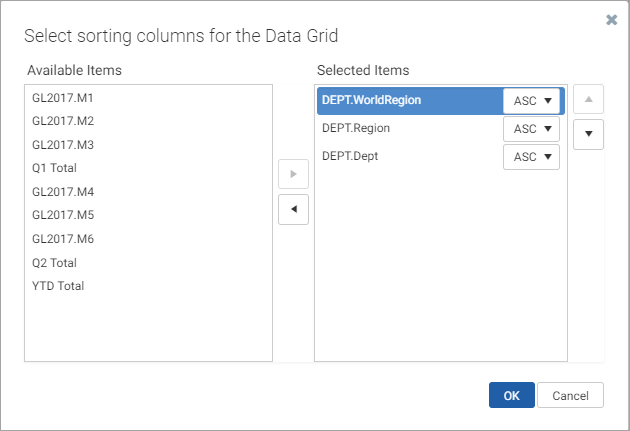
The Available Items box lists all columns and calculated columns that have been added to the grid.
-
Use the up and down arrows as needed to arrange the columns in the desired sort order. The top column in the list is the top-level sort.
- Use the drop-down list next to the column name to change the sort direction as needed. By default, the sort direction is ascending (ASC). If desired, you can change this to descending (DESC).
- Click OK to set the sort order of the grid to the selected columns.
You can change the sort columns using the same process, and you can clear the currently selected columns by clicking the X button to the right of the box.
If the report has an associated file group, and a selected sort order column is from the target table of a table variable in the file group, then the column is stored using the variable so that it can change dynamically.
|
Get more information and training resources: www.kaufmanhall.com |
Was this topic helpful? datagrid_web_report.htm |
